Classification Metrics
The last two lessons built two classifiers, logistic regression and k-NN, and scored both with a single number: accuracy, next to a DummyClassifier baseline. That number hides almost everything that matters. It does not say which mistakes the model makes, and in medicine, finance or security the two kinds of mistakes rarely cost the same. This lesson opens the box. Every metric is computed by hand on one small example you can check with a calculator, and scikit-learn then confirms each number.
How this lesson is organized
The lesson has two approaches. Each one has slides, text and a lab to run in class on Colab; the quiz at the end covers the fundamental one. Start with the fundamental one: the advanced one builds on it.
| Fundamental approach | Advanced approach | |
|---|---|---|
| question | Which mistakes does the model make, and how do you measure each one? | What breaks these metrics, and which one should you choose? |
| content | confusion matrix, accuracy and its paradox, precision, recall, specificity, FPR, NPV, the threshold, F1 | F-beta, prevalence, balanced accuracy and MCC, multiclass, log loss and Brier, how to choose |
| in-class lab | diabetes screening, steps 1 to 7 | probabilities, threshold and multiclass, steps 8 to 11 |
| by the end, you can | read a confusion matrix; compute each metric by hand and in scikit-learn; say which question each one answers | predict the effect of prevalence; choose between F1, F2, MCC and log loss; read a multiclass report |
Both labs use the same notebook on Colab (in Portuguese): the fundamental part runs steps 1 to 7, the advanced part steps 8 to 11. Everything runs in the browser; there is nothing to download.
Fundamental approach
One question guides this part: which mistakes does the model make, and how do you measure each one? Everything comes from a 2×2 table of four counts; each metric is a ratio between them, and each answers a different question in plain words.
After a word on why metrics matter, the part runs in four stages, drawn below: 1. count the mistakes in a confusion matrix; 2. accuracy is not enough, and its paradox shows why; 3. one question per metric, each reading a row or a column; 4. move the threshold and sum up precision and recall with F1. Each stage links to its section, and in the slides a strip at the bottom shows which stage you are in.
- Count the mistakes20 patients, four groups, the confusion matrix
- Accuracy is not enoughthe share of correct answers and its paradox
- One question per metricprecision, recall, specificity and the rest: a row or a column each
- Threshold and F1moving the line trades one mistake for the other; F1 sums up the two
Slides: fundamental approach
Click the slides and use the ← → arrows to navigate; F goes full screen and Esc shows every slide. Open the slides in a new tab
1. Why a lesson on metrics
A classifier makes two kinds of mistakes, and they are not symmetric:
- a missed cancer (the model says "healthy" to a sick patient) can cost a life; an unnecessary follow-up exam (the model says "sick" to a healthy one) costs money and a scare;
- a blocked card (a legitimate purchase flagged as fraud) costs a phone call and an irritated customer; an approved fraud costs the full amount.
Accuracy counts both mistakes as one and the same. Choosing a metric is choosing which mistake you are willing to make more often, and a model tuned for the wrong metric silently optimizes the wrong behavior. The rest of the lesson gives each question its own number.
2. The running example: 20 patients
Stage 1. Twenty patients were referred to a specialist. A model (think of the logistic regression of two lessons ago) gave each one a score, its predicted probability of disease, and later tests revealed who was really sick. Sorted by score:
| id | score | sick | id | score | sick | |
|---|---|---|---|---|---|---|
| P01 | 0.95 | 1 | P11 | 0.40 | 0 | |
| P02 | 0.90 | 1 | P12 | 0.35 | 1 | |
| P03 | 0.85 | 1 | P13 | 0.30 | 0 | |
| P04 | 0.80 | 1 | P14 | 0.25 | 0 | |
| P05 | 0.75 | 0 | P15 | 0.20 | 1 | |
| P06 | 0.70 | 1 | P16 | 0.15 | 0 | |
| P07 | 0.65 | 1 | P17 | 0.10 | 0 | |
| P08 | 0.60 | 0 | P18 | 0.08 | 0 | |
| P09 | 0.55 | 1 | P19 | 0.05 | 0 | |
| P10 | 0.45 | 1 | P20 | 0.02 | 0 |
Ten are sick and ten are healthy. The model does not answer "sick" or "healthy" by itself: it outputs a score, and we turn the score into a label with a threshold. The default is 0.5, which is what .predict() does for both logistic regression and k-NN. Every patient then falls into one of four groups:
- TP, true positive: sick, and flagged as sick;
- FP, false positive: healthy, but flagged as sick (a false alarm);
- FN, false negative: sick, but called healthy (a miss);
- TN, true negative: healthy, and called healthy.
The positive class is the one we are looking for, here "sick". It is usually the rare or interesting one (fraud, disease, churn), and it is what 1 means in the code. Copy the data and sort the patients:
import numpy as np

# 20 patients referred to a specialist, sorted by the model's score
ids   = [f"P{i:02d}" for i in range(1, 21)]
score = np.array([0.95, 0.90, 0.85, 0.80, 0.75, 0.70, 0.65, 0.60, 0.55, 0.45,
                  0.40, 0.35, 0.30, 0.25, 0.20, 0.15, 0.10, 0.08, 0.05, 0.02])
y_true = np.array([1, 1, 1, 1, 0, 1, 1, 0, 1, 1,
                   0, 1, 0, 0, 1, 0, 0, 0, 0, 0])      # 1 = sick

y_pred = (score >= 0.5).astype(int)                     # threshold 0.5
cell = {(1, 1): 'TP', (0, 1): 'FP', (1, 0): 'FN', (0, 0): 'TN'}
for name in ['TP', 'FP', 'FN', 'TN']:
    who = [i for i, t, p in zip(ids, y_true, y_pred) if cell[t, p] == name]
    print(f"{name} = {len(who)}:", ' '.join(who))
TP = 7: P01 P02 P03 P04 P06 P07 P09
FP = 2: P05 P08
FN = 3: P10 P12 P15
TN = 8: P11 P13 P14 P16 P17 P18 P19 P20
![The 20 patients on the score axis, split by the 0.5 threshold: 7 sick patients flagged (TP), 3 sick patients below the line (FN: P10, P12, P15), 2 healthy patients above it (FP: P05, P08) and 8 healthy below it (TN); the four counts form the confusion matrix in the standard layout, [[7, 3], [2, 8]]: TP and FN in the sick row, FP and TN in the healthy row](patients-threshold.svg)
The picture is the whole lesson in one line. The threshold is the dashed line. The three red patients are sick but scored below 0.5 (P10 with 0.45 was a near miss), and the two orange ones are healthy but scored above it. Each metric below is some ratio of these four counts: 7, 2, 3, 8.
3. The confusion matrix
The four counts arranged in a 2×2 table form the confusion matrix. The standard layout, the one in most textbooks and on Wikipedia, puts the actual condition in the rows, the predicted condition in the columns, and the positive class first in both:
| predicted sick | predicted healthy | |
|---|---|---|
| actually sick | TP = 7 | FN = 3 (miss) |
| actually healthy | FP = 2 (false alarm) | TN = 8 |
scikit-learn uses the same rows (actual) and columns (predicted) but, by default, orders both by the sorted order of the labels: with labels 0 and 1 the negatives come first and the top-left cell becomes TN. To get the standard layout, pass labels=[1, 0], positive class first. This lesson does that everywhere:
from sklearn.metrics import confusion_matrix

cm = confusion_matrix(y_true, y_pred, labels=[1, 0])    # positive first: the standard layout
print(cm)
tp, fn, fp, tn = cm.ravel()
print(f"tp={tp} fn={fn} fp={fp} tn={tn}")
print(confusion_matrix(y_true, y_pred))                  # no labels: scikit-learn's default
Read the layout before you read the numbers
Without labels, scikit-learn's confusion_matrix(y_true, y_pred) sorts the labels in ascending order: with 0 and 1 it returns [[TN, FP], [FN, TP]], the last matrix printed above, with TN in the top-left cell, and .ravel() returns tn, fp, fn, tp. Read as if it were in the standard layout, that matrix swaps TP with TN and FP with FN. With labels=[1, 0] it comes out in the standard layout, [[TP, FN], [FP, TN]], and .ravel() returns tp, fn, fp, tn. Two more traps: swapping the arguments (y_pred, y_true) transposes the matrix and silently swaps FP with FN; with string labels ("no", "yes") the default order is alphabetical. Always pass labels=[...], positive class first.
To look at it, ConfusionMatrixDisplay takes the same labels=[1, 0] and draws the matrix in the standard layout, with the names you choose:
import matplotlib.pyplot as plt
from sklearn.metrics import ConfusionMatrixDisplay

ConfusionMatrixDisplay.from_predictions(y_true, y_pred, labels=[1, 0],
                                        display_labels=['sick', 'healthy'], colorbar=False)
plt.show()
The diagonal holds the correct answers; everything off the diagonal is a mistake, and where it sits says which kind. ConfusionMatrixDisplay.from_estimator(model, X_test, y_test) does the same starting from a fitted model.
4. Accuracy, and the accuracy paradox
Stage 2. The metric used so far is the share of correct answers, the diagonal over the total:
Here the classes are balanced (10 and 10), so a DummyClassifier that always answers the majority class would score 0.50, and 0.75 is a real improvement. Accuracy is a fine summary when the classes are balanced and both mistakes cost the same. Take either condition away and it misleads.
Take 1,000 patients of whom only 10 are sick (prevalence 1%), and compare two "models": one that answers "healthy" to everybody, and a lazy one that catches half of the sick and raises 10 false alarms:
from sklearn.dummy import DummyClassifier
from sklearn.metrics import accuracy_score, recall_score

# 1,000 patients, 10 of them sick (prevalence 1%)
y_1000 = np.array([1] * 10 + [0] * 990)
always_healthy = np.zeros(1000, dtype=int)
lazy = np.array([1] * 5 + [0] * 5 +          # the 10 sick: 5 caught, 5 missed
                [1] * 10 + [0] * 980)        # the 990 healthy: 10 false alarms
X_none = np.zeros((1000, 1))                  # DummyClassifier ignores X
dummy = DummyClassifier(strategy='most_frequent').fit(X_none, y_1000)

for name, pred in [('always healthy', always_healthy), ('lazy model', lazy),
                   ('DummyClassifier', dummy.predict(X_none))]:
    print(f"{name:16s} accuracy {accuracy_score(y_1000, pred):.3f}   "
          f"recall {recall_score(y_1000, pred):.2f}")
always healthy   accuracy 0.990   recall 0.00
lazy model       accuracy 0.985   recall 0.50
DummyClassifier  accuracy 0.990   recall 0.00
The constant answer scores 99.0% and finds nobody. The lazy model, which at least finds 5 of the 10 sick patients, scores less: 98.5%. This is the accuracy paradox: on imbalanced data, accuracy rewards the model that ignores the rare class, because the rare class hardly weighs in the total. DummyClassifier(strategy='most_frequent') is exactly the constant answer, which is why it is the baseline to print next to any accuracy.
Everything comes from four cells
Accuracy, precision, recall and F1 are not independent measurements. They are four readings of the same 2×2 table. Move the sliders and watch them move together:
The button worth pressing is the lazy model: sensitivity 50%, specificity 99%, prevalence 1%. Out of 1000 patients, 10 are sick. The model catches 5 of them and raises 10 false alarms:
An impressive-looking number. But the model that always answers "healthy" scores 99%, so 98.5% is not merely unimpressive, it is worse than a constant. Meanwhile precision is 33%: two out of every three alarms are false, which is the number a clinician would actually care about.
Always report the baseline next to the metric. A score without a reference point is not a result.
The accuracy paradox
On imbalanced problems, high accuracy can describe a useless model. Always compare against the majority-class baseline (DummyClassifier), and look at the metrics of the next section, which read the matrix one row or one column at a time.
5. Precision, recall, specificity, FPR, NPV
Stage 3. Each of the following metrics answers one question in plain words, and each question reads one row or one column of the matrix. That is the only thing to memorize: once you know which cells a metric uses, you know what it measures and what it ignores.
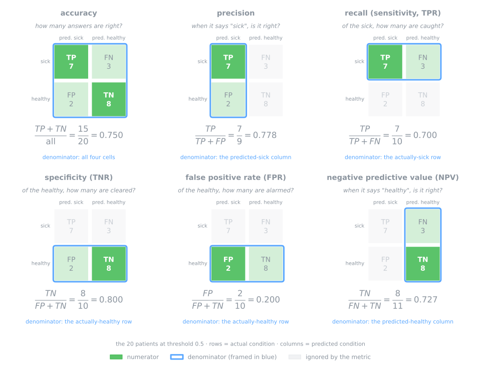
Precision: when it says "sick", is it right?
It reads the "predicted sick" column: of the 9 patients the model flagged, 7 were sick. Also called the positive predictive value (PPV). Precision ignores the sick patients the model missed. A model that flags only P01 has precision 1.0.
When it is the one that matters: when acting on an alarm is expensive or harmful. A spam filter that moves a real e-mail to the spam folder; a confirmatory test before surgery or chemotherapy; a fraud team that can only call 50 customers a day, where every false alarm wastes one of the 50 calls.
Recall (sensitivity): of the sick, how many are caught?
It reads the "actually sick" row: of the 10 sick patients, 7 were found. It has three names: recall (machine learning), sensitivity (medicine) and true positive rate, TPR (the ROC curve of the next lesson). Recall ignores false alarms. A model that flags everybody has recall 1.0.
When it is the one that matters: when a miss is expensive. Cancer screening, where a positive only leads to a second, more precise exam; detecting a fraud before the money leaves; inspecting aircraft parts for cracks.
Specificity and the false positive rate: of the healthy, how many are left alone?
Both read the "actually healthy" row. Specificity (true negative rate, TNR) is the recall of the negative class: of the 10 healthy patients, 8 were correctly left alone. The false positive rate is the other side of the same row: 2 of the 10 healthy patients got a false alarm. By the same logic, the false negative rate (miss rate) is \(1 - \text{recall} = 3/10 = 0.300\).
When it is the one that matters: when the negatives are the people you must not bother, and there are many of them. In mass screening of a population that is 99% healthy, the FPR decides how many healthy people receive a frightening letter: with FPR 0.20, one in five of them. The FPR is also the horizontal axis of the ROC curve.
Negative predictive value: when it says "healthy", is it right?
It reads the "predicted healthy" column, the mirror of precision: of the 11 patients sent home, 8 were really healthy.
When it is the one that matters: when the negative answer is the one acted on. An emergency room uses a blood test to rule out a heart attack and send the patient home; the patient who goes home is trusting the NPV.
The same numbers, in one table and in scikit-learn
| metric | question | formula | cells | value |
|---|---|---|---|---|
| accuracy | how many answers are right? | (TP + TN) / all | (7 + 8) / 20 | 0.750 |
| precision (PPV) | when it says "sick", is it right? | TP / (TP + FP) | 7 / 9 | 0.778 |
| recall, sensitivity, TPR | of the sick, how many are caught? | TP / (TP + FN) | 7 / 10 | 0.700 |
| specificity, TNR | of the healthy, how many are left alone? | TN / (TN + FP) | 8 / 10 | 0.800 |
| false positive rate (FPR) | of the healthy, how many get an alarm? | FP / (FP + TN) | 2 / 10 | 0.200 |
| false negative rate (FNR) | of the sick, how many are missed? | FN / (FN + TP) | 3 / 10 | 0.300 |
| negative predictive value (NPV) | when it says "healthy", is it right? | TN / (TN + FN) | 8 / 11 | 0.727 |
scikit-learn has functions for precision and recall only, and it does not need more. Specificity is the recall of class 0, and NPV is the precision of class 0, so pos_label=0 gives both:
from sklearn.metrics import precision_score

prec = precision_score(y_true, y_pred)             # TP / (TP + FP)
rec  = recall_score(y_true, y_pred)                # TP / (TP + FN)
spec = recall_score(y_true, y_pred, pos_label=0)   # TN / (TN + FP): recall of class 0
npv  = precision_score(y_true, y_pred, pos_label=0)  # TN / (TN + FN): precision of class 0
print(f"accuracy    {accuracy_score(y_true, y_pred):.3f}")
print(f"precision   {prec:.3f}")
print(f"recall      {rec:.3f}")
print(f"specificity {spec:.3f}")
print(f"FPR         {1 - spec:.3f}")
print(f"NPV         {npv:.3f}")
Every value matches the hand computation. Keep the pos_label=0 trick in mind: classification_report, used in the lab, prints one row per class, and the row of class 0 is specificity (its recall) and NPV (its precision).
6. The tension: moving the threshold
Stage 4. Nothing forces the threshold to be 0.5. Try 0.3 and 0.7 on the same 20 patients:
for t in [0.3, 0.5, 0.7]:
    pred = (score >= t).astype(int)
    tp, fn, fp, tn = confusion_matrix(y_true, pred, labels=[1, 0]).ravel()
    print(f"threshold {t}: TP={tp} FP={fp} FN={fn} TN={tn}   "
          f"precision {precision_score(y_true, pred):.3f}   recall {recall_score(y_true, pred):.3f}")
threshold 0.3: TP=9 FP=4 FN=1 TN=6   precision 0.692   recall 0.900
threshold 0.5: TP=7 FP=2 FN=3 TN=8   precision 0.778   recall 0.700
threshold 0.7: TP=5 FP=1 FN=5 TN=9   precision 0.833   recall 0.500
| threshold | flagged | TP | FP | FN | TN | precision | recall |
|---|---|---|---|---|---|---|---|
| 0.3 | 13 | 9 | 4 | 1 | 6 | 9/13 = 0.692 | 9/10 = 0.900 |
| 0.5 | 9 | 7 | 2 | 3 | 8 | 7/9 = 0.778 | 7/10 = 0.700 |
| 0.7 | 6 | 5 | 1 | 5 | 9 | 5/6 = 0.833 | 5/10 = 0.500 |
Lowering the threshold to 0.3 lets P10 and P12 in (recall 0.900, only P15 is missed), but also P11 and P13, two more false alarms (precision 0.692). Raising it to 0.7 removes P07, P08 and P09 from the flagged group: one false alarm fewer (P08), two more misses (P07 and P09), and recall drops to 0.500. Recall and precision move in opposite directions, and the model is the same in the three rows. Only the decision rule changed.
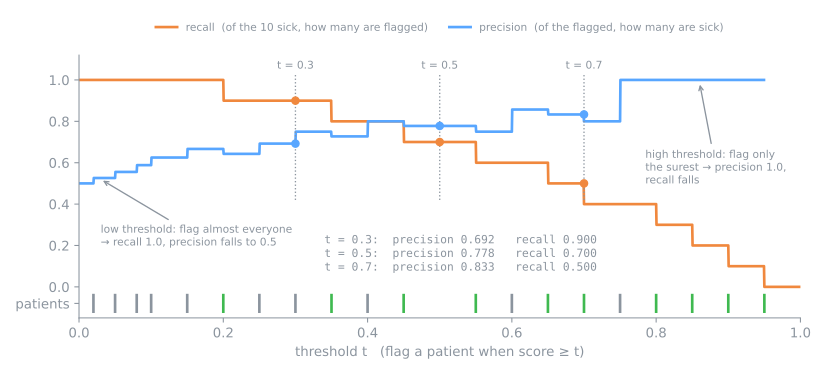
Both curves are staircases: they only change when the threshold crosses one patient's score (the ticks at the bottom). Recall can only go down as the threshold rises, one step for each sick patient left behind. Precision tends to go up, but not always: going from 0.60 to 0.65 removes the false alarm P08 and precision jumps from 0.750 to 0.857; going on to 0.70 removes P07, who is sick, and precision drops to 0.833.
The threshold is a decision, not a property of the model. The model provides the ranking (the scores); the threshold says how many patients the hospital is willing to send for a biopsy. Choosing it systematically, with curves that show every threshold at once, is the subject of the next lesson.
7. F1: one number from two
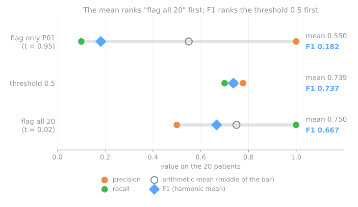
Sometimes one number is needed: to rank models, to pick a hyperparameter. The F1 score combines precision and recall with a harmonic mean:
Written with the counts, the same thing is \(F_1 = \frac{2\,TP}{2\,TP + FP + FN} = \frac{14}{14 + 2 + 3} = \frac{14}{19} = 0.737\). Note what is not there: TN. F1 does not care how many healthy patients were correctly left alone.
Why harmonic and not the ordinary average? Because the harmonic mean is pulled toward the smaller of the two. Compare three cuts of the 20 patients. Flagging only P01 (\(t = 0.95\)) gets its single flag right, precision 1.0, but catches 1 of 10 sick, recall 0.1: the arithmetic mean gives 0.55; F1, 0.18. Flagging all 20 (\(t = 0.02\)) has recall 1.0 and precision 0.5: the mean gives 0.750, slightly above the 0.739 of the threshold 0.5. By the mean, "send everybody to the specialist" would be the best of the three cuts. F1 (0.667 against 0.737) puts the threshold 0.5 first, because it is only high when both sides are high. You cannot buy a good F1 by maximizing one side and abandoning the other.
Key idea
Every metric in this part is a ratio between the same four counts. Knowing which cells it uses already tells you what it measures and what it ignores: recall never looks at the false alarms, precision never looks at the misses, and F1 never looks at the TN.
8. Summary: the four cells and the questions
- Build the matrix before any single number, in the standard layout: actual in the rows, predicted in the columns, positive first. In scikit-learn,
confusion_matrix(y_true, y_pred, labels=[1, 0]).ravel()returns tp, fn, fp, tn, in that order. - Choose the metric by the question, not by habit: the table in section 5 links each question to a row or a column.
- Print the baseline next to it (
DummyClassifier). A score without a reference point is not a result. - Remember the threshold is yours. The model gives the ranking; 0.5 is only what
.predict()happens to use.
| common mistake | symptom | fix |
|---|---|---|
reading scikit-learn's default matrix (no labels) as if TP were the top-left cell | TP swapped with TN and FP with FN in every computation | without labels the top-left cell is TN; pass labels=[1, 0] |
| reporting accuracy alone | a model that ignores the rare class looks excellent | accuracy next to the baseline, plus recall and precision |
| comparing models on one metric | the winner changes when the metric changes | a scoreboard with several metrics, as in step 7 |
| tuning the threshold while looking at the test set | the final number is no longer honest | choose the threshold on validation |
Fundamental lab — the screening tool
The Pima Indians diabetes dataset records 8 measurements of 768 women of Pima heritage, aged 21 or more, and whether each was diagnosed with diabetes. The setting: a screening tool that decides who is sent for a full diagnostic test. The lab trains the two models of the previous lessons and evaluates them with every metric of this page. Along the way it shows that the "best model" depends on the metric and that the threshold changes the answer, and it ends on a multiclass problem.
The protocol is hold-out: a training set to fit, a validation set for every comparison and choice, and a test set touched once at the end. Cross-validation, a few lessons ahead, will make these choices more robust.
How to run this lab in class (about 40 min, in pairs)
- Open the lab notebook on Colab (in Portuguese). There is nothing to download or install: Colab runs in the browser. To keep your answers, save a copy to your Drive (File → Save a copy in Drive) before editing. Run the cells in order, in one session.
- This lab covers steps 1 to 7 of the notebook. The advanced lab continues in the same notebook, from step 8.
- Each step starts with a Predict: answer it with your partner before running the cell. Getting the prediction wrong is what makes the result stick.
- After running, compare with the output and the reading on this page. Every output here is exactly what the code prints.
- The Simulations ask you to write a small Python experiment: change one input and watch what happens to the output. No arithmetic by hand. The solution is collapsed right below: try before opening it.
- Suggested pace: steps 1 to 3 in 12 min; steps 4 to 6 in 15 min; step 7 and the simulation in 13 min.
Step 1 — load and look at the target
Predict. The dataset collects women referred to a diabetes study, not the general population. Do you expect the two classes to be balanced? Would a model that always answers "no diabetes" be right more or less than half of the time?
import numpy as np
import pandas as pd
from sklearn.datasets import fetch_openml

pima = fetch_openml(data_id=37, as_frame=True)
X = pima.data.copy()                                       # 8 measurements per woman
y = (pima.target == 'tested_positive').astype(int)         # 1 = diabetes, 0 = no diabetes
print(X.shape)
print(y.value_counts())
print(f"prevalence: {y.mean():.3f}")
The target arrives as the strings 'tested_positive' and 'tested_negative'. We map them to 1 and 0 ourselves, so that 1 is the class we want to find and precision_score/recall_score (which assume pos_label=1) measure the right thing. 268 of the 768 women have diabetes: a prevalence of 34.9%. A model that always answers "no diabetes" is therefore right 65.1% of the time, and that is the accuracy to beat.
Step 2 — zeros that mean "not measured"
Predict. The insulin column holds hundreds of zeros. Is a zero insulin a real measurement or the code for "not measured"? If it stayed a zero, would the value read as a very low or a very high measurement?
print((X == 0).sum().to_frame('zeros').T)

missing = ['plas', 'pres', 'skin', 'insu', 'mass']   # a zero here is impossible: "not measured"
X[missing] = X[missing].replace(0, np.nan)
print(f"rows with at least one missing value: {X.isna().any(axis=1).sum()}")
       preg  plas  pres  skin  insu  mass  pedi  age
zeros   111     5    35   227   374    11     0    0
rows with at least one missing value: 376
The columns are: number of pregnancies (preg), plasma glucose two hours after a glucose tolerance test (plas), diastolic blood pressure (pres), triceps skinfold thickness (skin), serum insulin (insu), body mass index (mass), a family-history score (pedi) and age. Zero pregnancies is a real value. Zero glucose, blood pressure or BMI is impossible in a living person, and zero skinfold or insulin means the exam was not done: in this file, 0 is the code for "missing". Left as 0, it would be read as an extreme measurement.
We turn those zeros into NaN. Dropping the incomplete rows would throw away 376 of 768 women (almost all because of insulin), so we impute the median instead, with a SimpleImputer placed inside the pipeline of step 4. There, the medians are learned from the training rows only, and the validation and test rows never influence them.
Step 3 — three splits
Predict. What is each of the three parts for? Which one can you look at as often as you like, and which one can be touched only once?
from sklearn.model_selection import train_test_split

X_temp, X_test, y_temp, y_test = train_test_split(X, y, test_size=0.2, stratify=y,
                                                  random_state=42)
X_train, X_val, y_train, y_val = train_test_split(X_temp, y_temp, test_size=0.25,
                                                  stratify=y_temp, random_state=42)
for name, part in [('train', y_train), ('validation', y_val), ('test', y_test)]:
    print(f"{name:10s} {len(part):3d} rows · {part.sum():3d} positive ({part.mean():.1%})")
train      460 rows · 160 positive (34.8%)
validation 154 rows ·  54 positive (35.1%)
test       154 rows ·  54 positive (35.1%)
60/20/20, with stratify keeping the prevalence at about 35% in all three parts. The test set is now locked away until step 10. Keep the sizes in mind: with 54 positives in validation, one woman is worth 1.9 points of recall, so differences of a point or two between models are within the noise.
Step 4 — two models, two confusion matrices
Predict. Will the two models get the same women wrong? In a screening tool, which of the two mistakes would you rather avoid: sending a woman with diabetes home, or referring a woman without it to one extra test?
import matplotlib.pyplot as plt
from sklearn.impute import SimpleImputer
from sklearn.linear_model import LogisticRegression
from sklearn.metrics import ConfusionMatrixDisplay, confusion_matrix
from sklearn.neighbors import KNeighborsClassifier
from sklearn.pipeline import make_pipeline
from sklearn.preprocessing import StandardScaler

logreg = make_pipeline(SimpleImputer(strategy='median'), StandardScaler(),
                       LogisticRegression(max_iter=1000)).fit(X_train, y_train)
knn = make_pipeline(SimpleImputer(strategy='median'), StandardScaler(),
                    KNeighborsClassifier(n_neighbors=5)).fit(X_train, y_train)

pred_lr, pred_knn = logreg.predict(X_val), knn.predict(X_val)
print("logistic regression:\n", confusion_matrix(y_val, pred_lr, labels=[1, 0]))
print("k-NN (k = 5):\n", confusion_matrix(y_val, pred_knn, labels=[1, 0]))

fig, axes = plt.subplots(1, 2, figsize=(8, 3.5))
for ax, pred, title in [(axes[0], pred_lr, 'logistic regression'), (axes[1], pred_knn, 'k-NN')]:
    ConfusionMatrixDisplay.from_predictions(y_val, pred, labels=[1, 0],
                                            display_labels=['diabetes', 'no diabetes'], ax=ax, colorbar=False)
    ax.set_title(title)
plt.show()
The matrices are in the standard layout: the first row is the 54 women with diabetes, the second the 100 without; the top-left cell is TP. The logistic regression finds 32 of the 54 women with diabetes and misses 22 (top-right). k-NN finds 35 and misses 19, at the price of one more false alarm (13 against 12). Both pipelines impute, then scale (k-NN needs it, as seen in its lesson), then fit. The logistic regression keeps scikit-learn's default settings, including the mild L2 penalty its lesson switched off with C=np.inf; tuning that penalty waits for cross-validation.
Step 5 — the metrics by hand from .ravel()
Predict. The validation accuracy of logistic regression will land near 78%. Looking at that number alone, would you say the tool is ready to be used? What does it not tell you?
from sklearn.metrics import accuracy_score, f1_score, precision_score, recall_score

tp, fn, fp, tn = confusion_matrix(y_val, pred_lr, labels=[1, 0]).ravel()
print(f"tp={tp} fn={fn} fp={fp} tn={tn}")
by_hand = {'accuracy':    (tp + tn) / (tp + tn + fp + fn),
           'precision':   tp / (tp + fp),
           'recall':      tp / (tp + fn),
           'specificity': tn / (tn + fp),
           'F1':          2 * tp / (2 * tp + fp + fn)}
library = {'accuracy':    accuracy_score(y_val, pred_lr),
           'precision':   precision_score(y_val, pred_lr),
           'recall':      recall_score(y_val, pred_lr),
           'specificity': recall_score(y_val, pred_lr, pos_label=0),
           'F1':          f1_score(y_val, pred_lr)}
for name in by_hand:
    print(f"{name:12s} by hand {by_hand[name]:.3f}   sklearn {library[name]:.3f}")
tp=32 fn=22 fp=12 tn=88
accuracy     by hand 0.779   sklearn 0.779
precision    by hand 0.727   sklearn 0.727
recall       by hand 0.593   sklearn 0.593
specificity  by hand 0.880   sklearn 0.880
F1           by hand 0.653   sklearn 0.653
The four counts are all the functions need: accuracy \((32 + 88)/154 = 0.779\), precision \(32/44 = 0.727\), recall \(32/54 = 0.593\), specificity \(88/100 = 0.880\), F1 \(64/98 = 0.653\). Read as a screening tool, the logistic regression at threshold 0.5 is not good enough: it sends home 4 in 10 of the women who have diabetes. Its accuracy (77.9%) hides this completely.
Simulation: who are the misses? Logistic regression at 0.5 misses 22 of the 54 women with diabetes. Take the predicted probability of each of those 22 and see where those scores fall: did they land just below 0.5, hesitating, or much further away? If the threshold dropped to 0.3, how many would be recovered?
Solution
proba_val = logreg.predict_proba(X_val)[:, 1]
missed = proba_val[(y_val == 1) & (pred_lr == 0)]          # the 22 women who were missed
print(f"missed: {len(missed)}   mean score {missed.mean():.3f}")
for lo, hi in [(0.4, 0.5), (0.3, 0.4), (0.2, 0.3), (0.0, 0.2)]:
    n = ((missed >= lo) & (missed < hi)).sum()
    print(f"score between {lo:.1f} and {hi:.1f}: {n:2d} women")
missed: 22   mean score 0.273
score between 0.4 and 0.5:  4 women
score between 0.3 and 0.4:  4 women
score between 0.2 and 0.3:  8 women
score between 0.0 and 0.2:  6 women
Only 4 of the 22 were hesitating at the edge of the threshold. The mean score of the misses is 0.273 and 14 of them sit below 0.3: for those, the model is not in doubt, it is confidently wrong. Dropping the threshold to 0.3 recovers 8 of the 22 (the first two bands), which is exactly what step 9 will measure, when the misses fall from 22 to 14. The lesson: moving the threshold helps, but it cannot fix a model that placed a sick woman at 0.1 — that would take better features or a better model.
Step 6 — classification_report
Predict. The report prints one row per class. What does the no diabetes row measure, in plain words? (Hint: what is the "recall" of the negative class?)
from sklearn.metrics import classification_report

print(classification_report(y_val, pred_lr, target_names=['no diabetes', 'diabetes'], digits=3))
              precision    recall  f1-score   support

 no diabetes      0.800     0.880     0.838       100
    diabetes      0.727     0.593     0.653        54

    accuracy                          0.779       154
   macro avg      0.764     0.736     0.746       154
weighted avg      0.774     0.779     0.773       154
How to read it:
- the diabetes row is the positive class: precision 0.727, recall 0.593, F1 0.653, exactly step 5;
- the no diabetes row is the same matrix read from the other class: its recall (0.880) is the specificity, and its precision (0.800 = 88/110) is the NPV;
- macro avg recall (0.736) is the balanced accuracy of step 7; weighted avg recall (0.779) is the accuracy, as always.
Step 7 — a scoreboard with the baselines
Predict. Between logistic regression and k-NN, which one wins? Before looking: wins on which metric? And how much accuracy does a model that always answers "no diabetes" reach here?
from sklearn.dummy import DummyClassifier
from sklearn.metrics import balanced_accuracy_score, matthews_corrcoef

def scores(y_true, y_pred):
    return {'accuracy':    accuracy_score(y_true, y_pred),
            'precision':   precision_score(y_true, y_pred, zero_division=0),
            'recall':      recall_score(y_true, y_pred),
            'specificity': recall_score(y_true, y_pred, pos_label=0),
            'F1':          f1_score(y_true, y_pred),
            'balanced':    balanced_accuracy_score(y_true, y_pred),
            'MCC':         matthews_corrcoef(y_true, y_pred)}

models = {'dummy majority':   DummyClassifier(strategy='most_frequent'),
          'dummy stratified': DummyClassifier(strategy='stratified', random_state=0),
          'logistic':         logreg,
          'k-NN':             knn}
board = pd.DataFrame({name: scores(y_val, m.fit(X_train, y_train).predict(X_val))
                      for name, m in models.items()}).T
print(board.round(3).to_string())
                  accuracy  precision  recall  specificity     F1  balanced    MCC
dummy majority       0.649      0.000   0.000         1.00  0.000     0.500  0.000
dummy stratified     0.513      0.302   0.296         0.63  0.299     0.463 -0.074
logistic             0.779      0.727   0.593         0.88  0.653     0.736  0.499
k-NN                 0.792      0.729   0.648         0.87  0.686     0.759  0.534
How to read it:
- Two columns you have not met yet.
balanced(balanced accuracy) andMCCare single-number summaries that imbalance does not fool; section 11 defines them. For now, read them as "the accuracy of someone who gets no credit for ignoring the rare class". - Baselines. "Always no diabetes" reaches 64.9% accuracy with recall 0 and MCC 0; its precision is undefined (no positive predictions) and printed as 0 by
zero_division=0. The stratified dummy guesses at random with the class proportions: recall and precision near the prevalence, MCC near 0 (−0.074). Every real metric must be read against these rows: the models gain 13 to 14 points of accuracy over the baseline, and 0.50 to 0.53 of MCC over its 0. - Which model is best? k-NN leads in six columns, the logistic regression in specificity (0.88 against 0.87). But look at the size of the gaps: k-NN's better recall is 35 against 32 women, three people out of 54. On 154 validation rows that is not a clear win, and step 8, in the advanced approach, shows a metric on which the ranking flips completely.
Simulation: what if diabetes were rare? The Pima dataset has 34.9% prevalence, far above the general population. Build a validation set from the same women but with the disease rare: keep the 100 without diabetes and draw only 5 with it. Redo the scoreboard on it. Who leads on accuracy now? Do balanced accuracy and MCC change their minds?
Solution
rng = np.random.default_rng(0)
pos = np.flatnonzero(y_val.to_numpy() == 1)
neg = np.flatnonzero(y_val.to_numpy() == 0)
keep = np.sort(np.concatenate([neg, rng.choice(pos, size=5, replace=False)]))
Xr, yr = X_val.iloc[keep], y_val.iloc[keep]                 # same population, rare disease
print(f"{len(yr)} women, {yr.sum()} with diabetes (prevalence {yr.mean():.1%})")

rare = {name: scores(yr, m.predict(Xr))
        for name, m in [('dummy majority', DummyClassifier(strategy='most_frequent').fit(X_train, y_train)),
                        ('logistic', logreg), ('k-NN', knn)]}
print(pd.DataFrame(rare).T[['accuracy', 'recall', 'F1', 'balanced', 'MCC']].round(3).to_string())
105 women, 5 with diabetes (prevalence 4.8%)
                accuracy  recall     F1  balanced    MCC
dummy majority     0.952     0.0  0.000     0.500  0.000
logistic           0.876     0.8  0.381     0.840  0.403
k-NN               0.867     0.8  0.364     0.835  0.387
No model was refit and no woman changed diagnosis: only the mix of the validation set changed. Even so, the baseline that finds nobody now leads on accuracy (0.952 against 0.876), which is the accuracy paradox happening on the lab's own data. Balanced accuracy (0.840 against 0.500) and MCC (0.403 against 0) are not fooled, because they read the two rows of the matrix separately. F1 collapses to 0.381 because it contains precision, and precision gets worse when there are many more healthy women to generate false alarms — section 10 measures that effect. One reading caveat: with only 5 positives, a recall of 0.8 is 4 women; it did not "improve" on the 0.593 of step 7, it was simply measured on far too small a sample.
To close the fundamental part. One sentence each: (1) why is 77.9% accuracy not enough to approve a screening tool? (2) Which metric reads the row of the sick, and which reads the column of the flagged? (3) What happens to the four counts when the threshold rises?
Your turn (fundamental)
For homework:
- Another split. Replace
random_state=42in step 3 with other values and redo steps 4 and 5. How much does the recall of logistic regression move from one split to another? With 54 positives in validation, how many women is one point of recall worth? - The other class. In step 5, compute precision and recall with
pos_label=0. Which metrics of the section 5 table do you get? Check them against theno diabetesrow of step 6. - Without imputation. Redo step 4 keeping the original zeros (without turning them into
NaNand without theSimpleImputer). Does the confusion matrix change? Why is treating "not measured" as a zero worse than imputing the median?
Advanced approach
The fundamental part left a toolbox: the matrix, the metrics that come out of it, and the threshold. This part asks what breaks those tools and how to choose among them: what happens when the disease is rare, when there are many classes, and when what matters is the probability rather than the label. The code blocks continue those of sections 1 to 7 (the lab code runs separately, on Colab): the 20 patients (y_true, y_pred, score) and the 1,000-patient example (y_1000, lazy, always_healthy) are already defined.
This part closes with a table for choosing a metric and, before it, runs in four stages, drawn below: 1. weigh the errors with F-beta; 2. when positives are rare, precision moves and only some metrics resist; 3. many classes, averaged into one number; 4. grade the probability, not only the label. Each stage links to its section, and in the slides a strip at the bottom shows which stage you are in.
- Weigh the errorsF-beta: β says how much more recall matters
- When positives are rareprevalence moves precision; balanced accuracy and MCC resist
- Many classesone-vs-rest, then a macro, weighted or micro average
- Grade the probabilitylog loss, Brier score, calibration
Slides: advanced approach
Click the slides and use the ← → arrows to navigate; F goes full screen and Esc shows every slide. Open the slides in a new tab
9. F-beta: when one side matters more
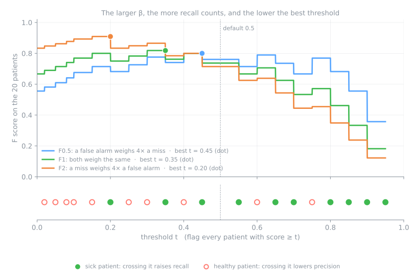
Stage 1. F1 weighs precision and recall equally. The F-beta score makes the trade explicit. In van Rijsbergen's formulation, it measures effectiveness for a user who attaches \(\beta\) times as much importance to recall as to precision:
The count form shows the mechanism: a miss (FN) weighs \(\beta^2\) times as much as a false alarm (FP). On the 20 patients at threshold 0.5:
- \(F_2\) (a miss weighs 4 times a false alarm): \(\frac{5 \cdot 7}{5 \cdot 7 + 4 \cdot 3 + 2} = \frac{35}{49} = 0.714\). It is lower than F1 because this model's weaker side is its recall (0.700).
- \(F_{0.5}\) (a false alarm weighs 4 times a miss): \(\frac{1.25 \cdot 7}{1.25 \cdot 7 + 0.25 \cdot 3 + 2} = \frac{8.75}{11.5} = 0.761\).
from sklearn.metrics import f1_score, fbeta_score

print(f"F1   {f1_score(y_true, y_pred):.3f}")
print(f"F2   {fbeta_score(y_true, y_pred, beta=2):.3f}")
print(f"F0.5 {fbeta_score(y_true, y_pred, beta=0.5):.3f}")
Use F2 for screening (catching the sick matters more, a false alarm only costs a second exam) and F0.5 when alarms are expensive (spam filtering, a confirmatory test, a team with limited time to check alerts). The figure shows the practical consequence. The x axis is the threshold \(t\), and the strip below shows the 20 patients at their scores: each time the threshold drops past a patient, the three curves take a step. A sick patient (●) raises recall; a healthy one (○) lowers precision. The dots mark each metric's best threshold: F2 is highest at a low threshold (0.20, where all 10 sick are flagged), F1 at 0.35 and F0.5 at a higher one (0.45). Picking \(\beta\) is a statement about costs, and it moves the operating point.
10. Prevalence changes precision
Stage 2. The 20 patients were referred to a specialist, so half of them are sick. Suppose the same model, with the same recall 0.70 and specificity 0.80, is used to screen the general population, where the disease is rarer. Count 10,000 people at three prevalences:
sens, spec = 0.70, 0.80          # the rates of our model at threshold 0.5
for prevalence in [0.50, 0.10, 0.01]:
    sick = round(10_000 * prevalence); healthy = 10_000 - sick
    tp = sens * sick;  fn = sick - tp
    tn = spec * healthy; fp = healthy - tn
    print(f"prevalence {prevalence:4.0%}: TP={tp:5.0f} FP={fp:5.0f}  precision {tp / (tp + fp):.3f}"
          f"   NPV {tn / (tn + fn):.4f}   accuracy {(tp + tn) / 10_000:.3f}")
prevalence  50%: TP= 3500 FP= 1000  precision 0.778   NPV 0.7273   accuracy 0.750
prevalence  10%: TP=  700 FP= 1800  precision 0.280   NPV 0.9600   accuracy 0.790
prevalence   1%: TP=   70 FP= 1980  precision 0.034   NPV 0.9962   accuracy 0.799
By hand, at 1%: 100 people are sick, and the model finds \(0.70 \times 100 = 70\). The other 9,900 are healthy, and 20% of them get a false alarm: \(0.20 \times 9{,}900 = 1{,}980\). Precision is \(70 / (70 + 1{,}980) = 0.034\). Of every 30 people the model flags, 29 are healthy, with the very same model that had precision 0.778 in the specialist's office.
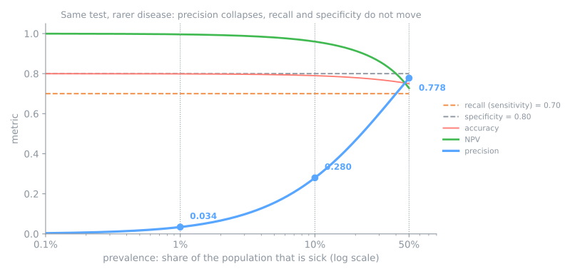
The rule behind the figure is the matrix again:
- recall uses only the sick row and specificity only the healthy row. Each is a proportion within one class, so they do not depend on how many patients of each class there are;
- precision, NPV and accuracy mix the two rows. When the healthy row grows 99 times larger than the sick one, even a small FPR produces a flood of false alarms that swamps the true positives.
This is the base-rate effect. Two consequences for practice: a precision measured on a test set with one prevalence will not hold in production if the prevalence changes, and an F1 (which contains precision) inherits the same dependence. When you report precision, report the prevalence of the data it was measured on.
11. Metrics that survive imbalance: balanced accuracy and MCC
Two single numbers were designed to resist the accuracy paradox.
Balanced accuracy is the average of the recall of each class, which for two classes is recall and specificity:
- 20 patients: \((0.700 + 0.800) / 2 = 0.750\) (the same as accuracy, because the classes are balanced);
- the lazy model: recall \(5/10 = 0.5\), specificity \(980/990 = 0.990\), so \((0.5 + 0.990) / 2 = 0.745\);
- always healthy: recall 0, specificity 1, so 0.500, which is the balanced accuracy of any constant answer.
The Matthews correlation coefficient (MCC) is the correlation between the true and the predicted labels, and it uses all four cells:
- 20 patients: \(\frac{7 \cdot 8 - 2 \cdot 3}{\sqrt{9 \cdot 10 \cdot 10 \cdot 11}} = \frac{50}{\sqrt{9{,}900}} = \frac{50}{99.5} = 0.503\);
- the lazy model: \(\frac{5 \cdot 980 - 10 \cdot 5}{\sqrt{15 \cdot 10 \cdot 990 \cdot 985}} = \frac{4{,}850}{12{,}094} = 0.401\);
- always healthy: TP = FP = 0, a factor of the denominator is zero, and scikit-learn returns 0.
MCC runs from −1 (always wrong) through 0 (no better than chance or a constant) to +1 (perfect). It is high only if the model does well on all four cells at once, which is why Chicco & Jurman (2020) recommend it over accuracy and F1 for binary problems.
from sklearn.metrics import balanced_accuracy_score, matthews_corrcoef, cohen_kappa_score

for name, yt, yp in [('20 patients', y_true, y_pred),
                     ('lazy model', y_1000, lazy),
                     ('always healthy', y_1000, always_healthy)]:
    print(f"{name:15s} accuracy {accuracy_score(yt, yp):.3f}   balanced {balanced_accuracy_score(yt, yp):.3f}"
          f"   MCC {matthews_corrcoef(yt, yp):.3f}   kappa {cohen_kappa_score(yt, yp):.3f}")
20 patients     accuracy 0.750   balanced 0.750   MCC 0.503   kappa 0.500
lazy model      accuracy 0.985   balanced 0.745   MCC 0.401   kappa 0.393
always healthy  accuracy 0.990   balanced 0.500   MCC 0.000   kappa 0.000
Accuracy ranks the constant answer first (0.990 against 0.985). Balanced accuracy and MCC reverse the ranking and expose it: 0.500 and 0.000, the value of a model that has learned nothing. The last column, Cohen's kappa, is a third option in the same spirit: accuracy corrected for the agreement a random guess with the same class proportions would reach by chance (0 = chance, 1 = perfect).
12. Multiclass: one-vs-rest, then average
Stage 3. With \(k\) classes the confusion matrix is \(k \times k\): rows are still the truth, columns the prediction, and the diagonal the correct answers. Take a triage model that sorts 200 patients into low, medium and high risk:
| truth predicted | low | medium | high | total |
|---|---|---|---|---|
| low | 110 | 9 | 1 | 120 |
| medium | 8 | 46 | 6 | 60 |
| high | 2 | 8 | 10 | 20 |
| total | 120 | 63 | 17 | 200 |
Precision, recall and F1 are computed per class, one-vs-rest: treat one class as "positive" and merge the other two into "negative". For high: TP = 10 (the diagonal cell), FN = 2 + 8 = 10 (the rest of its row: high-risk patients sent to low or medium), FP = 1 + 6 = 7 (the rest of its column: patients wrongly sent to high), TN = the remaining 173. So:
| class | precision = diagonal / column | recall = diagonal / row | F1 | support |
|---|---|---|---|---|
| low | 110 / 120 = 0.917 | 110 / 120 = 0.917 | 0.917 | 120 |
| medium | 46 / 63 = 0.730 | 46 / 60 = 0.767 | 0.748 | 60 |
| high | 10 / 17 = 0.588 | 10 / 20 = 0.500 | 0.541 | 20 |
Half of the high-risk patients, the ones triage exists for, are sent to a lower level. To report one number, the per-class scores are averaged in one of three ways:
- macro: plain mean over classes, every class counts the same. \(F_1^{macro} = (0.917 + 0.748 + 0.541)/3 = 0.735\);
- weighted: mean weighted by each class's support. \(F_1^{weighted} = (120 \cdot 0.917 + 60 \cdot 0.748 + 20 \cdot 0.541)/200 = 0.828\);
- micro: pool the counts of all classes first. Every mistake is a FP for one class and a FN for another, so pooled FP = pooled FN = 34 (all the off-diagonal cells), and precision = recall = F1 = 166/200 = 0.830 = accuracy. For single-label problems micro-F1 is always equal to accuracy.
from sklearn.metrics import classification_report

labels = ['low', 'medium', 'high']
counts = np.array([[110,  9,  1],     # truth = low     (120 patients)
                   [  8, 46,  6],     # truth = medium  ( 60 patients)
                   [  2,  8, 10]])    # truth = high    ( 20 patients)
# rebuild one row per patient from the counts
y_t = [labels[i] for i in range(3) for j in range(3) for _ in range(counts[i, j])]
y_p = [labels[j] for i in range(3) for j in range(3) for _ in range(counts[i, j])]

print(confusion_matrix(y_t, y_p, labels=labels))
print(classification_report(y_t, y_p, labels=labels, digits=3))
print(f"micro F1 {f1_score(y_t, y_p, average='micro'):.3f} = accuracy {accuracy_score(y_t, y_p):.3f}")
[[110   9   1]
 [  8  46   6]
 [  2   8  10]]
              precision    recall  f1-score   support

         low      0.917     0.917     0.917       120
      medium      0.730     0.767     0.748        60
        high      0.588     0.500     0.541        20

    accuracy                          0.830       200
   macro avg      0.745     0.728     0.735       200
weighted avg      0.828     0.830     0.828       200

micro F1 0.830 = accuracy 0.830
The report confirms every number of the hand table. Note the labels=labels argument: without it, the strings would be sorted alphabetically (high, low, medium).
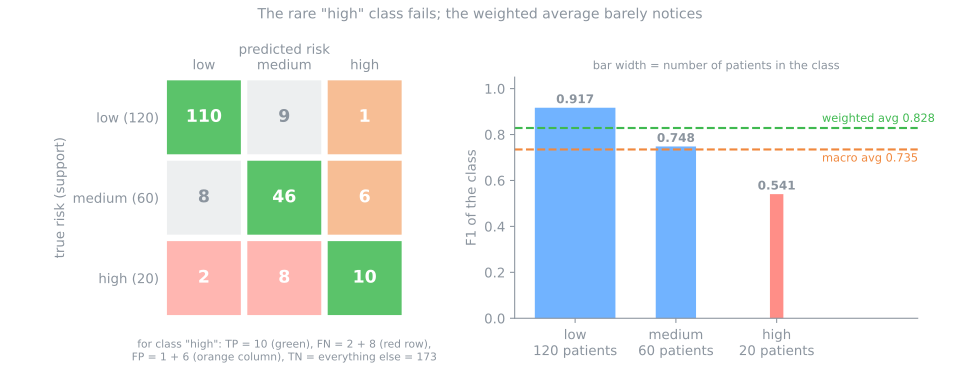
Weighted F1 (0.828) looks almost as good as the big low class, because low carries 60% of the weight. Macro F1 (0.735) gives the 20 high-risk patients the same voice as the 120 low-risk ones, and drops 9 points. When the rare class is the important one, report macro-F1 and the per-class recall, and read the off-diagonal cells: 8 high-risk patients sent to medium is a different problem from 2 sent to low. One detail: weighted recall is always equal to accuracy (0.830 here), since weighting each class's recall by its support simply counts all the diagonal hits.
13. Scores, thresholds, and calibration
Stage 4. Everything so far graded labels: the model's score was cut at a threshold, and only the side of the line mattered. P01 (0.95) and P09 (0.55) count the same, as one TP each. When the probabilities themselves are used as numbers (to price a risk, to order a queue, to tell a patient "you have a 30% risk"), they need a grade of their own. Two metrics grade the probability directly, with no threshold at all. For both, lower is better.
The log loss (cross-entropy) is the loss that logistic regression minimizes during training. Each patient costs \(-\ln\) of the probability the model gave to what really happened:
The Brier score is the mean squared error between the probability and the outcome (0 or 1):
By hand, for three of the patients:
| patient | score \(p\) | sick \(y\) | log loss term | Brier term |
|---|---|---|---|---|
| P01 | 0.95 | 1 | \(-\ln 0.95 = 0.051\) | \((0.95 - 1)^2 = 0.0025\) |
| P05 | 0.75 | 0 | \(-\ln (1 - 0.75) = 1.386\) | \((0.75 - 0)^2 = 0.5625\) |
| P15 | 0.20 | 1 | \(-\ln 0.20 = 1.609\) | \((0.20 - 1)^2 = 0.64\) |
A confident right answer (P01) costs almost nothing; a confident wrong answer costs a lot, and the log loss punishes it much harder than the Brier score (−ln grows without limit as \(p \to 0\); the square never exceeds 1). The mean over the 20 patients, and a second model that makes the same decisions at 0.5 but states every probability as 0.99 or 0.01:
from sklearn.metrics import log_loss, brier_score_loss

print(f"log loss {log_loss(y_true, score):.3f}   Brier {brier_score_loss(y_true, score):.3f}")

# same labels at 0.5, but every probability pushed to 0.99 / 0.01
bold = np.where(score >= 0.5, 0.99, 0.01)
print(f"accuracy {accuracy_score(y_true, bold >= 0.5):.2f} (was {accuracy_score(y_true, y_pred):.2f})")
print(f"log loss {log_loss(y_true, bold):.3f}   Brier {brier_score_loss(y_true, bold):.3f}")
The bold model has the same confusion matrix, so the same accuracy, precision, recall and F1: every metric of the previous sections is blind to the difference. Log loss and Brier are not. The five mistakes, now stated with 99% confidence, cost \(-\ln 0.01 = 4.6\) each, and the log loss rises from 0.463 to 1.159. Its probabilities are worse, even if its labels are identical.
The related question is calibration: among the patients to whom the model says "70%", are about 70% really sick? A calibration curve (sklearn.calibration.CalibrationDisplay) answers it by binning the predictions and comparing each bin's mean score with its observed share of positives; the log loss and Brier score summarize the same quality in one number. The ranking side of the scores, how well they separate sick from healthy across every threshold, is graded by the ROC and precision–recall curves of the next lesson.
14. How to choose a metric
There is no best metric, only a metric that matches the cost of the mistakes in your problem. Decide it before training, write it down, and always print the baseline next to it.
| scenario | the costly mistake | watch | why |
|---|---|---|---|
| cancer screening (a positive leads to a second exam) | FN: a missed tumour | recall, F2; specificity alongside | a false alarm costs an exam, a miss can cost a life |
| confirmatory test before surgery or chemotherapy | FP: treating a healthy person | precision, specificity | the action taken on a positive is invasive |
| spam filter | FP: a real e-mail lost | precision, F0.5 | spam in the inbox is a nuisance, a lost job offer is not |
| fraud triage, analysts can check 50 alerts a day | both, under a fixed capacity | precision among the top 50 scores; recall as a second number | the capacity fixes how many alerts are raised |
| ruling out a disease and sending the patient home | FN: a sick patient sent home | NPV, recall | the negative answer is the one acted on |
| credit approval | lending to a defaulter vs refusing a good payer | the expected cost of each cell, in money; recall and precision of "default" | each cell has a price |
| one number for an imbalanced binary benchmark | any | MCC or balanced accuracy, plus the baseline | accuracy and F1 ignore part of the matrix |
| multiclass with a rare, important class | failing the rare class | macro-F1 and per-class recall | weighted and micro averages follow the big classes |
| probabilities used as numbers (risk pricing, queue order) | wrong probabilities | log loss, Brier, calibration curve | label metrics never look at the probability |
Advanced lab — probabilities, threshold and multiclass
Steps 8 to 11 revisit four themes of this part: log loss and Brier grading the probabilities, F-beta choosing the operating point, the test set touched exactly once, and a multiclass report.
How to run this lab in class (about 30 min, in pairs)
- Use the same Colab notebook as the fundamental lab and go to step 8 (Passo 8). Nothing to download.
- Steps 8 to 11 use the models fit in steps 3 and 4. If the Colab session is new (or has expired), click the step 8 cell and use Runtime → Run before (Ctrl+F8) before going on.
- Same routine: Predict before running, compare with the page, and try the Simulations before opening the solution.
- Suggested pace: steps 8 and 9 in 15 min; steps 10 and 11 in 10 min; wrap-up in 5 min.
Step 8 — grading the probabilities
Predict. With k = 5, a k-NN "probability" is a vote count divided by 5. If a woman with diabetes has five nearest neighbors without it, what probability does she get? What does an answer like that do to the log loss?
from sklearn.metrics import brier_score_loss, log_loss

prior = DummyClassifier(strategy='prior').fit(X_train, y_train)   # always answers 34.8%
for name, m in [('dummy prior', prior), ('logistic', logreg), ('k-NN', knn)]:
    p = m.predict_proba(X_val)[:, 1]
    print(f"{name:12s} log loss {log_loss(y_val, p):.3f}   Brier {brier_score_loss(y_val, p):.3f}")

votes = knn.predict_proba(X_val)[:, 1]          # fraction of the 5 neighbors with diabetes
print(pd.crosstab(votes, y_val, rownames=['k-NN probability'], colnames=['diabetes']))
dummy prior  log loss 0.648   Brier 0.228
logistic     log loss 0.452   Brier 0.148
k-NN         log loss 1.290   Brier 0.146
diabetes           0   1
k-NN probability
0.0               51   3
0.2               25   7
0.4               11   9
0.6               11  18
0.8                1  13
1.0                1   4
On log loss the ranking flips: the logistic regression (0.452) beats the baseline that always says 34.8% (0.648), and k-NN is worse than the baseline (1.290). The table explains why. With k = 5, a k-NN "probability" is a vote count divided by 5, so it can only be 0, 0.2, …, 1. Three women with diabetes had five healthy neighbors and got a probability of exactly 0, and one healthy woman got exactly 1. The log loss of a certain answer that turns out wrong is infinite; scikit-learn clips it to \(-\ln(2.2\times10^{-16}) \approx 36\) per patient, and these 4 women alone add 0.94 to the average. The Brier score, bounded by 1 per patient, barely notices (0.146 against 0.148).
So which model is best depends on the metric: k-NN on the labels at 0.5, logistic regression by far on the probabilities. For a screening tool whose threshold we are about to move, the probabilities are what we will cut, and 5-vote probabilities offer only six possible cut points. The next steps continue with the logistic regression.
Simulation: does a larger k fix the probabilities? The k-NN problem here is how coarse the votes are: with k = 5 there are only six possible probabilities, and two of them are 0 and 1. Redo the measurement with k = 25 and k = 75, counting how many distinct values appear and how many predictions land exactly on 0 or 1. Can the log loss get below the baseline? Does Brier follow?
Solution
for k in [5, 25, 75]:
    m = make_pipeline(SimpleImputer(strategy='median'), StandardScaler(),
                      KNeighborsClassifier(n_neighbors=k)).fit(X_train, y_train)
    p = m.predict_proba(X_val)[:, 1]
    print(f"k={k:3d}  distinct values {len(np.unique(p)):3d}  p=0 or 1: {((p == 0) | (p == 1)).sum():3d}"
          f"   log loss {log_loss(y_val, p):.3f}   Brier {brier_score_loss(y_val, p):.3f}")
print(f"baseline (always 34.8%)                          log loss {log_loss(y_val, np.full(len(y_val), y_train.mean())):.3f}")
k=  5  distinct values   6  p=0 or 1:  59   log loss 1.290   Brier 0.146
k= 25  distinct values  21  p=0 or 1:  10   log loss 0.443   Brier 0.147
k= 75  distinct values  47  p=0 or 1:   0   log loss 0.467   Brier 0.154
baseline (always 34.8%)                          log loss 0.648
With k = 5, 59 of the 154 women get a 0 or a 1, an absolute certainty the model does not have; one of those being wrong is enough to send the log loss up. With k = 25 only 10 extreme answers remain and the log loss falls from 1.290 to 0.443, now well below the 0.648 baseline; with k = 75 no prediction is extreme any more, yet the log loss creeps back up (0.467), because an average over 75 neighbors is too vague. Brier barely moves across the three (0.146 to 0.154): it is capped at 1 per patient and so hardly sees the problem that wrecks the log loss. Two probability metrics, two different diagnoses — it is worth looking at both.
Step 9 — moving the threshold, on validation
Predict. Lowering the threshold from 0.5 to 0.3 finds more women with diabetes. What gets worse in exchange? Do you expect F1 to register that trade clearly?
from sklearn.metrics import fbeta_score

proba_val = logreg.predict_proba(X_val)[:, 1]
rows = []
for t in [0.3, 0.5, 0.7]:
    pred = (proba_val >= t).astype(int)
    tp, fn, fp, tn = confusion_matrix(y_val, pred, labels=[1, 0]).ravel()
    rows.append({'threshold': t, 'TP': tp, 'FP': fp, 'FN': fn, 'TN': tn,
                 'precision': precision_score(y_val, pred), 'recall': recall_score(y_val, pred),
                 'F1': f1_score(y_val, pred), 'F2': fbeta_score(y_val, pred, beta=2)})
table = pd.DataFrame(rows)
print(table.round(3).to_string(index=False))
best_t = table.loc[table['F2'].idxmax(), 'threshold']
print(f"highest F2 on validation: threshold {best_t}")
 threshold  TP  FP  FN  TN  precision  recall    F1    F2
       0.3  40  28  14  72      0.588   0.741 0.656 0.704
       0.5  32  12  22  88      0.727   0.593 0.653 0.615
       0.7  24   4  30  96      0.857   0.444 0.585 0.492
highest F2 on validation: threshold 0.3
The same model, three decisions. At 0.7 the tool is precise (86% of its alarms are right) but misses 30 of the 54 women with diabetes. At 0.3 it misses 14, at the price of 28 false alarms instead of 4. F1 hardly moves between 0.3 and 0.5 (0.656 against 0.653): it weighs both mistakes equally and sees no reason to prefer one over the other. For screening, where a false alarm costs a confirmatory glucose test and a miss costs years of untreated diabetes, we said a miss matters more, and F2 says so: 0.704 at 0.3 against 0.615 at 0.5. The choice is made on validation, among three candidates only, so the test set stays honest.
Simulation: β picks the threshold. Step 9 compared three thresholds chosen by hand. Sweep the threshold from 0.10 to 0.90 in steps of 0.05 and find the threshold that maximizes each of F0.5, F1 and F2 on validation. How many misses and how many false alarms does each choice produce?
Solution
proba_val = logreg.predict_proba(X_val)[:, 1]
grid = np.arange(0.10, 0.91, 0.05)
for beta, name in [(0.5, 'F0.5'), (1, 'F1'), (2, 'F2')]:
    sc = [fbeta_score(y_val, (proba_val >= t).astype(int), beta=beta) for t in grid]
    best = grid[int(np.argmax(sc))]
    pred = (proba_val >= best).astype(int)
    print(f"{name:4s} best threshold {best:.2f}  ->  misses {((y_val == 1) & (pred == 0)).sum():2d}"
          f"   false alarms {((y_val == 0) & (pred == 1)).sum():2d}   {name} {max(sc):.3f}")
F0.5 best threshold 0.60  ->  misses 25   false alarms  7   F0.5 0.732
F1   best threshold 0.25  ->  misses 10   false alarms 30   F1 0.688
F2   best threshold 0.10  ->  misses  1   false alarms 64   F2 0.796
The same model and the same validation set produce three very different screening tools, and it is \(\beta\) that chooses. F0.5 protects the healthy: 7 false alarms, but 25 women with diabetes sent home. F2 does the opposite and lets almost nobody through (1 miss), at the price of referring 64 of the 100 women without diabetes. Notice that maximizing F2 on its own pushes the threshold to the edge of the grid: the metric knows nothing about the lab's capacity. That is why, in practice, \(\beta\) is chosen together with an operational constraint ("at most 30 referrals a week") rather than maximized in a vacuum.
Step 10 — the single test
Predict. The 0.3 threshold was chosen on validation. On the test set, do you expect a similar, a better or a worse result? And will test accuracy be higher or lower than that of the 0.5 threshold in step 5?
pred_test = (logreg.predict_proba(X_test)[:, 1] >= best_t).astype(int)
print(confusion_matrix(y_test, pred_test, labels=[1, 0]))
final = scores(y_test, pred_test)
final['F2'] = fbeta_score(y_test, pred_test, beta=2)
print(pd.Series(final).round(3).to_string())
[[43 11]
 [28 72]]
accuracy       0.747
precision      0.606
recall         0.796
specificity    0.720
F1             0.688
balanced       0.758
MCC            0.494
F2             0.749
On 154 women it has never seen, the screening tool finds 43 of 54 women with diabetes (recall 0.796) and sends 28 of 100 healthy women for an unnecessary confirmatory test (specificity 0.720, precision 0.606). The numbers are in line with the validation row for 0.3 (recall 0.741, F2 0.704); the test came out slightly better, which with 54 positives is a difference of three women. Note that the accuracy (0.747) is lower than the 0.779 at threshold 0.5 in step 5: we deliberately traded accuracy for recall, and accuracy alone would have told us to undo it. This is the number to report, together with the baseline of step 7 (balanced accuracy 0.500, MCC 0).
Step 11 — multiclass: which digits get confused?
Predict. On handwritten digits, which pairs do you expect to see confused? With ten classes of almost the same size, will macro, weighted and micro F1 differ much?
from sklearn.datasets import load_digits

Xd, yd = load_digits(return_X_y=True)                     # 8x8 images of the digits 0-9
Xd_train, Xd_test, yd_train, yd_test = train_test_split(Xd, yd, test_size=0.3, stratify=yd,
                                                        random_state=42)
digits = make_pipeline(StandardScaler(), LogisticRegression(max_iter=2000)).fit(Xd_train, yd_train)
pred_d = digits.predict(Xd_test)

cm = confusion_matrix(yd_test, pred_d)
print(cm)
off = cm.copy()
np.fill_diagonal(off, 0)                                  # keep only the mistakes
for i, j in zip(*np.nonzero(off >= 2)):
    print(f"true {i} predicted as {j}: {off[i, j]} times")
print(f"lowest recall: digit {np.argmin(recall_score(yd_test, pred_d, average=None))}")
for avg in ['macro', 'weighted', 'micro']:
    print(f"{avg:8s} F1 {f1_score(yd_test, pred_d, average=avg):.4f}")
print(f"accuracy    {accuracy_score(yd_test, pred_d):.4f}")
ConfusionMatrixDisplay.from_predictions(yd_test, pred_d, colorbar=False)
plt.show()
[[54  0  0  0  0  0  0  0  0  0]
 [ 0 52  0  0  1  0  0  0  2  0]
 [ 0  0 53  0  0  0  0  0  0  0]
 [ 0  0  0 55  0  0  0  0  0  0]
 [ 0  0  0  0 53  0  0  0  1  0]
 [ 0  0  0  0  0 54  0  0  0  1]
 [ 0  0  0  0  0  0 53  0  1  0]
 [ 0  0  0  0  0  0  0 54  0  0]
 [ 0  3  0  0  0  0  0  0 49  0]
 [ 0  0  0  0  0  0  0  0  1 53]]
true 1 predicted as 8: 2 times
true 8 predicted as 1: 3 times
lowest recall: digit 8
macro    F1 0.9814
weighted F1 0.9816
micro    F1 0.9815
accuracy    0.9815
A 10×10 matrix of 540 test images. Almost everything is on the diagonal (98.15% accuracy), and the off-diagonal cells show where the 10 mistakes are: the only pair that is confused more than once is 1 ↔ 8 (five mistakes between them), and column 8 collects five of the ten errors, so the model uses "8" as its guess for ambiguous strokes. Digit 8 has the lowest recall (49/52 = 0.942). Here macro, weighted and micro F1 agree to the third decimal, because the ten classes are almost equally frequent (52 to 55 test images each): the averages only disagree when the classes differ in size and in quality, as in the triage example. Micro-F1 equals accuracy, as always for single-label problems.
To close the class. One sentence each: (1) why did k-NN with k = 5 end up worse than the baseline on log loss, even while winning on F1? (2) Why does a precision measured on this dataset not hold in the general population? (3) When do macro and weighted F1 disagree?
Your turn (advanced)
For homework, with more time:
- The other model. Repeat step 9 with
knninstead oflogreg. Which of the thresholds 0.3, 0.5 and 0.7 give different confusion matrices, and why? (Hint: what values can a 5-vote probability take?) - Threshold under a constraint. Sweep the threshold from 0.10 to 0.90 on validation, plot precision and recall against the threshold, and find the lowest threshold with precision ≥ 0.6. What recall do you get? Compare it with the threshold F2 chose in the step 9 simulation.
- Class weights. Fit
LogisticRegression(max_iter=1000, class_weight='balanced')in the pipeline and redo steps 5 and 7 at threshold 0.5. Compare with the unweighted model at threshold 0.3. Are the two ways of trading precision for recall very different? - A rare class. In step 11, drop 90% of the training and test images of digit 8 (keep 10%), refit, and compare macro and weighted F1 again. Which one moves, and why?
References
- van Rijsbergen, C. J. Information Retrieval. 2nd ed. Butterworths, 1979 — chapter 7 (Evaluation) defines the effectiveness measure from which the F-measure and \(F_\beta\) come. Full text
- Matthews, B. W. "Comparison of the Predicted and Observed Secondary Structure of T4 Phage Lysozyme." Biochimica et Biophysica Acta — Protein Structure 405, no. 2 (1975): 442–451 — the correlation coefficient now known as MCC. DOI
- Brier, G. W. "Verification of Forecasts Expressed in Terms of Probability." Monthly Weather Review 78, no. 1 (1950): 1–3 — the Brier score, first used for weather forecasts. DOI
- Fawcett, T. "An Introduction to ROC Analysis." Pattern Recognition Letters 27 (2006): 861–874 — the confusion matrix and the metrics derived from it, and the ROC curve of the next lesson. DOI
- Chicco, D.; Jurman, G. "The Advantages of the Matthews Correlation Coefficient (MCC) over F1 Score and Accuracy in Binary Classification Evaluation." BMC Genomics 21 (2020): 6. DOI
Quiz
The quiz covers the fundamental approach.