Clustering
Most of machine learning — the supervised models that come later in this course — needs someone to say what each row is: a label for every example. Clustering works without that: it receives only the table \(X\), with no labels, and returns a partition of the rows into groups whose members are similar to each other and different from the members of other groups. Structure is free, labels are expensive, and that is why clustering shows up everywhere: segmenting customers, compressing images (a palette of \(k\) colors is a clustering of the pixels), flagging rows that resemble nothing else, labeling one representative per group instead of every row, and organizing documents, the road to topic modeling.
The price of having no labels is that there is no answer key. The algorithm always returns a partition, whether or not the data has groups, and whether it is a good one depends on criteria that you choose. This lesson is about one algorithm per idea of what a group is (k-means: points near a center; DBSCAN and HDBSCAN: dense regions separated by sparse ones), and, just as much, about the numbers used to judge them and what those numbers cannot tell you.
Every number below is measured: the code blocks print them, and each figure is produced by a short script next to this page.
The lesson follows one pipeline in five stages, drawn below: 1. define and judge, what "similar" means and how a partition is scored; 2. k-means, Lloyd's algorithm worked by hand; 3. choosing k, with the elbow, the silhouette and what they cannot tell you; 4. beyond centers, where k-means fails and how DBSCAN and HDBSCAN find dense regions instead; 5. choose and interpret, picking an algorithm and saying what each group is. Each stage links to its section, and in the slides a strip at the bottom shows which stage you are in.
- Define and judgedistance, internal and external indices
- k-meansLloyd's algorithm by hand, local minima
- Choosing kelbow, silhouette, other indices, scaling
- Beyond centerswhere k-means fails; DBSCAN, HDBSCAN
- Choose and interpretwhich algorithm, what each group is
Slides
Click the slides and use the ← → arrows to navigate; F goes full screen and Esc shows every slide. Open the slides in a new tab
What clustering is, and how it is judged
| Classification | Clustering | |
|---|---|---|
| input | \(X\) and \(y\) | only \(X\) |
| "correct" means | predicting \(y\) on new rows | satisfying a criterion you chose |
| validated with | a held-out test set | no test set is possible without labels |
Stage 1. Two decisions come before any algorithm:
- What "similar" means. Almost every clustering method works on distances, usually Euclidean. A distance adds up differences across columns, so a column measured in grams will drown one measured in millimeters. Scaling (Preprocessing) is part of the clustering, and the section Scaling matters measures how much.
- How the result will be judged. There are two families of scores:
- internal indices use only \(X\) and the partition: the inertia, the silhouette, Calinski–Harabasz, Davies–Bouldin. They are all you have in a real project;
- external indices compare the partition with known labels. The standard one is the Adjusted Rand Index (ARI; Hubert & Arabie, 1985). In a real unsupervised problem there are no labels, so the ARI cannot be used to choose anything; it is used here, on data whose true groups we happen to know, to check whether the internal indices point the right way.
The ARI looks at every pair of points and asks whether the two partitions agree on it: both put the pair together, or both keep it apart. The fraction of pairs with agreement is the Rand index. Take six points whose true groups are \(\{1,2,3\}\) and \(\{4,5,6\}\), and a clustering that says \(\{1,2\}, \{3,4\}, \{5,6\}\). Of the 15 pairs, the two partitions agree on 10: two pairs together in both, (1,2) and (5,6), and eight pairs apart in both, the nine cross pairs except (3,4). So the Rand index is \(10/15 = 0.667\). But random labels also agree on many pairs (most pairs are "apart" in both), so the ARI subtracts what chance would give and rescales: 1 for identical partitions, about 0 for random ones.
import numpy as np
from sklearn.metrics import adjusted_rand_score, rand_score

truth = [0, 0, 0, 1, 1, 1]
print(adjusted_rand_score(truth, [1, 1, 1, 0, 0, 0]))            # same groups, names swapped
print(round(rand_score(truth, [0, 0, 1, 1, 2, 2]), 3),
      round(adjusted_rand_score(truth, [0, 0, 1, 1, 2, 2]), 3))  # the example above
rng = np.random.default_rng(0)
print(round(adjusted_rand_score(rng.integers(0, 3, 1000), rng.integers(0, 3, 1000)), 3))  # chance
The first line shows why accuracy cannot be used: a clustering has no idea which group is "0", so a perfect partition may carry swapped names, and the ARI ignores names. The second confirms the hand count (Rand index 0.667) and shows the chance correction pulling it down to an ARI of 0.242. The third is what two unrelated partitions of 1,000 points get: essentially zero.
k-means
Stage 2. k-means (Lloyd, 1982; MacQueen, 1967) says a group is the set of points closest to a center. You choose \(k\); it looks for \(k\) centers \(\mu_1, \dots, \mu_k\) and an assignment of points to them that minimize the inertia, also called the within-cluster sum of squares (WCSS):
In words: the sum, over every point, of the squared distance to the center of its own group, where each center is the mean of its group. The formula is circular: the centers depend on who is in each group, and who is in each group depends on which center is nearest. Lloyd's algorithm breaks the circle by alternating the two halves until nothing changes:
- assign: each point goes to its nearest center;
- update: each center moves to the mean of the points it received.
Neither step can increase \(J\). Assigning a point to its nearest center can only shorten its term, and the mean is exactly the point that minimizes the sum of squared distances to a set of points. Since \(J\) never rises and there are finitely many partitions, the algorithm always stops. That does not mean it stops at the best partition, as Initialization will show.
Lloyd's algorithm, by hand
Eight points and \(k = 2\). Two unit squares, one around \((1.5, 1.5)\) and one around \((6.5, 5.5)\), and a deliberately bad start: both centers inside the left square, \(c_1 = (1, 1)\) and \(c_2 = (2, 2)\). Squared distances avoid square roots.
| point | coordinates | \(d^2\) to \(c_1=(1,1)\) | \(d^2\) to \(c_2=(2,2)\) | group | \(d^2\) to \((4/3, 4/3)\) | \(d^2\) to \((5.6, 4.8)\) | group |
|---|---|---|---|---|---|---|---|
| \(x_1\) | (1, 1) | 0 | 2 | 1 | 0.22 | 35.60 | 1 |
| \(x_2\) | (2, 1) | 1 | 1 | 1 | 0.56 | 27.40 | 1 |
| \(x_3\) | (1, 2) | 1 | 1 | 1 | 0.56 | 29.00 | 1 |
| \(x_4\) | (2, 2) | 2 | 0 | 2 | 0.89 | 20.80 | 1 |
| \(x_5\) | (6, 5) | 41 | 25 | 2 | 35.22 | 0.20 | 2 |
| \(x_6\) | (7, 5) | 52 | 34 | 2 | 45.56 | 2.00 | 2 |
| \(x_7\) | (6, 6) | 50 | 32 | 2 | 43.56 | 1.60 | 2 |
| \(x_8\) | (7, 6) | 61 | 41 | 2 | 53.89 | 3.40 | 2 |
| inertia | 134 | 9.42 |
- Iteration 0, assign. \(x_2\) and \(x_3\) are tied (distance 1 to both); ties go to the first center. \(x_4\) sits exactly on \(c_2\), so it joins group 2, together with the four points six units away. The inertia is \(0+1+1+0+25+34+32+41 = 134\). The algorithm has just made a mistake, and nothing in it notices.
- Iteration 0, update. \(c_1\) = mean of \(x_1, x_2, x_3\) = \(\big(\tfrac{1+2+1}{3}, \tfrac{1+1+2}{3}\big) = (4/3, 4/3)\). \(c_2\) = mean of \(x_4, \dots, x_8\) = \(\big(\tfrac{28}{5}, \tfrac{24}{5}\big) = (5.6, 4.8)\).
- Iteration 1, assign (right half of the table). With \(c_2\) dragged to the right, \(x_4\) is now much closer to \(c_1\) (0.89 against 20.80) and switches back. The inertia drops to 9.42. Update: \(c_1 = (1.5, 1.5)\), \(c_2 = (6.5, 5.5)\).
- Iteration 2. Every point is at \(d^2 = 0.5\) from the center of its square, so the inertia is \(8 \times 0.5 = 4.00\). No assignment changes, the centers do not move: converged.
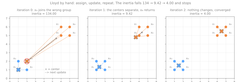
Three things the table shows that the formula does not. The inertia falls fast (134 → 9.42 → 4.00): the first iteration does almost all the work, as it usually does. A wrong assignment of one point corrects itself once the centers move. And convergence is an equality test, "no assignment changed", not a tolerance. The same loop in NumPy, printing each iteration:
X = np.array([[1, 1], [2, 1], [1, 2], [2, 2], [6, 5], [7, 5], [6, 6], [7, 6]], dtype=float)
C = np.array([[1, 1], [2, 2]], dtype=float)                    # the bad start

for it in range(10):
    d2 = ((X[:, None, :] - C[None, :, :]) ** 2).sum(axis=2)     # squared distances, 8 points x 2 centers
    labels = d2.argmin(axis=1)                                   # 1. assign (ties go to the first center)
    inertia = d2[np.arange(len(X)), labels].sum()
    C_new = np.array([X[labels == j].mean(axis=0) for j in range(2)])   # 2. update
    print(f"iteration {it}: groups {labels}  inertia {inertia:6.2f}  new centers {C_new.round(3).tolist()}")
    if np.allclose(C_new, C):                                    # nothing moved: converged
        break
    C = C_new
iteration 0: groups [0 0 0 1 1 1 1 1]  inertia 134.00  new centers [[1.333, 1.333], [5.6, 4.8]]
iteration 1: groups [0 0 0 0 1 1 1 1]  inertia   9.42  new centers [[1.5, 1.5], [6.5, 5.5]]
iteration 2: groups [0 0 0 0 1 1 1 1]  inertia   4.00  new centers [[1.5, 1.5], [6.5, 5.5]]
scikit-learn, started from the same two centers, lands on the same partition:
from sklearn.cluster import KMeans

km = KMeans(n_clusters=2, init=np.array([[1, 1], [2, 2]]), n_init=1).fit(X)
print(km.labels_, km.cluster_centers_.tolist(), km.inertia_)
Step through the same two operations on a larger cloud. The spokes join each point to its center; the inertia is the sum of their squared lengths, and its history, on the right, never goes up:
Why the mean, and not any other point
The update step puts each center at the mean of its group because the mean is the point that minimizes the sum of squared distances to that group: this is the definition of the criterion, not a convention. Try to beat it by hand: drag the centers, watch which group contributes most to the inertia, then press the button that moves every center to its mean. When the arrows disappear, the algorithm has converged.
Initialization and local minima
Lloyd's algorithm stops at the first partition from which neither step can improve. That is a local minimum of the inertia, and which one you reach depends on where the centers started. Take 300 points in three well-separated blobs and run k-means with one start per run (n_init=1), 100 times with different seeds, once with random starting centers and once with k-means++ (Arthur & Vassilvitskii, 2007). k-means++ picks the first center at random among the points and each next one with probability proportional to its squared distance to the nearest center already chosen, so the starting centers tend to be spread out.
from sklearn.datasets import make_blobs

X_blobs, _ = make_blobs(n_samples=300, centers=3, cluster_std=1.0, random_state=42)
for init in ['random', 'k-means++']:
    inertias = np.array([KMeans(n_clusters=3, init=init, n_init=1, random_state=s).fit(X_blobs).inertia_
                         for s in range(100)])
    stuck = (inertias > 1.01 * inertias.min()).sum()
    print(f"{init:10s} best {inertias.min():7.1f}  worst {inertias.max():7.1f}  stuck in {stuck} of 100 runs")

worst = max(KMeans(n_clusters=3, init='random', n_init=10, random_state=s).fit(X_blobs).inertia_
            for s in range(100))
print(f"random init, n_init=10: worst of 100 runs {worst:.1f}")
random     best   566.9  worst  5703.3  stuck in 22 of 100 runs
k-means++  best   566.9  worst   566.9  stuck in 0 of 100 runs
random init, n_init=10: worst of 100 runs 566.9
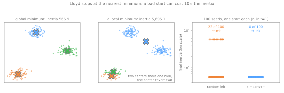
With random starting centers, 22 runs in 100 converge to an inertia ten times the best one: two centers share one blob, the third sits between the other two, and neither step can fix it, because moving any single center or any single point makes the inertia worse. This is a mistake that involves whole centers, and unlike \(x_4\) in the hand example it does not correct itself. k-means++ never got stuck here. The practical rule is the one scikit-learn follows: n_init restarts the whole algorithm from several initializations and keeps the one with the lowest inertia; with n_init=10, even random starts never lost across 100 runs. k-means++ is scikit-learn's default init; the default n_init='auto' means a single run with k-means++ (ten with random starts). This lesson writes n_init=10 explicitly.
Choosing k
Stage 3. The inertia is what k-means minimizes, so it cannot choose \(k\): adding a center can only lower it, and with \(k = n\) every point is its own center and the inertia is 0. Choosing \(k\) needs criteria that do not automatically improve with more groups.
The elbow
Plot the inertia against \(k\) and look for the elbow, the \(k\) after which adding a group buys much less than before. It is a heuristic, often ambiguous, and it reads a curve that always goes down.
The silhouette, by hand
The silhouette (Rousseeuw, 1987) asks each point: are you better off in your own group than in the neighboring one?
where \(a(i)\) is the mean distance from point \(i\) to the other points of its own group, and \(b(i)\) the mean distance to the points of the nearest other group. \(s\) near 1: comfortably inside its group; near 0: on a border; negative: closer, on average, to another group. The silhouette of a clustering is the mean of \(s(i)\) over all points. It uses plain distances, not squared ones.
Back to the eight points, in the converged partition \(\{x_1..x_4\}\), \(\{x_5..x_8\}\). For \(x_1 = (1,1)\):
- \(a(x_1)\): distances to \(x_2, x_3, x_4\) are \(1, 1, \sqrt2\), so \(a = (1 + 1 + 1.414)/3 = 1.1381\);
- \(b(x_1)\): distances to \(x_5..x_8\) are \(\sqrt{41}, \sqrt{52}, \sqrt{50}, \sqrt{61}\) = 6.403, 7.211, 7.071, 7.810, so \(b = 7.1239\);
- \(s(x_1) = (7.1239 - 1.1381) / 7.1239 = 0.8402\).
from sklearn.metrics import silhouette_samples, silhouette_score

labels = np.array([0, 0, 0, 0, 1, 1, 1, 1])                        # the converged partition
D = np.sqrt(((X[:, None, :] - X[None, :, :]) ** 2).sum(axis=2))   # Euclidean distances
a, b = D[0, 1:4].mean(), D[0, 4:8].mean()                          # x1 to its group, x1 to the other
print(f"a = {a:.4f}  b = {b:.4f}  s = {(b - a) / max(a, b):.4f}")
print(silhouette_samples(X, labels).round(4))
print(round(silhouette_score(X, labels), 4))
The library confirms \(s(x_1) = 0.8402\). The eight values also say something the mean hides: \(a\) is the same, 1.1381, for every point (from any corner of a unit square the other three are at 1, 1 and \(\sqrt2\)), so only \(b\) orders them. The outer corners \(x_1\) and \(x_8\) are farthest from the other square and score highest; the inner corners \(x_4\) and \(x_5\) score lowest, 0.8011. The mean, 0.8223, is very high, as it should be for two small squares five units apart. Click any point in the simulator to see its two circles, \(a\) in its own color and \(b\) in the neighbor's; the bars on the right are the silhouette of every point, sorted by group, which is how a whole clustering is read at once:
Two more internal indices
scikit-learn offers two more indices built from the same ingredients, compactness against separation:
- Calinski–Harabasz (Caliński & Harabasz, 1974), higher is better: the ratio between the dispersion between groups and the dispersion within groups, each divided by its degrees of freedom, \(\mathrm{CH} = \dfrac{B/(k-1)}{W/(n-k)}\), with \(W\) the inertia and \(B = \sum_j |C_j|\,\lVert \mu_j - \bar x \rVert^2\);
- Davies–Bouldin (Davies & Bouldin, 1979), lower is better: for each group, take its worst neighbor, the one maximizing \((s_i + s_j)/d(\mu_i, \mu_j)\), where \(s_i\) is the mean distance of group \(i\)'s points to its center; then average over the groups.
On the eight points, by hand: the overall mean is \(\bar x = (4, 3.5)\); each center is at squared distance \(2.5^2 + 2^2 = 10.25\) from it, so \(B = 4 \times 10.25 + 4 \times 10.25 = 82\), \(W = 4\), and \(\mathrm{CH} = (82/1)/(4/6) = 123\). Each point is \(\sqrt{0.5} = 0.7071\) from its center and the centers are \(\sqrt{41} = 6.4031\) apart, so \(\mathrm{DB} = (0.7071 + 0.7071)/6.4031 = 0.2209\).
from sklearn.metrics import calinski_harabasz_score, davies_bouldin_score

print(round(calinski_harabasz_score(X, labels), 2), round(davies_bouldin_score(X, labels), 4))
On real data: the penguins
Palmer penguins: 342 birds with four measurements (bill length and depth, flipper length, body mass), standardized (why, in the next section). The species is kept aside and used only for the ARI column, which you would not have in a real project:
import pandas as pd
from sklearn.datasets import fetch_openml
from sklearn.preprocessing import StandardScaler

peng = fetch_openml(data_id=42585, as_frame=True).frame           # Palmer penguins
num = ['culmen_length_mm', 'culmen_depth_mm', 'flipper_length_mm', 'body_mass_g']
peng = peng.dropna(subset=num)
species = peng['species']                                           # never shown to k-means
Z = StandardScaler().fit_transform(peng[num])

rows = []
for k in range(2, 9):
    m = KMeans(n_clusters=k, n_init=10, random_state=0).fit(Z)
    rows.append({'k': k, 'inertia': m.inertia_, 'silhouette': silhouette_score(Z, m.labels_),
                 'CH': calinski_harabasz_score(Z, m.labels_), 'DB': davies_bouldin_score(Z, m.labels_),
                 'ARI (check)': adjusted_rand_score(species, m.labels_)})
print(len(peng), species.value_counts().to_dict())
print(pd.DataFrame(rows).round(3).to_string(index=False))
342 {'Adelie': 151, 'Gentoo': 123, 'Chinstrap': 68}
 k  inertia  silhouette      CH    DB  ARI (check)
 2  565.708       0.532 482.191 0.714        0.655
 3  379.393       0.447 441.677 0.944        0.793
 4  300.400       0.400 400.410 0.944        0.637
 5  232.637       0.378 411.175 0.973        0.572
 6  204.319       0.372 382.731 0.951        0.554
 7  187.138       0.335 352.315 1.048        0.489
 8  170.980       0.296 334.045 1.151        0.397
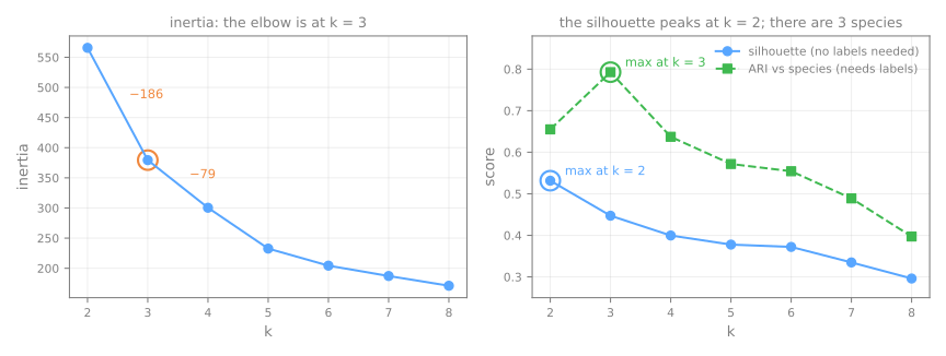
Read the table as you would in a real project, covering the last column. The inertia drops 186.3 from \(k=2\) to 3 and then only 79.0 from 3 to 4: an elbow at 3. The silhouette, the Calinski–Harabasz and the Davies–Bouldin all prefer \(k = 2\) (0.532, 482.2 and 0.714). Now uncover the ARI: it is highest at \(k = 3\), 0.793, the three species. The internal indices were not wrong about what they measure. Adelie and Chinstrap penguins have almost the same mass and flippers and differ mainly in bill length, so merging them gives a partition that really is more compact and better separated. "How separated is this partition" and "is this the partition I want" are different questions, and no internal index answers the second. Here the elbow happened to be right; that is luck of this dataset, not a rule.
Sweep \(k\) on the simulator's eight datasets. On clean blobs the elbow and the silhouette agree; on unequal sizes the silhouette points to 2, on circles and elongated groups it has no interior maximum, and on noise it still returns a number for every \(k\):
That last case deserves a number. Uniform noise has no groups at all:
R = np.random.default_rng(0).random((300, 2))                    # 300 uniform points: no structure
for k in range(2, 6):
    lab = KMeans(n_clusters=k, n_init=10, random_state=0).fit_predict(R)
    print(k, round(silhouette_score(R, lab), 3))
A silhouette of 0.40 out of pure noise, in the same range as the penguins. The silhouette is therefore not a certificate that groups exist. A useful ruler is to rerun the same pipeline on your data with each column shuffled independently (which keeps every column's distribution and destroys the relations between columns) and report the real silhouette next to the shuffled one; the lab does exactly that.
Scaling matters (and the silhouette will not tell you)
The same penguins, clustered in raw units and standardized:
print(peng[num].std().round(2).to_dict())
for name, M in [('raw units', peng[num].to_numpy()), ('standardized', Z)]:
    lab = KMeans(n_clusters=3, n_init=10, random_state=0).fit_predict(M)
    print(f"{name:13s} silhouette {silhouette_score(M, lab):.3f}   ARI with species {adjusted_rand_score(species, lab):.3f}")
{'culmen_length_mm': 5.46, 'culmen_depth_mm': 1.97, 'flipper_length_mm': 14.06, 'body_mass_g': 801.95}
raw units     silhouette 0.580   ARI with species 0.331
standardized  silhouette 0.447   ARI with species 0.793
The standard deviation of body mass is about 400 times that of bill depth, so the raw Euclidean distance is essentially a difference in grams: k-means sorts the penguins into three weight bands. Those bands are well separated, and the silhouette prefers the raw data (0.580 against 0.447). The species are recovered far better after standardizing (ARI 0.793 against 0.331). Without labels, which is the real situation, following the silhouette would have led you to the wrong preprocessing. An internal index compares partitions of the same space; when the scaling changes, the ruler changes with it. Whether to scale is decided by an argument about units (a gram and a millimeter are not comparable), not by an index. Standardizing is the usual choice; the Preprocessing lesson compares the scalers.
What k-means assumes, and where it fails
Stage 4. Each k-means group is the set of points closer to one center than to any other: a convex cell of a Voronoi diagram, separated from its neighbors by straight boundaries halfway between centers. And the inertia charges every point the same squared distance, whatever group it belongs to. That builds in assumptions:
- groups are convex and roughly round (isotropic): no crescents, rings or long diagonal bands;
- groups have similar spread: a wide group loses its outer points to a compact neighbor;
- there is no noise: every point is assigned somewhere, outliers included;
- you know \(k\).
Five 2-D datasets of 500 points whose true groups are known, and k-means told the correct \(k\):
from sklearn.datasets import make_circles, make_moons

Xa, ya = make_blobs(n_samples=500, centers=3, random_state=170)
shapes = {
    'blobs':       make_blobs(n_samples=500, centers=3, cluster_std=1.0, random_state=8),
    'moons':       make_moons(n_samples=500, noise=0.06, random_state=0),
    'circles':     make_circles(n_samples=500, factor=0.5, noise=0.05, random_state=0),
    'anisotropic': (Xa @ np.array([[0.6, -0.6], [-0.4, 0.8]]), ya),    # stretched blobs
    'densities':   make_blobs(n_samples=[150, 150, 200], centers=[[0, 0], [1.2, 0], [4, 2]],
                              cluster_std=[0.2, 0.2, 1.0], random_state=0),
}
for name, (Xs, ys) in shapes.items():
    k = len(np.unique(ys))
    lab = KMeans(n_clusters=k, n_init=10, random_state=0).fit_predict(Xs)
    print(f"{name:12s} k={k}  silhouette {silhouette_score(Xs, lab):.3f}   ARI {adjusted_rand_score(ys, lab):6.3f}")
blobs        k=3  silhouette 0.823   ARI  1.000
moons        k=2  silhouette 0.489   ARI  0.253
circles      k=2  silhouette 0.356   ARI -0.002
anisotropic  k=3  silhouette 0.501   ARI  0.555
densities    k=3  silhouette 0.605   ARI  0.436
Only the blobs are recovered. The moons are cut across (ARI 0.253), the concentric circles are split into two half-discs, which is exactly as good as chance (ARI −0.002), and the stretched groups are divided along the wrong diagonal (0.555). In "densities", two tight groups sit side by side next to a wide one: k-means merges the two tight groups and cuts the wide one in two (0.436), because that lowers the inertia more than respecting the true groups. Now read the silhouette column: it does not rank the clusterings by how right they are. "Densities", where k-means got all three groups wrong (ARI 0.436), has the second-highest silhouette, 0.605, above the anisotropic and moon clusterings. The metric does not warn you, because it shares the algorithm's idea of a good group: compact and far from the others. Cycle through the shapes and vary \(k\) here; no value of \(k\) fixes a ring:
Hierarchical clustering
k-means returns one flat partition for one chosen \(k\); hierarchical (agglomerative) clustering instead builds the whole tree of successive merges, the dendrogram, and lets you choose the number of groups afterwards by cutting it. It has its own lesson, Hierarchical Clustering, where the linkages (single, complete, average, Ward) are worked by hand.
DBSCAN and HDBSCAN: density-based clustering
DBSCAN (Ester et al., 1996) starts from another idea of a group: a dense region, separated from other dense regions by sparse ones. It has two parameters, a radius eps and a count min_samples, and it sorts the points into three kinds:
- core point: at least
min_samplespoints within distanceeps, the point itself included (scikit-learn's convention); - border point: not core, but within
epsof a core point; - noise: neither. Noise gets the label −1: DBSCAN does not force outliers into a group.
A cluster is then a set of core points that can be reached from each other by hops of length at most eps through core points, plus the border points attached to them. Clusters can take any shape, and nobody chooses their number.
DBSCAN, by hand
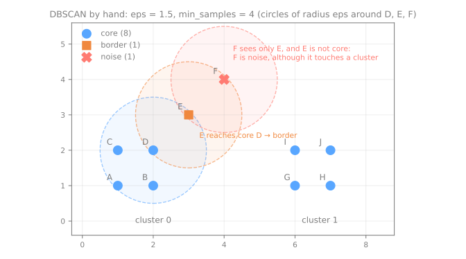
Ten points, eps = 1.5, min_samples = 4. \(A, B, C, D\) form a unit square at the bottom left, \(E = (3, 3)\) and \(F = (4, 4)\) run diagonally away from it, and \(G, H, I, J\) form another unit square at the bottom right. Count, for each point, the points within 1.5 (itself included); in a unit square the other corners are at 1, 1 and 1.414:
| point | coordinates | points within 1.5 (self included) | core? | reaches a core point? | kind |
|---|---|---|---|---|---|
| A, B, C, D | the left square | 4 (the square) +1 for D, which also sees E | yes | core | |
| E | (3, 3) | 3: E, D (1.414), F (1.414) | no | yes, D | border |
| F | (4, 4) | 2: F, E (1.414) | no | no, E is not core | noise |
| G, H, I, J | the right square | 4 | yes | core |
\(F\) is the instructive one: it is within eps of \(E\), which belongs to a cluster, but \(E\) is only a border point, and clusters grow only through core points. So \(F\) is noise.
from sklearn.cluster import DBSCAN

P = np.array([[1, 1], [2, 1], [1, 2], [2, 2], [3, 3], [4, 4], [6, 1], [7, 1], [6, 2], [7, 2]], dtype=float)
names = list('ABCDEFGHIJ')
DP = np.sqrt(((P[:, None, :] - P[None, :, :]) ** 2).sum(axis=2))
print('within eps:', dict(zip(names, (DP <= 1.5).sum(axis=1).tolist())))   # itself included
db = DBSCAN(eps=1.5, min_samples=4).fit(P)
print('core:  ', [names[i] for i in db.core_sample_indices_])
print('labels:', dict(zip(names, db.labels_.tolist())))
within eps: {'A': 4, 'B': 4, 'C': 4, 'D': 5, 'E': 3, 'F': 2, 'G': 4, 'H': 4, 'I': 4, 'J': 4}
core:   ['A', 'B', 'C', 'D', 'G', 'H', 'I', 'J']
labels: {'A': 0, 'B': 0, 'C': 0, 'D': 0, 'E': 0, 'F': -1, 'G': 1, 'H': 1, 'I': 1, 'J': 1}
The counts match the table, the core points are the eight corners of the two squares, \(E\) joins cluster 0 as a border point and \(F\) gets −1.
Choosing eps: the k-distance plot
eps is a distance, and a good value depends entirely on the scale and the density of the data. The standard tool (proposed in the DBSCAN paper) is the k-distance plot: for every point, the distance to its \(k\)-th nearest neighbor, with \(k\) = min_samples (again counting the point itself), sorted. A point is core exactly when that distance is at most eps. Inside a dense region the distance is small; the curve bends sharply upwards where the sparse points begin, and eps is read at that knee.
That works when there is one density. Take the "densities" data again: two tight groups (standard deviation 0.2) and one loose group (1.0).
from sklearn.neighbors import NearestNeighbors

X_dens, y_dens = shapes['densities']
kdist = NearestNeighbors(n_neighbors=5).fit(X_dens).kneighbors(X_dens)[0][:, -1]   # 5th neighbor, itself included
for g in range(3):
    print(f"group {g}: median distance to the 5th neighbor {np.median(kdist[y_dens == g]):.3f}")
for eps in [0.1, 0.15, 0.2, 0.3, 0.4, 0.6, 0.8]:
    lab = DBSCAN(eps=eps, min_samples=5).fit_predict(X_dens)
    print(f"eps {eps:<4}: {lab.max() + 1} clusters (largest {np.bincount(lab[lab >= 0]).max()}), "
          f"{(lab == -1).sum():3d} noise, ARI {adjusted_rand_score(y_dens, lab):6.3f}")
group 0: median distance to the 5th neighbor 0.070
group 1: median distance to the 5th neighbor 0.065
group 2: median distance to the 5th neighbor 0.293
eps 0.1 : 5 clusters (largest 134), 225 noise, ARI  0.740
eps 0.15: 8 clusters (largest 146), 172 noise, ARI  0.825
eps 0.2 : 9 clusters (largest 149), 137 noise, ARI  0.789
eps 0.3 : 6 clusters (largest 300),  63 noise, ARI  0.397
eps 0.4 : 2 clusters (largest 300),  28 noise, ARI  0.556
eps 0.6 : 2 clusters (largest 301),   5 noise, ARI  0.619
eps 0.8 : 1 clusters (largest 496),   4 noise, ARI -0.003
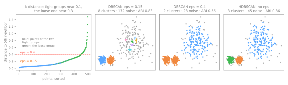
The tight groups need an eps of about 0.07, the loose one about 0.3, four times more. Every single value fails somewhere. Up to eps = 0.2 the two tight groups are found (no cluster exceeds 149 points, so the two stay apart) while the loose one shatters into fragments and noise: 172 noise points at 0.15. At eps = 0.3 the two tight groups have already fused into one cluster of 300 points, while the loose one is still in pieces; at 0.4 and 0.6 there are two clusters, the fused pair and the loose group; at 0.8, everything is one cluster. Nowhere in the sweep do the three groups come out. One global eps means one density, and that is DBSCAN's central limitation.
HDBSCAN: all values of eps at once
HDBSCAN (Campello, Moulavi & Sander, 2013) removes eps. Informally, it runs DBSCAN for every possible eps at once: as eps shrinks, clusters split, shed points as noise, or vanish, and the result is a hierarchy of clusters. HDBSCAN then keeps the clusters that persist over the widest range of densities (the most stable ones), each at its own density level. A tight group and a loose group can both be kept, because they are not required to exist at the same eps. The main parameter left is min_cluster_size, the smallest group you are willing to call a cluster, which is far easier to reason about than a distance.
from sklearn.cluster import HDBSCAN

for name, (Xs, ys) in shapes.items():
    lab = HDBSCAN(min_cluster_size=15).fit_predict(Xs)
    print(f"{name:12s} {lab.max() + 1} clusters, {(lab == -1).sum():2d} noise, ARI {adjusted_rand_score(ys, lab):.3f}")
blobs        3 clusters,  0 noise, ARI 1.000
moons        2 clusters,  0 noise, ARI 1.000
circles      2 clusters,  0 noise, ARI 1.000
anisotropic  3 clusters, 49 noise, ARI 0.852
densities    3 clusters, 45 noise, ARI 0.856
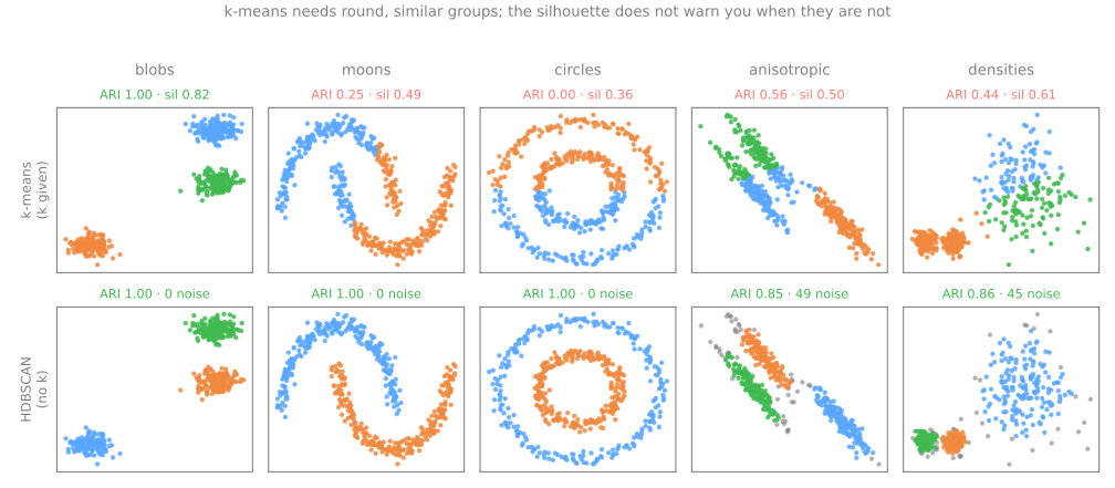
Without being told \(k\), HDBSCAN finds the right number of groups on all five datasets and recovers the moons and the rings exactly. On the stretched groups and on "densities" it labels 49 and 45 points as noise, the thin tails and the fringe of the loose group, and the ARI counts noise as a mistake, hence 0.852 and 0.856; the points it did assign are all in the right group. Whether calling fringe points "noise" is a flaw or a feature depends on the application. It is the reason BERTopic uses HDBSCAN on document embeddings: documents that fit no topic become noise instead of polluting a topic.
HDBSCAN is not free of assumptions. min_cluster_size still matters: on the circles, raising it to 30 turns every point into noise. And any density method suffers in many dimensions, where every point is roughly equally far from every other and "dense" loses meaning: the lab measures that on 13 wine measurements.
Choosing an algorithm
| k-means | hierarchical (Ward) | DBSCAN | HDBSCAN | |
|---|---|---|---|---|
| a group is | the points nearest a center | what merges first in a tree of merges | a dense region | a dense region, at its own density |
| you choose | \(k\) | where to cut the tree (\(k\)) | eps, min_samples | min_cluster_size |
| shapes | convex, round, similar spread | depends on the linkage | any | any, with different densities |
| noise / outliers | forced into a group | forced into a group | labeled −1 | labeled −1 |
| new points | predict to the nearest center | no predict | no predict | no predict |
| scales to | millions of rows (MiniBatchKMeans) | thousands (quadratic memory) | large \(n\), low dimension | large \(n\), low dimension |
Stage 5. Start with k-means: it is fast, its criterion (the inertia) and its usual score (the silhouette) are well understood, and it can assign new points. Switch when you have a concrete reason: visibly non-convex groups, very different densities, outliers that must not be forced into a group, or no way to justify a \(k\). Gaussian mixture models (GaussianMixture) are the other common step up from k-means: each group gets its own elliptical shape and each point a probability of belonging to it; one of the lab's extension exercises tries them.
Four questions before believing a clustering
- Did I scale? If not, the clustering is probably sorting by the column with the largest unit.
- Did I restart enough?
n_initwell above 1, or an inertia ten times too high is possible. - Where did \(k\) come from? If from the silhouette alone, remember that it preferred 2 penguin groups where there are 3 species.
- Did I compare with shuffled data? Pure noise reaches a silhouette of 0.40.
Interpreting clusters
A partition is only useful if someone can say what each group is. Centers in standardized units cannot be read, so go back to the original columns and describe each group with a groupby, exactly as in EDA:
peng['cluster'] = KMeans(n_clusters=3, n_init=10, random_state=0).fit_predict(Z)
print(peng.groupby('cluster')[num].mean().round(1).assign(n=peng['cluster'].value_counts()))
print(pd.crosstab(peng['cluster'], species))                    # a check we can afford here only
         culmen_length_mm  culmen_depth_mm  flipper_length_mm  body_mass_g    n
cluster
0                    47.5             15.0              217.2       5076.0  123
1                    38.2             18.1              188.4       3584.7  132
2                    47.5             18.8              196.9       3902.0   87
species  Adelie  Chinstrap  Gentoo
cluster
0             0          0     123
1           127          5       0
2            24         63       0
The profile is a description anyone can check: one group of heavy birds with long flippers and shallow bills, one of long and deep bills, one of small birds with short bills. That is what you would write in a report without labels. The crosstab is the luxury of this dataset: the first group is exactly the Gentoo penguins, and the only confusion is between Adelie and Chinstrap, the two species that differ mainly in bill length, which is the pair the silhouette wanted to merge.
When you write the result up, describe a choice, not a discovery. Not "we found 3 segments", but "we partitioned the data into 3 groups after standardizing, chose \(k\) by this criterion, and the result is this far from what shuffled data gives". The difference is not style: the first sentence claims something about the world, the second states a decision, its criterion and the evidence that the result is not noise. The end of the lab writes such a paragraph with real numbers.
Exercises
- Redo Lloyd's hand computation with the good start \(c_1 = (1, 1)\), \(c_2 = (7, 6)\). How many iterations does it take, and what is the inertia after the first assignment?
- For the eight points, compute \(s(x_4)\) by hand and check it against
silhouette_samples. Then move \(x_4\) to \((3, 3)\), recompute its silhouette, and explain the change using \(a\) and \(b\). - In the DBSCAN example, which is the smallest
epsfor which \(F\) stops being noise withmin_samples = 4? And which is the smallest for which the two squares merge into one cluster? Check with scikit-learn. - Build 300 points where one feature is uniform on \([0, 1]\) and another on \([0, 1000]\), with three true groups separated only along the first feature. Compare the ARI of k-means with and without standardizing.
Lab: clustering 178 wines
The dataset is the one used in the instructor's lab handout: 178 Italian wines from three cultivars, each described by 13 chemical measurements, built into scikit-learn. The rule of the lab: the cultivar column is sealed until the last step. Every decision (scaling, \(k\), algorithm) has to be taken with the tools that exist when there are no labels; only at the end do we open the answer key, to audit those decisions. In a real project that last step does not exist.
Run the blocks in order, in one session. Every output below is what the code prints. To work on it directly, download the lab notebook and open it in Jupyter or Colab (File → Upload notebook); it needs only scikit-learn, pandas, numpy and matplotlib.
Step 1 — load, and seal the cultivar
import numpy as np
import pandas as pd
import matplotlib.pyplot as plt
from sklearn.datasets import load_wine

wine = load_wine(as_frame=True)
df = wine.frame
cultivar = df.pop('target')                 # the true cultivar: sealed until step 9
print(df.shape, '· missing values:', int(df.isna().sum().sum()))
sd = df.std().sort_values()
print(sd.iloc[[0, 1, -2, -1]].round(3))
print(f"largest std / smallest std = {sd.iloc[-1] / sd.iloc[0]:.0f}")
(178, 13) · missing values: 0
nonflavanoid_phenols      0.124
hue                       0.229
magnesium                14.282
proline                 314.907
dtype: float64
largest std / smallest std = 2530
How to read it: 178 wines, 13 numeric columns, nothing missing. The columns live on wildly different scales: proline has a standard deviation of 314.9, non-flavanoid phenols 0.124, a ratio of 2,530. In raw units, any Euclidean distance between two wines is essentially their difference in proline.
Step 2 — scale, and why the indices cannot decide it
from sklearn.cluster import KMeans
from sklearn.metrics import calinski_harabasz_score, davies_bouldin_score, silhouette_score
from sklearn.preprocessing import MinMaxScaler, RobustScaler, StandardScaler

X = df.to_numpy()
scalers = {'none': None, 'StandardScaler': StandardScaler(), 'MinMaxScaler': MinMaxScaler(),
           'RobustScaler': RobustScaler()}
for name, scaler in scalers.items():
    M = X if scaler is None else scaler.fit_transform(X)
    lab = KMeans(n_clusters=3, n_init=10, random_state=0).fit_predict(M)
    print(f"{name:15s} silhouette {silhouette_score(M, lab):.3f}   CH {calinski_harabasz_score(M, lab):6.1f}"
          f"   DB {davies_bouldin_score(M, lab):.3f}")

Z = StandardScaler().fit_transform(X)       # the choice, made by argument
none            silhouette 0.571   CH  561.8   DB 0.534
StandardScaler  silhouette 0.285   CH   70.9   DB 1.389
MinMaxScaler    silhouette 0.301   CH   83.4   DB 1.305
RobustScaler    silhouette 0.264   CH   61.1   DB 1.466
How to read it: the three internal indices are unanimous, and they all prefer no scaling: silhouette 0.571 against 0.285, a Calinski–Harabasz eight times larger, a Davies–Bouldin (lower is better) 2.6 times smaller. Unscaled, the space is essentially the proline axis, and bands of proline are very well separated. As with the penguins, the indices measure separation in the space you give them, so comparing them across scalings compares rulers, not partitions. We standardize anyway, because a distance that adds percentages of alcohol to milligrams of proline per liter to absorbance ratios is meaningless; step 9 will say whether that was right.
Step 3 — choose k with the elbow and the silhouette
rows = []
for k in range(2, 9):
    m = KMeans(n_clusters=k, n_init=10, random_state=0).fit(Z)
    rows.append({'k': k, 'inertia': m.inertia_, 'silhouette': silhouette_score(Z, m.labels_),
                 'CH': calinski_harabasz_score(Z, m.labels_), 'DB': davies_bouldin_score(Z, m.labels_)})
scores = pd.DataFrame(rows).set_index('k')
print(scores.round(3))

fig, (ax1, ax2) = plt.subplots(1, 2, figsize=(9, 3.2))
scores['inertia'].plot(ax=ax1, marker='o', title='inertia: look for the elbow')
scores['silhouette'].plot(ax=ax2, marker='o', title='silhouette: higher is better')
plt.tight_layout()
plt.show()
    inertia  silhouette      CH     DB
k
2  1659.008       0.268  69.486  1.448
3  1277.928       0.285  70.940  1.389
4  1180.738       0.246  55.668  1.765
5  1110.365       0.203  46.883  1.820
6  1044.470       0.196  41.812  1.812
7   995.995       0.139  37.714  1.922
8   944.559       0.158  35.210  1.769
How to read it: the inertia falls by 381.1 from \(k = 2\) to 3 and only by 97.2 from 3 to 4, an elbow at 3. The silhouette, the Calinski–Harabasz and the Davies–Bouldin all point to \(k = 3\) as well. But look at the margin: the silhouette separates \(k = 3\) (0.285) from \(k = 2\) (0.268) by only 0.017, the kind of difference a slightly different sample could erase. The first extension exercise measures a criterion that separates them much more clearly.
Step 4 — the ruler: the same pipeline on shuffled data
rng = np.random.default_rng(0)
Z_shuffled = Z.copy()
for j in range(Z_shuffled.shape[1]):
    rng.shuffle(Z_shuffled[:, j])           # destroys the relations between columns, keeps each column
for k in [2, 3, 4]:
    lab = KMeans(n_clusters=k, n_init=10, random_state=0).fit_predict(Z_shuffled)
    print(k, round(silhouette_score(Z_shuffled, lab), 3), round(calinski_harabasz_score(Z_shuffled, lab), 1))
How to read it: shuffling every column independently keeps each measurement's distribution but destroys any structure that lives in the combination of columns. On those structureless wines, k-means with \(k = 3\) reaches a silhouette of 0.068 and a Calinski–Harabasz of 13.3. The real data gives 0.285 and 70.9: about four and five times more. A silhouette of 0.285 looks low in absolute terms (the eight points gave 0.82), and without this ruler you might have discarded the clustering. With it, you can say that the groups are far more separated than anything shuffled data produces.
Step 5 — fit k = 3 and inspect each cluster
from sklearn.metrics import silhouette_samples

km = KMeans(n_clusters=3, n_init=10, random_state=0).fit(Z)
labels = km.labels_
s = silhouette_samples(Z, labels)
for j in range(3):
    print(f"cluster {j}: {np.sum(labels == j):3d} wines · mean silhouette {s[labels == j].mean():.3f}"
          f" · negative silhouettes {np.sum(s[labels == j] < 0)}")
cluster 0:  65 wines · mean silhouette 0.177 · negative silhouettes 7
cluster 1:  51 wines · mean silhouette 0.351 · negative silhouettes 0
cluster 2:  62 wines · mean silhouette 0.343 · negative silhouettes 0
How to read it: the mean silhouette of 0.285 hides two different kinds of group. Clusters 1 and 2 (51 and 62 wines) have silhouettes around 0.35 and no negative point. Cluster 0 (65 wines) has half that cohesion, 0.177, and 7 wines closer on average to another cluster than to their own. Keep the hypothesis open: is cluster 0 a badly formed group, or just a spread-out one? Step 9 answers it.
Step 6 — profile the clusters in the original units
cols = ['alcohol', 'flavanoids', 'color_intensity', 'proline', 'od280/od315_of_diluted_wines']
print(df.assign(cluster=labels).groupby('cluster')[cols].mean().round(2).to_string())

z_means = pd.DataFrame(Z, columns=df.columns).assign(cluster=labels).groupby('cluster').mean()
for j, row in z_means.iterrows():
    top = row[row.abs().sort_values(ascending=False).index[:3]]
    print(f"cluster {j}:", ', '.join(f"{c} {v:+.2f} sd" for c, v in top.items()))
         alcohol  flavanoids  color_intensity  proline  od280/od315_of_diluted_wines
cluster
0          12.25        2.05             2.97   510.17                          2.80
1          13.13        0.82             7.23   619.06                          1.70
2          13.68        3.00             5.45  1100.23                          3.16
cluster 0: alcohol -0.93 sd, color_intensity -0.90 sd, proline -0.75 sd
cluster 1: od280/od315_of_diluted_wines -1.29 sd, flavanoids -1.22 sd, hue -1.16 sd
cluster 2: proline +1.13 sd, flavanoids +0.98 sd, total_phenols +0.89 sd
How to read it: the first table is an EDA groupby in the original units, which a winemaker can read. The second lists, for each cluster, the three measurements where its mean is farthest from the overall mean, in standard deviations. Now the clusters can be named. Cluster 2 is rich in proline (1,100 on average, against 510 and 619), flavanoids and phenols, and the most alcoholic (13.68%). Cluster 1 has few flavanoids (0.82), a low OD280 (a measure of phenolic content), a low hue and the most intense color (7.23). Cluster 0 is the light one: 0.93 standard deviations below average in alcohol, 0.90 in color intensity, 0.75 in proline. A clustering nobody can describe like this is rarely useful, however good its silhouette.
Step 7 — try DBSCAN and HDBSCAN
from sklearn.cluster import DBSCAN, HDBSCAN
from sklearn.neighbors import NearestNeighbors

kdist = NearestNeighbors(n_neighbors=5).fit(Z).kneighbors(Z)[0][:, -1]
print('distance to the 5th neighbor, percentiles 10/50/90:', np.percentile(kdist, [10, 50, 90]).round(2))
for eps in [1.8, 2.0, 2.2, 2.4, 2.6]:
    lab = DBSCAN(eps=eps, min_samples=5).fit_predict(Z)
    print(f"DBSCAN eps {eps}: {lab.max() + 1} clusters, {np.sum(lab == -1):3d} noise")
hd = HDBSCAN(min_cluster_size=10).fit_predict(Z)
print(f"HDBSCAN min_cluster_size=10: {hd.max() + 1} clusters, {np.sum(hd == -1)} noise")
distance to the 5th neighbor, percentiles 10/50/90: [1.83 2.22 3.13]
DBSCAN eps 1.8: 7 clusters, 118 noise
DBSCAN eps 2.0: 5 clusters,  85 noise
DBSCAN eps 2.2: 2 clusters,  55 noise
DBSCAN eps 2.4: 2 clusters,  36 noise
DBSCAN eps 2.6: 1 clusters,  20 noise
HDBSCAN min_cluster_size=10: 2 clusters, 75 noise
How to read it: in 13 standardized dimensions, the distance from a wine to its 5th neighbor ranges only from 1.83 to 3.13 between the 10th and 90th percentiles. There is no region clearly denser than the rest, which is typical in many dimensions, where all points tend to be roughly equally far apart (the curse of dimensionality). DBSCAN reflects that. A small eps leaves most wines as noise and breaks the rest into fragments (7 clusters and 118 noise points at 1.8); a large one merges everything into a single cluster (2.6); in between it finds two clusters with 36 to 55 noise points. It never finds three. HDBSCAN finds 2 clusters and calls 75 of the 178 wines noise. Density methods are the right tool for arbitrary shapes in few dimensions; here, k-means' assumption of round groups is the better fit, as the last step will confirm.
Step 8 — look at the clusters with PCA
from sklearn.decomposition import PCA

pca = PCA(n_components=2).fit(Z)
A = pca.transform(Z)
print('variance kept by 2 components:', pca.explained_variance_ratio_.round(3),
      round(pca.explained_variance_ratio_.sum(), 3))

lab_2d = KMeans(n_clusters=3, n_init=10, random_state=0).fit_predict(A)
print('k-means on the 2 components, silhouette measured in 2-D :', round(silhouette_score(A, lab_2d), 3))
print('the same partition, silhouette measured in 13-D         :', round(silhouette_score(Z, lab_2d), 3))

fig, (ax1, ax2) = plt.subplots(1, 2, figsize=(10, 4), sharex=True, sharey=True)
ax1.scatter(A[:, 0], A[:, 1], c=labels, cmap='tab10', vmin=0, vmax=9, s=15)
ax1.set_title('k-means, k = 3 (fit in 13-D)')
ax2.scatter(A[:, 0], A[:, 1], c=np.where(hd == -1, 7, hd), cmap='tab10', vmin=0, vmax=9, s=15)
ax2.set_title('HDBSCAN (gray = noise)')
plt.show()
variance kept by 2 components: [0.362 0.192] 0.554
k-means on the 2 components, silhouette measured in 2-D : 0.561
the same partition, silhouette measured in 13-D         : 0.283
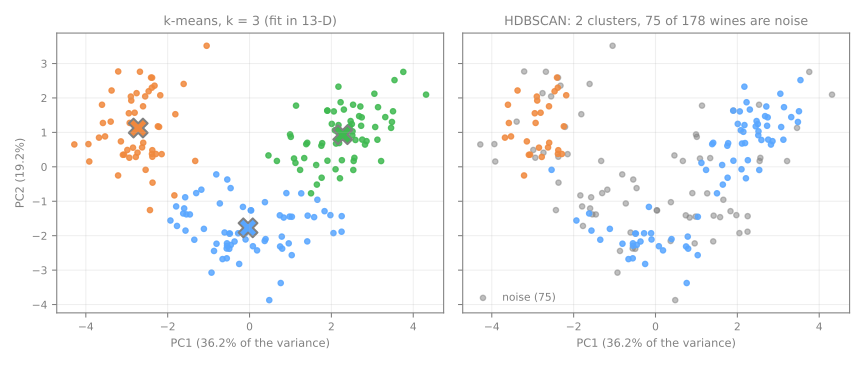
How to read it: the two first principal components (Dimensionality Reduction) keep 55.4% of the variance, enough to see the three k-means groups as three regions of the plane, and HDBSCAN's noise spread over all of them. The plane is a window, not the space where the clustering happened. Clustering in the plane changes little: the partition found on 2 components has a silhouette of 0.283 when measured in the full 13-D space, the same as before. But measured in 2-D, the same partition scores 0.561, twice as much. That is not a better clustering, it is a shorter ruler: in 2-D the silhouette ignores the 11 directions in which the groups overlap. Reduce to visualize (or to speed things up) if you like, but measure in the space where you make the claim.
Step 9 — open the seal: audit every decision
from sklearn.metrics import adjusted_rand_score

partitions = {
    'k-means k=3, standardized': labels,
    'k-means k=2, standardized': KMeans(n_clusters=2, n_init=10, random_state=0).fit_predict(Z),
    'k-means k=3, raw units':    KMeans(n_clusters=3, n_init=10, random_state=0).fit_predict(X),
    'k-means k=3, on 2 PCs':     lab_2d,
    'DBSCAN eps=2.4':            DBSCAN(eps=2.4, min_samples=5).fit_predict(Z),
    'HDBSCAN':                   hd,
}
for name, lab in partitions.items():
    print(f"{name:27s} ARI {adjusted_rand_score(cultivar, lab):.3f}")
print(pd.crosstab(labels, cultivar, rownames=['cluster'], colnames=['cultivar']))
k-means k=3, standardized   ARI 0.897
k-means k=2, standardized   ARI 0.389
k-means k=3, raw units      ARI 0.371
k-means k=3, on 2 PCs       ARI 0.895
DBSCAN eps=2.4              ARI 0.421
HDBSCAN                     ARI 0.263
cultivar   0   1   2
cluster
0          0  65   0
1          0   3  48
2         59   3   0
How to read it: the answer key audits each decision.
- Scaling. Unscaled, k-means recovers the cultivars with an ARI of 0.371; standardized, 0.897. The three internal indices of step 2 were unanimous for the wrong answer. No geometric index could have saved that decision; it rests on the argument about units.
- \(k\). \(k = 2\) would have given 0.389 against 0.897 for \(k = 3\). The silhouette chose right, but by a margin of 0.017.
- Cluster 0. It had the worst silhouette (0.177) and 7 negative values, and the crosstab shows it is 100% pure: its 65 wines are all of cultivar 1. A low silhouette means a spread-out group, not a wrong one. The 6 mistakes of k-means (172 of 178 wines correct) are in clusters 1 and 2, the ones with the high silhouettes.
- The algorithm. DBSCAN (0.421) and HDBSCAN (0.263) are far behind: in 13 dimensions there are no clear density valleys to follow.
- PCA. Clustering on the 2 components loses almost nothing (0.895), which step 8 had already suggested; it is its silhouette of 0.561 that was misleading.
In a real project this step does not exist, and everything above would have been decided with steps 1 to 8. The paragraph you would write is then something like: "The 13 measurements were standardized, since their scales differ by a factor of up to 2,530. The wines were partitioned with k-means (n_init=10); \(k = 3\) was chosen because the inertia's elbow and the three internal indices agree on it, although the silhouette separates \(k = 3\) from \(k = 2\) by only 0.017. The silhouette, 0.285, compares with 0.068 for the same data with shuffled columns. One of the three groups is markedly less cohesive (mean silhouette 0.177, 7 wines with negative silhouette) and should be interpreted with care." It states the preprocessing and why, the criterion for \(k\) and its weakness, the baseline and the known fragility, and never claims to have "discovered" three kinds of wine.
Your turn
- Stability. A real group should reappear when the data is resampled. For \(k = 2, \dots, 7\), cluster 30 random subsamples of 80% of the wines, and for every pair of subsamples compute the ARI between their labels on the wines they share. Which \(k\) gives the highest and least variable agreement? Compare the margin between \(k = 2\) and \(k = 3\) with the silhouette's 0.017.
- Gaussian mixtures. Fit
GaussianMixture(n_components=3, covariance_type='tied', n_init=5, random_state=0)onZand compare its ARI with k-means'. Then choose the number of components and thecovariance_typeby the lowestbic(Z): does the BIC choose the configuration with the best ARI? - The gap statistic (Tibshirani, Walther & Hastie, 2001). For each \(k\), compare \(\log\) of the inertia on the real data with its average over 20 datasets drawn uniformly in the same bounding box. The gap is the difference; choose the smallest \(k\) with \(\text{gap}(k) \ge \text{gap}(k+1) - s_{k+1}\). Which \(k\) does it choose?
- Fewer measurements. Cluster using only
flavanoids,od280/od315_of_diluted_winesandproline(standardized), then only the three measurements that separate the clusters least in step 6. Compare the ARIs. Why is choosing variables with the clusters' own profiles circular, and how would you make it honest?
Class materials
Handout and lab — Clustering and k-means (in Portuguese)
Iris and synthetic data (make_blobs, make_moons and a random baseline): why grouping is a choice rather than a discovery, the algorithm and the inertia it chases, and the silhouette point by point, both metrics worked by hand on eight points before any library; then choosing \(k\) with the two of them together, across five lab steps. A 50 min class plus a 70 min lab, 12 questions.
Extra challenge — clustering 178 wines (in Portuguese)
Self-guided, with the answer key held back to the end: five scalings, four indices plus a gap statistic written from scratch, stability, GMM with BIC and clustering in reduced space; then audit every decision against the key.
Video
Algoritmo k-means (k-médias) — in Portuguese
References
- Lloyd, S. P. "Least Squares Quantization in PCM." IEEE Transactions on Information Theory 28, no. 2 (1982): 129–137 — Lloyd's algorithm (a Bell Labs note from 1957, published in 1982). DOI
- MacQueen, J. "Some Methods for Classification and Analysis of Multivariate Observations." Proceedings of the Fifth Berkeley Symposium on Mathematical Statistics and Probability 1 (1967): 281–297 — the name "k-means". Project Euclid
- Arthur, D.; Vassilvitskii, S. "k-means++: The Advantages of Careful Seeding." Proceedings of the 18th ACM-SIAM Symposium on Discrete Algorithms (SODA) (2007): 1027–1035. ACM
- Rousseeuw, P. J. "Silhouettes: A Graphical Aid to the Interpretation and Validation of Cluster Analysis." Journal of Computational and Applied Mathematics 20 (1987): 53–65. DOI
- Caliński, T.; Harabasz, J. "A Dendrite Method for Cluster Analysis." Communications in Statistics 3, no. 1 (1974): 1–27. DOI
- Davies, D. L.; Bouldin, D. W. "A Cluster Separation Measure." IEEE Transactions on Pattern Analysis and Machine Intelligence PAMI-1, no. 2 (1979): 224–227. DOI
- Hubert, L.; Arabie, P. "Comparing Partitions." Journal of Classification 2 (1985): 193–218 — the Adjusted Rand Index. DOI
- Ester, M.; Kriegel, H.-P.; Sander, J.; Xu, X. "A Density-Based Algorithm for Discovering Clusters in Large Spatial Databases with Noise." Proceedings of the 2nd International Conference on Knowledge Discovery and Data Mining (KDD-96) (1996): 226–231 — DBSCAN and the k-distance plot. AAAI
- Campello, R. J. G. B.; Moulavi, D.; Sander, J. "Density-Based Clustering Based on Hierarchical Density Estimates." Advances in Knowledge Discovery and Data Mining (PAKDD 2013), LNCS 7819 (2013): 160–172 — HDBSCAN. DOI
- Tibshirani, R.; Walther, G.; Hastie, T. "Estimating the Number of Clusters in a Data Set via the Gap Statistic." Journal of the Royal Statistical Society B 63, no. 2 (2001): 411–423. DOI
- Gorman, K. B.; Williams, T. D.; Fraser, W. R. "Ecological Sexual Dimorphism and Environmental Variability within a Community of Antarctic Penguins (Genus Pygoscelis)." PLoS ONE 9, no. 3 (2014): e90081 — the Palmer penguins data. DOI