Dimensionality Reduction
Real datasets often have dozens, hundreds or, for text and images, thousands of columns. Dimensionality reduction replaces them with a few new columns that keep what matters. Which method you use depends on why you are reducing, and mixing up the reasons is behind most misuse of these methods:
| Goal | What the method must deliver | Typical method |
|---|---|---|
| See the data | a 2-D or 3-D picture; local fidelity is enough | t-SNE, UMAP |
| Compress / speed up | reconstruction, and a transform that works on new data | PCA |
| Remove noise / collinearity | drop the low-variance directions | PCA |
| Feed another model | an honest fit/transform, no leakage | PCA (almost always) |
There is also a statistical reason, the curse of dimensionality: in many dimensions distances lose their contrast, and everything that relies on distance suffers. This lesson starts there, then builds PCA by hand (every number below can be checked with a calculator), and moves on to the nonlinear maps t-SNE and UMAP, whose pictures are easy to make and easy to misread. Every claim is measured: the figures come from short Python scripts next to this page, and each code block is followed by the output it prints.
The lesson follows one pipeline in four stages, drawn below: 1. the curse, measuring how distances lose their contrast as columns pile up; 2. linear: PCA, built by hand, with the scaling question, the choice of k and the reconstruction; 3. nonlinear: t-SNE and UMAP, for the structure PCA cannot unbend, and what their maps do not tell you; 4. compare and choose, the three methods side by side and the goal that picks one. Each stage links to its section, and in the slides a strip at the bottom shows which stage you are in.
- The cursedistances lose their contrast
- Linear: PCAby hand, scaling, choosing k, reconstruction
- Nonlinear: t-SNE, UMAPwhere PCA runs out, what a map does not tell
- Compare and chooseside by side, forbidden statements, the goal decides
Slides
Click the slides and use the ← → arrows to navigate; F goes full screen and Esc shows every slide. Open the slides in a new tab
The curse of dimensionality, measured
Stage 1. In high dimensions something counter-intuitive happens to distance itself: every pair of points ends up roughly equally far apart.
Take n points uniformly at random in the unit cube and look at all pairwise distances. In two dimensions the histogram is wide: some pairs are close, others far, and "nearest neighbor" picks out something meaningful. Push the dimension up and the histogram collapses into a narrow spike:
The number to watch is the relative contrast of a point, \((d_{\max} - d_{\min})/d_{\min}\): how much farther its farthest neighbor is than its nearest one. The code below measures it (median over 400 points) for two kinds of data with the same number of columns:
- noise columns: every coordinate independent and uniform, so each new column is a new, irrelevant direction;
- a 2-D sheet rotated into \(d\) columns: 400 points on a flat 2-D sheet, then rotated at random into \(d\) dimensions. Every column is non-zero, but there are only two real degrees of freedom.
import numpy as np
from sklearn.metrics import pairwise_distances

def relative_contrast(X):
    """For each point: (farthest - nearest) / nearest. Median over the points."""
    D = pairwise_distances(X)
    np.fill_diagonal(D, np.nan)                 # a point is not its own neighbor
    nearest, farthest = np.nanmin(D, axis=1), np.nanmax(D, axis=1)
    return np.median((farthest - nearest) / nearest)

print("   d   noise columns   2-D sheet in d columns")
for d in [2, 10, 100, 1000]:
    rng = np.random.default_rng(d)
    noise = rng.random((400, d))                                   # d independent columns
    sheet = np.hstack([rng.random((400, 2)), np.zeros((400, d - 2))])
    Q, _ = np.linalg.qr(rng.normal(size=(d, d)))                   # a random rotation
    print(f"{d:4d}   {relative_contrast(noise):13.2f}   {relative_contrast(sheet @ Q):10.2f}")
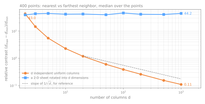
With noise columns, at \(d = 2\) the farthest point is typically tens of times farther than the nearest; at \(d = 1000\) it is only about 10% farther. "Nearest" has stopped meaning much. Everything built on distance degrades with it: k-NN, k-means, RBF kernels, and t-SNE and UMAP themselves.
The blue line is the part of the story that is usually left out. Concentration is not caused by the number of columns. The rotated sheet has 1,000 columns too, and its contrast does not move, because its points still live on a 2-D surface. What hurts is columns that carry no information about the structure: each one adds its own noise to every distance while the signal stays the same. Real data sit between the two lines: images, text embeddings and sensor readings have many columns but far fewer independent directions of variation. So the practical question is not "how many columns?" but "how many directions actually vary?", and PCA's explained variance, below, estimates exactly that. This is also why t-SNE and UMAP recommend running PCA first when the input has hundreds of dimensions: not only for speed, but to feed them neighborhoods that still mean something.
PCA — Principal Component Analysis
Stage 2. PCA (Pearson, 1901; Hotelling, 1933) is the classical, linear method: find the orthogonal directions of maximum variance and project the data onto the first few.
The math
Given centered data \(X \in \mathbb{R}^{n \times d}\) (each column has zero mean), the sample covariance matrix is
The first principal component is the unit vector \(w\) maximizing the variance of the projection:
The solution is the eigenvector of \(C\) with the largest eigenvalue \(\lambda_1\); the second component is the next eigenvector, orthogonal to the first, and so on. The eigenvalue \(\lambda_k\) is the variance captured by component \(k\), which gives the explained variance ratio:
There is a second way to ask for "the best line": the one that minimizes the squared distances from the points to the line (the residuals). By Pythagoras, each point's squared distance to the center splits into the part along the line plus the part perpendicular to it. The total is fixed, so maximizing the first is the same as minimizing the second: maximum variance and minimum reconstruction error are the same optimization.
PCA by hand
Five points, chosen so every number comes out whole:
| \(x\) | \(y\) | \(x-\bar{x}\) | \(y-\bar{y}\) |
|---|---|---|---|
| 2 | 4 | −3 | −1 |
| 4 | 2 | −1 | −3 |
| 5 | 5 | 0 | 0 |
| 6 | 8 | 1 | 3 |
| 8 | 6 | 3 | 1 |
Step 1 — center. The mean is \((5, 5)\); subtract it (last two columns).
Step 2 — covariance matrix. With \(n - 1 = 4\): the variance of \(x\) is \((9+1+0+1+9)/4 = 5\), the same for \(y\), and the covariance is \((3+3+0+3+3)/4 = 3\):
Step 3 — eigenvalues. Solve \(\det(C - \lambda I) = 0\), which for a 2×2 is a quadratic whose coefficients are the trace and the determinant:
Two checks worth internalizing: the eigenvalues sum to the trace (8 + 2 = 10 = 5 + 5), and the trace is the total variance. So \(\text{EVR}_1 = 8/10 = 80\%\).
Step 4 — eigenvectors. Substituting \(\lambda_1 = 8\) into \((C - 8I)w = 0\) gives \(-3w_1 + 3w_2 = 0\), so \(w_1 = w_2\): PC1 is \((1,1)/\sqrt{2}\), exactly the 45° diagonal, which is where the cloud visibly points. PC2 is forced to be \((-1,1)/\sqrt{2}\), perpendicular to it.
Step 5 — project. The PC1 score of a point is its centered coordinates dotted with \(w_1\): for \((2, 4)\), \((-3 - 1)/\sqrt2 = -2\sqrt2 \approx -2.828\). The five scores are \(-2\sqrt2,\ -2\sqrt2,\ 0,\ 2\sqrt2,\ 2\sqrt2\), whose variance is \(4 \cdot 8/4 = 8\): the eigenvalue again. The eigenvalue is not a proxy for the variance along the component; it is that variance.
Step 6 — reconstruct. Keeping only PC1 means replacing each point by its shadow on the diagonal, \(\text{mean} + (\text{score})\, w_1\): \((2,4)\) and \((4,2)\) both become \((3,3)\), \((6,8)\) and \((8,6)\) become \((7,7)\). Each of those four moves a distance \(\sqrt2\), so the squared error is \(4 \times 2 = 8\), and \(8/(n-1) = 2 = \lambda_2\). The reconstruction error is exactly the variance you threw away.
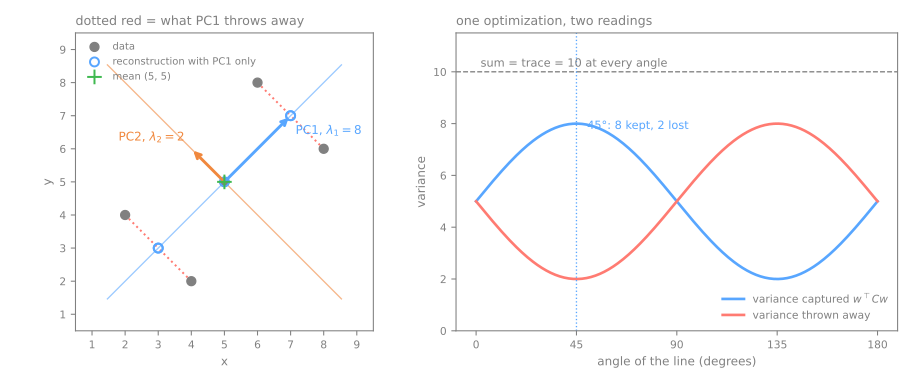
Now the same six steps in numpy. One trap first: np.linalg.eigh (the routine for symmetric matrices) returns the eigenvalues in ascending order, so the best direction comes last. Forgetting to sort is a silent bug: the code runs, the shapes are right, and you have kept the worst direction.
X = np.array([[2, 4], [4, 2], [5, 5], [6, 8], [8, 6]], dtype=float)

mean = X.mean(axis=0)                  # step 1: center
Xc = X - mean
C = Xc.T @ Xc / (len(X) - 1)           # step 2: covariance matrix (divisor n - 1)
lam, V = np.linalg.eigh(C)             # step 3-4: eigenvalues, eigenvectors (columns of V)
print("mean:", mean)
print("C:", C.tolist())
print("eigh order:", lam)              # ascending: the best direction comes LAST
order = np.argsort(lam)[::-1]          # largest first
lam, V = lam[order], V[:, order]
print("sorted:    ", lam)
print("PC1:", V[:, 0].round(4), "  PC2:", V[:, 1].round(4))
mean: [5. 5.]
C: [[5.0, 3.0], [3.0, 5.0]]
eigh order: [2. 8.]
sorted:     [8. 2.]
PC1: [0.7071 0.7071]   PC2: [-0.7071  0.7071]
Z = Xc @ V                              # step 5: scores = coordinates in the new axes
print("PC1 scores:", Z[:, 0].round(3))
print("variance of the scores:", Z.var(axis=0, ddof=1))     # = the eigenvalues
print("explained variance ratio:", lam / lam.sum())

W = V[:, :1]                            # step 6: keep PC1 only ...
X_rec = Xc @ W @ W.T + mean             # ... project, and map back to x, y
print("reconstruction:", X_rec.tolist())
print("squared error / (n - 1):", ((X - X_rec) ** 2).sum() / (len(X) - 1))   # = lambda_2
PC1 scores: [-2.828 -2.828  0.     2.828  2.828]
variance of the scores: [8. 2.]
explained variance ratio: [0.8 0.2]
reconstruction: [[3.0000000000000004, 3.0000000000000004], [3.0000000000000004, 3.0000000000000004], [5.0, 5.0], [7.0, 7.0], [7.0, 7.0]]
squared error / (n - 1): 2.0
scikit-learn does the same thing in one call (internally it uses the SVD of \(X_c\) rather than forming \(C\), which is numerically safer, and it always sorts the components from largest to smallest):
from sklearn.decomposition import PCA

pca = PCA(n_components=2).fit(X)
print("components_:", pca.components_.round(4).tolist())    # one row per component
print("explained_variance_:", pca.explained_variance_)
print("explained_variance_ratio_:", pca.explained_variance_ratio_)
print("same scores up to sign?", np.allclose(np.abs(pca.transform(X)), np.abs(Z)))

x_new = np.array([[9, 7]])                                  # a point PCA never saw
print("transform:", pca.transform(x_new).round(3), "  by hand:", ((x_new - mean) @ V).round(3))
components_: [[0.7071, 0.7071], [-0.7071, 0.7071]]
explained_variance_: [8. 2.]
explained_variance_ratio_: [0.8 0.2]
same scores up to sign? True
transform: [[ 4.243 -1.414]]   by hand: [[ 4.243 -1.414]]
The library agrees with the hand computation. Two details are worth knowing before they surprise you:
- Signs are arbitrary. If \(w\) is an eigenvector, so is \(-w\). Another library (or another version) may return PC1 as \((-0.707, -0.707)\); the scores then flip sign and the plot is mirrored. That is why the check above compares absolute values. Interpret the relative signs inside a component ("\(x\) and \(y\) move together"), never the absolute sign.
- New points need no refitting.
transformsubtracts the training mean and multiplies by the stored components: \((9, 7) - (5, 5) = (4, 2)\), and \((4 + 2)/\sqrt2 = 4.243\). This is what lets PCA sit inside a pipeline and process data it has never seen. Keep it in mind: t-SNE cannot do this.
Divisor \(n\) or \(n-1\)?
The class handout's paper exercise divides by \(n\) (the population covariance); numpy's np.cov and scikit-learn's explained_variance_ divide by \(n-1\). The eigenvalues then differ by the factor \(n/(n-1)\), but the eigenvectors, the scores and the explained variance ratios are identical, because the factor cancels.
Rotate the line yourself: the bar on the right is the variance captured at that angle, and the gray segments are what gets thrown away. There is exactly one angle where the bar peaks. Press find PC1 to snap to it and confirm it is the one you were converging on.
The scaling question
PCA chases variance, and variance has units. The wine dataset has 13 chemical measurements of 178 wines from three cultivars; one of them, proline, is measured in the hundreds, while hue is around 1. Fit PCA twice, on the raw columns and on standardized ones (Preprocessing):
import pandas as pd
from sklearn.datasets import load_wine
from sklearn.preprocessing import StandardScaler

X_wine, y_wine = load_wine(return_X_y=True, as_frame=True)
print(X_wine.std().round(1).sort_values(ascending=False).head(3).to_dict())

raw = PCA().fit(X_wine)
std = PCA().fit(StandardScaler().fit_transform(X_wine))
print("variance ratio, raw columns:         ", raw.explained_variance_ratio_[:3].round(3))
print("variance ratio, standardized columns:", std.explained_variance_ratio_[:3].round(3))
print("largest |weights| in PC1, raw:", pd.Series(raw.components_[0], X_wine.columns).abs().nlargest(2).round(3).to_dict())
print("largest |weights| in PC1, std:", pd.Series(std.components_[0], X_wine.columns).abs().nlargest(3).round(3).to_dict())
print("sum of eigenvalues, standardized:", std.explained_variance_.sum().round(3))
{'proline': 314.9, 'magnesium': 14.3, 'alcalinity_of_ash': 3.3}
variance ratio, raw columns:          [0.998 0.002 0.   ]
variance ratio, standardized columns: [0.362 0.192 0.111]
largest |weights| in PC1, raw: {'proline': 1.0, 'magnesium': 0.018}
largest |weights| in PC1, std: {'flavanoids': 0.423, 'total_phenols': 0.395, 'od280/od315_of_diluted_wines': 0.376}
sum of eigenvalues, standardized: 13.073
On the raw columns, PC1 "explains" 99.8% of the variance, and it is essentially the proline column by itself (weight 1.000). That is not a discovery about wine, it is a measurement of the unit of proline. After standardizing, the variance spreads out (36.2%, 19.2%, 11.1%), and PC1 becomes a mix of flavanoids, total phenols and the OD280 ratio, chemistry that actually co-varies. Standardizing is the same as running PCA on the correlation matrix, whose trace is the number of columns: the eigenvalues add up to 13, times \(n/(n-1) = 178/177\) because the scaler divides by \(n\) and PCA by \(n-1\).
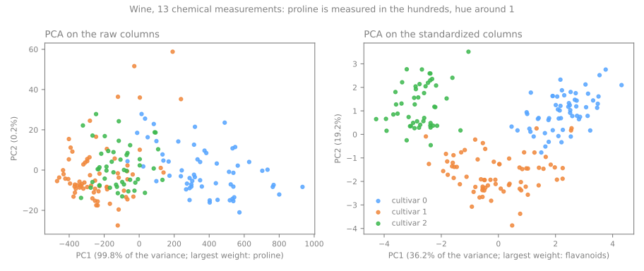
Does it matter downstream? Use a model as a black box for a moment: a k-NN classifier (it has its own lesson later) that sees only the two PCA coordinates, fitted on 70% of the wines and scored on the other 30%:
from sklearn.model_selection import train_test_split
from sklearn.neighbors import KNeighborsClassifier
from sklearn.pipeline import make_pipeline

X_tr, X_te, y_tr, y_te = train_test_split(X_wine, y_wine, test_size=0.3,
                                          stratify=y_wine, random_state=0)
for name, pipe in [("raw -> PCA(2) -> k-NN", make_pipeline(PCA(2), KNeighborsClassifier())),
                   ("scaled -> PCA(2) -> k-NN", make_pipeline(StandardScaler(), PCA(2),
                                                             KNeighborsClassifier()))]:
    print(f"{name:25s} test accuracy {pipe.fit(X_tr, y_tr).score(X_te, y_te):.3f}")
From 72.2% to 92.6% of the held-out wines, with the same two-number summary; the only difference is whether proline was allowed to shout. Notice also where PCA sits: inside the pipeline, so it is fitted on the training wines only (fitting it on all the data first would leak the test set into the projection, the same mistake as fitting a scaler before the split).
When to standardize
Standardize when the columns are in different units (reais and years, mg/L and pH). Do not blindly standardize when they share a unit and their variance is meaningful, as with the pixels of an image: there a nearly constant border pixel would be inflated to the same importance as the strokes in the middle.
Choosing k
With more columns, the question becomes how many components to keep. The digits dataset has 1,797 images of 8×8 = 64 pixels, all in the same unit (ink intensity 0–16), so no scaling:
from sklearn.datasets import load_digits

X_dig, y_dig = load_digits(return_X_y=True)
pca = PCA().fit(X_dig)
cum = np.cumsum(pca.explained_variance_ratio_)
print("first 5 ratios:", pca.explained_variance_ratio_[:5].round(3))
print("cumulative at k = 2, 10, 20:", cum[[1, 9, 19]].round(3))
for target in [0.90, 0.95, 0.99]:
    print(f"k for {target:.0%}: {np.searchsorted(cum, target) + 1}")
print("PCA(n_components=0.95) keeps", PCA(n_components=0.95).fit(X_dig).n_components_, "components")
first 5 ratios: [0.149 0.136 0.118 0.084 0.058]
cumulative at k = 2, 10, 20: [0.285 0.738 0.894]
k for 90%: 21
k for 95%: 29
k for 99%: 41
PCA(n_components=0.95) keeps 29 components
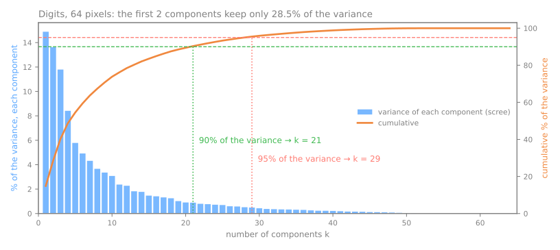
The first two components keep only 28.5% of the variance: a 2-D PCA picture of the digits shows less than a third of what is there. The usual criteria, in decreasing order of how much you should trust them:
- Cumulative variance threshold (90%, 95%, 99%): simple and defensible, the standard for compression. Here 95% needs 29 of 64 components;
PCA(n_components=0.95)does the search for you; - Elbow of the scree plot: visual and subjective; useful when there is a clear break, which there is not here;
- Downstream performance: treat \(k\) as a hyperparameter of the model that uses the components, and choose it on validation data. It is the only valid criterion when PCA is preprocessing for a classifier; cross-validation will make that choice robust later in the course;
- Kaiser's rule (keep \(\lambda > 1\) on standardized data): common in applied statistics, but fragile.
The same curve is a cheap estimate of the intrinsic dimension from the curse-of-dimensionality section: 64 pixels, but about 29 directions that matter.
Reconstruction: what k components actually keep
PCA is reversible. Drop from \(d\) dimensions to \(k\) and project back (inverse_transform), and you get an approximation whose error is exactly the variance you discarded, \(\sum_{j>k}\lambda_j\), as in step 6 of the hand computation. On the digits:
n = len(X_dig)
print(" k    kept   error/image   discarded eigenvalues")
for k in [1, 2, 5, 10, 20, 29, 40, 64]:
    p = PCA(n_components=k).fit(X_dig)
    X_rec = p.inverse_transform(p.transform(X_dig))
    error = ((X_dig - X_rec) ** 2).sum(axis=1).mean()           # squared error per image
    discarded = pca.explained_variance_[k:].sum() * (n - 1) / n
    print(f"{k:2d}  {cum[k - 1]:6.1%}   {error:10.1f}   {discarded:12.1f}")
 k    kept   error/image   discarded eigenvalues
 1   14.9%       1022.6         1022.6
 2   28.5%        858.9          858.9
 5   54.5%        546.7          546.7
10   73.8%        314.5          314.5
20   89.4%        127.0          127.0
29   95.5%         54.3           54.3
40   98.8%         14.2           14.2
64  100.0%          0.0            0.0
The two last columns are the same number, row by row: the mean squared reconstruction error per image is the sum of the discarded eigenvalues (up to the \(n-1\) vs \(n\) factor). This is the second derivation of PCA, checked numerically.
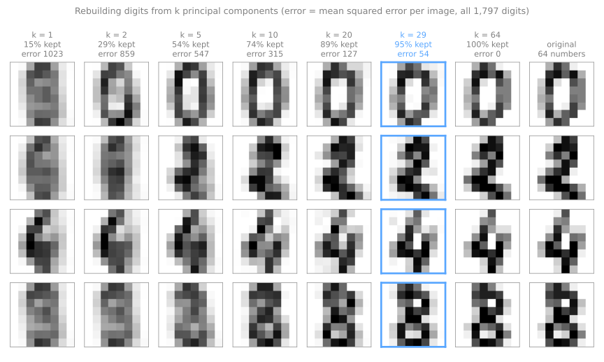
With 29 numbers per image (plus a shared mean and 29 component images, stored once), the digits are nearly indistinguishable from the 64-pixel originals. This is why PCA doubles as compression and denoising: the discarded directions are the low-variance ones, and noise tends to live there. The simulator does the same on 12×12 images. Slide \(k\) and watch how few components the eye needs before it stops objecting:
Five PCA pitfalls
- Not standardizing columns in different units: you measure the choice of unit, not the structure (wine, above).
- Fitting before the split.
PCA().fit(X_all)lets the test rows shape the projection. Fit on training data only, which a pipeline does for you. - Assuming high-variance components are the useful ones for prediction. PCA never looks at the target; nothing guarantees that the signal lives in the first components, and there are classic cases where it lives in the last.
- Reading components as real-world factors. Signs are arbitrary, and when two eigenvalues are close, any rotation inside their plane is equally valid.
- PCA on one-hot columns without thinking. It runs, but a 0/1 column has variance \(p(1-p)\), so rare categories are discarded almost automatically.
Where PCA runs out
Stage 3. PCA can only rotate and project: it moves the axes, never bends them. When the structure in the data is a bend, that is fatal.
The Swiss roll is the standard counter-example: a 2-D sheet rolled up in 3-D. Two points on opposite layers of the roll can be close in straight-line distance while being very far apart along the sheet. Tick mark a pair of points to see one such pair, then project with PCA and watch the two colors smear into each other:
The distinction the simulator makes visible is between Euclidean distance (through the empty space between layers) and geodesic distance (walking along the surface). Manifold methods are the ones that use the second.
To measure "smear", we need a score for a 2-D map. Trustworthiness (Venna & Kaski, 2001), sklearn.manifold.trustworthiness, asks: of the \(k\) nearest neighbors of each point on the map, how many were really neighbors in the reference space? Intruders are penalized by how far away they really were. 1 means no intruders; a random map scores about 0.5. For the roll, the reference is where each point sits on the unrolled sheet, which make_swiss_roll gives us:
from sklearn.datasets import make_swiss_roll
from sklearn.manifold import Isomap, trustworthiness

X_roll, t = make_swiss_roll(n_samples=1000, noise=0.1, random_state=0)
sheet = np.column_stack([t, X_roll[:, 1]])      # position on the unrolled sheet

for name, model in [("PCA", PCA(n_components=2)), ("Isomap", Isomap(n_neighbors=10))]:
    E = model.fit_transform(X_roll)
    print(f"{name:7s} trustworthiness vs the sheet: {trustworthiness(sheet, E, n_neighbors=12):.3f}")
PCA's map has intruders everywhere (0.810): points from different layers land on top of each other. Isomap (Tenenbaum, de Silva & Langford, 2000) builds a graph linking each point to its 10 nearest neighbors, measures distances by walking along that graph (an approximation of the geodesic), and then lays the points out to respect those distances. It unrolls the sheet (0.976).
Isomap is one of a family of nonlinear methods. They all make the same bet: Euclidean distance is only trustworthy locally. Build a neighborhood graph where it holds, and infer the global shape from the graph.
| Method | Idea | Status today |
|---|---|---|
| Kernel PCA | PCA in the implicit feature space of a kernel | useful, but you must choose the kernel; \(O(n^2)\) memory |
| MDS | preserve all pairwise distances | historical basis; suffers from crowding |
| Isomap | MDS on geodesic distances from a neighbor graph | elegant; sensitive to "short-circuit" edges between layers |
| LLE / Laplacian eigenmaps | preserve local linear reconstructions / graph Laplacian eigenvectors | theoretical ancestors of UMAP |
| t-SNE | match neighbor distributions | the visualization standard since 2008 |
| UMAP | fuzzy neighbor graph + layout by optimization | the current standard at scale |
| Autoencoder | learn the map and its inverse with a neural network | parametric and reversible; the bridge to deep learning |
Nonlinear methods: t-SNE and UMAP
t-SNE (van der Maaten & Hinton, 2008)
The idea in one sentence: turn distances into neighbor probabilities in both spaces, and move the points of a 2-D map until the two sets of probabilities match.
- Neighborhoods in the original space. For each point \(i\), a Gaussian centered on it gives each other point \(j\) a probability \(p_{j|i}\) of being its neighbor. Its width \(\sigma_i\) is tuned separately for each point until the neighborhood has a prescribed size, the perplexity, roughly "the effective number of neighbors". Dense regions get a small \(\sigma_i\), sparse regions a large one: t-SNE automatically adapts its scale to the local density (keep that in mind; it is why cluster sizes on the map mean nothing).
- Neighborhoods on the map, \(q_{ij}\), use a Student-t distribution with one degree of freedom, whose tails are much heavier than a Gaussian's. In 10 dimensions a point has room for many neighbors at moderate distance; in 2-D there is no such room (the crowding problem). The heavy tail lets moderately distant pairs be placed far apart at little cost, which frees space to separate the groups. Side effect: distances between groups on the map are no longer interpretable.
- Minimize the Kullback–Leibler divergence \(\text{KL}(P\,\|\,Q) = \sum p_{ij} \log (p_{ij}/q_{ij})\) by gradient descent. KL is asymmetric: true neighbors drawn far apart (\(p\) high, \(q\) low) are expensive; far points drawn close (\(p\) low, \(q\) high) are almost free. Hence: what is close on the map may not be close in the data; what is close in the data is usually close on the map.
The simulator below runs real gradient descent on the KL divergence, in your browser; nothing is pre-computed:
Three experiments worth doing before you trust any t-SNE plot you did not make yourself:
- pick uniform noise and run it. t-SNE will still produce tidy-looking blobs. The method always outputs clusters; the data does not always contain them.
- keep the dataset and change only the perplexity. The number of apparent groups can change. Report the perplexity alongside any t-SNE figure, the way you would report a random seed;
- pick groups of different sizes and compare the on-screen sizes with the real ones. They do not match.
What a t-SNE map does not tell you, measured
The simulator shows it; now measure it. Three small datasets where the truth is known (Wattenberg, Viégas & Johnson, 2016, built many more): two groups of 100 points, one ten times wider than the other; three tight groups on a line, blue at 0, orange at 10 and green at 100; and 200 points of pure noise in 10 dimensions.
from sklearn.manifold import TSNE

rng = np.random.default_rng(42)
sizes = np.vstack([rng.normal(0, 1, (100, 2)),                 # tight group, std 1
                   rng.normal(0, 10, (100, 2)) + [60, 0]])     # loose group, std 10
g_sizes = np.repeat([0, 1], 100)
dists = np.vstack([rng.normal(0, 1, (50, 2)) + c for c in [[0, 0], [10, 0], [100, 0]]])
g_dists = np.repeat([0, 1, 2], 50)                             # blue, orange, green
noise = rng.random((200, 10))                                  # 10 columns of pure noise

def spread(Z):          # root-mean-square distance of a group's points to their center
    return np.sqrt(((Z - Z.mean(axis=0)) ** 2).sum(axis=1).mean())

def size_ratio(Z):      # how many times wider the loose group is
    return spread(Z[g_sizes == 1]) / spread(Z[g_sizes == 0])

def dist_ratio(Z):      # distance(blue, green) / distance(blue, orange), between centers
    m = [Z[g_dists == k].mean(axis=0) for k in range(3)]
    return np.linalg.norm(m[0] - m[2]) / np.linalg.norm(m[0] - m[1])

E_sizes = TSNE(perplexity=30, random_state=0).fit_transform(sizes)
E_dists = TSNE(perplexity=30, random_state=0).fit_transform(dists)
print(f"size ratio:     data {size_ratio(sizes):5.1f}   t-SNE {size_ratio(E_sizes):4.1f}")
print(f"distance ratio: data {dist_ratio(dists):5.1f}   t-SNE {dist_ratio(E_dists):4.1f}")
The loose group is 11.6 times wider than the tight one; on the map, they are the same size (1.0). Green is 10 times farther from blue than orange is; on the map, 1.3 times. Both are consequences of the design, not bugs: the per-point \(\sigma_i\) equalizes dense and sparse groups, and the heavy tail makes "far" and "very far" cost the same.
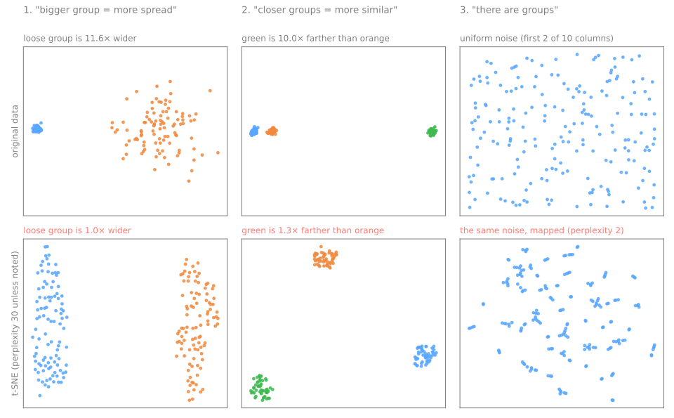
Perplexity changes the picture. Same three groups, same seed, four perplexities:
for p in [2, 5, 30, 100]:
    E = TSNE(perplexity=p, random_state=0).fit_transform(dists)
    print(f"perplexity {p:3d}: distance ratio {dist_ratio(E):.1f}")
perplexity   2: distance ratio 3.3
perplexity   5: distance ratio 1.1
perplexity  30: distance ratio 1.3
perplexity 100: distance ratio 7.0
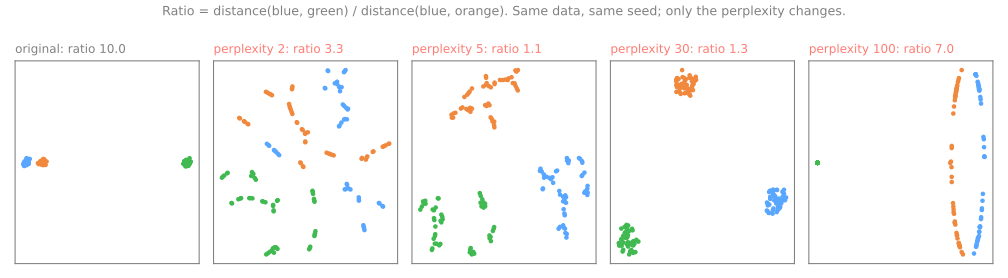
At perplexity 2 each point looks at a couple of neighbors, and every group shatters into fragments that do not exist. At 30 the groups are clean, but equidistant. At 100 the neighborhoods span most of the 150 points, and some global geometry comes back (7.0), at the price of distorted groups. There is no "right" perplexity; the usual range is 5–50, it must be smaller than the smallest group you want to see, and the honest practice is to run several and trust only what persists.
t-SNE finds groups in noise. A k-means clustering scored by its silhouette (both in the next lesson; here they are black boxes: the silhouette is near 1 for well-separated groups and near 0 when there are none) says how "groupy" a set of points looks:
from sklearn.cluster import KMeans
from sklearn.metrics import silhouette_score

def best_silhouette(Z):         # k-means with k = 2..6; the best silhouette found
    return max(silhouette_score(Z, KMeans(k, n_init=10, random_state=0).fit_predict(Z))
               for k in range(2, 7))

print(f"10-column noise itself: silhouette {best_silhouette(noise):.2f}")
for p in [2, 30]:
    E = TSNE(perplexity=p, random_state=0).fit_transform(noise)
    print(f"  t-SNE, perplexity {p:2d}: silhouette {best_silhouette(E):.2f}   "
          f"trustworthiness {trustworthiness(noise, E, n_neighbors=12):.2f}")
low = np.random.default_rng(0).random((200, 4))               # noise in only 4 columns
E = TSNE(perplexity=30, random_state=0).fit_transform(low)
print(f"4-column noise itself:  silhouette {best_silhouette(low):.2f}")
print(f"  t-SNE, perplexity 30: silhouette {best_silhouette(E):.2f}   "
      f"trustworthiness {trustworthiness(low, E, n_neighbors=12):.2f}")
10-column noise itself: silhouette 0.09
  t-SNE, perplexity  2: silhouette 0.42   trustworthiness 0.79
  t-SNE, perplexity 30: silhouette 0.38   trustworthiness 0.86
4-column noise itself:  silhouette 0.23
  t-SNE, perplexity 30: silhouette 0.43   trustworthiness 0.97
The 10-column noise has no groups (silhouette 0.09); its t-SNE maps look four to five times more "clustered". Trustworthiness does not rescue you. Here it is lower than on real structure (0.86, against 0.99 for the digits below), but with noise in 4 columns it reaches 0.97, nearly as good as a real map: trustworthiness measures whether local neighborhoods were kept, and noise has local neighborhoods too. A good fidelity score does not certify that the structure is real; it only says the map is faithful to whatever was there. The cure is a null comparison: shuffle each column independently (this destroys the relations between columns but keeps each column's distribution), run the same pipeline, and compare. If the shuffled data look equally structured, what you saw was the algorithm, not the data.
Axes and runs. The KL loss depends only on distances between map points, so rotating or mirroring a map changes nothing: the optimizer has no preferred orientation. With a random initialization, two seeds produce two different pictures:
from sklearn.neighbors import NearestNeighbors

def neighbor_overlap(A, B, k=10):   # share of each point's 10 map-neighbors that two maps agree on
    na = NearestNeighbors(n_neighbors=k + 1).fit(A).kneighbors(A, return_distance=False)[:, 1:]
    nb = NearestNeighbors(n_neighbors=k + 1).fit(B).kneighbors(B, return_distance=False)[:, 1:]
    return np.mean([len(set(a) & set(b)) / k for a, b in zip(na, nb)])

E0 = TSNE(init="random", random_state=0).fit_transform(X_dig)
for seed in [1, 2, 3]:
    E = TSNE(init="random", random_state=seed).fit_transform(X_dig)
    r = np.corrcoef(E0[:, 0], E[:, 0])[0, 1]
    print(f"digits, seed 0 vs {seed}: horizontal axes |correlation| {abs(r):.1f}, "
          f"neighbor overlap {neighbor_overlap(E0, E):.0%}")
N0, N1 = [TSNE(init="random", random_state=s).fit_transform(noise) for s in [0, 1]]
print(f"noise,  seed 0 vs 1: neighbor overlap {neighbor_overlap(N0, N1):.0%}")
same = np.allclose(TSNE(random_state=0).fit_transform(noise), TSNE(random_state=1).fit_transform(noise))
print("default init='pca', seeds 0 and 1 give the same map:", same)
digits, seed 0 vs 1: horizontal axes |correlation| 1.0, neighbor overlap 90%
digits, seed 0 vs 2: horizontal axes |correlation| 0.0, neighbor overlap 94%
digits, seed 0 vs 3: horizontal axes |correlation| 0.1, neighbor overlap 85%
noise,  seed 0 vs 1: neighbor overlap 47%
default init='pca', seeds 0 and 1 give the same map: True
On the digits (all 1,797 images, the same digits as in Choosing k), the horizontal axis of one run is almost perfectly correlated with that of seed 1 (|r| ≈ 1.0), not at all with that of seed 2 (|r| ≈ 0.0: that map came out rotated a quarter turn) and barely with seed 3 (|r| ≈ 0.1), while 85–94% of each point's ten neighbors are the same in every pair. The neighborhoods are real; the orientation is not. On the noise, only 47% of the neighbors survive a change of seed: structure that is an artifact moves around from run to run. Since scikit-learn 1.2, init="pca" is the default and makes the map reproducible across seeds; that is convenient, but reproducible is not the same as stable. Stability has to be checked by varying what matters: perplexity, the sample, the initialization.
UMAP (McInnes, Healy & Melville, 2018)
UMAP reaches a similar picture by a different road. Instead of probabilities over all pairs, it builds an explicit graph of k nearest neighbors:
- each point is linked to its
n_neighborsnearest points, with fuzzy weights that decay with distance; the scale is set per point, and every point is guaranteed at least one edge of weight 1, so no point is left isolated; - the directed weights are merged into one symmetric fuzzy graph (the analogue of t-SNE's symmetrization);
- a 2-D layout is found by stochastic gradient descent with negative sampling: at each step an edge is drawn and its two ends attract; a few random points are drawn and repelled. The loss is a cross-entropy with an explicit penalty for putting distant points close together, the term t-SNE does not have, which is where UMAP's somewhat better global structure comes from. Sampling instead of summing over all pairs is why it is fast.
The two parameters that matter:
n_neighbors(default 15): the scale at which you declare Euclidean distance trustworthy. Small values keep fine local detail but may break the graph into disconnected pieces; large values see more global structure, and on a Swiss roll start adding short-cut edges between layers, which is what PCA does;min_dist(default 0.1): how tightly points may be packed on the map. It does not change who is a neighbor of whom, only how compact the groups are drawn: low values produce dense, very convincing blobs; high values spread them out. It is cosmetic, not structural.
And the property that makes it usable in a pipeline: UMAP has transform. Fit it once, and new points are placed on the same map without refitting. t-SNE has no such method; the only way to add points is to recompute the whole map, which moves everything. This is exactly UMAP's role inside BERTopic, where it reduces text embeddings before clustering.
UMAP is not part of scikit-learn: install umap-learn (in Colab, run !pip install umap-learn once). The same digits, fitted on 80% and asked to place the other 20%:
import umap

print("PCA has transform:  ", hasattr(PCA(), "transform"))
print("TSNE has transform: ", hasattr(TSNE(), "transform"))

X_tr, X_te, y_tr, y_te = train_test_split(X_dig, y_dig, test_size=0.2,
                                          stratify=y_dig, random_state=0)
reducer = umap.UMAP(n_neighbors=15, min_dist=0.1, random_state=0).fit(X_tr)
E_tr, E_te = reducer.embedding_, reducer.transform(X_te)       # new images, same map
nearest = NearestNeighbors(n_neighbors=1).fit(E_tr).kneighbors(E_te, return_distance=False)[:, 0]
print(E_tr.shape, E_te.shape)
print(f"new images whose nearest training image on the map is the same digit: {(y_tr[nearest] == y_te).mean():.1%}")
PCA has transform:   True
TSNE has transform:  False
(1437, 2) (360, 2)
new images whose nearest training image on the map is the same digit: 96.4%
The 360 new images land among their own kind: 96.4% of them have, as nearest training image on the map, an image of the same digit. The map built on the training images is a function you can apply to new data, like PCA's projection and unlike t-SNE.
PCA vs t-SNE vs UMAP, side by side
Stage 4. The digits and the Swiss roll, each mapped by PCA and t-SNE (the figure scripts use scikit-learn only, so UMAP appears in the table below and in the lab):
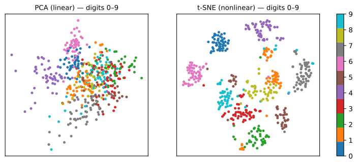
PCA, the best linear view, overlaps several digit classes: two directions of maximum variance (28.5% of it) are not enough. t-SNE separates the ten classes by preserving local neighborhoods. The price is visible too: the 1s are split into several islands, the Swiss roll is cut into pieces whose relative positions mean nothing, and axes, cluster sizes and inter-cluster distances have no interpretation.
Which one is "better" depends on the scale you care about. Trustworthiness takes the neighborhood size \(k\) as a parameter; small \(k\) asks about the immediate neighbors, large \(k\) about broader structure:
maps = {"PCA": PCA(n_components=2).fit_transform(X_dig),
        "t-SNE": TSNE(random_state=0).fit_transform(X_dig),
        "UMAP": umap.UMAP(random_state=0).fit_transform(X_dig)}
print("         k=5    k=12   k=30   k=100")
for name, E in maps.items():
    print(f"{name:6s}", "  ".join(f"{trustworthiness(X_dig, E, n_neighbors=k):.3f}" for k in [5, 12, 30, 100]))
         k=5    k=12   k=30   k=100
PCA    0.830  0.830  0.830  0.835
t-SNE  0.995  0.992  0.985  0.963
UMAP   0.989  0.988  0.983  0.961
On the digits, both nonlinear maps beat PCA at every scale, and both lose fidelity as \(k\) grows while PCA stays flat: t-SNE and UMAP spend their effort on the immediate neighbors. On other data, PCA can win at large \(k\) (the class handout shows it on Iris): there is no winner until you say which scale you care about. Report trustworthiness for more than one \(k\).
The comparison table
| PCA | t-SNE | UMAP | |
|---|---|---|---|
| Nature | linear, deterministic | nonlinear, stochastic | nonlinear, stochastic |
| Objective | maximum variance | KL divergence between neighborhoods | cross-entropy on a fuzzy graph |
| Preserves local structure | weak | very good | very good |
| Preserves global structure | best (variance) | weak | moderate |
| Distance between groups interpretable? | yes | no | partly |
| Size of groups interpretable? | yes | no | no |
| Reconstruction (inverse) | yes, exact within the subspace | no | approximate |
Apply to new data (transform) | yes, trivial | no | yes |
| Typical cost | very fast | slow (\(O(n \log n)\) with Barnes-Hut) | fast (\(O(n \log n)\), smaller constant) |
| Critical hyperparameters | \(k\), scaling | perplexity, iterations, learning rate | n_neighbors, min_dist |
| As preprocessing for a model | recommended | not advised | with care, inside the pipeline |
The seven forbidden statements about a t-SNE/UMAP plot
- "This group is bigger, so it varies more." Size on the map is an artifact of local density (measured above: 11.6× wider in the data, 1.0× on the map).
- "These two groups are close, so they are similar." Distances between groups are not preserved (10× farther in the data, 1.3× on the map, and the ratio moves with the perplexity).
- "There are 5 groups in the data." There are 5 blobs on the plot. Groups are validated in the original space (t-SNE turned pure noise into a silhouette four to five times higher).
- "The horizontal axis represents X." The axes have no meaning; rotation and reflection are arbitrary (four seeds on the digits: the horizontal axes correlate anywhere from |r| ≈ 0.0 to 1.0, with the same neighborhoods).
- "I ran it once and saw this." Results vary with seed, perplexity and sample; report several runs and trust what persists.
- "I used the 2 t-SNE components as features for my classifier." There is no honest
transformfor new data, and you compressed hundreds of dimensions into 2 chosen to please the eye. - "I ran t-SNE on the whole dataset and then split train/test." Leakage: the map was built using the test rows (see data leakage).
A plot is a hypothesis, not a result. If a reduction supports a claim, it needs a number: reconstruction error (PCA), trustworthiness at more than one scale, a null comparison against shuffled data, or the performance of a downstream model trained on the reduced data.
Choosing a method
| Goal | Method |
|---|---|
| Preprocess features for a downstream model | PCA (fast, deterministic, has transform) |
| Understand/interpret directions of variation | PCA (components are linear combinations) |
| Visualize cluster structure | t-SNE or UMAP, with PCA first if \(d\) is large |
| Place new points on an existing map | UMAP (t-SNE cannot) |
| Reduce before density clustering (e.g. HDBSCAN, BERTopic) | UMAP |
| Compress/denoise images or signals | PCA |
The decision rule, in four lines:
- it will feed another model, or you need reversibility → PCA. Full stop;
- you want to look at the data to form hypotheses, with up to a few thousand points → t-SNE or UMAP, always with PCA first if \(d\) is large;
- \(n\) is large, or you must project new data onto the same map → UMAP;
- you need reliable global structure in one picture → none of the three is ideal; show PCA (for the geometry) and t-SNE/UMAP (for the local detail), and report both.
Exercises
- By hand. Without a computer, for the points (2,1), (3,3), (4,3), (5,5): center the data, write the 2×2 covariance matrix with divisor \(n\), find both eigenvalues, and say what fraction of the variance PC1 explains. Check that the eigenvalues add up to the trace and multiply to the determinant.
- Spot the leak. A colleague reduces 5,000 columns to 50 like this:
Z = PCA(50).fit_transform(StandardScaler().fit_transform(X)), thentrain_test_split(Z, y), trains a model and reports its test accuracy. What is wrong, and how does a pipeline fix it? Why does the problem get worse when the number of columns is much larger than the number of rows? - Pick the method. For each case, choose PCA, t-SNE or UMAP and justify in one sentence: (a) compress 1,024 sensor columns to speed up a model that runs 50,000 times per second; (b) explore 8,000 cells × 20,000 genes looking for unknown cell types; (c) find out why a classifier confuses two classes, using its internal representations; (d) a product map that must accept new items every day without being recomputed.
- Perplexity. In the t-SNE simulator, run 3 equal groups at perplexity 2, 30 and 80, then uniform noise at perplexity 5. What does a low perplexity do to a compact group, and a high one? What evidence would you ask of a colleague before accepting that the groups on their t-SNE plot are real?
- Intrinsic dimension. A colleague says: "my dataset has 5,000 columns, so t-SNE won't work because of the curse of dimensionality." What do you need to know before agreeing, and how would you estimate it with a tool from this lesson?
Answers
- Mean (3.5, 3); covariance \(\begin{pmatrix}1.25 & 1.5\\ 1.5 & 2\end{pmatrix}\); trace 3.25, determinant 0.25; \(\lambda = (3.25 \pm \sqrt{3.25^2 - 1})/2 = 3.1712\) and \(0.0788\); PC1 explains 97.6%, because the four points almost lie on a line.
- The scaler and the PCA were fitted on all rows, test included: the projection "saw" the test set, and the score is optimistic, more so when \(d \gg n\), because with few rows and many columns the directions of maximum variance are tuned to the particular rows. Fix:
make_pipeline(StandardScaler(), PCA(50), model), split first,fiton the training rows only. - (a) PCA: a single matrix multiplication at inference, deterministic. (b) PCA to ~50 components, then UMAP; validate the groups with known markers, not with the plot. (c) t-SNE or UMAP colored by class and by right/wrong: local visual diagnosis, nothing used downstream. (d) UMAP, because it has
transform. - Low perplexity breaks one real group into several artificial sub-groups; high perplexity smooths toward global structure and can merge distinct groups. Acceptable evidence: a clustering measured in the original space; stability across seeds and perplexities; a null comparison with shuffled columns; a model that separates the groups using the original columns.
- What matters is how many independent directions of variation the data have, not the number of columns (the rotated sheet above had 1,000 columns and no concentration). Estimate it with PCA's cumulative explained variance: if 30 components hold 95%, the linear intrinsic dimension is around 30, not 5,000, which is also why PCA before t-SNE is standard.
Lab: mapping handwritten zip codes
The USPS dataset (Hull, 1994) holds 9,298 handwritten digits scanned from envelopes by the US Postal Service, each a 16×16 gray image: 256 columns, twice as many pixels per side as the digits above. You will measure how many dimensions it really has, compress it, draw it with PCA, t-SNE and UMAP, score the three maps, and check one of the forbidden statements with numbers.
Run the blocks in order, in one session (about a minute on a laptop). Every output below is what the code prints. To work on it directly, download the lab notebook and open it in Jupyter or Colab (File → Upload notebook).
Step 1 — load a sample
# In Colab, run this first, in a cell of its own:  !pip install umap-learn
import numpy as np
import matplotlib.pyplot as plt
from sklearn.datasets import fetch_openml
from sklearn.model_selection import train_test_split

usps = fetch_openml(data_id=41082, as_frame=True)          # USPS digits, 16x16 pixels
X_all = usps.data.to_numpy()
y_all = usps.target.astype(int).to_numpy() - 1              # OpenML stores digit d as class d + 1
X, X_new, y, y_new = train_test_split(X_all, y_all, train_size=1500, test_size=500,
                                      stratify=y_all, random_state=0)
print(X_all.shape, "->", X.shape, "+", X_new.shape)
print("pixel range:", X.min(), "to", X.max())
print("images per digit:", np.bincount(y))

fig, axes = plt.subplots(1, 10, figsize=(10, 1.4))
for d, ax in enumerate(axes):
    ax.imshow(X[y == d][0].reshape(16, 16), cmap="gray_r")
    ax.set_title(d)
    ax.axis("off")
plt.show()
(9298, 256) -> (1500, 256) + (500, 256)
pixel range: -1.0 to 0.999663
images per digit: [251 205 150 133 137 115 135 128 114 132]
How to read it. We keep a stratified sample of 1,500 images to map, and 500 more that the maps will not see until step 7. Check the label before anything else: OpenML codes the digit 0 as class "1", so we subtract one, and the row of images confirms that label d shows the digit d. The pixels were rescaled to [−1, 1] by the dataset's authors and share one unit, so we will not standardize them. The classes are unbalanced (0 is the most common digit on envelopes, 8 the least), which is fine for everything below.
Step 2 — how many dimensions does USPS really have?
from sklearn.decomposition import PCA

pca = PCA().fit(X)
cum = np.cumsum(pca.explained_variance_ratio_)
print("first 3 components:", pca.explained_variance_ratio_[:3].round(3))
print("2 components keep:", cum[1].round(3))
for target in [0.90, 0.95, 0.99]:
    print(f"k for {target:.0%}: {np.searchsorted(cum, target) + 1} of 256")

plt.plot(np.arange(1, 257), cum)
plt.axhline(0.95, ls="--", color="gray")
plt.xlabel("number of components k")
plt.ylabel("cumulative explained variance")
plt.show()
first 3 components: [0.25  0.113 0.09 ]
2 components keep: 0.363
k for 90%: 22 of 256
k for 95%: 32 of 256
k for 99%: 62 of 256
How to read it. 256 pixels, but 95% of the variance fits in about 30 directions: neighboring pixels are strongly correlated (a stroke covers several of them at once), so the intrinsic dimension is far below the number of columns. The first component alone holds a quarter of the variance; two components hold a bit more than a third, which is what a 2-D PCA plot will show.
Step 3 — compression and reconstruction error
n = len(X)
print("  k    kept   error/image   discarded eigenvalues")
for k in [1, 2, 5, 10, 20, 50, 100]:
    p = PCA(n_components=k).fit(X)
    X_rec = p.inverse_transform(p.transform(X))
    error = ((X - X_rec) ** 2).sum(axis=1).mean()
    discarded = pca.explained_variance_[k:].sum() * (n - 1) / n
    print(f"{k:3d}  {cum[k - 1]:6.1%}   {error:10.2f}   {discarded:12.2f}")

fig, axes = plt.subplots(1, 6, figsize=(9, 1.8))
for ax, k in zip(axes, [1, 5, 10, 20, 50, 256]):
    p = PCA(n_components=k).fit(X)
    ax.imshow(p.inverse_transform(p.transform(X[:1]))[0].reshape(16, 16), cmap="gray_r")
    ax.set_title(f"k = {k}")
    ax.axis("off")
plt.show()
  k    kept   error/image   discarded eigenvalues
  1   25.0%        50.99          50.99
  2   36.3%        43.28          43.28
  5   58.5%        28.23          28.23
 10   75.9%        16.40          16.40
 20   89.2%         7.34           7.34
 50   98.2%         1.21           1.21
100   99.8%         0.12           0.12
How to read it. Read across each row: the reconstruction error per image equals the variance of the components you dropped, to the last decimal. With 20 of 256 numbers per image, the error falls to about a seventh of the one-component error, and the pictures show a clearly readable digit. That is PCA as compression: 20 numbers per image plus 20 component images stored once, instead of 256 numbers per image.
Step 4 — three maps of the same images
import umap
from sklearn.manifold import TSNE

reducer = umap.UMAP(n_neighbors=15, min_dist=0.1, random_state=0).fit(X)
maps = {"PCA": PCA(n_components=2).fit_transform(X),
        "t-SNE": TSNE(perplexity=30, random_state=0).fit_transform(X),
        "UMAP": reducer.embedding_}
print({name: E.shape for name, E in maps.items()})

fig, axes = plt.subplots(1, 3, figsize=(15, 4.5))
for ax, (name, E) in zip(axes, maps.items()):
    points = ax.scatter(E[:, 0], E[:, 1], c=y, cmap="tab10", s=5)
    ax.set_title(name)
    ax.set_xticks([])
    ax.set_yticks([])
fig.colorbar(points, ax=axes, ticks=range(10))
plt.show()
How to read it. Look before you measure. PCA shows a few recognizable regions (the 1s and the 0s at opposite ends of PC1) and a large overlapping middle. t-SNE draws ten islands. UMAP draws tighter ones (that is min_dist at work) and gathers some of them into clusters of clusters, such as 4, 7 and 9, or 3, 5 and 8: digits that share strokes. Before trusting what you see, remember the seven forbidden statements: the next steps put numbers on the pictures.
Step 5 — score the maps with trustworthiness
from sklearn.manifold import trustworthiness

print("        k=5    k=12   k=30")
for name, E in maps.items():
    print(f"{name:6s}", "  ".join(f"{trustworthiness(X, E, n_neighbors=k):.3f}" for k in [5, 12, 30]))
How to read it. The first argument is always the original space (all 256 pixels), the second the map; swapping them gives a different, meaningless number. PCA's 2-D map is the least trustworthy at every scale: many of its neighbors are intruders from other regions. t-SNE is the most faithful for the immediate neighbors, and both nonlinear maps lose a little as \(k\) grows, since they spend their effort on the local scale.
Step 6 — perplexity
fig, axes = plt.subplots(1, 3, figsize=(15, 4.5))
for ax, p in zip(axes, [5, 30, 100]):
    E = maps["t-SNE"] if p == 30 else TSNE(perplexity=p, random_state=0).fit_transform(X)
    print(f"perplexity {p:3d}: trustworthiness {trustworthiness(X, E, n_neighbors=12):.3f}")
    ax.scatter(E[:, 0], E[:, 1], c=y, cmap="tab10", s=5)
    ax.set_title(f"perplexity {p}")
    ax.set_xticks([])
    ax.set_yticks([])
plt.show()
perplexity   5: trustworthiness 0.975
perplexity  30: trustworthiness 0.980
perplexity 100: trustworthiness 0.978
How to read it. The three scores are within a few thousandths of each other, but the pictures are not: at perplexity 5 the islands are ragged and some digits split into several pieces; at 100 they are rounder and pressed closer together, and 4, 7 and 9 start to merge. Trustworthiness at \(k = 12\) barely notices, because local neighborhoods are kept in all three. What changes is the arrangement of the islands, which is exactly the part you are not allowed to interpret. Report the perplexity with every t-SNE figure.
Step 7 — UMAP: n_neighbors, min_dist, and new images
from sklearn.metrics import silhouette_score
from sklearn.neighbors import NearestNeighbors

print("                          trustworthiness   digits look separated (silhouette)")
for nn, md in [(5, 0.1), (15, 0.1), (50, 0.1), (15, 0.0), (15, 0.5)]:
    E = reducer.embedding_ if (nn, md) == (15, 0.1) else \
        umap.UMAP(n_neighbors=nn, min_dist=md, random_state=0).fit_transform(X)
    print(f"n_neighbors {nn:2d}, min_dist {md}   {trustworthiness(X, E, n_neighbors=12):.3f}"
          f"             {silhouette_score(E, y):.2f}")

E_new = reducer.transform(X_new)                    # 500 images the map has never seen
on_map = NearestNeighbors(n_neighbors=1).fit(reducer.embedding_).kneighbors(E_new, return_distance=False)[:, 0]
in_pixels = NearestNeighbors(n_neighbors=1).fit(X).kneighbors(X_new, return_distance=False)[:, 0]
print(f"new image next to its own digit - on the UMAP map: {(y[on_map] == y_new).mean():.1%}"
      f",  in the 256 pixels: {(y[in_pixels] == y_new).mean():.1%}")

plt.scatter(*reducer.embedding_.T, c="lightgray", s=4)
plt.scatter(*E_new.T, c=y_new, cmap="tab10", s=8)
plt.title("500 new images placed with reducer.transform")
plt.show()
                          trustworthiness   digits look separated (silhouette)
n_neighbors  5, min_dist 0.1   0.972             0.51
n_neighbors 15, min_dist 0.1   0.971             0.48
n_neighbors 50, min_dist 0.1   0.963             0.44
n_neighbors 15, min_dist 0.0   0.972             0.53
n_neighbors 15, min_dist 0.5   0.958             0.36
new image next to its own digit - on the UMAP map: 87.6%,  in the 256 pixels: 95.4%
How to read it. The silhouette (taught in the next lesson, clustering; used here as a black box) scores how separated the true digits look on the map. min_dist barely moves trustworthiness but moves the silhouette a lot: at 0.0 the islands are packed tight and look very convincing, at 0.5 they are spread out. Same neighbors, different impression. That is why min_dist is called cosmetic. n_neighbors moves both a little: small values favor local detail, large values a smoother, more global picture. The last line shows transform at work: new images land next to an image of their own digit most of the time, though less often than in the full 256-pixel space, because some information was lost in the compression to two numbers.
Step 8 — test a forbidden statement: "a bigger group varies more"
def spread(Z):                       # root-mean-square distance to the group's center
    return np.sqrt(((Z - Z.mean(axis=0)) ** 2).sum(axis=1).mean())

print("digit   pixels   PCA   t-SNE   UMAP     (each group's spread / average spread)")
rel = {}
for name, E in [("pixels", X)] + list(maps.items()):
    s = np.array([spread(E[y == d]) for d in range(10)])
    rel[name] = s / s.mean()
for d in range(10):
    print(f"{d:5d}   " + "   ".join(f"{rel[name][d]:5.2f}" for name in rel))
digit   pixels   PCA   t-SNE   UMAP     (each group's spread / average spread)
    0    1.20    1.34    1.00    0.94
    1    0.48    0.28    0.88    0.89
    2    1.23    1.10    1.15    1.11
    3    1.05    0.98    0.77    0.73
    4    1.08    1.13    1.22    1.14
    5    1.19    1.15    1.26    1.34
    6    0.96    1.10    0.96    1.19
    7    0.88    0.83    1.02    0.73
    8    1.03    1.15    0.86    1.19
    9    0.92    0.95    0.86    0.73
How to read it. In the 256-pixel space, the 1s are by far the tightest group: a 1 is a single stroke, and all 1s look alike, so their spread is about half the average. PCA keeps that fact (the 1s are the tightest group on its map too). On the t-SNE and UMAP maps, the 1s are drawn at nearly average size, indistinguishable from digits that vary twice as much. Statement 1 fails, measured on real data: the size of an island on a t-SNE or UMAP map tells you nothing about how variable the group is.
Your turn
- The null test. Shuffle each pixel column independently (
rng.permuted(X, axis=0)withrng = np.random.default_rng(0)), run t-SNE on the shuffled images, and plot the real and shuffled maps side by side. Does the shuffled map still show groups? Compare the two trustworthiness scores at \(k = 12\). Here, unlike the 10-column noise of the lesson, the score separates the two cases clearly; why does it work with 256 columns? - PCA before t-SNE. Reduce to 50 components with PCA, then run t-SNE on those 50 columns. Time both versions with
time.perf_counter()and compute trustworthiness against the 256-pixel space (not against the 50 components, which would hide what the first reduction lost). Was the speed-up worth it? - Statement 2. Compute the ten digit centers in the pixel space and on each map, and the rank correlation between the 45 center-to-center distances (
scipy.stats.spearmanronscipy.spatial.distance.pdist). Which map preserves the distances between groups best? Does raising the perplexity to 100 help t-SNE? - Seeds. Run t-SNE with
init="random"and seeds 0, 1 and 2. Which digit pairs are neighbors in all three maps, and which only in one? Only the first kind is worth reporting.
Review lab: from EDA to dimensionality reduction
This lab reviews the first block of the course, EDA, preprocessing, pipelines and this lesson, on one dataset from start to finish. Palmer Penguins: 344 penguins, 6 input columns and 19 missing values from two different causes.
- univariate, then bivariate analysis;
- a train/test split before any transformation;
- a pipeline that handles missing values and scaling without leaking;
- the same data projected by PCA, t-SNE and UMAP, compared under a single criterion, then applied to unseen points.
Open the review lab in Colab (in Portuguese) · 8 steps, each one ending in a check value.
Class materials
Handout — Dimensionality Reduction (in Portuguese)
Iris and MNIST, from 4 dimensions to 784: PCA from two derivations, how to choose \(k\), reconstruction and interpretation; where PCA fails on non-linear manifolds, then t-SNE and UMAP, what each one preserves and distorts, and a decision rule for choosing between them. Appendix on the curse of dimensionality. About 3 h, 12 live simulators, an eight-step Iris lab and 5 MNIST tasks.
Video
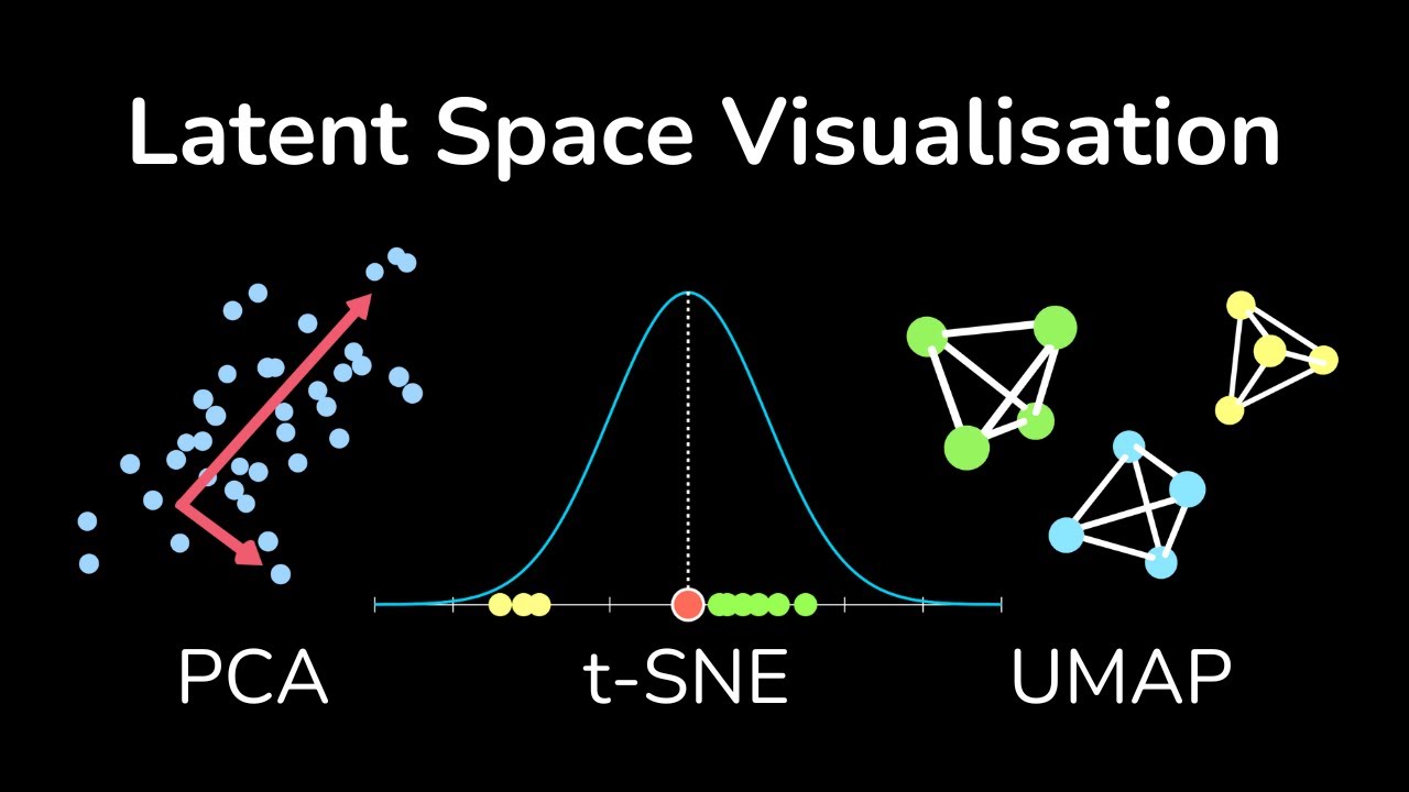
Latent Space Visualization: PCA, t-SNE, UMAP
References
- Pearson, K. "On Lines and Planes of Closest Fit to Systems of Points in Space." The London, Edinburgh, and Dublin Philosophical Magazine and Journal of Science, Series 6, 2, no. 11 (1901): 559–572 — PCA as the best-fitting line and plane. DOI
- Hotelling, H. "Analysis of a Complex of Statistical Variables into Principal Components." Journal of Educational Psychology 24, no. 6 (1933): 417–441 — PCA as maximum variance, and the name. DOI
- Beyer, K.; Goldstein, J.; Ramakrishnan, R.; Shaft, U. "When Is 'Nearest Neighbor' Meaningful?" Database Theory — ICDT'99, LNCS 1540, Springer (1999): 217–235 — distance concentration in high dimensions. DOI
- Tenenbaum, J. B.; de Silva, V.; Langford, J. C. "A Global Geometric Framework for Nonlinear Dimensionality Reduction." Science 290, no. 5500 (2000): 2319–2323 — Isomap and the Swiss roll. DOI
- Venna, J.; Kaski, S. "Neighborhood Preservation in Nonlinear Projection Methods: An Experimental Study." Artificial Neural Networks — ICANN 2001, LNCS 2130, Springer (2001): 485–491 — the trustworthiness measure. DOI
- van der Maaten, L.; Hinton, G. "Visualizing Data using t-SNE." Journal of Machine Learning Research 9 (2008): 2579–2605. full text
- Wattenberg, M.; Viégas, F.; Johnson, I. "How to Use t-SNE Effectively." Distill (2016) — interactive catalog of what t-SNE plots do and do not show. DOI
- McInnes, L.; Healy, J.; Melville, J. "UMAP: Uniform Manifold Approximation and Projection for Dimension Reduction." arXiv (2018). arXiv:1802.03426
- Kobak, D.; Berens, P. "The Art of Using t-SNE for Single-Cell Transcriptomics." Nature Communications 10 (2019): 5416 — PCA initialization, perplexity and reproducible t-SNE maps. DOI
- Hull, J. J. "A Database for Handwritten Text Recognition Research." IEEE Transactions on Pattern Analysis and Machine Intelligence 16, no. 5 (1994): 550–554 — the USPS digits of the lab (OpenML 41082). DOI