Why reduce? The reason picks the method
| goal | what the method must deliver | typical method |
|---|---|---|
| see the data | a 2-D or 3-D picture; local fidelity is enough | t-SNE, UMAP |
| compress / speed up | reconstruction, and a transform for new data | PCA |
| remove noise / collinearity | drop the low-variance directions | PCA |
| feed another model | an honest fit/transform, no leakage | PCA (almost always) |
The path of this lesson
- The cursedistances lose their contrast
- Linear: PCAby hand, scaling, choosing k, reconstruction
- Nonlinear: t-SNE, UMAPwhere PCA runs out, what a map does not tell
- Compare and chooseside by side, forbidden statements, the goal decides
The curse of dimensionality
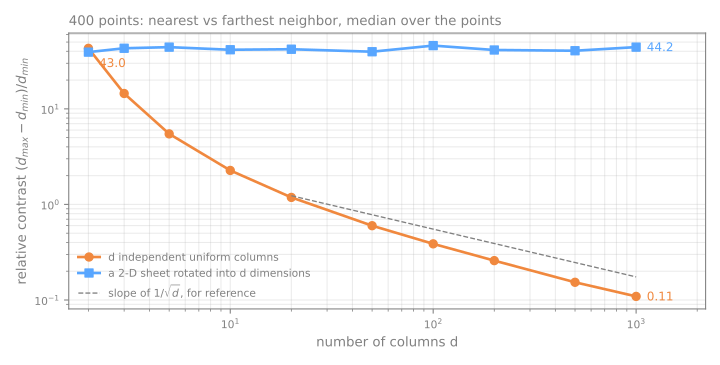
Take random points in the unit cube and look at the distances between them.
Simulator: distances in \(d\) dimensions
Push \(d\) up and watch the histogram of distances collapse into a spike.
Relative contrast, measured
\((d_{\max} - d_{\min})/d_{\min}\), median over 400 points:
| \(d\) | noise columns | 2-D sheet in \(d\) columns |
|---|---|---|
| 2 | 42.97 | 39.23 |
| 10 | 2.27 | 41.51 |
| 100 | 0.39 | 45.88 |
| 1000 | 0.11 | 44.24 |
PCA: the directions of maximum variance
Centered data \(X\); covariance \(C = \frac{1}{n-1} X^\top X\).
\[ w_1 = \arg\max_{\|w\|=1} w^\top C\, w \qquad \text{EVR}_k = \frac{\lambda_k}{\sum_j \lambda_j} \]- \(w_1\) is the eigenvector of \(C\) with the largest eigenvalue \(\lambda_1\); the next is orthogonal to it, and so on.
- \(\lambda_k\) is the variance captured by component \(k\); EVR is the explained variance ratio.
PCA by hand: center, then covariance
| \(x\) | \(y\) | \(x-\bar x\) | \(y-\bar y\) |
|---|---|---|---|
| 2 | 4 | −3 | −1 |
| 4 | 2 | −1 | −3 |
| 5 | 5 | 0 | 0 |
| 6 | 8 | 1 | 3 |
| 8 | 6 | 3 | 1 |
1. The mean is \((5, 5)\).
2. With \(n - 1 = 4\): variance of \(x\) = \((9+1+0+1+9)/4 = 5\), the same for \(y\); covariance = \((3+3+0+3+3)/4 = 3\).
\[ C = \begin{pmatrix} 5 & 3 \\ 3 & 5 \end{pmatrix} \]PCA by hand: eigenvalues and directions
3. \(\det(C - \lambda I) = 0\):
\[ \lambda^2 - \underbrace{10}_{\text{trace}}\lambda + \underbrace{16}_{\det} = 0 \quad\Rightarrow\quad \lambda_1 = 8,\ \lambda_2 = 2 \]Check: \(8 + 2 = 10 = 5 + 5\), the total variance. So \(\text{EVR}_1 = 8/10 = 80\%\).
4. \((C - 8I)w = 0\) gives \(w_1 = w_2\): PC1, the first principal component, = \((1,1)/\sqrt{2}\), the 45° diagonal. PC2 = \((-1,1)/\sqrt{2}\).
PCA by hand: project and reconstruct
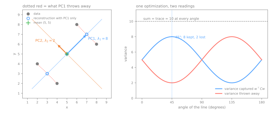
5. Scores on PC1: \(-2\sqrt2, -2\sqrt2, 0, 2\sqrt2, 2\sqrt2\). Their variance is 8: the eigenvalue.
6. Keep PC1 only: \((2,4)\) and \((4,2)\) become \((3,3)\); squared error \(4 \times 2 = 8\), and \(8/4 = 2 = \lambda_2\).
The same in code, and two details
np.linalg.eighreturns the eigenvalues in ascending order: the best direction comes last. Forgetting to sort is a silent bug.- scikit-learn's
PCAagrees:explained_variance_ratio_= [0.8, 0.2]. - Signs are arbitrary: \(w\) and \(-w\) are both eigenvectors; read relative signs inside a component, never the absolute sign.
- New points need no refitting: \((9,7) - (5,5) = (4,2)\), and \((4+2)/\sqrt2 = 4.243\), exactly
pca.transform.
Simulator: rotate the line
Predict. As you turn the line, at how many angles does the captured variance peak? Then press find PC1.
The scaling question
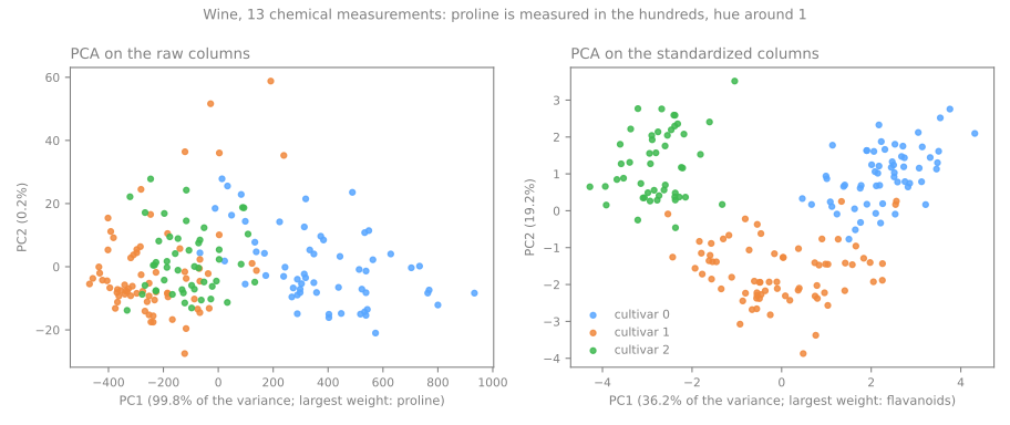
Wine: 13 chemical measurements of 178 wines. Proline has standard deviation 314.9; hue is around 1.
| variance ratio of PC1, PC2, PC3 | largest weights in PC1 | |
|---|---|---|
| raw columns | 0.998, 0.002, 0.0 | proline 1.000 |
| standardized | 0.362, 0.192, 0.111 | flavanoids, total phenols, OD280 |
99.8% is not a discovery about wine: it is a measurement of the unit of proline.
Does it matter downstream?
A k-NN classifier (k-nearest neighbors) that sees only the two PCA coordinates, scored on 30% of the wines:
raw → PCA(2)
scaled → PCA(2)
Choosing \(k\): 64 pixels of digits
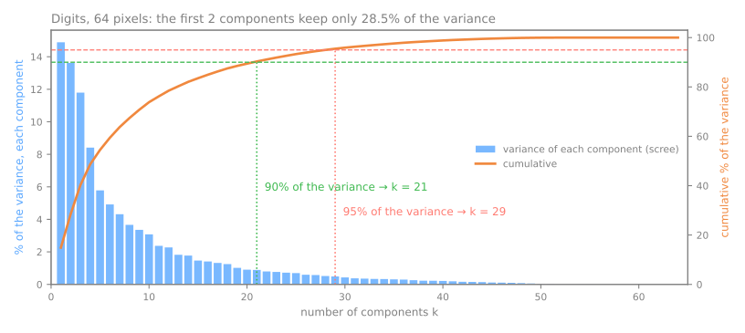
- 2 components keep 28.5%: a 2-D PCA picture shows less than a third.
- 90% needs 21, 95% needs 29, 99% needs 41.
PCA(n_components=0.95)searches for you.
Criteria, most trusted first: a cumulative-variance threshold; the elbow (subjective); downstream performance on validation data; Kaiser's rule (fragile).
Reconstruction: what \(k\) components keep
| \(k\) | kept | error / image | discarded \(\lambda\) |
|---|---|---|---|
| 1 | 14.9% | 1022.6 | 1022.6 |
| 2 | 28.5% | 858.9 | 858.9 |
| 10 | 73.8% | 314.5 | 314.5 |
| 29 | 95.5% | 54.3 | 54.3 |
| 64 | 100.0% | 0.0 | 0.0 |
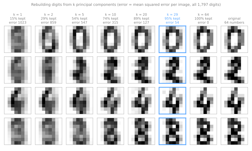
Simulator: rebuild an image from \(k\) components
Predict. How few components does your eye need before it stops objecting?
Five PCA pitfalls
- Not standardizing columns in different units: you measure the unit.
- Fitting before the split: the test rows shape the projection.
- Assuming high-variance components are the useful ones for prediction: PCA never looks at the target.
- Reading components as real-world factors: signs are arbitrary, and close eigenvalues allow any rotation.
- PCA on one-hot columns without thinking: a 0/1 column has variance \(p(1-p)\), so rare categories vanish.
Where PCA runs out
PCA can only rotate and project: it moves the axes, never bends them.
The Swiss roll: a 2-D sheet rolled up in 3-D. Two points on opposite layers are close in straight line, far along the sheet.
Simulator: the Swiss roll
Tick mark a pair of points, then project with PCA. Euclidean distance goes through the empty space; geodesic distance walks along the sheet.
A score for a map: trustworthiness
Of the \(k\) nearest neighbors of each point on the map, how many were really neighbors? 1 = no intruders; a random map ≈ 0.5.
PCA on the roll
Isomap
t-SNE in three steps
- Neighborhoods in the data: a Gaussian around each point, its width tuned per point to a perplexity ("effective number of neighbors"). Dense and sparse regions get different widths.
- Neighborhoods on the map: a Student-t, with heavy tails, to make room in 2-D. Side effect: distances between groups stop meaning anything.
- Minimize the Kullback–Leibler divergence \(\text{KL}(P\,\|\,Q)\): true neighbors drawn far apart are expensive; far points drawn close are almost free.
Simulator: real t-SNE, in your browser
Try. Run it on uniform noise; change only the perplexity; compare groups of different sizes.
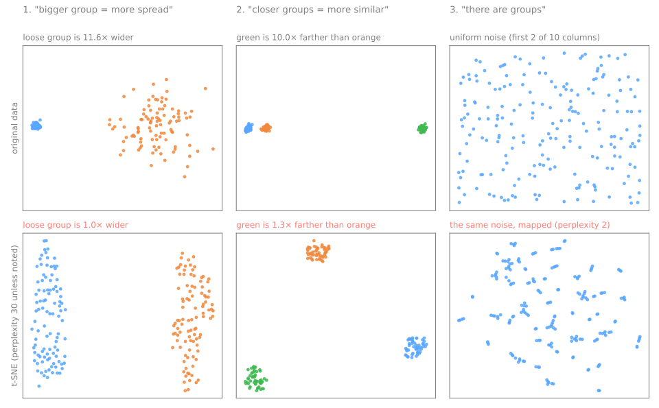
What a t-SNE map does not tell you, measured
| data | t-SNE | |
|---|---|---|
| how many times wider the loose group is | 11.6 | 1.0 |
| how many times farther the far group is | 10.0 | 1.3 |
Perplexity changes the picture
| perplexity | distance ratio |
|---|---|
| 2 | 3.3 |
| 5 | 1.1 |
| 30 | 1.3 |
| 100 | 7.0 |
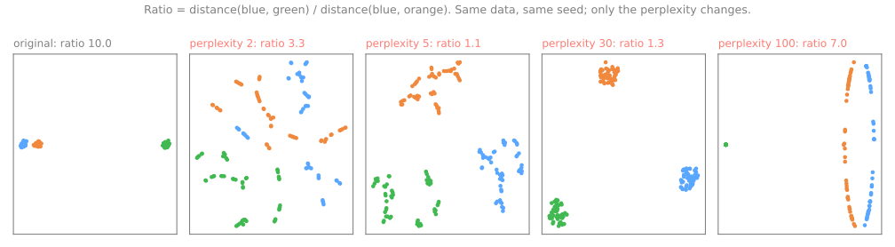
At 2 and 5 every group shatters into fragments that do not exist. There is no "right" perplexity: usually 5–50, smaller than the smallest group you want to see.
t-SNE finds groups in noise
| best silhouette | trustworthiness | |
|---|---|---|
| 10-column noise itself | 0.09 | |
| its t-SNE map, perplexity 30 | 0.38 | 0.86 |
| 4-column noise, t-SNE map | 0.43 | 0.97 |
- The map looks four to five times more "clustered" than the data.
- A good trustworthiness does not certify the structure: noise has local neighborhoods too.
Axes and runs
The loss depends only on distances on the map: rotating or mirroring it changes nothing. Digits, random initialization, seed 0 against seeds 1, 2, 3:
horizontal axes |correlation|
1.0, 0.0, 0.1
seed 2 came out rotated a quarter turn
neighbors in common
90%, 94%, 85%
on noise: only 47%
init="pca" (the default) makes the map reproducible, which is not the same as stable.UMAP: a graph of neighbors
- Each point is linked to its
n_neighborsnearest points, with fuzzy weights; no point is left isolated. - The weights are merged into one symmetric fuzzy graph.
- A 2-D layout by stochastic gradient descent: edges attract, sampled random points repel; an explicit penalty for putting distant points close.
n_neighbors (15)
the scale at which Euclidean distance is trusted: local detail against global structure
min_dist (0.1)
how tightly points are packed: cosmetic, not structural
transform: fit on 80% of the digits, 96.4% of the new images land next to an image of the same digit.PCA vs t-SNE, side by side
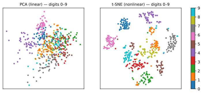
Trustworthiness on the digits, for neighborhoods of size \(k\):
| k=5 | k=30 | k=100 | |
|---|---|---|---|
| PCA | 0.830 | 0.830 | 0.835 |
| t-SNE | 0.995 | 0.985 | 0.963 |
| UMAP | 0.989 | 0.983 | 0.961 |
t-SNE splits the 1s into islands and cuts the roll into pieces. No winner until you say which scale you care about.
The comparison table
| PCA | t-SNE | UMAP | |
|---|---|---|---|
| nature | linear, deterministic | nonlinear, stochastic | nonlinear, stochastic |
| local structure | weak | very good | very good |
| global structure | best (variance) | weak | moderate |
| group distances / sizes | yes / yes | no / no | partly / no |
transform new data | yes, trivial | no | yes |
| key hyperparameters | \(k\), scaling | perplexity, iterations | n_neighbors, min_dist |
| preprocessing for a model | recommended | not advised | with care, in the pipeline |
Seven forbidden statements about a t-SNE/UMAP plot
- "This group is bigger, so it varies more." (11.6× in the data, 1.0× on the map)
- "These two groups are close, so they are similar." (10× in the data, 1.3× on the map)
- "There are 5 groups in the data." There are 5 blobs on the plot.
- "The horizontal axis represents X." Rotation and reflection are arbitrary.
- "I ran it once and saw this." Vary seed, perplexity, sample.
- "I used the 2 t-SNE components as features." No honest
transform. - "I ran t-SNE on the whole dataset and then split." Leakage.
Choosing a method
- It will feed another model, or you need reversibility → PCA. Full stop.
- You want to look at the data to form hypotheses, up to a few thousand points → t-SNE or UMAP, with PCA first if \(d\) is large.
- \(n\) is large, or you must project new data onto the same map → UMAP.
- You need reliable global structure in one picture → none is ideal: show PCA and t-SNE/UMAP.
Summary
- Distances concentrate when columns carry no information; ask how many directions vary.
- PCA = eigenvectors of the covariance; \(\lambda\) is the variance kept; the error is the variance thrown away.
- Standardize columns in different units; fit PCA inside the pipeline.
- t-SNE and UMAP keep local neighborhoods; sizes, distances and axes on their maps mean nothing.
- Only UMAP and PCA can place new points.
Mapping handwritten zip codes
- USPS: 9,298 handwritten digits from envelopes, 16×16 = 256 columns.
- Download the lab notebook and open it in Jupyter or Colab; in Colab, run
!pip install umap-learnfirst.
1. load a sample
2. how many dimensions does USPS really have?
3. compression and reconstruction error
4. three maps of the same images
5. score the maps with trustworthiness
6. perplexity
7. UMAP: n_neighbors, min_dist, new images
8. test a forbidden statement