Exploratory Data Analysis
Exploratory Data Analysis (EDA) is the disciplined practice of looking at your data before modeling it. The term was coined by John Tukey (1977), who argued that data analysis should begin with open-minded exploration — plots, summaries, anomalies — rather than jumping straight to hypothesis tests or models.
Tukey (1977)
The greatest value of a picture is when it forces us to notice what we never expected to see.
EDA is step 2 of the ML workflow, and skipping it is the most common source of silent failure: models trained on misunderstood data produce confident nonsense. This lesson is your first real contact with a dataset, so there are no models yet. The goal is to leave with a short list of facts about the data, of problems to fix before modeling, and of questions worth testing later.
The running example is California Housing: 20,640 districts from the 1990 US census (Pace & Barry, 1997), the same file used in the class handout. Every number quoted below is printed by the code next to it, and every figure is produced by a short script that sits next to this page. Where a statistic can be computed with a calculator, we do it by hand first on a tiny column, then let pandas confirm it.
The lesson follows one path in five stages, drawn below: 1. meet the data, its size, what one row is and the type of each column; 2. summarize by hand, the center, spread and shape of one column; 3. look at the shape, because a few numbers hide what a plot shows; 4. two variables, how pairs of columns move together and when a third one fools you; 5. problems to fix, missing values, outliers and caps, found on the training part only. Each stage links to its section, and in the slides a strip at the bottom shows which stage you are in.
- Meet the datasize, what one row is, column types, describe()
- Summarize by handcenter, spread and shape of one column
- Look at the shapeAnscombe, histograms, density, log scale
- Two variablesscatter, Pearson and Spearman, Simpson, groups
- Problems to fixmissing values, outliers, caps; split before exploring
Slides
Click the slides and use the ← → arrows to navigate; F goes full screen and Esc shows every slide. Open the slides in a new tab
First contact with a dataset
Stage 1. Load the file and ask the three questions you should ask of any table: how big is it, what does one row look like, and what type is each column?
import numpy as np
import pandas as pd

pd.set_option('display.width', 120)       # wider printed tables
URL = "https://raw.githubusercontent.com/hsandmann/biblio/refs/heads/main/ml/aula02/housing.csv"
df = pd.read_csv(URL)
print(df.shape)
print(df.head(3).T)                       # transposed: one line per column
(20640, 10)
                           0         1         2
longitude            -122.23   -122.22   -122.24
latitude               37.88     37.86     37.85
housing_median_age      41.0      21.0      52.0
total_rooms            880.0    7099.0    1467.0
total_bedrooms         129.0    1106.0     190.0
population             322.0    2401.0     496.0
households             126.0    1138.0     177.0
median_income         8.3252    8.3014    7.2574
median_house_value  452600.0  358500.0  352100.0
ocean_proximity     NEAR BAY  NEAR BAY  NEAR BAY
20,640 rows and 10 columns. Transposing head() puts one column per line, which is easier to read when there are many columns. The types come next, together with the frequencies of the only text column:
longitude             float64
latitude              float64
housing_median_age    float64
total_rooms           float64
total_bedrooms        float64
population            float64
households            float64
median_income         float64
median_house_value    float64
ocean_proximity           str
dtype: object
ocean_proximity
<1H OCEAN     9136
INLAND        6551
NEAR OCEAN    2658
NEAR BAY      2290
ISLAND           5
Name: count, dtype: int64
Nine numeric columns and one text column (recent pandas prints str for text; older versions print object). ocean_proximity has five levels, and one of them, ISLAND, has only 5 rows. Keep that in mind: a category with 5 rows behaves differently from one with 9,136.
What is one row?
The most common mistake with this dataset is conceptual. A row is not a house. It is a census block group, a small area of typically 600 to 3,000 people. We call it a district. Every column describes the district as a whole:
| Column | Meaning | Unit and type |
|---|---|---|
longitude, latitude | location of the district | degrees; numeric |
housing_median_age | median age of the houses | years; numeric, capped at 52 |
total_rooms, total_bedrooms | rooms and bedrooms summed over all the homes | counts; numeric |
population, households | residents and occupied homes | counts; numeric |
median_income | median household income | tens of thousands of US$ (3.87 = US$ 38,700); capped at 15.0001 |
median_house_value | median home value — the target | 1990 US$; capped at 500,001 |
ocean_proximity | distance to the ocean | categorical, 5 levels |
So total_rooms = 39,320 is not a mansion: it is a very populous district. Counts like total_rooms measure the size of the district and only become comparable across districts when divided by something (rooms per household). We will come back to this.
describe() gives the first numeric summary of every column at once:
                      count      mean       50%      min       max
longitude           20640.0    -119.6    -118.5   -124.4    -114.3
latitude            20640.0      35.6      34.3     32.5      42.0
housing_median_age  20640.0      28.6      29.0      1.0      52.0
total_rooms         20640.0    2635.8    2127.0      2.0   39320.0
total_bedrooms      20433.0     537.9     435.0      1.0    6445.0
population          20640.0    1425.5    1166.0      3.0   35682.0
households          20640.0     499.5     409.0      1.0    6082.0
median_income       20640.0       3.9       3.5      0.5      15.0
median_house_value  20640.0  206855.8  179700.0  14999.0  500001.0
Read it line by line, looking for anything surprising:
- count is 20,433 for
total_bedroomsand 20,640 elsewhere: 207 values are missing; - mean vs median (
50%): for the four counts, the mean is well above the median (2,635.8 against 2,127.0 rooms). A few very large districts pull the mean up — a long right tail; - min and max: a district with 3 inhabitants, another with 35,682; and three maxima that look suspiciously round: 52, 15.0 (15.0001 before rounding) and 500,001. These are the caps of the table above, and they get their own section.
The rest of this lesson explains how to read each of these clues properly.
Summary statistics, by hand first
Stage 2. Take a tiny column: the monthly salaries, in R$ thousand, of the nine people in a small office. Eight employees and the owner.
The center: mean and median
The mean adds everything and divides by \(n\):
The median sorts the values and takes the one in the middle: the 5th of 9, which is 3. Now remove the owner and recompute: the mean of the other eight is \(28/8 = 3.5\), and their median is 3.
print(f"all nine:     mean {salaries.mean():.2f}   median {salaries.median():.2f}")
print(f"without 26:   mean {salaries[:-1].mean():.2f}   median {salaries[:-1].median():.2f}")
One person moved the mean from 3.5 to 6. The median did not move. A "typical salary" of 6 describes nobody in this office: seven of the nine people earn less than that (and one earns exactly 6). This is the general rule:
- the mean is pulled toward a long tail, because every value counts in proportion to its size;
- the median only counts positions, so it ignores how far the extreme values are;
- mean well above median is the signature of a long right tail (income, prices, city sizes); mean below median, of a long left tail.
In California housing, total_rooms has mean 2,635.8 and median 2,127.0: the same signature.
The spread: standard deviation, quantiles and IQR
The standard deviation is the typical distance from the mean:
By hand, with \(\bar{x} = 6\):
| \(x_i\) | 2 | 2 | 3 | 3 | 3 | 4 | 5 | 6 | 26 | sum |
|---|---|---|---|---|---|---|---|---|---|---|
| \(x_i - \bar{x}\) | −4 | −4 | −3 | −3 | −3 | −2 | −1 | 0 | 20 | 0 |
| \((x_i - \bar{x})^2\) | 16 | 16 | 9 | 9 | 9 | 4 | 1 | 0 | 400 | 464 |
\(s^2 = 464 / 8 = 58\), so \(s = \sqrt{58} = 7.62\). The owner alone contributes 400 of the 464: like the mean, the standard deviation is dominated by extreme values. (Dividing by \(n - 1 = 8\) instead of \(n\) is the usual sample correction; pandas does it by default, NumPy's np.std does not.)
Quantiles are the robust alternative. The quantile \(q_p\) is the value below which a fraction \(p\) of the data lies. pandas finds it at position \(p\,(n-1)\) of the sorted list, counting from 0: with \(n = 9\), the first quartile \(Q_1\) (\(p = 0.25\)) is at position 2, the median at 4, the third quartile \(Q_3\) at 6. In the sorted list 2 2 3 3 3 4 5 6 26 those are 3, 3 and 5. The interquartile range \(\text{IQR} = Q_3 - Q_1 = 2\) is the width of the middle half of the data, and the owner does not affect it at all.
print(f"std {salaries.std():.2f}")
print(salaries.quantile([0.25, 0.50, 0.75]))
print(salaries.describe().round(2))
std 7.62
0.25    3.0
0.50    3.0
0.75    5.0
dtype: float64
count     9.00
mean      6.00
std       7.62
min       2.00
25%       3.00
50%       3.00
75%       5.00
max      26.00
dtype: float64
pandas confirms the hand computation: \(s = 7.62\), \(Q_1 = 3\), median 3, \(Q_3 = 5\). describe() is simply all of these in one call. (When \(p\,(n-1)\) is not a whole number, pandas interpolates linearly between the two neighbors; other tools use slightly different conventions, so quartiles from different software can differ a little on small samples.)
Shape: skewness
Skewness turns "which side is the tail on?" into a number: the average of the cubed standardized deviations,
where \(\sigma\) is the standard deviation computed with \(n\) in the denominator. The cube keeps the sign, so values far above the mean push it up and values far below push it down; a symmetric distribution gives 0.
z = (salaries - salaries.mean()) / salaries.std(ddof=0)
n = len(salaries)
print(f"by the formula: {(z ** 3).mean():.2f}")
print(f"pandas .skew(): {salaries.skew():.2f}  (formula x {np.sqrt(n * (n - 1)) / (n - 2):.2f})")
The owner makes the salaries strongly right-skewed. pandas prints a larger number because it multiplies by the small-sample correction \(\sqrt{n(n-1)}/(n-2)\), which is 1.21 for \(n = 9\) and close to 1 for large \(n\). A common reading: \(|\text{skew}| < 0.5\) roughly symmetric, 0.5–1 moderate, above 1 strong. We will measure it on the housing columns in the distributions section.
Why statistics are not enough
Stage 3. Summary statistics compress a column into a few numbers, and compression throws information away. The four datasets below — Anscombe's quartet (Anscombe, 1973) — were built to make that point:
x123 = [10, 8, 13, 9, 11, 14, 6, 4, 12, 7, 5]
quartet = {
    'I':   (x123, [8.04, 6.95, 7.58, 8.81, 8.33, 9.96, 7.24, 4.26, 10.84, 4.82, 5.68]),
    'II':  (x123, [9.14, 8.14, 8.74, 8.77, 9.26, 8.10, 6.13, 3.10, 9.13, 7.26, 4.74]),
    'III': (x123, [7.46, 6.77, 12.74, 7.11, 7.81, 8.84, 6.08, 5.39, 8.15, 6.42, 5.73]),
    'IV':  ([8, 8, 8, 8, 8, 8, 8, 19, 8, 8, 8],
            [6.58, 5.76, 7.71, 8.84, 8.47, 7.04, 5.25, 12.50, 5.56, 7.91, 6.89]),
}
rows = {}
for name, (x, y) in quartet.items():
    x, y = np.array(x, float), np.array(y)
    slope, intercept = np.polyfit(x, y, 1)             # least-squares line
    rows[name] = {'mean x': x.mean(), 'mean y': y.mean(), 'var x': x.var(ddof=1),
                  'var y': y.var(ddof=1), 'r': np.corrcoef(x, y)[0, 1],
                  'intercept': intercept, 'slope': slope}
print(pd.DataFrame(rows).T.round(2))
     mean x  mean y  var x  var y     r  intercept  slope
I       9.0     7.5   11.0   4.13  0.82        3.0    0.5
II      9.0     7.5   11.0   4.13  0.82        3.0    0.5
III     9.0     7.5   11.0   4.12  0.82        3.0    0.5
IV      9.0     7.5   11.0   4.12  0.82        3.0    0.5
Means, variances, correlation and least-squares line agree to two decimals (the variance of \(y\) differs by 0.01). Only a plot reveals how different the four datasets are (figure script):
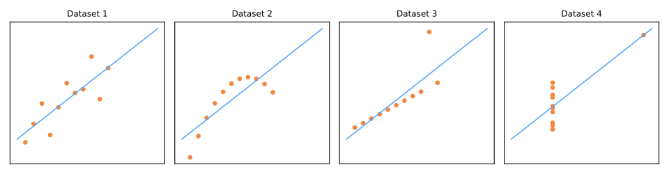
Dataset II is a smooth curve, so a straight line is the wrong summary. Dataset III is a perfect line except for one outlier, which tilts the fitted line. In dataset IV, a single point creates the entire correlation: remove it and \(x\) no longer varies at all.
Anscombe's datasets have 11 points each. Matejka & Fitzmaurice (2017) pushed the idea to its limit: starting from a drawing of a dinosaur, they moved points a tiny step at a time toward a target shape, keeping only the moves that left the statistics unchanged to two decimals. Four of their thirteen datasets (figure script):
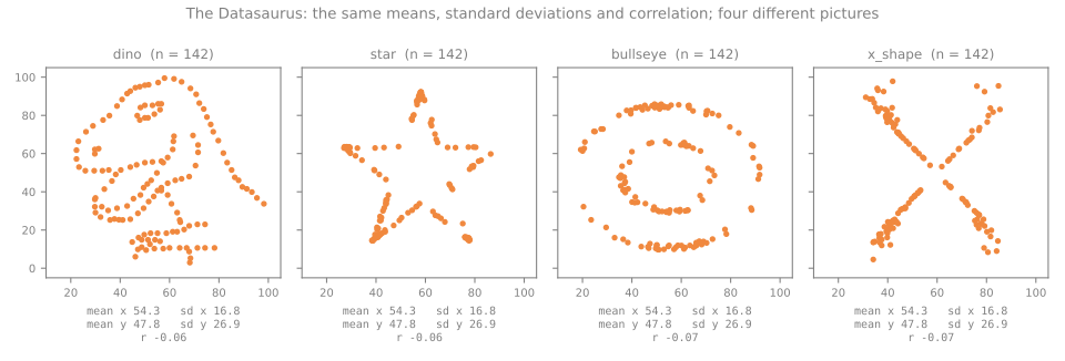
The same means (54.3 and 47.8), the same standard deviations (16.8 and 26.9), and the same correlation (−0.06 to −0.07) describe a dinosaur, a star, a bullseye and an X. Always plot.
Distributions
Histograms: the bin width changes the story
A histogram cuts the range of a column into bins and counts the values in each. It is the first plot to make for every numeric column, because it is the only simple one that shows the shape: how many peaks, where the gaps are, and whether there are artificial spikes. It has one knob, the number of bins, and the knob matters. The same target column, drawn with 10 and with 50 bins:
v = df['median_house_value']
for bins in [10, 50]:
    counts, edges = np.histogram(v, bins=bins)
    print(f"{bins} bins of width {edges[1] - edges[0]:8,.0f}: last bin {counts[-1]:5d}, "
          f"its neighbor {counts[-2]:4d}, tallest bin {counts.max():5d}")
print("Freedman-Diaconis rule:", len(np.histogram_bin_edges(v, bins='fd')) - 1, "bins")
print(v.value_counts().head(3))                      # the most repeated values
10 bins of width   48,500: last bin  1243, its neighbor  479, tallest bin  4099
50 bins of width    9,700: last bin  1030, its neighbor   47, tallest bin  1030
Freedman-Diaconis rule: 46 bins
median_house_value
500001.0    965
137500.0    122
162500.0    117
Name: count, dtype: int64
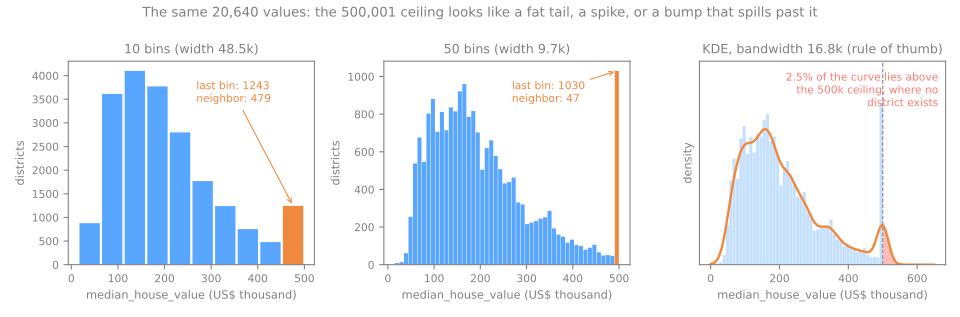
With 10 bins, the last bar (1,243 districts) is a modest bump, 30% of the tallest bar: it reads like a slightly fat tail. With 50 bins it becomes the tallest bar of the whole histogram (1,030), 22 times its neighbor (47). No natural process piles a thousand districts onto the very edge of the range. The last line of the output names the culprit: the most frequent value of the column is exactly 500,001, shared by 965 districts — the cap. Too few bins can hide the most important defect of the dataset. Practical rules:
- try more than one bin count; start with 30–50 for a few thousand rows or more;
bins='fd'(Freedman–Diaconis) picks the width from the IQR and \(n\) and is robust to long tails; here it chooses 46 bins, close to our 50;- for a discrete column with few values (an age in whole years), use one bin per value.
Kernel density estimates
A kernel density estimate (KDE) replaces each value by a small bell curve (a Gaussian "kernel") and adds them up, giving a smooth curve instead of bars. Its knob is the width of the bell, the bandwidth; the rule of thumb \(h = 1.06\,s\,n^{-1/5}\) gives 16.8 thousand dollars here. The right panel of the figure shows both sides of smoothing. The curve is pleasant to read and does not depend on where bins start. But it turns the spike into a gentle bump, and because each bell extends on both sides of its value, 2.5% of the curve lies above 500,001, where not a single district exists. A KDE can invent values outside the possible range (negative prices, ages above the cap). Use it to compare shapes between groups, never as the only view of a column.
Skewed features and the log scale
Four of the housing columns are counts with a long right tail, like the salaries above. The logarithm is the standard remedy: it compresses large values much more than small ones (\(\log 10 = 2.3\), \(\log 10{,}000 = 9.2\)), so a long right tail is pulled in. Measure the skewness before and after:
for col in ['median_income', 'population']:
    x = df[col]
    print(f"{col:14s} skew {x.skew():5.2f} -> after log {np.log(x).skew():5.2f}   "
          f"(mean {x.mean():,.1f}, median {x.median():,.1f})")
print("districts with fewer than 50 people:", (df['population'] < 50).sum(),
      "· smallest:", df['population'].min())
small_out = np.log(df.loc[df['population'] >= 200, 'population'])
print(f"log(population) without districts under 200 people: skew {small_out.skew():.2f}")
median_income  skew  1.65 -> after log -0.15   (mean 3.9, median 3.5)
population     skew  4.94 -> after log -1.07   (mean 1,425.5, median 1,166.0)
districts with fewer than 50 people: 104 · smallest: 3.0
log(population) without districts under 200 people: skew 0.12
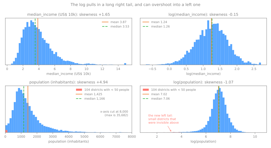
For median_income the log works as advertised: skewness 1.65 becomes −0.15, and mean and median almost coincide. For population it overshoots: +4.94 becomes −1.07, a long left tail. The culprits are the 104 districts with fewer than 50 inhabitants (the smallest has 3). On the original scale they sit invisibly near zero; the log stretches exactly that region (\(\log 3 = 1.1\) against a median of \(\log 1{,}166 = 7.1\)), and they become the new extremes. Excluding districts under 200 people, the log of population has skewness 0.12. The lesson is general: a transformation is a hypothesis, not a recipe — apply it, then measure again. The preprocessing lesson covers the transformations themselves (log1p for columns with zeros, Box-Cox, Yeo-Johnson) and when a model needs them.
Relationships between two variables
Scatter plots and overplotting
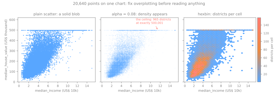
Stage 4. The scatter plot is the basic view of two numeric columns. With 20,640 points, though, it has a problem of its own: points are drawn on top of each other, and a dense region looks exactly like a moderately dense one — a solid blob. Three views of income against house value (figure script):
- Transparency (
alpha=0.08): each point is nearly invisible alone, so the color builds up only where many points overlap. The dense core appears, and so do details that the solid blob hid: a horizontal line of 965 districts at the 500,001 ceiling, and fainter lines at round values that repeat far more than their neighbors (137,500 appears 122 times and 162,500 appears 117 times, as the histogram code printed). - Hexbin (
plt.hexbin): cut the plane into hexagonal cells and color each by the number of points in it. It shows where the mass is (incomes of 2–5 and values of 100–250 thousand) at the cost of individual points. - What the picture says: value rises with income, roughly linearly up to an income of about 8, and the vertical spread grows with income — a model's errors will not be the same size everywhere.
Correlation: Pearson and Spearman
The Pearson correlation measures how close the points lie to a straight line:
The Spearman correlation \(\rho\) is Pearson computed on the ranks (1st, 2nd, ...) instead of the values. It measures whether \(y\) goes up whenever \(x\) goes up, in a straight line or not. By hand, on five points where \(y\) always increases but the last jump is huge:
| \(x\) | \(y\) | \(x - \bar{x}\) | \(y - \bar{y}\) | product | \((x - \bar{x})^2\) | \((y - \bar{y})^2\) | rank \(x\) | rank \(y\) |
|---|---|---|---|---|---|---|---|---|
| 1 | 1 | −2 | −5 | 10 | 4 | 25 | 1 | 1 |
| 2 | 2 | −1 | −4 | 4 | 1 | 16 | 2 | 2 |
| 3 | 3 | 0 | −3 | 0 | 0 | 9 | 3 | 3 |
| 4 | 4 | 1 | −2 | −2 | 1 | 4 | 4 | 4 |
| 5 | 20 | 2 | 14 | 28 | 4 | 196 | 5 | 5 |
| sum | 40 | 10 | 250 |
With \(\bar{x} = 3\) and \(\bar{y} = 6\): \(r = 40 / \sqrt{10 \times 250} = 40/50 = 0.8\). The ranks of \(x\) and \(y\) are identical, so Spearman is exactly 1.
pts = pd.DataFrame({'x': [1, 2, 3, 4, 5], 'y': [1, 2, 3, 4, 20]})
print(f"Pearson  {pts['x'].corr(pts['y']):.3f}")
print(f"Spearman {pts['x'].corr(pts['y'], method='spearman'):.3f}")
The relationship is perfectly monotonic, but not a straight line, and the far point dominates the sums: 28 of the 40 in the numerator come from it. Pearson says 0.8, Spearman says 1. Computing both and comparing them is a cheap diagnostic. On the housing data, against the target:
target = df['median_house_value']
cols = ['median_income', 'total_rooms', 'housing_median_age', 'households', 'population', 'latitude']
print(pd.DataFrame({'pearson': df[cols].corrwith(target),
                    'spearman': df[cols].corrwith(target, method='spearman')}).round(3))
                    pearson  spearman
median_income         0.688     0.677
total_rooms           0.134     0.206
housing_median_age    0.106     0.075
households            0.066     0.113
population           -0.025     0.004
latitude             -0.144    -0.166
median_incomeis the dominant feature: 0.688 and 0.677, almost equal, so the relationship is close to linear (as the scatter showed);- for
total_rooms, Spearman (0.206) is well above Pearson (0.134): a monotonic relationship distorted by the long tail of the counts; latitudehas \(r = -0.144\), which looks weak. It is not: in the lab the median value swings from 84,500 to 236,500 across one-degree bands of latitude, up and down twice. Both coefficients are near zero because the relationship is not monotonic, and neither Pearson nor Spearman can see that. \(r \approx 0\) means "no linear (or monotonic) association", never "no relationship".
The simulator puts both coefficients side by side on twenty points. Start with the monotone curve: the points never go down, so Spearman is exactly 1 while Pearson is not, as in the table. Then load with one outlier, or add one, and drag the red point even further away: watch which coefficient keeps moving.
Pearson squares distances, so a single far point can move it a lot. In the rank square the same point is just one rank among the others, and once it is first or last it has nowhere further to go. Spearman is robust to how far a point is, not to a point that reverses the order: drag a point to the bottom right corner and both coefficients fall.
Redundant features
Correlation between features matters too. When two columns are almost perfectly correlated, they carry nearly the same information:
size = ['total_rooms', 'total_bedrooms', 'population', 'households']
print(df[size].corr().round(2))

from sklearn.datasets import load_iris
iris = load_iris(as_frame=True).frame
print(f"iris, petal length vs petal width: r = "
      f"{iris['petal length (cm)'].corr(iris['petal width (cm)']):.3f}")
                total_rooms  total_bedrooms  population  households
total_rooms            1.00            0.93        0.86        0.92
total_bedrooms         0.93            1.00        0.88        0.98
population             0.86            0.88        1.00        0.91
households             0.92            0.98        0.91        1.00
iris, petal length vs petal width: r = 0.963
The four housing counts correlate at 0.86 to 0.98 with each other: all four measure how big the district is. In the iris dataset, petal length and petal width have \(r = 0.963\): knowing one, you almost know the other. Redundancy is not an error, but it is worth writing down. Linear models get unstable coefficients when features are this correlated (see the linear regression lesson), and dimensionality reduction exploits exactly this redundancy. For the housing counts there is a simpler fix, dividing by the size (rooms per household), which the lab tries in step 9.
Two rules of thumb for reading feature–target correlations:
- a feature suspiciously strongly associated with the target may be the target in disguise — a leaked column (see Data Leakage). If a model later turns out perfect, distrust it first;
- the correlation tables only cover numeric pairs. For the other pairs: categorical × numeric, compare the groups (next section, with the Kruskal–Wallis test if you need a number); categorical × categorical, a contingency table (
pd.crosstab) summarized by Cramér's V.
Correlation is not causation
Income and house value have \(r = 0.69\). That does not mean that raising a district's income raises its house prices, nor the reverse. Both respond to a third thing, the demand for living in that place (jobs, coast, schools). Ice cream sales and drownings correlate through summer. Whenever you read a correlation, ask which third variable could be driving both. The next paradox shows how far such a variable can mislead.
Simpson's paradox
A trend in the whole data can reverse inside every group. The classic real example compares two treatments for kidney stones (Charig et al., 1986):
stones = pd.DataFrame({'treatment': ['A', 'A', 'B', 'B'],
                       'stone':     ['small', 'large', 'small', 'large'],
                       'patients':  [87, 263, 270, 80],
                       'successes': [81, 192, 234, 55]})
stones['rate'] = stones['successes'] / stones['patients']
print(stones.pivot(index='stone', columns='treatment', values='rate').round(3))
overall = stones.groupby('treatment')[['successes', 'patients']].sum()
print((overall['successes'] / overall['patients']).round(3))
Treatment A wins for small stones (0.931 against 0.867) and for large stones (0.730 against 0.688), yet loses overall (0.780 against 0.826). Check it with a calculator: A's total is \((81 + 192)/(87 + 263) = 273/350\). The reason is in the patient counts: A was mostly given to large stones (263 of its 350 patients), which are harder to treat, and B mostly to small ones. The overall rate compares a group of hard cases with a group of easy ones. The size of the stone is a confounder: it influences both which treatment was chosen and whether it succeeded.
The same trap is in our data. Divide bedrooms by rooms to get the share of rooms that are bedrooms, and correlate it with house value, first overall and then within five income bands (quintiles of median_income):
d = df.dropna(subset=['total_bedrooms']).copy()
d['bedrooms_per_room'] = d['total_bedrooms'] / d['total_rooms']
print(f"overall: r = {d['bedrooms_per_room'].corr(d['median_house_value']):.3f}   "
      f"(and with income: r = {d['bedrooms_per_room'].corr(d['median_income']):.3f})")
band = pd.qcut(d['median_income'], 5, labels=['Q1', 'Q2', 'Q3', 'Q4', 'Q5'])
within = d.groupby(band, observed=True)[['bedrooms_per_room', 'median_house_value']].corr()
print(within.xs('bedrooms_per_room', level=1)['median_house_value'].round(3))
print(d[band == 'Q1'].groupby('ocean_proximity')['bedrooms_per_room'].median().round(3))
overall: r = -0.256   (and with income: r = -0.616)
median_income
Q1    0.418
Q2    0.368
Q3    0.335
Q4    0.237
Q5   -0.174
Name: median_house_value, dtype: float64
ocean_proximity
<1H OCEAN     0.279
INLAND        0.230
ISLAND        0.311
NEAR BAY      0.253
NEAR OCEAN    0.276
Name: bedrooms_per_room, dtype: float64
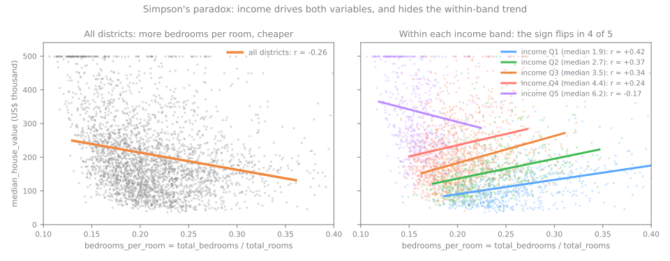
Overall, a higher share of bedrooms goes with cheaper districts (\(r = -0.256\)). Within each of the four lower income bands, it goes with more expensive ones (\(r\) from +0.24 to +0.42). Income drives both variables: richer districts have bigger homes with more non-bedroom rooms (\(r = -0.616\) between bedroom share and income) and higher prices. The pooled correlation mostly measures income. Within a band, the bedroom share tells a different story; for instance, inside the lowest band (the last lines of the output) the median share is 0.230 in INLAND districts and 0.253 to 0.311 on the coast, where prices are higher, so a high share partly means "near the coast". The top band keeps a negative slope, and the ceiling at 500,001, which flattens exactly the richest districts, is one suspect.
The lesson for EDA: a correlation in the pooled data is a hypothesis, not a finding. Before writing "X lowers the price", condition on the obvious third variables (income, location) and see whether the relationship survives.
Categorical vs numeric
To compare a numeric column across the levels of a categorical one, group by the category and summarize each group — always with its size \(n\) next to it:
summary = (df.groupby('ocean_proximity')['median_house_value']
             .agg(['count', 'mean', 'median', 'std'])
             .sort_values('median'))
print(summary.round(0))
print(df.groupby('ocean_proximity')['median_income'].median().round(2))
                 count      mean    median       std
ocean_proximity
INLAND            6551  124805.0  108500.0   70008.0
<1H OCEAN         9136  240084.0  214850.0  106124.0
NEAR OCEAN        2658  249434.0  229450.0  122477.0
NEAR BAY          2290  259212.0  233800.0  122819.0
ISLAND               5  380440.0  414700.0   80560.0
ocean_proximity
<1H OCEAN     3.88
INLAND        2.99
ISLAND        2.74
NEAR BAY      3.82
NEAR OCEAN    3.65
Name: median_income, dtype: float64
The picture is boxplots or violins, one per group, ordered by the median rather than alphabetically (figure script):
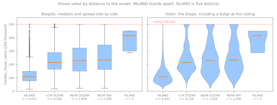
- A boxplot draws five numbers per group: the box goes from \(Q_1\) to \(Q_3\), the line inside is the median, the whiskers reach the most extreme values within 1.5 IQR of the box, and points beyond are drawn one by one. It is the best view for comparing many groups side by side. INLAND stands apart at once: median 108,500 against 214,850–233,800 for the three coastal groups, and a smaller spread (std 70,008 against 106,124–122,819).
- A violin draws the whole distribution of each group, mirrored. It shows what the box hides: the coastal groups bulge at the 500,001 ceiling, so the cap affects them much more than INLAND.
- ISLAND has 5 districts. Its median of 414,700 is the highest of the table and also the least reliable: 5 values next to thousands. Never report a group statistic without its \(n\).
Before concluding "being near the ocean raises the price", remember the previous section: INLAND districts also have lower incomes (median 2.99 against 3.65–3.88 on the coast), so part of the gap is income. Conditioning on income, as in the Simpson example, is how you would separate the two.
Missing values: the why matters
Stage 5. total_bedrooms has 207 missing values (1.00%). How many is the easy question. The important one is why, because the reason decides which fixes are safe. Rubin (1976) named the three possible mechanisms:
| Mechanism | Meaning | Example | Safe fixes |
|---|---|---|---|
| MCAR | missing completely at random: nothing predicts which values are missing | a sensor drops packets at random | drop the rows or impute |
| MAR | missing at random given other observed columns | younger users skip the income field, and age is recorded | impute using those columns |
| MNAR | missing not at random: the chance of missing depends on the missing value itself | high incomes are deliberately not reported | dangerous — needs domain reasoning |
The names are easy to confuse, so let us watch the three mechanisms act on data where we know the truth. Simulate 10,000 people whose income grows with age, then hide about 30% of the incomes in three different ways. Finally, fill each missing income with the mean of the people of the same age group (under 35 or not) — a simple imputation that uses an observed column.
rng = np.random.default_rng(0)
n = 10_000
age = rng.uniform(20, 65, n)
income = np.exp(0.5 + 0.03 * age + rng.normal(0, 0.4, n))     # R$ thousand per month
people = pd.DataFrame({'age': age, 'income': income})
young = people['age'] < 35
rich = people['income'] > people['income'].quantile(2 / 3)
p_missing = {'MCAR': np.full(n, 0.3),                # a coin, the same for everyone
             'MAR':  np.where(young, 0.6, 0.15),     # depends on age, which we see
             'MNAR': np.where(rich, 0.6, 0.15)}      # depends on income itself
print(f"true mean income: {people['income'].mean():.2f}")
for mech, p in p_missing.items():
    missing = rng.random(n) < p
    seen = people['income'].mask(missing)                             # NaN where missing
    by_age = seen.fillna(seen.groupby(young).transform('mean'))      # fill by age group
    print(f"{mech:4s}  missing {missing.mean():.1%}   mean of what we see {seen.mean():.2f}   "
          f"after filling by age group {by_age.mean():.2f}")
true mean income: 6.89
MCAR  missing 30.1%   mean of what we see 6.82   after filling by age group 6.85
MAR   missing 30.6%   mean of what we see 7.48   after filling by age group 6.88
MNAR  missing 30.2%   mean of what we see 5.91   after filling by age group 6.11
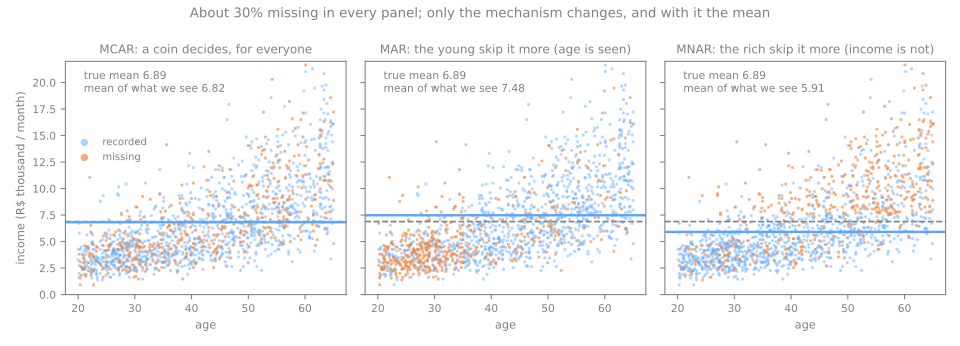
- MCAR: the incomes we see are a random sample of all incomes, so their mean (6.82) is close to the truth (6.89). Dropping the rows only loses precision.
- MAR: the young, who earn less, are missing more often, so the observed mean is too high (7.48). But within each age group the missing values are random, so filling by age group recovers the truth (6.88). The bias is real, and fixable with the columns you have.
- MNAR: the rich hide their income, so the observed mean is too low (5.91), and filling by age group barely helps (6.11): nothing observed tells you who is rich. No imputation fixes MNAR; you need knowledge about how the data was collected, or at least an honest statement of the bias.
Deleting all rows with any missing value is harmless only under MCAR. Two practical consequences for EDA:
- you can collect evidence against MCAR: compare the rows with and without the missing value on the other columns. If they differ (the missing rows are younger, poorer, more often INLAND), the data are not MCAR. The lab runs this check on
total_bedroomsin step 3; - you can never prove MCAR, and MNAR is undetectable from the data alone: the value that would reveal it is exactly the one that is missing. When in doubt, keep a flag column (
bedrooms_missing = df['total_bedrooms'].isna()) so that a model can use the fact that a value was missing.
Imputation strategies are covered in Data Preprocessing.
Outliers
Two rules, by hand
An outlier is a value far from the rest. Two rules put a number on "far". Back to the salaries:
- IQR rule (the boxplot's whiskers): flag values outside \([Q_1 - 1.5\,\text{IQR},\; Q_3 + 1.5\,\text{IQR}]\). With \(Q_1 = 3\), \(Q_3 = 5\), \(\text{IQR} = 2\): the fences are \(3 - 3 = 0\) and \(5 + 3 = 8\). The 26 is flagged.
- z-score rule: flag values more than 3 standard deviations from the mean, \(|z| = |x - \bar{x}|/s > 3\). For the owner, \(z = (26 - 6)/7.62 = 2.63\). Not flagged.
q1, q3 = salaries.quantile([0.25, 0.75])
iqr = q3 - q1
low, high = q1 - 1.5 * iqr, q3 + 1.5 * iqr
print(f"IQR fences [{low}, {high}] -> flagged: {salaries[(salaries < low) | (salaries > high)].tolist()}")
z = (salaries - salaries.mean()) / salaries.std()
print("z-scores:", z.round(2).tolist())
n = len(salaries)
print(f"largest |z| possible with n = {n}: {(n - 1) / np.sqrt(n):.2f}")
IQR fences [0.0, 8.0] -> flagged: [26]
z-scores: [-0.53, -0.53, -0.39, -0.39, -0.39, -0.26, -0.13, 0.0, 2.63]
largest |z| possible with n = 9: 2.67
The z-score rule misses the most extreme value of the column for two reasons. First, the outlier inflates the very statistics used to judge it: it pulls the mean from 3.5 to 6 and the standard deviation up to 7.62, so it looks less extreme (this is called masking). Second, in a sample of \(n\) values no z-score can exceed \((n-1)/\sqrt{n}\) (Shiffler, 1988): with \(n = 9\) that is 2.67, so "\(|z| > 3\)" cannot flag anything, whatever the data. Quartiles are not moved by the extreme value, which is why the IQR rule is the usual default in EDA.
On real data the two rules also disagree, by a lot:
def iqr_flags(s):
    q1, q3 = s.quantile([0.25, 0.75])
    return ((s < q1 - 1.5 * (q3 - q1)) | (s > q3 + 1.5 * (q3 - q1))).sum()

pop = df['population']
print("population, IQR rule:        ", iqr_flags(pop))
print("population, |z| > 3:         ", (((pop - pop.mean()) / pop.std()).abs() > 3).sum())
print("log(population), IQR rule:   ", iqr_flags(np.log(pop)))
On population the IQR rule flags 1,196 districts (5.8%) — not because they are wrong, but because the 1.5 IQR fences were designed with roughly symmetric data in mind, and a long right tail puts many ordinary large districts beyond them. On the log scale it flags 847. The rules only flag candidates; they do not tell you what to do.
Error or rare-but-real?
The decision requires looking at the flagged rows and knowing the domain:
- an
age = 190in a customer table is almost certainly a typing error (19? 90?) → fix it if the source allows, otherwise set it to missing; - the owner's salary of 26 is real → keep it, and prefer statistics and models that are robust to it (the median, quantiles, a log scale);
- in between are values that are correct but mean something different from the rest.
California housing has a striking case of the third kind. Divide population by households:
people_per_household = df['population'] / df['households']
print(f"median {people_per_household.median():.2f} people per household · "
      f"{(people_per_household > 10).sum()} districts above 10 · {(people_per_household > 50).sum()} above 50")
print(df.loc[people_per_household.idxmax(),
             ['population', 'households', 'total_rooms', 'latitude', 'longitude']])
median 2.82 people per household · 37 districts above 10 · 7 above 50
population     7460.00
households        6.00
total_rooms      19.00
latitude         38.32
longitude      -121.98
Name: 4407, dtype: float64
The typical district has 2.82 people per household. One has 7,460 people in 6 households with 19 rooms in total — 1,243 people per household. No family arrangement produces that. What does is an institution: a prison, a military base, a dormitory. The census counts those people in the district's population, but they do not live in "households". (Its coordinates are near Vacaville, a town with two state prisons, which is a hypothesis worth checking, not a fact.) The numbers are probably correct; what changes is their meaning. For the 37 districts above 10 people per household, the size columns describe a population that does not live in the houses whose value we want to predict. Reasonable decisions are to flag them with a column, or to remove them and state the rule and the count. The wrong decision is to discover them after a model fails.
Capped and censored values
Three of the columns stop at a suspiciously precise maximum:
for col, cap in [('median_house_value', 500001), ('housing_median_age', 52), ('median_income', 15.0001)]:
    at_cap = (df[col] >= cap).sum()
    print(f"{col:19s} cap {cap:>9,}: {at_cap:4d} districts ({at_cap / len(df):.1%})")
capped = df['median_house_value'] >= 500001
print(f"mean income of capped districts {df.loc[capped, 'median_income'].mean():.2f} "
      f"vs {df['median_income'].mean():.2f} overall")
print(df.loc[capped, 'ocean_proximity'].value_counts())
median_house_value  cap   500,001:  965 districts (4.7%)
housing_median_age  cap        52: 1273 districts (6.2%)
median_income       cap   15.0001:   49 districts (0.2%)
mean income of capped districts 7.83 vs 3.87 overall
ocean_proximity
<1H OCEAN     532
NEAR OCEAN    212
NEAR BAY      194
INLAND         27
Name: count, dtype: int64
965 districts (4.7%) have a target of exactly 500,001; 1,273 (6.2%) have a median age of exactly 52; 49 have an income of exactly 15.0001. Values like 500,001 and 15.0001, just above a round number, are the classic signature of top-coding: whoever published the data replaced every value above a limit by the limit (plus a little, to mark it). A district recorded as 500,001 is not worth 500,001 — it is worth at least 500,000, and the true value was lost. Statisticians call such values censored. These districts are not a random subset: their mean income is 7.83, twice the 3.87 of the whole table, and only 27 of the 965 are INLAND.
How to spot caps in any dataset: a spike at the very edge of a histogram (as in the bin-width figure), a horizontal line in a scatter plot, a maximum that many rows share exactly. Consequences to state before modeling:
- a model trained on these values learns that no district is worth more than about 500,000, and will underestimate the expensive ones;
- relationships flatten at the top: the income–value relationship looks like it levels off after an income of about 8, but part of that is the cap, not economics;
- defensible options: keep them and document the limitation; remove the capped rows and declare that the model only covers districts below 500,000; or use a model made for censored data. The one indefensible option is not noticing.
Don't snoop: split before you explore
One subtlety the class handout insists on: perform the train/test split before the exploratory analysis, and run EDA on the training set only. Exploring the full dataset means "peeking" at the test set — data snooping — and what you learn (which features look promising, where the outliers are, which transformations to apply) silently influences decisions that the test set was supposed to judge from the outside.
from sklearn.model_selection import train_test_split

train, test = train_test_split(df, test_size=0.2, random_state=42)
# from here on, explore `train` only; `test` waits until the very end
The two principles
- The training set can be used freely.
- The test set is SACRED. It exists for exactly one purpose: measuring the final model once. Don't look at it, don't get close to it, don't acknowledge its existence until the end.
Where to draw the line in practice: facts about how the file was produced (the units, the caps, that one column has missing values) are not learned from the test rows and are harmless to know. Anything that is estimated from the data and feeds a decision — an imputation value, a scaling mean, an outlier threshold, which features correlate best with the target — must come from the training part only. The figures in this lesson use all 20,640 rows because they illustrate techniques, not decisions; the lab below does it the right way. The cross-validation lesson measures how large the resulting errors can get.
An EDA checklist
- Context — who collected the data, when, and what exactly is one row? Which column is the target?
- Split first — set the test set aside before looking at anything else.
- Shape and types — rows, columns, dtypes; numeric, categorical, dates, identifiers.
- Integrity — missing values (how many and why), duplicated rows, impossible values (more households than people), caps and suspicious round values.
- One column at a time — histogram with more than one bin count, mean vs median, skewness; for categories, frequencies and rare levels.
- Pairs — scatter (with transparency or hexbin when \(n\) is large), Pearson and Spearman, grouped boxplots; redundant features; features suspiciously good at predicting the target.
- Third variables — does a relationship survive within groups (income bands, regions)?
- Write it down — every plot earns a sentence that starts with "this means that...". The output of EDA is a list of findings, problems to fix in preprocessing, and hypotheses to test with models.
EDA is iterative
You will return to EDA after modeling: prediction errors, surprising feature importances, and drift alerts all send you back to look at the data again.
Lab: a first EDA of California housing
A complete exploratory analysis of the housing data, done the right way: split first, explore only the training part, and end with a written list of findings. The steps follow the checklist above. There are no models: the output of the lab is a set of facts, problems and hypotheses that the next lessons (preprocessing, pipelines, and later linear regression) will act on.
Run the blocks in order, in one session. Every output below is what the code prints; the plots appear when you run the notebook. To work on it directly, download the lab notebook and open it in Jupyter or Colab (File → Upload notebook). The whole lab runs in a few seconds.
Step 1 — load and meet the columns
import numpy as np
import pandas as pd
import matplotlib.pyplot as plt
import seaborn as sns

pd.set_option('display.width', 120)
URL = "https://raw.githubusercontent.com/hsandmann/biblio/refs/heads/main/ml/aula02/housing.csv"
df = pd.read_csv(URL)
print(df.shape)
df.info()
(20640, 10)
<class 'pandas.DataFrame'>
RangeIndex: 20640 entries, 0 to 20639
Data columns (total 10 columns):
 #   Column              Non-Null Count  Dtype
---  ------              --------------  -----
 0   longitude           20640 non-null  float64
 1   latitude            20640 non-null  float64
 2   housing_median_age  20640 non-null  float64
 3   total_rooms         20640 non-null  float64
 4   total_bedrooms      20433 non-null  float64
 5   population          20640 non-null  float64
 6   households          20640 non-null  float64
 7   median_income       20640 non-null  float64
 8   median_house_value  20640 non-null  float64
 9   ocean_proximity     20640 non-null  str
dtypes: float64(9), str(1)
memory usage: 1.6 MB
info() gives in one call the size, the type of each column, and the non-null counts. 20,640 districts and 10 columns: nine numeric, one text (ocean_proximity; older pandas prints object instead of str). One count stands out: total_bedrooms has 20,433 non-null values, so 207 are missing. Before going further, reread the data dictionary: one row is a district, not a house, and median_house_value is the target.
Step 2 — split first, then explore
from sklearn.model_selection import train_test_split

train, test = train_test_split(df, test_size=0.2, random_state=42)
train = train.copy()          # we will add columns to train; keep test untouched
print(train.shape, test.shape)
80% of the rows (16,512) for exploration and, later, for training; 20% (4,128) set aside. random_state=42 fixes the shuffle, so everyone who runs this gets the same rows and the same numbers. From here on, every line uses train only.
Step 3 — audit: missing values and duplicates
print(train.isna().sum()[lambda s: s > 0])
print("duplicated rows:", train.duplicated().sum())
print("more bedrooms than rooms:", (train['total_bedrooms'] > train['total_rooms']).sum())
impossible = train[train['households'] > train['population']]
print("more households than people:", len(impossible))
print(impossible[['population', 'households', 'total_rooms', 'median_house_value']])

missing = train['total_bedrooms'].isna()
print(train.groupby(missing)[['median_income', 'median_house_value', 'housing_median_age']].mean().round(2))
target = train['median_house_value']
gap = target[missing].mean() - target[~missing].mean()
print(f"difference in mean value: {gap:,.0f} · standard error for {missing.sum()} random rows: "
      f"{target.std() / np.sqrt(missing.sum()):,.0f}")
total_bedrooms    163
dtype: int64
duplicated rows: 0
more bedrooms than rooms: 0
more households than people: 3
      population  households  total_rooms  median_house_value
1235         3.0         4.0         18.0            350000.0
5901       198.0       204.0        484.0            187500.0
5892        27.0        39.0       1116.0             83000.0
                median_income  median_house_value  housing_median_age
total_bedrooms
False                    3.86           206190.97               28.58
True                     3.79           198105.55               29.91
difference in mean value: -8,085 · standard error for 163 random rows: 8,991
How to read it:
- 163 of the 207 missing
total_bedroomslanded in the training part, and there are no duplicated rows; - rules that must hold by definition. No district has more bedrooms than rooms. But 3 have more households than people, which is impossible: an occupied household has at least one resident. All three are small (3, 27 and 198 people), so a few miscounted units weigh a lot. They are almost certainly recording errors, and any ratio computed from them is meaningless: set them aside for preprocessing to drop or fix;
- the table compares the rows with the missing value (
True) and without it (False), the check for evidence against MCAR from the missing values section. Income (3.79 against 3.86) and age (29.91 against 28.58) are close; - the mean house value is 8,085 lower in the missing rows. Is that a difference? The last number says how much the mean of 163 rows drawn at random would wobble: about 8,991. The gap is smaller than that wobble. So we find no evidence against MCAR, which is not the same as proof. Decision for preprocessing: impute with the training median, and add a missing-value flag.
Step 4 — summary statistics
num = train.select_dtypes('number')
stats = pd.DataFrame({'mean': num.mean(), 'median': num.median(),
                      'min': num.min(), 'max': num.max(), 'skew': num.skew()})
print(stats.round(2))
                         mean     median       min        max  skew
longitude             -119.57    -118.49   -124.35    -114.31 -0.30
latitude                35.63      34.25     32.54      41.95  0.47
housing_median_age      28.59      29.00      1.00      52.00  0.07
total_rooms           2635.52    2129.00      2.00   32627.00  3.85
total_bedrooms         538.92     437.00      1.00    6445.00  3.32
population            1428.12    1169.00      3.00   35682.00  5.17
households             500.26     411.00      1.00    6082.00  3.26
median_income            3.86       3.52      0.50      15.00  1.71
median_house_value  206111.15  179200.00  14999.00  500001.00  0.99
How to read it:
- mean vs median, and skew. The four counts (
total_rooms,total_bedrooms,population,households) have their mean 22–24% above the median and skewness between 3.26 and 5.17: long right tails.median_incomeis moderately skewed (1.71), the target slightly (0.99).housing_median_ageis symmetric (0.07); - min and max. A district with 2 rooms and one with 3 inhabitants: tiny districts, worth keeping in mind for the log in the next step. The maxima 52, 15.00 and 500,001 are the caps;
- longitude and latitude have small skewness, but that says nothing about the number of peaks. The histograms of the next step show two.
Step 5 — distributions, ceilings and the log
num.hist(bins=50, figsize=(12, 8))
plt.tight_layout()
plt.show()

at_max = pd.DataFrame({'max': num.max(), 'rows at max': (num == num.max()).sum()})
at_max['share'] = (at_max['rows at max'] / len(num)).round(4)
print(at_max.sort_values('rows at max', ascending=False).head(4))

counts = ['total_rooms', 'total_bedrooms', 'population', 'households', 'median_income']
print(pd.DataFrame({'skew': train[counts].skew(), 'skew of log': np.log(train[counts]).skew()}).round(2))
                            max  rows at max   share
housing_median_age      52.0000         1022  0.0619
median_house_value  500001.0000          761  0.0461
median_income           15.0001           44  0.0027
latitude                41.9500            2  0.0001
                skew  skew of log
total_rooms     3.85        -1.12
total_bedrooms  3.32        -1.08
population      5.17        -1.07
households      3.26        -1.14
median_income   1.71        -0.13
Look at the grid of histograms first. Then the numbers:
- The ceilings, found without knowing they exist. How many rows share the maximum of each column? For an ordinary column, one or two (
latitude: 2). Forhousing_median_age, 1,022 rows (6.2%); for the target, 761 (4.6%); formedian_income, 44. In the histograms, these are the isolated spikes at the right edge of three panels; - Two peaks in
longitudeandlatitude: the two big metropolitan areas, Los Angeles (latitudes 33 to 35) and the San Francisco Bay Area (37 to 38); the table of step 8 counts them. A column with two peaks almost always means two groups; - The log. It fixes
median_income(1.71 → −0.13) and overshoots on the four counts (around −1.1), for the reason seen in the log section: the smallest districts become the new tail. Note it as a preprocessing option to test, not a decision.
Step 6 — the categorical column
print(train['ocean_proximity'].value_counts())
g = train.groupby('ocean_proximity')
table = pd.DataFrame({'n': g.size(), 'median value': g['median_house_value'].median(),
                      'median income': g['median_income'].median().round(2)}).sort_values('median value')
print(table)

sns.violinplot(data=train, x='ocean_proximity', y='median_house_value', order=table.index, cut=0)
plt.show()
ocean_proximity
<1H OCEAN     7313
INLAND        5276
NEAR OCEAN    2091
NEAR BAY      1827
ISLAND           5
Name: count, dtype: int64
                    n  median value  median income
ocean_proximity
INLAND           5276      108800.0           2.99
<1H OCEAN        7313      214800.0           3.85
NEAR OCEAN       2091      231300.0           3.62
NEAR BAY         1827      232200.0           3.80
ISLAND              5      414700.0           2.74
How to read it:
- Frequencies. Two categories hold 76% of the rows (7,313 and 5,276 of 16,512). All 5 ISLAND districts fell in the training part, so the test set has none. With a random split, a category of 5 rows ends up entirely on one side surprisingly often; stratifying the split or merging rare levels are the usual fixes;
- Groups. INLAND has half the median value of the coastal groups (108,800 against 214,800–232,200), and also a lower median income (2.99 against 3.62–3.85). Part of the "distance to the ocean" effect is income;
- The violin shows the same, plus the bulge at 500,001 in the coastal groups.
Step 7 — relationships with the target
features = train.select_dtypes('number').drop(columns='median_house_value')
corr = pd.DataFrame({'pearson': features.corrwith(target),
                     'spearman': features.corrwith(target, method='spearman')})
print(corr.sort_values('spearman', key=abs, ascending=False).round(3))

train.plot.hexbin(x='median_income', y='median_house_value', gridsize=40, mincnt=1)
plt.show()
                    pearson  spearman
median_income         0.687     0.674
total_rooms           0.134     0.204
latitude             -0.146    -0.169
households            0.066     0.113
total_bedrooms        0.050     0.086
housing_median_age    0.105     0.076
longitude            -0.044    -0.068
population           -0.026     0.004
How to read it:
median_incomedominates (Pearson 0.687, Spearman 0.674). Every other numeric column is below 0.21 in absolute value. For a model that only adds up the raw columns linearly, income will carry almost everything;- for
total_roomsandhouseholds, Spearman is well above Pearson (0.204 against 0.134; 0.113 against 0.066): monotonic but bent by the long tails; latitudeandlongitudelook useless (\(|r| < 0.17\)). The next step shows that they are anything but;- in the hexbin, look for the ceiling line at 500,001 and the fan-shaped spread that widens with income.
Step 8 — the map
train.plot.scatter(x='longitude', y='latitude', c='median_house_value', cmap='viridis',
                   s=train['population'] / 100, alpha=0.4, figsize=(7, 6))
plt.show()

bands = pd.cut(train['latitude'], [32, 33, 34, 35, 36, 37, 38, 39, 40, 42])
print(train.groupby(bands, observed=True)['median_house_value'].agg(['size', 'median']))
          size    median
latitude
(32, 33]  1043  158500.0
(33, 34]  3967  194900.0
(34, 35]  4031  199800.0
(35, 36]   419   84500.0
(36, 37]  1022   90250.0
(37, 38]  3619  236500.0
(38, 39]  1615  139100.0
(39, 40]   467   96200.0
(40, 42]   329   80400.0
The scatter of longitude against latitude, colored by value and sized by population, draws California without any map library: the two expensive coastal clusters, the cheap Central Valley between them, and prices falling quickly with distance from the coast. The table puts numbers on it. Walking north one degree at a time, the median value goes 158,500 → 194,900 → 199,800, drops to 84,500 and 90,250, jumps to 236,500 (the Bay Area), and falls again to around 80,000–140,000. A relationship that goes up and down twice has no single correlation coefficient, which is why \(r = -0.146\). Location matters a lot; it just does not matter linearly. Hypothesis for later: models that can combine longitude and latitude (trees, distance-to-city features) should gain a lot over a linear model on the raw coordinates.
Step 9 — redundant counts and ratios
train['rooms_per_household'] = train['total_rooms'] / train['households']
train['bedrooms_per_room'] = train['total_bedrooms'] / train['total_rooms']
train['people_per_household'] = train['population'] / train['households']

size = ['total_rooms', 'total_bedrooms', 'population', 'households']
ratios = ['rooms_per_household', 'bedrooms_per_room', 'people_per_household']
print(train[size].corr().round(2))
print(train[size + ratios].corrwith(target).round(3))
                total_rooms  total_bedrooms  population  households
total_rooms            1.00            0.93        0.85        0.92
total_bedrooms         0.93            1.00        0.87        0.98
population             0.85            0.87        1.00        0.90
households             0.92            0.98        0.90        1.00
total_rooms             0.134
total_bedrooms          0.050
population             -0.026
households              0.066
rooms_per_household     0.147
bedrooms_per_room      -0.255
people_per_household   -0.022
dtype: float64
The four counts correlate at 0.85–0.98 with each other: they all measure the size of the district, and none correlates with the target above 0.134. A bigger district does not have more expensive houses; it has more houses. Dividing by the size removes it. bedrooms_per_room reaches \(r = -0.255\), five times the 0.050 of total_bedrooms, without any new information. Keep the Simpson section in mind, though: most of that −0.255 is income in disguise. The ratios are candidate features to evaluate with a model, not proven ones.
Step 10 — outliers and odd districts
def iqr_outliers(s):
    q1, q3 = s.quantile([0.25, 0.75])
    iqr = q3 - q1
    return ((s < q1 - 1.5 * iqr) | (s > q3 + 1.5 * iqr)).sum()

print(train[size + ['median_income', 'people_per_household']].apply(iqr_outliers))
odd = train[train['people_per_household'] > 10]
print(len(odd), "districts with more than 10 people per household")
print(odd.sort_values('people_per_household', ascending=False)
         [['population', 'households', 'people_per_household', 'median_house_value']].head(5).round(1))
total_rooms             1033
total_bedrooms          1013
population               965
households               975
median_income            573
people_per_household     545
dtype: int64
28 districts with more than 10 people per household
       population  households  people_per_household  median_house_value
4407       7460.0         6.0                1243.3            137500.0
13850      4198.0         7.0                 599.7             67500.0
4002       6532.0        13.0                 502.5            350000.0
12562      6675.0        29.0                 230.2            225000.0
14320      1275.0        20.0                  63.8            162500.0
How to read it:
- the IQR rule flags around 1,000 districts in each count column (about 6%). These are the long right tails, not errors: removing them would throw away the large districts and, applied column after column, a sizeable fraction of the data. No automatic removal;
- the ratio
people_per_householdpoints to something different: 28 districts with more than 10 people per household in the training part, up to 1,243. These are most likely institutions (prisons, barracks, dormitories), where the size columns describe people who do not live in the houses being priced. Decision for preprocessing: flag them (or remove them and report the rule and the count).
Step 11 — write down the findings
findings = {
    'training rows': len(train),
    'impossible rows (more households than people)': len(impossible),
    'missing total_bedrooms (no evidence against MCAR)': train['total_bedrooms'].isna().sum(),
    'target at the 500,001 ceiling': (target >= 500001).sum(),
    'housing_median_age at the 52 ceiling': (train['housing_median_age'] >= 52).sum(),
    'ISLAND districts': (train['ocean_proximity'] == 'ISLAND').sum(),
    'districts with > 10 people per household': len(odd),
    'strongest feature (Spearman)': corr['spearman'].abs().idxmax(),
}
for k, v in findings.items():
    print(f"{k:50s} {v}")
training rows                                      16512
impossible rows (more households than people)      3
missing total_bedrooms (no evidence against MCAR)  163
target at the 500,001 ceiling                      761
housing_median_age at the 52 ceiling               1022
ISLAND districts                                   5
districts with > 10 people per household           28
strongest feature (Spearman)                       median_income
The last step of an EDA is writing. A plot without a sentence is decoration. From the numbers above and the plots you looked at, a first data card:
Facts about the data
- One row is a census district (block group) of 1990 California, not a house; counts depend on the size of the district.
- The target is capped at 500,001 (761 training districts, 4.6%),
housing_median_ageat 52 andmedian_incomeat 15.0001. median_incomeis by far the strongest single predictor (Spearman 0.674); location matters strongly but not linearly.
Problems to fix in preprocessing
- 163 missing
total_bedrooms: impute with the training median, add a flag. - 3 impossible districts (more households than people): drop them or set the counts to missing.
- Four right-skewed counts, redundant with each other: replace or complement them with ratios; test a log.
- 28 districts with implausible occupancy: flag or remove, and document the rule.
- A 5-row category (ISLAND): merge it, drop it, or at least make sure the encoder handles a level it never saw.
- The ceiling: decide whether to keep, remove, or declare the model valid only below 500,000.
Hypotheses to test with models
- A model using only
median_incomewill be a strong baseline; anything more complex must beat it. - Combinations of longitude and latitude (or distances to the big cities) will add a lot over the raw coordinates.
bedrooms_per_roommay help less than its correlation suggests, because it mostly tracks income.- Errors will be larger for expensive districts, where the spread is wider and the cap distorts the target.
Your turn
- Stratified split. Create
income_cat = pd.cut(df['median_income'], [0, 1.5, 3, 4.5, 6, np.inf], labels=[1, 2, 3, 4, 5])and compare the proportions of each income category in the test set for the random split of step 2 and fortrain_test_split(..., stratify=income_cat). Which split keeps the test set closer to the whole dataset? Why does it matter most for the column that correlates best with the target? - Find the caps automatically. Write a function that returns every numeric column whose maximum or minimum is shared by more than 1% of the rows. Which columns does it find? Which cap does it miss at a 1% threshold, and what does that say about choosing thresholds?
- The rare category. Repeat the split of step 2 with 1,000 different values of
random_stateand count how often the test set has no ISLAND district at all. Compare with \(0.8^5\). What would happen to a model evaluated per category? - Pearson vs Spearman. For
rooms_per_household, compute both coefficients with the target, then recompute them after removing the districts with more than 10 people per household. Which coefficient moves more, and why?
Class materials
Full EDA walkthrough — California Housing (in Portuguese)
A 3-hour reference handout with every figure rendered from the actual data: histogram and boxplot grids, univariate analysis for numeric and categorical variables, all three pairings (numeric × numeric, categorical × numeric, categorical × categorical), multivariate and geospatial analysis, an interactive skewness/kurtosis simulator, and 10 solved exercises.
References
- Tukey, J. W. Exploratory Data Analysis. Addison-Wesley (1977) — the book that named the field.
- Anscombe, F. J. "Graphs in Statistical Analysis." The American Statistician 27, no. 1 (1973): 17–21 — the quartet. DOI
- Matejka, J.; Fitzmaurice, G. "Same Stats, Different Graphs: Generating Datasets with Varied Appearance and Identical Statistics through Simulated Annealing." Proceedings of CHI 2017, ACM (2017): 1290–1294 — the Datasaurus Dozen. DOI
- Rubin, D. B. "Inference and Missing Data." Biometrika 63, no. 3 (1976): 581–592 — MCAR, MAR and MNAR. DOI
- Pace, R. K.; Barry, R. "Sparse Spatial Autoregressions." Statistics & Probability Letters 33, no. 3 (1997): 291–297 — the source of the California Housing data. DOI
- Géron, A. Hands-On Machine Learning with Scikit-Learn, Keras, and TensorFlow. 3rd ed. O'Reilly (2022), chapter 2 — the end-to-end project on the same housing file.
- Simpson, E. H. "The Interpretation of Interaction in Contingency Tables." Journal of the Royal Statistical Society B 13, no. 2 (1951): 238–241 — Simpson's paradox. DOI
- Charig, C. R.; Webb, D. R.; Payne, S. R.; Wickham, J. E. A. "Comparison of Treatment of Renal Calculi by Open Surgery, Percutaneous Nephrolithotomy, and Extracorporeal Shockwave Lithotripsy." British Medical Journal 292, no. 6524 (1986): 879–882 — the kidney-stone data. DOI
- Spearman, C. "The Proof and Measurement of Association between Two Things." The American Journal of Psychology 15, no. 1 (1904): 72–101 — rank correlation. DOI
- Freedman, D.; Diaconis, P. "On the Histogram as a Density Estimator: L2 Theory." Zeitschrift für Wahrscheinlichkeitstheorie und verwandte Gebiete 57 (1981): 453–476 — the bin-width rule. DOI
- Shiffler, R. E. "Maximum Z Scores and Outliers." The American Statistician 42, no. 1 (1988): 79–80 — why \(|z| > 3\) cannot fire in small samples. DOI
- pandas and NumPy — data manipulation.