Why look first?
- Exploratory Data Analysis (EDA): plots, summaries and anomalies before any model.
- It is step 2 of the ML workflow. Skipping it is the most common source of silent failure: misunderstood data gives confident nonsense.
- The goal: leave with a short list of facts, problems to fix and questions to test.
The path of this lesson
- Meet the datasize, what one row is, column types, describe()
- Summarize by handcenter, spread and shape of one column
- Look at the shapeAnscombe, histograms, density, log scale
- Two variablesscatter, Pearson and Spearman, Simpson, groups
- Problems to fixmissing values, outliers, caps; split before exploring
The running example: California Housing
- 20,640 rows from the 1990 US census, 10 columns: 9 numeric, 1 text (
ocean_proximity). - The target:
median_house_value. ocean_proximityhas 5 levels;ISLANDhas only 5 rows,<1H OCEANhas 9,136.
total_rooms = 39,320. What is one row of this table: a house?A row is not a house
It is a census block group (a "district"), typically 600 to 3,000 people. Every column describes the district as a whole.
| column | meaning | note |
|---|---|---|
total_rooms, population, … | summed over the district | measure its size |
housing_median_age | median age of the houses | capped at 52 |
median_income | tens of thousands of US$ (3.87 = US$ 38,700) | capped at 15.0001 |
median_house_value | the target, 1990 US$ | capped at 500,001 |
describe(): three clues
count
for total_bedrooms, 20,640 elsewhere: 207 missing
mean vs median
rooms: the mean is well above the median, a long right tail
min and max
suspiciously round maxima: caps
The rest of the lesson explains how to read each clue properly.
By hand first: the salaries of a small office
Nine people, R$ thousand per month: eight employees and the owner.
The center: mean and median
mean
\(\frac{2+2+3+3+3+4+5+6+26}{9} = \frac{54}{9}\)
median
the 5th of 9 sorted values
- One person moved the mean from 3.5 to 6; seven of the nine earn less than 6.
- The mean is pulled by a long tail; the median only counts positions.
total_rooms: 2,635.8 against 2,127.0.The spread: standard deviation, by hand
| \(x_i\) | 2 | 2 | 3 | 3 | 3 | 4 | 5 | 6 | 26 | sum |
|---|---|---|---|---|---|---|---|---|---|---|
| \(x_i - \bar x\) | −4 | −4 | −3 | −3 | −3 | −2 | −1 | 0 | 20 | 0 |
| \((x_i - \bar x)^2\) | 16 | 16 | 9 | 9 | 9 | 4 | 1 | 0 | 400 | 464 |
Quantiles and the IQR: robust spread
Sorted: 2 2 3 3 3 4 5 6 26 — pandas takes position \(p\,(n-1)\), counting from 0.
\(Q_1\) (position 2)
median (position 4)
\(Q_3\) (position 6)
Shape: skewness
\[ \text{skew} = \frac{1}{n}\sum_{i=1}^{n}\left(\frac{x_i - \bar{x}}{\sigma}\right)^3 \]- The cube keeps the sign: values far above the mean push it up. Symmetric → 0.
- Salaries: 2.34 by the formula; pandas prints 2.83 (it multiplies by a small-sample correction, 1.21 for \(n = 9\)).
\(|\text{skew}| < 0.5\)
roughly symmetric
0.5 to 1
moderate
above 1
strong
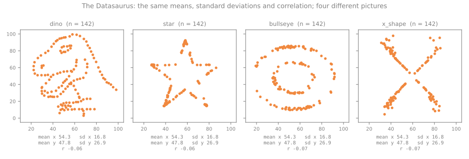
Why statistics are not enough
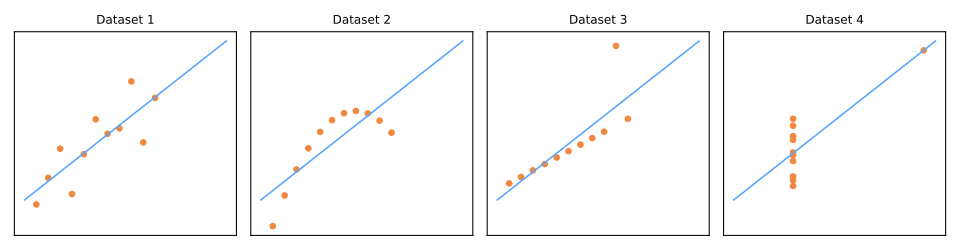
Anscombe's quartet, read
II
a smooth curve: a straight line is the wrong summary
III
a perfect line except one outlier, which tilts the fit
IV
one point creates the entire correlation; remove it and \(x\) no longer varies
Histograms: the bin width changes the story
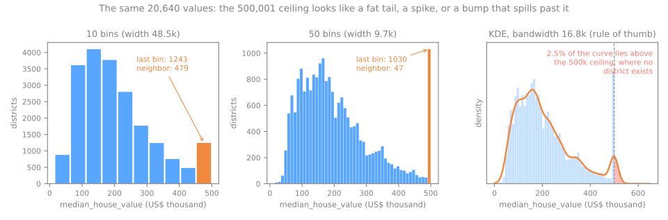
What the 50 bins revealed
10 bins
the last bar, 1,243 districts, is a modest bump: 30% of the tallest. A slightly fat tail?
50 bins
the last bar, 1,030, is the tallest of all, 22 times its neighbor (47)
The most frequent value of the column is exactly 500,001, in 965 districts: the cap.
- Try more than one bin count (30–50 for a few thousand rows);
bins='fd'(Freedman–Diaconis) chooses 46 here. - A kernel density estimate (KDE) is smooth, but turns the spike into a bump and puts 2.5% of its area above 500,001, where no district exists.
Skewed counts and the log scale
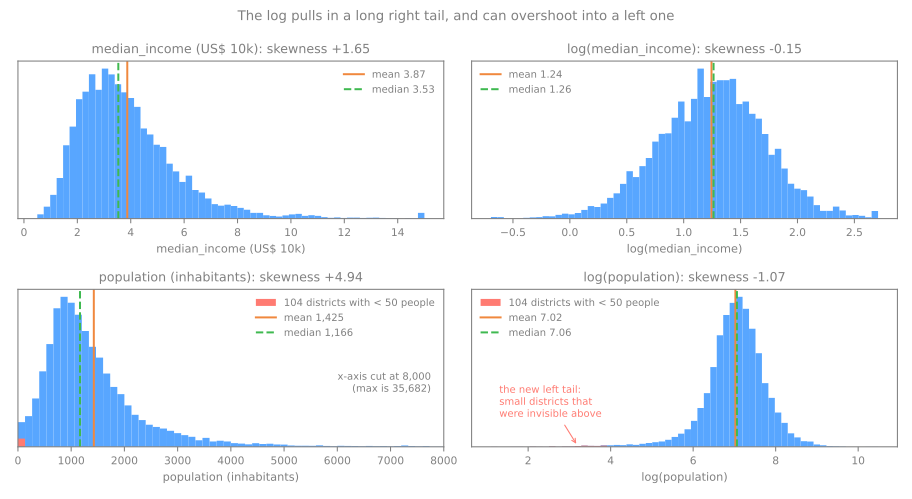
median_income: skew 1.65 → −0.15. Works as advertised.
population: 4.94 → −1.07. It overshoots: the 104 districts with fewer than 50 people become a new left tail (the smallest has 3).
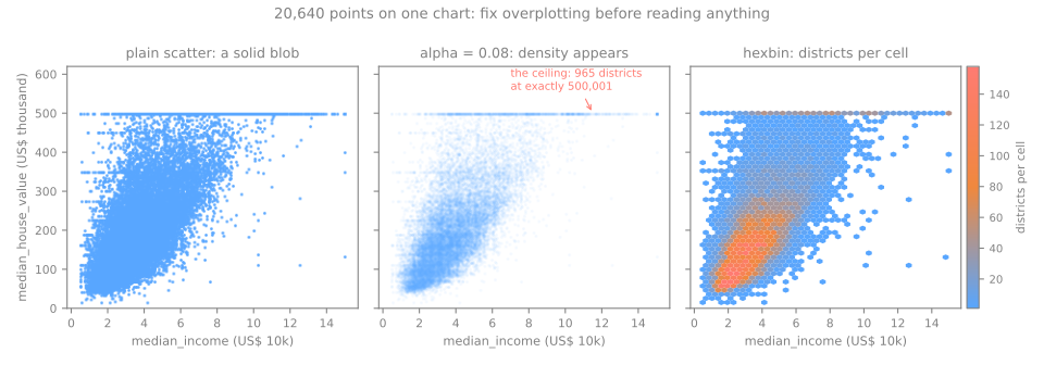
20,640 points: overplotting
- Transparency (
alpha=0.08) reveals the core, the ceiling line of 965 districts and lines at round values (137,500 appears 122 times). - Hexbin counts points per cell. Value rises with income, and the spread grows with income.
Pearson and Spearman, by hand
| \(x\) | \(y\) | \(x-\bar x\) | \(y-\bar y\) | product | rank \(x\) | rank \(y\) |
|---|---|---|---|---|---|---|
| 1 | 1 | −2 | −5 | 10 | 1 | 1 |
| 2 | 2 | −1 | −4 | 4 | 2 | 2 |
| 3 | 3 | 0 | −3 | 0 | 3 | 3 |
| 4 | 4 | 1 | −2 | −2 | 4 | 4 |
| 5 | 20 | 2 | 14 | 28 | 5 | 5 |
Pearson: \(r = \frac{40}{\sqrt{10 \times 250}} = 0.8\)
Spearman (Pearson on the ranks): 1
28 of the 40 come from the far point.
On the housing data, against the target
| feature | Pearson | Spearman |
|---|---|---|
| median_income | 0.688 | 0.677 |
| total_rooms | 0.134 | 0.206 |
| housing_median_age | 0.106 | 0.075 |
| population | −0.025 | 0.004 |
| latitude | −0.144 | −0.166 |
- income dominates, almost linearly (both ≈ 0.68);
- rooms: Spearman above Pearson, a monotonic relation distorted by the tail;
- latitude looks weak, but the median value swings from 84,500 to 236,500 across bands, up and down twice: not monotonic.
Simulator: Pearson reads the line, Spearman the order
Predict. Load with one outlier and drag the red point even higher. Which coefficient keeps moving, and which one stops?
Redundant features
- The four counts (rooms, bedrooms, population, households) correlate at 0.86 to 0.98: all measure how big the district is.
- Iris: petal length and width, \(r = 0.963\).
- Not an error, but worth writing down: linear models get unstable coefficients; dimensionality reduction exploits it; for the counts, divide by the size.
Correlation is not causation
- Income and house value: \(r = 0.69\). Raising a district's income does not raise its prices, nor the reverse.
- Both respond to a third thing: the demand for living there (jobs, coast, schools).
- Ice cream sales and drownings correlate through summer.
Simpson's paradox: kidney stones
| success rate | treatment A | treatment B |
|---|---|---|
| small stones | 0.931 | 0.867 |
| large stones | 0.730 | 0.688 |
Overall: A 0.780, B 0.826. A loses: \(273/350\) for A.
A was mostly given to large stones (263 of 350), which are harder to treat. The size of the stone is a confounder: it influences both the choice of treatment and the success.
The same trap in the housing data
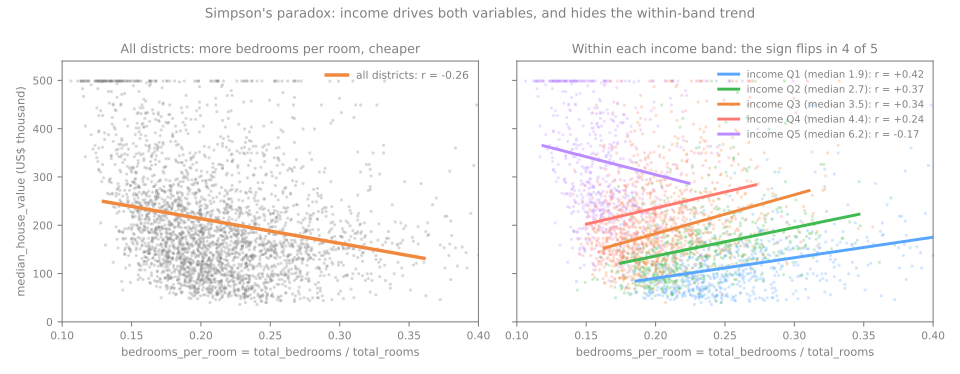
Share of rooms that are bedrooms vs value:
overall \(r = -0.256\); within income bands Q1–Q4, +0.24 to +0.42.
Income drives both (\(r = -0.616\) with the bedroom share).
Categorical vs numeric: group, with \(n\)
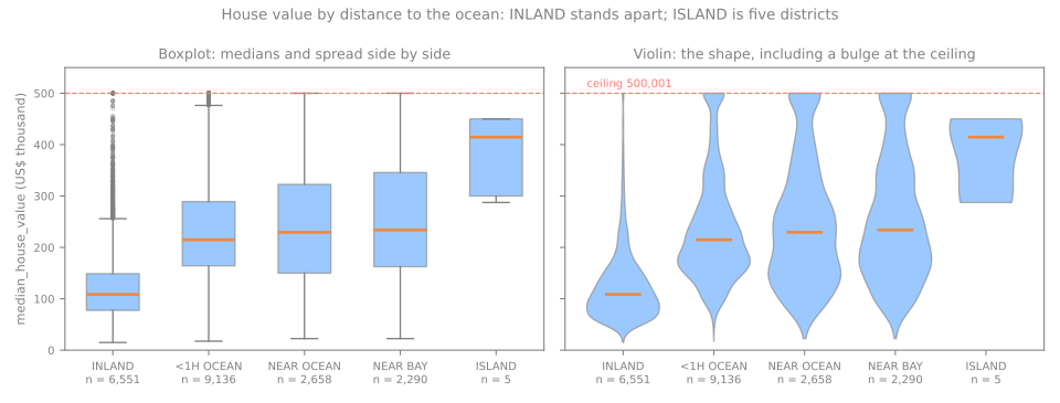
- INLAND stands apart: median 108,500 against 214,850–233,800 on the coast.
- The violins bulge at the 500,001 ceiling for the coastal groups.
- ISLAND has 5 districts: the highest median (414,700) and the least reliable.
- INLAND also has lower incomes (2.99 vs 3.65–3.88): part of the gap is income.
Missing values: the why matters
total_bedrooms: 207 missing (1.00%). The important question is why (Rubin, 1976).
| mechanism | the chance of missing depends on… | example |
|---|---|---|
| MCAR | nothing: missing completely at random | a sensor drops packets at random |
| MAR | other observed columns: missing at random | younger users skip the income field |
| MNAR | the missing value itself: missing not at random | high incomes deliberately not reported |
Watching the three mechanisms act
10,000 simulated people, income grows with age; hide ~30% of incomes, then fill each by the mean of its age group. True mean: 6.89.
| mean of what we see | after filling by age group | |
|---|---|---|
| MCAR | 6.82 | 6.85 |
| MAR: the young hide more | 7.48 | 6.88 |
| MNAR: the rich hide more | 5.91 | 6.11 |
What to do about it in EDA
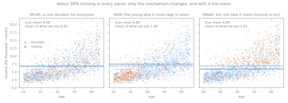
- Deleting rows is harmless only under MCAR. You can collect evidence against MCAR: compare rows with and without the value on the other columns.
- MNAR is undetectable from the data alone. Keep a flag column so a model can use the fact that a value was missing.
Outliers: two rules, by hand
IQR rule
fences \(Q_1 - 1.5\,\text{IQR} = 0\) and \(Q_3 + 1.5\,\text{IQR} = 8\)
z-score rule
\(z = (26 - 6)/7.62 = 2.63\)
The outlier inflates the mean and \(s\) used to judge it (masking), and with \(n = 9\) no \(|z|\) can exceed \((n-1)/\sqrt{n} = 2.67\). Quartiles do not move: the IQR rule is the usual default.
On real data the rules disagree
population, IQR
population, \(|z| > 3\)
log(population), IQR
A long right tail puts many ordinary large districts beyond the 1.5 IQR fences.
Error, or rare but real?
age = 190in a customer table: a typing error → fix it or set it to missing.- The owner's salary of 26: real → keep it; prefer robust statistics (median, quantiles, log).
- In between: values that are correct but mean something different.
Capped (censored) values
value at 500,001
age at 52
income at 15.0001
Top-coding: 500,001 means "at least 500,000"; the true value was lost. The capped districts are not random: mean income 7.83 against 3.87 overall.
Don't snoop: split before you explore
from sklearn.model_selection import train_test_split
train, test = train_test_split(df, test_size=0.2, random_state=42)
# from here on, explore `train` only; `test` waits until the very end
- Facts about how the file was produced (units, caps) are harmless to know.
- Anything estimated that feeds a decision (an imputation value, an outlier threshold, which features correlate best) comes from the training part only.
An EDA checklist
- Context: who collected it, what is one row, which is the target?
- Split first.
- Shape and types.
- Integrity: missing (and why), duplicates, impossible values, caps.
- One column at a time: several bin counts, mean vs median, skewness, rare levels.
- Pairs: scatter, Pearson and Spearman, grouped boxplots.
- Third variables: does a relation survive within groups?
- Write it down: every plot earns a sentence.
A first EDA: steps 1 to 11
- Split first, explore only the training part, and end with a written list of findings. There are no models.
- Steps: load → split → audit (missing, duplicates) → statistics → distributions and caps → the categorical column → relationships → the map → counts and ratios → outliers → findings.
- Download the lab notebook and open it in Jupyter or Colab; it runs in a few seconds.
Summary
- Know what one row is before anything else.
- Mean and \(s\) follow the tail; median and IQR resist it.
- Always plot: equal statistics can hide different data; try several bin counts.
- Pearson and Spearman together; correlation is not causation; condition on third variables.
- Ask why values are missing; outlier rules only flag; caps are censored values.
- Split before you explore: the test set is sacred.