Explainability
The models that won the last lessons, random forests, gradient boosting and neural networks, share a defect: nobody can read them. A boosted ensemble of 200 trees makes a good prediction, but "why this number?" has no answer you could write on a page. This lesson is about getting that answer anyway: which features a model relies on (global explanations), and why it made this prediction for this row (local explanations).
Every method below is first worked out by hand, in a few lines of NumPy, and only then called from a library, which must return the same numbers. The running example is the California housing data of the model selection lab: predict the median house value of a district from its income, its houses and its position. The lab at the end applies everything to a question where explanations are a legal matter: why was this loan applicant flagged as high risk?
Every number quoted comes from the code blocks or from the figure scripts next to this page.
The lesson follows one path in four stages, drawn below: 1. readable first, checking whether an interpretable model is good enough; 2. global, which features the model relies on and with what shape (permutation importance, partial dependence, ICE curves); 3. local, why the model made one prediction (SHAP, LIME); 4. read with care, what an explanation can and cannot claim. Each stage links to its section, and in the slides a strip at the bottom shows which stage you are in.
- Readable firstcoefficients, tree rules, the price of readability
- Global: what matterspermutation importance, partial dependence, ICE
- Local: one predictionSHAP values, LIME
- Read with carecausation, right for the wrong reasons, a checklist
Slides
Click the slides and use the ← → arrows to navigate; F goes full screen and Esc shows every slide. Open the slides in a new tab
Why explain a model?
Four reasons come up again and again:
- Debugging. A model that looks too good usually is. In the leakage section of the cross-validation lesson, the cure started with a question: which feature is doing the work? A leaked column shows up at the top of every importance ranking (you will plant one in the lab and watch it happen).
- Trust. A doctor, a credit analyst or a judge will not act on a number they cannot question. An explanation that matches their knowledge builds trust; one that does not is either a discovery or a bug, and both are worth knowing.
- Regulation. Brazil's data-protection law (LGPD, Lei 13.709/2018, art. 20) gives people the right to ask for a review of decisions taken solely by automated processing, including credit scoring, and to receive "clear and adequate information" about the criteria used. Europe's GDPR (art. 22) and the US rules on credit denials, which require the lender to state the principal reasons, point the same way (see also the ethics discussion of the ML landscape lesson).
- Science. Sometimes the model is a tool to learn about the world: which measurements predict a disease, which conditions predict a crop failure. Then the explanation is the result.
Two distinctions organize the methods:
- global vs local: how does the model behave overall? against why this prediction?;
- model-specific vs model-agnostic: some methods read the model's internals (coefficients, tree splits); others only call
predictand work for any model.
| Method | Question it answers | Scope | Needs |
|---|---|---|---|
| Coefficients, tree rules | the model itself | global | an interpretable model |
| Impurity importance (MDI) | which features did the training splits use most? | global | trees |
| Permutation importance | how much does the score depend on each feature? | global | any model + labeled data |
| Partial dependence (PDP) | how does the average prediction change with one feature? | global | any model |
| ICE curves | ... and for each row? | local, many rows | any model |
| SHAP values | how much did each feature move this prediction away from the average? | local, global by aggregation | any model; exact and fast for trees |
| LIME | which linear model imitates the black box around this row? | local | any model |
Interpretable by design
Stage 1. Before explaining a black box, ask whether you need one. Load the data first. The raw file has district totals; we turn them into per-household quantities, which are easier to read:
import numpy as np
import pandas as pd
from sklearn.model_selection import KFold, cross_val_score, train_test_split

url = 'https://raw.githubusercontent.com/hsandmann/biblio/refs/heads/main/ml/aula02/housing.csv'
df = pd.read_csv(url).dropna()               # drops the 207 districts with no bedroom count
X = pd.DataFrame({
    'income':     df['median_income'],                   # median household income, in $10,000
    'house_age':  df['housing_median_age'],              # median age of the houses, in years
    'rooms':      df['total_rooms'] / df['households'],  # rooms per household
    'bedrooms':   df['total_bedrooms'] / df['households'],
    'population': df['population'],                      # people living in the district
    'occupancy':  df['population'] / df['households'],   # people per household
    'latitude':   df['latitude'],
    'longitude':  df['longitude'],
})
y = df['median_house_value'] / 1000          # median house value, in $1,000
X_train, X_test, y_train, y_test = train_test_split(X, y, test_size=0.2, random_state=42)
print(X_train.shape, X_test.shape)
Three candidates, from fully readable to not readable at all, on the same five folds:
from sklearn.ensemble import GradientBoostingRegressor
from sklearn.linear_model import LinearRegression
from sklearn.tree import DecisionTreeRegressor

cv = KFold(n_splits=5, shuffle=True, random_state=42)
models = {'linear regression': LinearRegression(),
          'tree, depth 3':     DecisionTreeRegressor(max_depth=3, random_state=0),
          'gradient boosting': GradientBoostingRegressor(n_estimators=200, max_depth=4, random_state=0)}
for name, m in models.items():
    r2 = cross_val_score(m, X_train, y_train, cv=cv, scoring='r2')
    print(f"{name:18s} R² {r2.mean():.3f} ± {r2.std():.3f}")
linear regression  R² 0.602 ± 0.017
tree, depth 3      R² 0.526 ± 0.016
gradient boosting  R² 0.823 ± 0.007
The two readable models are readable indeed. The linear regression is eight numbers:
linear = LinearRegression().fit(X_train, y_train)
print(pd.Series(linear.coef_, index=X.columns).round(2))
print(f"correlation rooms/bedrooms: {X['rooms'].corr(X['bedrooms']):.2f} · "
      f"latitude/longitude: {X['latitude'].corr(X['longitude']):.2f}")
income        44.14
house_age      0.91
rooms        -11.65
bedrooms      63.55
population    -0.00
occupancy     -0.34
latitude     -41.30
longitude    -42.64
dtype: float64
correlation rooms/bedrooms: 0.85 · latitude/longitude: -0.92
Each coefficient is a sentence: with the other features fixed, $10,000 more of median income adds $44,140 to the predicted value, and one degree further north removes $41,300. The logistic regression gave the same kind of sentence in odds ratios, which is why credit scorecards have been logistic regressions for decades. The fine print from those lessons still applies: "with the others fixed" is a strong assumption when features move together. Here rooms and bedrooms (correlation 0.85) get opposite signs, −11.65 and +63.55: one more bedroom at a fixed number of rooms means converting a room, and that sentence is hard to interpret as a statement about houses.
The depth-3 tree is eight rules:
from sklearn.tree import export_text

tree = DecisionTreeRegressor(max_depth=3, random_state=0).fit(X_train, y_train)
print(export_text(tree, feature_names=list(X.columns), decimals=1))
|--- income <= 5.0
|   |--- income <= 3.1
|   |   |--- rooms <= 4.3
|   |   |   |--- value: [162.6]
|   |   |--- rooms >  4.3
|   |   |   |--- value: [117.8]
|   |--- income >  3.1
|   |   |--- occupancy <= 2.4
|   |   |   |--- value: [282.2]
|   |   |--- occupancy >  2.4
|   |   |   |--- value: [188.9]
|--- income >  5.0
|   |--- income <= 6.6
|   |   |--- occupancy <= 2.6
|   |   |   |--- value: [354.6]
|   |   |--- occupancy >  2.6
|   |   |   |--- value: [260.5]
|   |--- income >  6.6
|   |   |--- income <= 7.8
|   |   |   |--- value: [367.6]
|   |   |--- income >  7.8
|   |   |   |--- value: [457.9]
Anyone can follow a district down the tree: income above $78,000 → $457,900. But on this data readability has a price, and the cross-validation measured it: the boosted ensemble explains 0.823 of the variance, the linear model 0.602 and the tree 0.526. Twenty-two points of R² is too much to give away, so here the black box wins:
model = GradientBoostingRegressor(n_estimators=200, max_depth=4, random_state=0).fit(X_train, y_train)
print(f"test R²: {model.score(X_test, y_test):.3f}")
From now on model is this black box, 200 trees with up to 16 leaves each, and the rest of the lesson opens it. The gap is not always there. In the lab, on credit data, a logistic regression and a random forest are statistically tied, and Rudin (2019) argues that for high-stakes decisions this is the common case: when an interpretable model is as good, use it, instead of explaining a black box after the fact.
Permutation importance
By hand
Stage 2. The oldest model-agnostic question is global: how much does the model need each feature? Breiman (2001) answered it for random forests with a trick that works for any model. Take held-out data, shuffle one column, and measure how much the score drops. Shuffling keeps the column's values, its distribution, but breaks its link with the target and with the other columns of each row. If the model relied on that column, it now receives garbage and the score falls; if it ignored the column, nothing happens.
The whole method is a loop:
from sklearn.metrics import r2_score

rng = np.random.default_rng(0)
base = r2_score(y_test, model.predict(X_test))
drops = {}
for col in X_test.columns:
    d = []
    for _ in range(5):                                   # 5 different shuffles per column
        X_perm = X_test.copy()
        X_perm[col] = rng.permutation(X_perm[col].to_numpy())
        d.append(base - r2_score(y_test, model.predict(X_perm)))
    drops[col] = np.mean(d)
print(f"R² with nothing shuffled: {base:.3f}")
print(pd.Series(drops).sort_values(ascending=False).round(3))
R² with nothing shuffled: 0.825
latitude      1.330
longitude     1.168
income        0.539
occupancy     0.139
rooms         0.054
house_age     0.035
bedrooms      0.008
population    0.002
dtype: float64
scikit-learn's permutation_importance is the same loop with its own random shuffles, so the numbers agree to about two decimals. Next to it, the model's impurity importance (MDI, feature_importances_), which gradient boosting also computes:
from sklearn.inspection import permutation_importance

pi = permutation_importance(model, X_test, y_test, scoring='r2', n_repeats=5, random_state=0)
print(pd.DataFrame({'permutation': pi.importances_mean, 'MDI': model.feature_importances_},
                   index=X.columns).sort_values('permutation', ascending=False).round(3))
            permutation    MDI
latitude          1.346  0.103
longitude         1.187  0.117
income            0.532  0.567
occupancy         0.134  0.130
rooms             0.056  0.024
house_age         0.035  0.042
bedrooms          0.009  0.009
population        0.003  0.009
Shuffling income costs 0.539 of R², shuffling population 0.002: the model barely looks at population. MDI tells a different story, with more than half of the total for income (0.567) and about a tenth each for latitude and longitude; the two columns do not measure the same thing, as the next section shows. And the two top rows of the permutation column look impossible. Shuffling latitude "costs" 1.330, taking R² from 0.825 to about −0.5, much worse than predicting the average for everybody. Keep that number in mind: it is explained two sections below, and it says more about the method than about the model.
Held-out data, not training data
The decision trees lesson and the random forest lesson measured the classic weakness of impurity importance (MDI, feature_importances_): it is computed on the training data during fitting, and it rewards columns with many distinct values, even pure noise. Permutation importance fixes that only if you shuffle on held-out data. To see both effects, give a random forest two noise columns, a continuous one and a coin flip, and compute the importances three ways:
from sklearn.ensemble import RandomForestRegressor

rng = np.random.default_rng(0)
X_train_n = X_train.assign(noise=rng.normal(size=len(X_train)), coin=rng.integers(0, 2, len(X_train)))
X_test_n = X_test.assign(noise=rng.normal(size=len(X_test)), coin=rng.integers(0, 2, len(X_test)))
forest = RandomForestRegressor(n_estimators=100, random_state=0, n_jobs=-1).fit(X_train_n, y_train)
on_train = permutation_importance(forest, X_train_n, y_train, n_repeats=5, random_state=0)
on_test = permutation_importance(forest, X_test_n, y_test, n_repeats=5, random_state=0)
print(pd.DataFrame({'MDI': forest.feature_importances_,
                    'perm. on train': on_train.importances_mean,
                    'perm. on test': on_test.importances_mean}, index=X_train_n.columns).round(3))
              MDI  perm. on train  perm. on test
income      0.516           0.875          0.754
house_age   0.052           0.117          0.068
rooms       0.042           0.068          0.025
bedrooms    0.026           0.032          0.008
population  0.030           0.033          0.005
occupancy   0.137           0.298          0.186
latitude    0.088           0.488          0.415
longitude   0.088           0.385          0.319
noise       0.018           0.016         -0.000
coin        0.002           0.002         -0.000
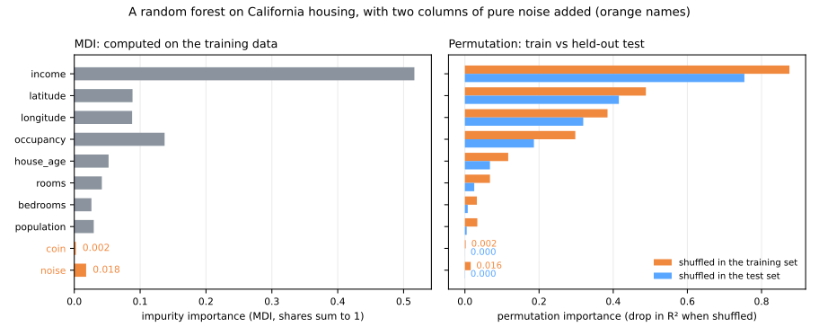
- MDI gives the continuous noise 0.018 of the total, against 0.002 for the two-valued coin, and more than half of what
bedroomsorpopulationget. The forest's deep splits did use it, on the training rows. - Permutation on the training set is fooled the same way: shuffling
noisecosts 0.016 of R², because the forest memorized training rows partly through it. Every real feature also looks more important on training data (income 0.875 against 0.754): the model fits training rows better than new ones, so it has more to lose there. - Permutation on the test set gives the noise exactly nothing (−0.000; slightly negative values are shuffle noise around zero). This is the number to report.
Correlated features: shared credit and impossible rows
Permutation importance shuffles one column while the others stay put. When features are correlated, that has two consequences, one for each direction.
Shared credit. The random forest lesson showed that an exact duplicate splits a feature's importance. The cure it suggested, shuffling the pair together, takes one extra line:
X_train_d = X_train.assign(income_copy=X_train['income'])       # an exact duplicate
X_test_d = X_test.assign(income_copy=X_test['income'])
forest_d = RandomForestRegressor(n_estimators=100, random_state=0, n_jobs=-1).fit(X_train_d, y_train)
pi_d = permutation_importance(forest_d, X_test_d, y_test, n_repeats=5, random_state=0)
print(pd.DataFrame({'MDI': forest_d.feature_importances_, 'perm. on test': pi_d.importances_mean},
                   index=X_train_d.columns).loc[['income', 'income_copy']].round(3))

order = rng.permutation(len(X_test_d))                           # shuffle both copies the same way
X_both = X_test_d.assign(income=X_test_d['income'].to_numpy()[order],
                         income_copy=X_test_d['income_copy'].to_numpy()[order])
print(f"both shuffled together: {forest_d.score(X_test_d, y_test) - forest_d.score(X_both, y_test):.3f}")
Alone, income had an MDI of 0.516 and a permutation importance of 0.754. With a twin, the MDI is cut in half (0.262 + 0.259), and each copy's permutation importance falls to 0.196: shuffle one, and the trees that split on the other copy still work. Together they are worth 0.196 + 0.196 = 0.392, half of what the information is really worth. Shuffling the pair as a group gives back 0.748. Real data has near-twins everywhere (rooms and bedrooms here, radius and area of a tumour), so a "useless" feature may just have a substitute: permute correlated groups together.
Impossible rows. Now the latitude mystery. Latitude and longitude have a correlation of −0.92, because California is a diagonal strip. Shuffle latitude alone and a San Francisco longitude receives, say, a San Diego latitude: a point in the Pacific Ocean. How many of the shuffled districts land where no district exists?
from sklearn.neighbors import NearestNeighbors

map_ = NearestNeighbors(n_neighbors=1).fit(X[['latitude', 'longitude']])   # every real district
X_perm = X_test.assign(latitude=rng.permutation(X_test['latitude'].to_numpy()))
dist, _ = map_.kneighbors(X_perm[['latitude', 'longitude']])
print(f"shuffled districts more than 0.25° from any real one: {(dist[:, 0] > 0.25).mean():.0%}")
45% of the shuffled rows are more than 0.25° (about 25 km) from any real district: in the ocean or the desert. The model never saw such places, so it predicts whatever its trees happen to extrapolate, and the R² collapses. Part of the 1.330 measures how important latitude is; part measures how badly the model behaves off the map (Hooker, Mentch & Zhou, 2021). With strongly correlated features, permutation importance mixes the two, and the fix is again to treat the correlated pair as one feature, "location".
Partial dependence and ICE
The PDP, by hand
Importance says how much; it does not say in which direction or with what shape. Does the predicted value grow with income steadily, or does it saturate? Friedman (2001) proposed the partial dependence plot: set the feature to a value \(v\) in every row, keep everything else as it is, and average the predictions:
It is one line of pandas per value:
from sklearn.inspection import partial_dependence

grid = np.array([1.5, 2, 3, 4, 5, 6, 8, 10])           # income, in $10,000
by_hand = [model.predict(X_test.assign(income=v)).mean() for v in grid]
print(np.round(by_hand, 1))

pdp = partial_dependence(model, X_test, ['income'], method='brute', custom_values={'income': grid})
print(pdp['average'][0].round(1))
Identical. If every district had a median income of $15,000, the model would price the average district at $142,600; at $100,000, at $379,800. The curve is flat at the bottom (1.5 → 2 adds only 8.0), steepest between 5 and 8 (+129.1), and flattening again above 8 (+21.2 from 8 to 10): part of that flattening is the data's cap, since every house worth more than $500,000 is recorded as $500,001. (method='brute' is the definition above. For gradient boosting, scikit-learn defaults to a faster 'recursion' shortcut that walks the trees with the training data's proportions and returns a curve shifted and slightly different; ask for 'brute' when you want the textbook quantity.)
ICE: one curve per row
The PDP is an average, and an average can hide opposite behaviors. Goldstein et al. (2015) proposed to keep the individual curves, one per row, before averaging: individual conditional expectation (ICE) curves.
ice = partial_dependence(model, X_test, ['income'], kind='individual', method='brute',
                         custom_values={'income': grid})['individual'][0]
gain = ice[:, grid == 8][:, 0] - ice[:, grid == 2][:, 0]    # income $20k -> $80k, district by district
print(f"PDP gain: {gain.mean():.0f}   ICE gains, 5th / 50th / 95th percentile: {np.percentile(gain, [5, 50, 95]).round(0)}")
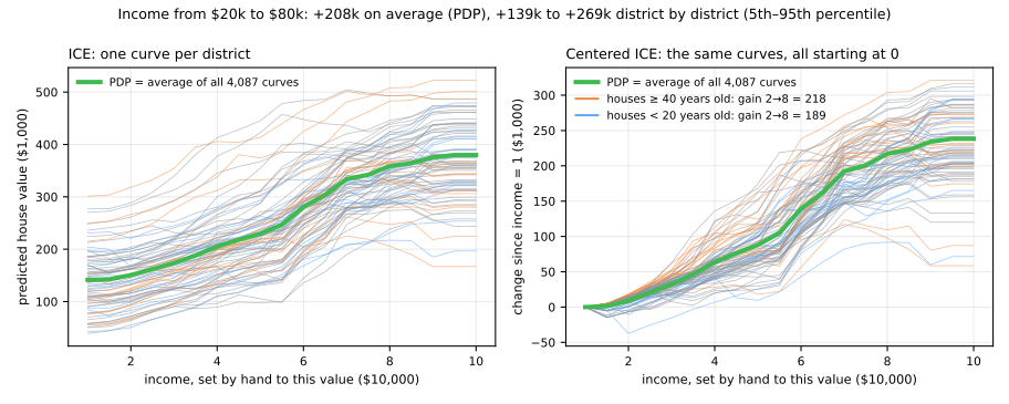
Raising income from $20,000 to $80,000 adds $208,000 on average, but the district-by-district gain ranges from $139,000 to $269,000 (5th to 95th percentile). On the right, the centered ICE curves all start at zero, which makes the spread visible: the model has learned interactions, so the effect of income depends on the rest of the row (the colors show one of them: older neighborhoods gain more). When ICE curves are parallel, the PDP tells the whole story; when they fan out or cross, it does not. scikit-learn draws both at once:
import matplotlib.pyplot as plt
from sklearn.inspection import PartialDependenceDisplay

PartialDependenceDisplay.from_estimator(model, X_test, ['income', 'occupancy'], kind='both',
                                        subsample=100, random_state=0)
plt.show()
The extrapolation trap
The PDP formula has the same flaw as permutation: it sets one feature to \(v\) in every row and keeps the others, whether or not that combination exists. For latitude, the partial dependence at 33° takes every district, San Francisco included, and moves it to latitude 33° without moving its longitude:
for lat in [33, 35, 37, 39, 41]:
    moved = X_test[['latitude', 'longitude']].assign(latitude=lat)
    dist, _ = map_.kneighbors(moved)
    print(f"latitude set to {lat}: {(dist[:, 0] > 0.25).mean():4.0%} of the rows land off the map")
latitude set to 33:  87% of the rows land off the map
latitude set to 35:  35% of the rows land off the map
latitude set to 37:  18% of the rows land off the map
latitude set to 39:  58% of the rows land off the map
latitude set to 41:  62% of the rows land off the map
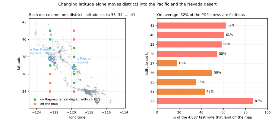
At latitude 33°, 87% of the rows the PDP averages are fictitious districts, most of them in the ocean; over the nine latitudes of the figure, 52%. The value the plot shows for 33° is mostly the model's guess about places that do not exist. Rules: look at ICE curves and at the data's range before trusting a PDP; do not read a PDP of one feature from a strongly correlated pair (plot the pair jointly, PartialDependenceDisplay.from_estimator(model, X, [('longitude', 'latitude')])); and know that accumulated local effects (ALE) plots were designed to avoid exactly this extrapolation (Apley & Zhu, 2020).
SHAP (local + global)
Stage 3. Permutation importance and PDPs are global. The question a person affected by a decision asks is local: why this prediction, for me? SHAP answers it by splitting one prediction into contributions, one per feature, that add up exactly:
where \(\phi_0\) is the average prediction and \(\phi_j\) is feature \(j\)'s share of the difference. The shares come from cooperative game theory: they are Shapley values (Shapley, 1953), and Lundberg & Lee (2017) showed how to compute them for model predictions.
Shapley values by hand
Think of the features as players in a team, and the prediction as the team's payout. The game needs a value for every coalition \(S\) of players: what does the model predict when it knows only the features in \(S\)? A model cannot "not know" a feature, so we fill the missing ones from a background dataset: set the features in \(S\) to the row's values, leave the other columns as they are in each background row, and average the predictions:
\(v(\varnothing)\) is the average prediction over the background, the base value; \(v(\text{all})\) is the prediction for the row. A feature's Shapley value is its marginal contribution \(v(S \cup \{j\}) - v(S)\), averaged over all the coalitions it could join, with the weights that make every order in which players arrive equally likely:
With \(d\) features there are \(2^d\) coalitions, few enough to enumerate for a small \(d\). The whole computation fits in one function:
from itertools import combinations
from math import factorial

def shapley(predict, x, background):
    """Exact Shapley values of the row x, by brute force over all 2^d coalitions."""
    names = list(x.index)
    d = len(names)
    v = {}                                                    # v[S] = value of coalition S
    for size in range(d + 1):
        for S in combinations(names, size):
            Z = background.assign(**{j: x[j] for j in S})    # features in S take x's values,
            v[S] = predict(Z).mean()                          # the others keep the background's
    phi = pd.Series(0.0, index=names)
    for S, vS in v.items():
        for j in names:
            if j not in S:
                S_j = tuple(k for k in names if k in S or k == j)       # S ∪ {j}
                weight = factorial(len(S)) * factorial(d - len(S) - 1) / factorial(d)
                phi[j] += weight * (v[S_j] - vS)
    return phi, v
Start with a toy model small enough for a calculator: a price (in $1,000) from three yes/no features, with an interaction: being rich and coastal is worth 40 more than the two separately.
The background is four districts, and we explain a rich, coastal, not-big district:
def toy_model(Z):                                   # price in $1,000
    return 100 + 80 * Z['rich'] + 60 * Z['coastal'] + 40 * Z['rich'] * Z['coastal'] + 20 * Z['big']

background_toy = pd.DataFrame({'rich':    [0, 1, 0, 0],
                               'coastal': [0, 0, 1, 0],
                               'big':     [1, 0, 0, 0]})
x_toy = pd.Series({'rich': 1, 'coastal': 1, 'big': 0})

phi, v = shapley(toy_model, x_toy, background_toy)
for S, value in v.items():
    print(f"v({{{', '.join(S)}}})".ljust(26), f"{value:6.1f}")
print(phi)
print(f"f(x) - v(empty) = {toy_model(x_toy) - v[()]:.1f} = sum of phi = {phi.sum():.1f}")
v({})                       140.0
v({rich})                   210.0
v({coastal})                195.0
v({big})                    135.0
v({rich, coastal})          285.0
v({rich, big})              205.0
v({coastal, big})           190.0
v({rich, coastal, big})     280.0
rich       80.0
coastal    65.0
big        -5.0
dtype: float64
f(x) - v(empty) = 140.0 = sum of phi = 140.0
Check two lines by hand. The four background districts are worth 120, 180, 160 and 100, so \(v(\varnothing) = 140\). For \(v(\{\text{rich}\})\), set rich = 1 in all four: 200, 180, 280, 180, average 210. Then follow the blue arrows of the figure:
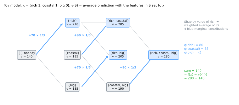
Everything in the output makes sense once you know the formula. The rich main effect is 80 × (1 − ¼) = 60, because one background district in four is already rich; the interaction term, 40, is split equally between the two features that create it, 20 each: 60 + 20 = 80 for rich and 45 + 20 = 65 for coastal. big gets −5 = 20 × (0 − ¼): this district is not big, while a quarter of the background is. And the three add up to exactly 280 − 140. The Shapley values are the only attribution with these four properties (Shapley, 1953):
- efficiency: the contributions add up to prediction − base value;
- symmetry: two features that contribute the same to every coalition get the same value;
- dummy: a feature that never changes the prediction gets 0;
- additivity: for a model that is a sum of two models (a forest, a boosted ensemble), the values are the sums of the values.
Try it on the toy model. Click an arrival order to follow its path through the coalitions, then turn coastal off, set the interaction to 0 or 80, and check the waterfall after each change:
The mean of the six rows is always the Shapley value, and the waterfall always lands on the prediction: the values add up to prediction − base value whatever you toggle. The interaction gives credit only to rich and coastal, never to big; when both are 1, it is split in half between them.
The shap library (preinstalled in Colab; elsewhere pip install shap) must agree. Its TreeExplainer reads a tree's structure; a tree fitted on the eight corners reproduces the formula exactly:
import shap
from sklearn.tree import DecisionTreeRegressor

corners = pd.DataFrame([(r, c, b) for r in (0, 1) for c in (0, 1) for b in (0, 1)],
                       columns=['rich', 'coastal', 'big'])
toy_tree = DecisionTreeRegressor().fit(corners, toy_model(corners))   # reproduces the formula exactly
explainer = shap.TreeExplainer(toy_tree, data=background_toy)
print(explainer.shap_values(x_toy.to_frame().T).round(2), explainer.expected_value)
On the real model
Now the gradient-boosting model, 8 features: \(2^8 = 256\) coalitions, each averaged over 100 background districts, 25,600 predictions in all. Take a San Francisco district and compare the brute force with TreeExplainer:
background = X_train.sample(100, random_state=0)
x = X_test.loc[5403]                                   # a district of San Francisco
phi, v = shapley(model.predict, x, background)

explainer = shap.TreeExplainer(model, data=background)
sv = explainer(x.to_frame().T)
print(pd.DataFrame({'value': x, 'phi by hand': phi, 'TreeExplainer': sv.values[0]}).round(2))
print(f"base value {v[()]:.2f} + sum of phi {phi.sum():.2f} = {v[()] + phi.sum():.2f}"
      f" = model.predict {model.predict(x.to_frame().T)[0]:.2f}")
print(f"largest difference, by hand vs TreeExplainer: {np.abs(phi - sv.values[0]).max():.0e}")
              value  phi by hand  TreeExplainer
income         3.39         2.62           2.62
house_age     52.00        34.24          34.24
rooms          3.77        -8.05          -8.05
bedrooms       1.06         3.60           3.60
population  1588.00         2.54           2.54
occupancy      1.98        66.34          66.34
latitude      37.78       -64.56         -64.56
longitude   -122.44       185.61         185.61
base value 207.39 + sum of phi 222.35 = 429.74 = model.predict 429.74
largest difference, by hand vs TreeExplainer: 2e-06
The two agree to the sixth decimal. Brute force would not scale: with 20 features it would need a million coalitions per row. TreeExplainer gets the same exact numbers in time polynomial in the size of the trees, by walking each tree once per row (Lundberg et al., 2020); for models that are not trees, shap.KernelExplainer estimates them by sampling coalitions. Called without data, TreeExplainer uses a variant that fills missing features from the proportions of training rows stored in the trees; the numbers change a little, the sum rule does not.
The explanation of the district, as a waterfall, next to a district of Fresno:
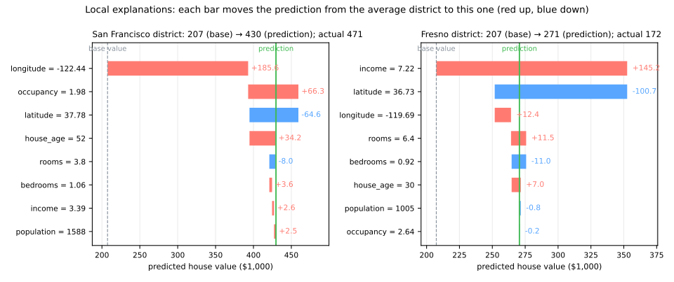
Read it from the base value, $207,000, the average prediction over the background. For the San Francisco district, location adds the most: longitude +185.6 and latitude −64.6. The two are correlated, and SHAP splits location between them in a way that has no physical meaning; by additivity their sum, +121.0 for "location", is the meaningful number. Low occupancy (1.98 people per household) adds 66.3 and old houses add 34.2. Its income, 3.39, is an ordinary one, so it contributes almost nothing (+2.6). In Fresno the story is reversed: a high income (7.22) adds 145.2, and the location takes money away (latitude −100.7, longitude +12.4: −88.3 for location). The same feature can push up in one row and down in another; a local explanation is about this row.
Global: local explanations, stacked
Explaining 300 test districts gives a table of 300 × 8 SHAP values. The mean absolute value per column is a global importance:
sample = X_test.sample(300, random_state=0)
sv = explainer(sample)                                  # 300 districts x 8 features
mean_abs = pd.Series(np.abs(sv.values).mean(axis=0), index=X.columns)
print(mean_abs.sort_values(ascending=False).round(1))
shap.plots.beeswarm(sv)
latitude      76.6
longitude     64.1
income        44.2
occupancy     22.5
rooms         11.0
house_age      5.5
bedrooms       3.5
population     2.4
dtype: float64
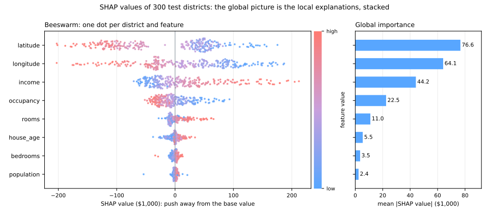
The beeswarm puts one dot per district and feature at its SHAP value, colored by the feature's value. It shows direction as well as size: high incomes (red) sit on the right, high occupancies on the left, northern latitudes (red) push prices down. The bar chart is the table above.
Three global rankings of the same model now disagree in the details. MDI put income first (0.567 of the total impurity decrease); permutation put latitude first with a drop of R² larger than 1, inflated by impossible rows; mean |SHAP| puts latitude first, 76.6 against 44.2 for income, but in $1,000 of prediction, not in R². They answer different questions: what did training use?, what does the score need?, how far does each feature move the predictions? Choose the question before the method.
LIME
SHAP needs a value for every coalition. LIME (Ribeiro, Singh & Guestrin, 2016) asks something simpler: in the neighborhood of this row, which linear model imitates the black box best? Its coefficients are the explanation. The recipe for tabular data is four steps:
- perturb: draw thousands of points around the row, by adding noise to every feature;
- predict: ask the black box about each of them;
- weight: the closer to the row, the heavier, through a kernel of width \(w\);
- fit a weighted linear model to those predictions.
Each step is one or two lines:
from sklearn.linear_model import Ridge

def lime_by_hand(predict, x, X_ref, n=5000, width=None, seed=0):
    """LIME for tabular data: perturb x, weight by proximity, fit a weighted linear model."""
    rng = np.random.default_rng(seed)
    scale = X_ref.std(ddof=0).to_numpy()
    steps = rng.normal(size=(n, len(x)))                           # perturbations, in std units
    Z = pd.DataFrame(x.to_numpy() + steps * scale, columns=x.index)
    width = width or 0.75 * np.sqrt(len(x))                        # LIME's default kernel width
    weight = np.sqrt(np.exp(-(steps ** 2).sum(axis=1) / width ** 2))   # close = heavy
    surrogate = Ridge(alpha=1).fit(steps, predict(Z), sample_weight=weight)
    return pd.Series(surrogate.coef_, index=x.index)          # k$ per standard deviation

print(lime_by_hand(model.predict, x, X_train).round(1))
income        42.1
house_age      1.3
rooms          2.8
bedrooms       3.0
population     3.3
occupancy    -49.9
latitude     -89.3
longitude    -53.6
dtype: float64
The lime package (pip install lime), with its continuous-feature options, does the same thing with its own random draws:
from lime.lime_tabular import LimeTabularExplainer      # pip install lime

lt = LimeTabularExplainer(X_train.to_numpy(), feature_names=list(X.columns), mode='regression',
                          discretize_continuous=False, sample_around_instance=True, random_state=0)
exp = lt.explain_instance(x.to_numpy(), lambda A: model.predict(pd.DataFrame(A, columns=X.columns)),
                          num_features=8, num_samples=5000)
print(pd.Series(dict(exp.as_list()))[X.columns].round(1))
income        42.0
house_age      3.5
rooms          2.5
bedrooms       2.1
population     5.1
occupancy    -48.9
latitude     -91.8
longitude    -55.5
dtype: float64
The same story within a few units: around this San Francisco district, one standard deviation more income ($19,000) adds about $42,000, one standard deviation north (2.1°) removes about $90,000. (By default the library does something coarser: it cuts each feature at its quartiles and explains with rules such as "income between the first and second quartile".)
Compare with SHAP for the same district: income got +2.6 there, and +42.1 per standard deviation here. Both are right, because they answer different questions. SHAP asks how much this district's actual income moves its prediction away from the average district; its income is close to average, so not much. LIME asks what would happen if income changed: the local slope, which is steep. Ask "why is this house expensive?" and SHAP answers; ask "what would change the price?" and LIME answers. (The two are also closer than they look: Lundberg & Lee's KernelSHAP is LIME run on coalitions, features switched on or off, with one particular kernel and no regularization, and that choice makes the weighted regression return Shapley values.)
LIME's weak point is the word "around". How far is local?
table = pd.DataFrame({f'width {w}': lime_by_hand(model.predict, x, X_train, width=w)
                      for w in [0.5, 1.0, 2.12, 5.0]})
table['std, 5 seeds'] = pd.DataFrame([lime_by_hand(model.predict, x, X_train, seed=s)
                                      for s in range(5)]).std()
print(table.round(1))
            width 0.5  width 1.0  width 2.12  width 5.0  std, 5 seeds
income           54.7       54.8        42.1       38.2           1.5
house_age        -9.9        1.3         1.3        1.0           1.3
rooms           -11.2       -0.3         2.8        3.7           0.9
bedrooms          5.9        8.9         3.0        1.4           1.0
population        6.9        3.5         3.3        3.9           1.7
occupancy       -71.0      -67.4       -49.9      -45.0           0.9
latitude        -80.4      -99.3       -89.3      -86.8           0.7
longitude       -67.8      -64.8       -53.6      -50.1           1.6
With 5,000 samples, the random draws matter little (standard deviations of 0.7 to 1.7 across 5 seeds). The kernel width matters a lot: the income slope goes from 54.7 to 38.2, occupancy from −71.0 to −45.0, and house_age even changes sign. The default, \(0.75\sqrt{d} = 2.12\), is a convention, not a law. The figure shows why, with a one-feature LIME: the model's curve is a staircase, and a narrow neighborhood sees only the steep step next to the row, a wide one sees the whole trend.
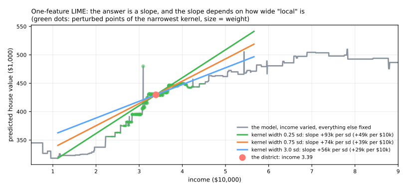
Two more cautions. The perturbations move each feature independently, so LIME, like permutation and the PDP, asks the model about districts in the ocean. And the noise added to each feature is one full standard deviation of the whole dataset, so "local" covers a good part of California. LIME's strength is its generality: the same recipe explains images (switching superpixels on and off) and texts (removing words), which is where it is used most.
Reading explanations responsibly
Stage 4. Every method above produced numbers; this section is about what those numbers can and cannot claim.
Explanation ≠ causation
An explanation describes the model, not the world. "Around the San Francisco district, one standard deviation more occupancy lowers the predicted price by about $50,000" (the LIME slope, −49.9) is a true statement about the boosted trees. It does not mean that moving more people into a house makes it cheaper: crowded households are a marker of poorer neighborhoods, and the model uses the marker. The same logic makes explanations useful for auditing: if a credit model's explanation leans on the postcode, the model may be using the postcode as a proxy for income or ethnicity. To claim that a feature causes an outcome you need experiments or causal inference, not SHAP.
A model can be right for the wrong reasons. Ribeiro et al. (2016) trained a classifier to tell wolves from huskies; LIME showed that it was looking at the snow in the background. Zech et al. (2018) found chest X-ray models that recognized which hospital an image came from, a strong predictor of disease in their data. The pattern is easy to reproduce. In hospital A, patients too sick to stand are imaged with a portable scanner, so the scanner type tracks the diagnosis; in hospital B, scanners are assigned at random:
from sklearn.ensemble import GradientBoostingClassifier

def hospital(n, shortcut, seed):
    rng = np.random.default_rng(seed)
    sick = rng.integers(0, 2, n)
    X = pd.DataFrame({f'marker_{k}': 0.8 * sick + rng.normal(size=n) for k in (1, 2, 3)})
    # with probability `shortcut`, the scanner type copies the diagnosis
    X['portable_scanner'] = np.where(rng.random(n) < shortcut, sick, rng.integers(0, 2, n))
    return X, sick

X_a, y_a = hospital(3000, shortcut=0.9, seed=1)     # hospital A: the sick get the portable scanner
X_b, y_b = hospital(3000, shortcut=0.0, seed=2)     # hospital B: scanner assigned at random
X_a_tr, X_a_va, y_a_tr, y_a_va = train_test_split(X_a, y_a, test_size=0.3, random_state=0)

clf = GradientBoostingClassifier(random_state=0).fit(X_a_tr, y_a_tr)
pi = permutation_importance(clf, X_a_va, y_a_va, n_repeats=5, random_state=0)
print(pd.Series(pi.importances_mean, index=X_a.columns).round(3))
print(f"accuracy on hospital A (validation): {clf.score(X_a_va, y_a_va):.3f} · on hospital B: {clf.score(X_b, y_b):.3f}")

markers = ['marker_1', 'marker_2', 'marker_3']
honest = GradientBoostingClassifier(random_state=0).fit(X_a_tr[markers], y_a_tr)
print(f"markers only:  hospital A {honest.score(X_a_va[markers], y_a_va):.3f} · hospital B {honest.score(X_b[markers], y_b):.3f}")
marker_1            0.006
marker_2            0.006
marker_3            0.012
portable_scanner    0.393
dtype: float64
accuracy on hospital A (validation): 0.934 · on hospital B: 0.538
markers only:  hospital A 0.730 · hospital B 0.747
On a validation split of hospital A the model looks excellent, 93.4%; in hospital B it is barely better than a coin, 53.8%. No amount of validation on hospital A could have warned you, because the shortcut is real there. The explanation did: the scanner's permutation importance, 0.393, dwarfs every medical marker (0.012 at most). The explanation was correct, the model really does rely on the scanner, and only domain knowledge can say that this reliance will not survive. The model built on the markers alone is worse on A (73.0%) and better where it matters, on B (74.7%).
Explanations are estimates, with choices inside. This lesson measured several: the background dataset sets SHAP's base value; the kernel width changes LIME's slopes; correlated features split their credit arbitrarily (latitude and longitude; income and its copy); permutation and PDP query impossible rows. Explanations can even be gamed: Slack et al. (2020) built models that behave in a discriminatory way on real inputs while showing innocent explanations to LIME and SHAP, which probe them with off-distribution points. Treat an explanation as evidence to be checked, not as a certificate.
A checklist for explaining a model
- Try an interpretable model first; if it is as good (compare on the same folds), use it. 2. Compute importances on held-out data. 3. Look for correlated groups and permute or explain them together. 4. Look at ICE curves, not only the PDP, and check that the plotted values are inside the data. 5. Use SHAP for local explanations; state the background you used. 6. When a feature dominates, ask when is this value recorded? before celebrating (leakage). 7. Never read an explanation as a causal claim.
Lab: explaining credit decisions
A bank must explain its decisions: by law, to a declined applicant who asks, and by prudence, to itself. The data is the classic German credit dataset (Hofmann, 1994): 1,000 loans, 20 attributes of the applicant and the loan, and whether the loan went bad (30% did). You will compare an interpretable scorecard with a random forest, then open the forest with every tool of this lesson: importances, partial dependence, SHAP (global and for one applicant), and finally plant a leak and watch the explanations find it.
Run the blocks in order, in one session (about a minute). To work on it directly, download the lab notebook and open it in Jupyter or Colab (File → Upload notebook). It uses shap, which Colab usually has preinstalled; if import shap fails, run %pip install shap in a cell.
Step 1 — load the applicants
import numpy as np
import pandas as pd
from sklearn.datasets import fetch_openml

credit = fetch_openml(data_id=31, as_frame=True)        # German credit: 1,000 loan applicants
raw = credit.data                                       # 7 numeric + 13 categorical columns
y = (credit.target == 'bad').astype(int)                # 1 = the loan went bad
cat_cols = list(raw.select_dtypes('category').columns)
X = raw.copy()
X[cat_cols] = X[cat_cols].apply(lambda c: c.cat.codes)  # each category -> an integer code
X = X.astype(float)
print(X.shape, f"bad loans: {y.sum()} ({y.mean():.0%})")
print(raw[['checking_status', 'duration', 'credit_amount', 'purpose', 'age']].head(3))
(1000, 20) bad loans: 300 (30%)
  checking_status  duration  credit_amount    purpose  age
0              <0         6           1169   radio/tv   67
1        0<=X<200        48           5951   radio/tv   22
2     no checking        12           2096  education   49
Each row is an applicant: the balance of their checking account (checking_status, in Deutsche Mark), the loan's duration in months and amount, its purpose, the applicant's age, and 15 more columns (savings, employment, housing, personal_status, which mixes sex and marital status, and so on). The categories become integer codes, which trees handle well; raw keeps the readable values for later.
Step 2 — scorecard or forest? Same folds
from sklearn.compose import make_column_transformer
from sklearn.dummy import DummyClassifier
from sklearn.ensemble import RandomForestClassifier
from sklearn.linear_model import LogisticRegression
from sklearn.model_selection import StratifiedKFold, cross_val_score, train_test_split
from sklearn.pipeline import make_pipeline
from sklearn.preprocessing import OneHotEncoder, StandardScaler

X_dev, X_test, y_dev, y_test = train_test_split(X, y, test_size=0.2, stratify=y, random_state=42)
cv = StratifiedKFold(n_splits=5, shuffle=True, random_state=42)

scorecard = make_pipeline(
    make_column_transformer((OneHotEncoder(handle_unknown='ignore'), cat_cols), remainder=StandardScaler()),
    LogisticRegression(max_iter=1000))
candidates = {'dummy': DummyClassifier(),
              'logistic regression': scorecard,
              'random forest': RandomForestClassifier(n_estimators=300, min_samples_leaf=5,
                                                      random_state=42, n_jobs=-1)}
auc = {}
for name, m in candidates.items():
    auc[name] = cross_val_score(m, X_dev, y_dev, cv=cv, scoring='roc_auc')
    print(f"{name:20s} ROC AUC {auc[name].mean():.3f} ± {auc[name].std():.3f}")
d = auc['random forest'] - auc['logistic regression']
print(f"forest - logistic, fold by fold: {d.round(3)}  ->  {d.mean():+.3f} ± {d.std():.3f}")
dummy                ROC AUC 0.500 ± 0.000
logistic regression  ROC AUC 0.771 ± 0.053
random forest        ROC AUC 0.785 ± 0.043
forest - logistic, fold by fold: [ 0.01  -0.027  0.016  0.03   0.041]  ->  +0.014 ± 0.023
How to read it: the test set (200 applicants) is locked away, and both models are scored on the same five folds, as in the cross-validation lesson. The forest is ahead by 0.014 of ROC AUC, but the per-fold difference has a spread of 0.023 and changes sign: by the rule of that lesson, a tie. This is Rudin's point in practice: on this problem a logistic regression, whose one-hot coefficients a regulator can read line by line, is as good as the black box. A real bank should ship the scorecard. We keep going with the forest, because it is the model you will face when the gap is real, and because we can check whether its explanations make sense.
Step 3 — fit the forest, test it once
from sklearn.metrics import roc_auc_score

forest = candidates['random forest'].fit(X_dev, y_dev)
risk = forest.predict_proba(X_test)[:, 1]                # predicted probability that the loan goes bad
print(f"test ROC AUC: {roc_auc_score(y_test, risk):.3f}")
The one and only test: 0.798, inside the CV estimate of 0.785 ± 0.043. From here on, the 200 test applicants are used to explain the model, not to choose anything about it.
Step 4 — MDI against permutation importance
from sklearn.inspection import permutation_importance

perm = permutation_importance(forest, X_test, y_test, scoring='roc_auc', n_repeats=10, random_state=42)
imp = pd.DataFrame({'MDI': forest.feature_importances_,
                    'perm. (AUC drop)': perm.importances_mean,
                    'perm. std': perm.importances_std}, index=X.columns)
imp['MDI rank'] = imp['MDI'].rank(ascending=False).astype(int)
print(imp.sort_values('perm. (AUC drop)', ascending=False).head(8).round(3))
                          MDI  perm. (AUC drop)  perm. std  MDI rank
checking_status         0.179             0.141      0.036         1
duration                0.121             0.036      0.013         3
credit_amount           0.133             0.021      0.008         2
purpose                 0.050             0.012      0.006         7
credit_history          0.057             0.010      0.006         5
age                     0.089             0.009      0.006         4
savings_status          0.053             0.005      0.011         6
installment_commitment  0.043             0.004      0.005         8
How to read it: both methods put checking_status first, and by permutation it is in a league of its own: shuffling it costs 0.141 of AUC, four times the next feature. Below that the rankings part ways, in the direction the decision trees and random forest lessons predicted. credit_amount and age, columns with many distinct values, are 2nd and 4th by MDI but cost only 0.021 and 0.009 when shuffled: many distinct values attract splits on the training rows. Notice also the standard deviations: from the 5th row down, the drops are within about one or two standard deviations of zero, so their order means little.
Step 5 — partial dependence and ICE
import matplotlib.pyplot as plt
from sklearn.inspection import PartialDependenceDisplay, partial_dependence

PartialDependenceDisplay.from_estimator(forest, X_test, ['duration', 'credit_amount'], kind='both',
                                        subsample=100, random_state=42)
plt.show()

for f in ['duration', 'credit_amount']:
    grid = np.percentile(X_dev[f], [5, 25, 50, 75, 95])
    pdp = partial_dependence(forest, X_test, [f], method='brute', custom_values={f: grid})
    print(f"{f:14s}", '  '.join(f"{g:>6.0f}: {p:.3f}" for g, p in zip(grid, pdp['average'][0])))
duration            6: 0.223      12: 0.272      18: 0.328      24: 0.344      48: 0.415
credit_amount     701: 0.326    1353: 0.305    2317: 0.291    3933: 0.299    8615: 0.375
How to read it: the printed values are the PDP at the 5th, 25th, 50th, 75th and 95th percentiles of each feature. Longer loans are riskier, steadily: the average predicted risk goes from 0.223 for a 6-month loan to 0.415 for a 48-month one. The amount has a U shape: the smallest loans (0.326) and the largest (0.375) are riskier than the median one (0.291). In the plot, look at the ICE curves: do they run parallel to the PDP, or do some applicants react differently? And remember the extrapolation trap: duration and amount are correlated (long loans tend to be large), so a 6-month loan of DM 8,615 is a combination the model has rarely seen.
Step 6 — SHAP: the global picture
import shap                  # preinstalled in Colab; elsewhere: pip install shap

background = X_dev.sample(100, random_state=42)
explainer = shap.TreeExplainer(forest, data=background)
sv = explainer(X_test)[:, :, 1]                          # class 1 (bad loan), in units of probability
print(f"base value: {sv.base_values[0]:.3f}")
mean_abs = pd.Series(np.abs(sv.values).mean(axis=0), index=X.columns).sort_values(ascending=False)
print(mean_abs.head(8).round(3))
shap.plots.beeswarm(sv)
base value: 0.305
checking_status           0.090
duration                  0.049
savings_status            0.031
credit_amount             0.025
personal_status           0.021
credit_history            0.020
other_payment_plans       0.016
installment_commitment    0.016
dtype: float64
How to read it: for a random forest classifier, SHAP values are in units of probability of a bad loan. The base value, 0.305, is the forest's average predicted risk over the 100 background applicants. On average, checking_status moves an applicant's risk by 9.0 points, duration by 4.9. The top of the ranking agrees with permutation importance, with one striking newcomer: personal_status, 5th by SHAP. In the beeswarm, remember that the colors of the categorical columns are integer codes, so "high" and "low" have no meaning for them; look at the spread instead.
Step 7 — one applicant, one explanation
i = int(np.argmax(risk))                                 # the riskiest applicant in the test set
who = X_test.index[i]
print(f"applicant {who}: predicted risk {risk[i]:.3f} · actual outcome: {'bad' if y_test.iloc[i] else 'good'}")
reasons = pd.DataFrame({'value': raw.loc[who].astype(str), 'SHAP': sv.values[i]})
print(reasons.sort_values('SHAP', key=abs, ascending=False).head(6).round(3))
print(f"base {sv.base_values[i]:.3f} + sum of SHAP {sv.values[i].sum():+.3f} = "
      f"{sv.base_values[i] + sv.values[i].sum():.3f}  (model: {risk[i]:.3f})")
shap.plots.waterfall(sv[i])
applicant 11: predicted risk 0.710 · actual outcome: bad
                              value   SHAP
duration                         48  0.114
checking_status                  <0  0.114
savings_status                 <100  0.045
personal_status  female div/dep/mar  0.033
age                              24  0.021
credit_history        existing paid  0.020
base 0.305 + sum of SHAP +0.404 = 0.710  (model: 0.710)
How to read it: this is the adverse-action letter the law asks for. The applicant's predicted risk is 0.710, and the efficiency property holds to the third decimal: 0.305 + 0.404 = 0.710. The principal reasons are a 48-month loan (+11.4 points), an overdrawn checking account (+11.4), savings below DM 100 (+4.5) and, fourth, being a divorced, separated or married woman (+3.3), then being 24 years old (+2.1). The first three are reasons a bank can defend. The fourth and fifth are protected characteristics in most anti-discrimination laws. The explanation did its job: it made visible something the AUC could never show.
Step 8 — does the model need personal_status?
without = cross_val_score(candidates['random forest'], X_dev.drop(columns='personal_status'), y_dev,
                          cv=cv, scoring='roc_auc')
d = without - auc['random forest']
print(f"permutation importance of personal_status: {imp.loc['personal_status', 'perm. (AUC drop)']:.3f}")
print(f"without personal_status: ROC AUC {without.mean():.3f} · difference {d.mean():+.3f} ± {d.std():.3f}")
print(f"applicants whose risk personal_status moves by more than 0.02: "
      f"{(np.abs(sv[:, 'personal_status'].values) > 0.02).mean():.0%}")
permutation importance of personal_status: -0.001
without personal_status: ROC AUC 0.781 · difference -0.004 ± 0.005
applicants whose risk personal_status moves by more than 0.02: 50%
How to read it: by permutation, personal_status is worth nothing to the score (−0.001), and retraining without it changes the CV AUC by −0.004 ± 0.005, a tie. Yet it moves the predicted risk of half of the test applicants by more than 2 points. Permutation importance asks whether the ranking needs a feature; SHAP asks whether the predictions use it. For fairness, the second question is the one that matters: a feature can be useless for accuracy and still decide who gets a loan. Dropping the column is the easy part; the harder audit is whether other columns act as its proxy (a question for the "Your turn").
Step 9 — plant a leak, watch the explanations find it
rng = np.random.default_rng(42)
letters = rng.poisson(np.where(y == 1, 2.0, 0.3))        # collection letters: sent AFTER a loan goes bad
X_leak = X.assign(collection_letters=letters)
X_dev_l, X_test_l = X_leak.loc[X_dev.index], X_leak.loc[X_test.index]

leaky = RandomForestClassifier(n_estimators=300, min_samples_leaf=5, random_state=42, n_jobs=-1)
auc_leak = cross_val_score(leaky, X_dev_l, y_dev, cv=cv, scoring='roc_auc')
leaky.fit(X_dev_l, y_dev)
perm_l = permutation_importance(leaky, X_test_l, y_test, scoring='roc_auc', n_repeats=10, random_state=42)
sv_l = shap.TreeExplainer(leaky, data=X_dev_l.sample(100, random_state=42))(X_test_l)[:, :, 1]
print(f"CV ROC AUC: {auc['random forest'].mean():.3f} -> {auc_leak.mean():.3f}")
print(pd.DataFrame({'perm. (AUC drop)': perm_l.importances_mean,
                    'mean |SHAP|': np.abs(sv_l.values).mean(axis=0)},
                   index=X_leak.columns).sort_values('mean |SHAP|', ascending=False).head(4).round(3))
CV ROC AUC: 0.785 -> 0.927
                    perm. (AUC drop)  mean |SHAP|
collection_letters             0.209        0.154
checking_status                0.052        0.067
duration                       0.015        0.027
savings_status                 0.002        0.020
How to read it: a column that counts collection letters exists in the bank's database, but the letters are only sent after a loan goes bad, the "feature that knows the future" of the cross-validation lesson. Cross-validation cannot catch it: the CV AUC jumps from 0.785 to 0.927, and the test set would agree, because the leak is in every row. The explanations catch it at once. collection_letters is first by both methods, with a permutation drop four times that of checking_status (0.209 against 0.052) and a mean |SHAP| of 0.154, more than twice the former leader's. A new feature that outweighs everything a credit analyst knows about should trigger one question: when is this value recorded?
Your turn
- LIME for applicant 11. Adapt
lime_by_handfrom the lesson to the forest (predict = lambda Z: forest.predict_proba(Z)[:, 1]). Perturbing an integer category code by a fraction of a standard deviation makes no sense: perturb only the 7 numeric columns and keep the categorical ones fixed. Do the local slopes agree in sign with the SHAP values of step 7? - Scorecard against forest. Fit the
scorecardof step 2 onX_devand list its 10 largest coefficients (the one-hot names come fromscorecard[0].get_feature_names_out()). Do the scorecard and the forest's SHAP ranking agree on the top reasons? Which one would you rather defend in front of a regulator? - Group the SHAP values. SHAP values add up, so the contribution of a group is the sum of its members. Compute, for every test applicant, the "liquidity" contribution
checking_status + savings_statusand compare its mean |SHAP| withduration's. - Proxies. Drop
personal_status, refit, and recompute the SHAP values of applicant 11. Which features absorb its contribution? Then train a classifier to predictpersonal_statusfrom the other 19 columns: if it does much better than the majority class, the other columns carry the information, and dropping the column did not remove it.
Class materials
Lab notebook
The lab of this lesson as a notebook, ready for Jupyter or Colab: lab notebook.
References
- Breiman, L. "Random Forests." Machine Learning 45 (2001): 5–32 — permutation importance, introduced for forests with out-of-bag data. DOI
- Friedman, J. H. "Greedy Function Approximation: A Gradient Boosting Machine." Annals of Statistics 29, no. 5 (2001): 1189–1232 — the partial dependence plot (section 8.2). DOI
- Goldstein, A.; Kapelner, A.; Bleich, J.; Pitkin, E. "Peeking Inside the Black Box: Visualizing Statistical Learning with Plots of Individual Conditional Expectation." Journal of Computational and Graphical Statistics 24, no. 1 (2015): 44–65 — ICE curves. DOI
- Shapley, L. S. "A Value for n-Person Games." In Contributions to the Theory of Games II, Annals of Mathematics Studies 28, Princeton University Press (1953): 307–317. DOI
- Lundberg, S. M.; Lee, S.-I. "A Unified Approach to Interpreting Model Predictions." Advances in Neural Information Processing Systems 30 (NeurIPS 2017): 4765–4774 — SHAP and KernelSHAP. arXiv:1705.07874
- Lundberg, S. M.; Erion, G.; Chen, H.; DeGrave, A.; Prutkin, J. M.; Nair, B.; Katz, R.; Himmelfarb, J.; Bansal, N.; Lee, S.-I. "From Local Explanations to Global Understanding with Explainable AI for Trees." Nature Machine Intelligence 2 (2020): 56–67 — TreeSHAP. DOI
- Ribeiro, M. T.; Singh, S.; Guestrin, C. ""Why Should I Trust You?": Explaining the Predictions of Any Classifier." Proceedings of the 22nd ACM SIGKDD (KDD 2016): 1135–1144 — LIME, and the husky that was a snow detector. DOI
- Molnar, C. Interpretable Machine Learning: A Guide for Making Black Box Models Explainable. Online book, 2nd ed. (2022) — every method of this lesson, and more. christophm.github.io/interpretable-ml-book
- Strobl, C.; Boulesteix, A.-L.; Zeileis, A.; Hothorn, T. "Bias in Random Forest Variable Importance Measures: Illustrations, Sources and a Solution." BMC Bioinformatics 8 (2007): 25. DOI
- Hooker, G.; Mentch, L.; Zhou, S. "Unrestricted Permutation Forces Extrapolation: Variable Importance Requires at Least One More Model, or There Is No Free Variable Importance." Statistics and Computing 31 (2021): 82. DOI
- Apley, D. W.; Zhu, J. "Visualizing the Effects of Predictor Variables in Black Box Supervised Learning Models." Journal of the Royal Statistical Society B 82, no. 4 (2020): 1059–1086 — ALE plots. DOI
- Rudin, C. "Stop Explaining Black Box Machine Learning Models for High Stakes Decisions and Use Interpretable Models Instead." Nature Machine Intelligence 1 (2019): 206–215. DOI
- Zech, J. R.; Badgeley, M. A.; Liu, M.; Costa, A. B.; Titano, J. J.; Oermann, E. K. "Variable Generalization Performance of a Deep Learning Model to Detect Pneumonia in Chest Radiographs: A Cross-Sectional Study." PLOS Medicine 15, no. 11 (2018): e1002683. DOI
- Slack, D.; Hilgard, S.; Jia, E.; Singh, S.; Lakkaraju, H. "Fooling LIME and SHAP: Adversarial Attacks on Post hoc Explanation Methods." Proceedings of the AAAI/ACM Conference on AI, Ethics, and Society (AIES 2020): 180–186. DOI
- Hofmann, H. "Statlog (German Credit Data)." UCI Machine Learning Repository (1994) — the lab's data (OpenML 31). DOI
- Pace, R. K.; Barry, R. "Sparse Spatial Autoregressions." Statistics & Probability Letters 33, no. 3 (1997): 291–297 — the California housing data. DOI
- Brasil. Lei nº 13.709, de 14 de agosto de 2018 — Lei Geral de Proteção de Dados Pessoais (LGPD), art. 20. planalto.gov.br
- SHAP — model explainability.