A good prediction nobody can read
- Random forests, gradient boosting and neural networks won the last lessons.
- A boosted ensemble of 200 trees predicts well, but "why this number?" has no answer you could write on a page.
global
which features does the model rely on, overall?
local
why did it make this prediction for this row?
Why explain a model?
debugging
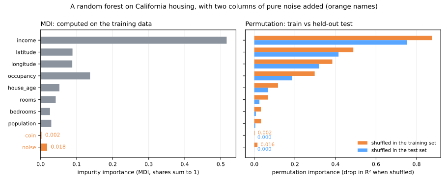
a model that looks too good usually is: a leaked column shows up at the top of every importance ranking
trust
a doctor, a credit analyst or a judge will not act on a number they cannot question
regulation
LGPD (Lei 13.709/2018, art. 20): the right to ask for a review of automated decisions, with "clear and adequate information" about the criteria; GDPR art. 22 points the same way
science
sometimes the model is a tool to learn about the world, and the explanation is the result
The toolbox of this lesson
| method | question it answers | scope |
|---|---|---|
| coefficients, tree rules | the model itself | global |
| impurity importance (MDI) | which features did the training splits use most? | global, trees |
| permutation importance | how much does the score depend on each feature? | global |
| partial dependence (PDP) | how does the average prediction change with one feature? | global |
| ICE curves | ... and for each row? | local, many rows |
| SHAP values | how much did each feature move this prediction from the average? | local → global |
| LIME | which linear model imitates the black box around this row? | local |
Model-specific methods read the internals; model-agnostic ones only call predict.
The path of this lesson
- Readable firstcoefficients, tree rules, the price of readability
- Global: what matterspermutation importance, partial dependence, ICE
- Local: one predictionSHAP values, LIME
- Read with carecausation, right for the wrong reasons, a checklist
First: do you need a black box?
Three candidates on the same five folds, from fully readable to not readable at all.
Readability has a price, here
linear regression
tree, depth 3
gradient boosting
What the readable models say
eight coefficients
$10,000 more income → +$44,140 (with the others fixed); one degree north → −$41,300.
rooms −11.65 and bedrooms +63.55 have opposite signs: they are correlated (0.85), so "one more bedroom at a fixed number of rooms" means converting a room.
eight rules
Anyone can follow a district down the tree:
income above $78,000 → $457,900.
model is the black box: 200 trees with up to 16 leaves each. The rest of the lesson opens it.Permutation importance: shuffle one column
- Take held-out data and the model's score on it.
- Shuffle one column: its values stay, its link with the target and with the rest of each row breaks.
- Measure the drop in the score. Repeat for every column (Breiman, 2001).
for col in X_test.columns:
    X_perm = X_test.copy()
    X_perm[col] = rng.permutation(X_perm[col].to_numpy())
    drops[col] = base - r2_score(y_test, model.predict(X_perm))
Two rankings of the same model
| permutation | MDI | |
|---|---|---|
| latitude | 1.346 | 0.103 |
| longitude | 1.187 | 0.117 |
| income | 0.532 | 0.567 |
| occupancy | 0.134 | 0.130 |
| rooms | 0.056 | 0.024 |
| population | 0.003 | 0.009 |
The by-hand loop gives the same story: income 0.539, population 0.002.
Shuffling latitude "costs" 1.330: R² from 0.825 to about −0.5, much worse than predicting the average for everybody.
The explanation comes in three slides.
Held-out data, not training data
A forest with two noise columns: a continuous one and a coin flip.
Correlated features (1): shared credit
Add an exact copy of income and refit the forest.
| MDI | perm. on test | |
|---|---|---|
| income alone | 0.516 | 0.754 |
| income | 0.262 | 0.196 |
| income_copy | 0.259 | 0.196 |
| both shuffled together | 0.748 |
Shuffle one copy and the trees that split on the other still work.
Together the two copies get 0.392, half of what the information is worth.
Correlated features (2): impossible rows
- Latitude and longitude: correlation −0.92, because California is a diagonal strip.
- Shuffle latitude alone: a San Francisco longitude gets a San Diego latitude, a point in the Pacific.
The model never saw such places. Part of the 1.330 measures latitude; part measures how badly the model behaves off the map.
Partial dependence: in which direction, with what shape?
Set feature \(j\) to a value \(v\) in every row, keep the rest, average the predictions (Friedman, 2001):
\[ \mathrm{PD}_j(v) = \frac{1}{n}\sum_{i=1}^{n} \hat f\bigl(x_{i,1}, \dots,\, v,\, \dots, x_{i,d}\bigr) \]
by_hand = [model.predict(X_test.assign(income=v)).mean() for v in grid]
The PDP of income, by hand
| income ($10k) | 1.5 | 2 | 3 | 4 | 5 | 6 | 8 | 10 |
|---|---|---|---|---|---|---|---|---|
| average prediction ($1k) | 142.6 | 150.6 | 173.7 | 205.1 | 229.5 | 280.6 | 358.6 | 379.8 |
flat at the bottom
1.5 → 2 adds only 8.0
steep in the middle
5 → 8 adds 129.1
flattening again
8 → 10 adds 21.2, partly the data's cap ($500,001)
partial_dependence(..., method='brute') returns the same eight numbers.
ICE: one curve per row
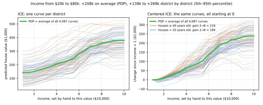
Income from $20,000 to $80,000: +$208,000 on average (the PDP), but from +$139,000 to +$269,000 district by district (5th to 95th percentile).
The extrapolation trap
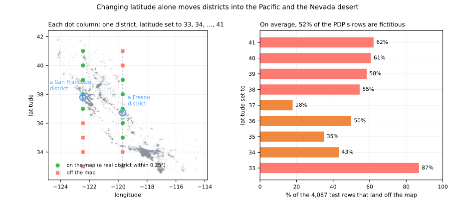
| latitude set to | 33° | 35° | 37° | 39° | 41° |
|---|---|---|---|---|---|
| rows off the map | 87% | 35% | 18% | 58% | 62% |
SHAP: why this prediction, for me?
Split one prediction into contributions, one per feature, that add up exactly:
\[ \hat f(x) = \underbrace{\phi_0}_{\text{base value}} + \phi_1 + \phi_2 + \dots + \phi_d \]- Features are players; the prediction is the team's payout (Shapley, 1953; Lundberg & Lee, 2017).
- Value of a coalition \(S\): set the features in \(S\) to the row's values, take the others from a background dataset, average.
- \(\phi_j\): the average of \(v(S \cup \{j\}) - v(S)\) over the coalitions \(j\) can join, every order of arrival equally likely.
A toy model, small enough for a calculator
\[ f = 100 + 80\,\text{rich} + 60\,\text{coastal} + 40\,\text{rich}\cdot\text{coastal} + 20\,\text{big} \quad (\$1{,}000) \]- Background: four districts, worth 120, 180, 160 and 100. So \(v(\varnothing) = 140\).
- We explain a rich, coastal, not big district: \(f(x) = 280\).
Follow the arrows where "rich" joins
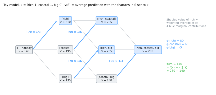
\(v(\{\text{rich}\})\): set rich = 1 in the four districts: 200, 180, 280, 180, average 210.
\[ \phi_{\text{rich}} = \tfrac13(210-140) + \tfrac16(285-195) + \tfrac16(205-135) + \tfrac13(280-190) = 80 \]Every number makes sense
rich: 80
main effect 80 × (1 − ¼) = 60, plus half of the interaction, 20
coastal: 65
45 + 20: the interaction is split equally
big: −5
20 × (0 − ¼): not big, while a quarter of the background is
80 + 65 − 5 = 140 = 280 − 140. The only attribution with these four properties:
efficiency (they add up) · symmetry · dummy (no effect → 0) · additivity (a sum of models → a sum of values)
shap.TreeExplainer on a tree that reproduces the formula returns [80, 65, −5] and base value 140.
Simulator: every coalition, every arrival order
Predict. Turn coastal off. Does the interaction still split in half? Does the waterfall still land on the prediction?
On the real model: a San Francisco district
- 8 features: \(2^8 = 256\) coalitions × 100 background districts = 25,600 predictions.
- Brute force and
TreeExplaineragree to the sixth decimal (largest difference 2e-06).
TreeExplainer gets the same exact numbers by walking each tree once per row (Lundberg et al., 2020).Reading a waterfall
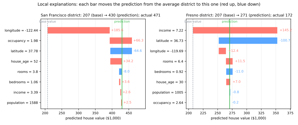
San Francisco (430k): longitude +185.6 and latitude −64.6, so location +121.0; low occupancy +66.3; old houses +34.2; an ordinary income, +2.6.
Fresno (271k): a high income (7.22) adds +145.2; location −88.3.
Global: local explanations, stacked
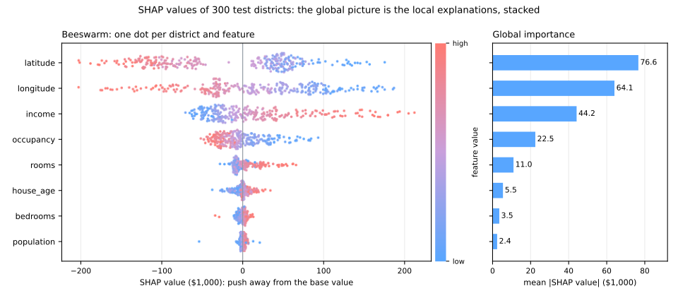
300 districts × 8 SHAP values. Mean |SHAP|, in $1,000: latitude 76.6, longitude 64.1, income 44.2, occupancy 22.5 ...
The beeswarm shows direction too: high incomes on the right, high occupancies and northern latitudes on the left.
Three rankings, three questions
MDI
income first (0.567)
what did training use?
permutation
latitude first, a drop larger than 1, inflated by impossible rows
what does the score need?
mean |SHAP|
latitude first, 76.6 against 44.2 for income, in $1,000
how far does each feature move the predictions?
LIME: a linear model around one row
- perturb: thousands of points around the row
- predict: ask the black box about each
- weight: the closer, the heavier (kernel width \(w\))
- fit a weighted linear model
| San Francisco | by hand | lime |
|---|---|---|
| income | 42.1 | 42.0 |
| occupancy | −49.9 | −48.9 |
| latitude | −89.3 | −91.8 |
| longitude | −53.6 | −55.5 |
In $1,000 per standard deviation (Ribeiro, Singh & Guestrin, 2016).
SHAP or LIME? They answer different questions
SHAP
how much does this district's actual income move its prediction away from the average? Its income is close to average: not much.
"why is this house expensive?"
LIME
what would happen if income changed? The local slope, which is steep.
"what would change the price?"
How local is "local"?
| width | 0.5 | 1.0 | 2.12 | 5.0 | std, 5 seeds |
|---|---|---|---|---|---|
| income | 54.7 | 54.8 | 42.1 | 38.2 | 1.5 |
| house_age | −9.9 | 1.3 | 1.3 | 1.0 | 1.3 |
| occupancy | −71.0 | −67.4 | −49.9 | −45.0 | 0.9 |
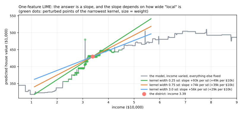
house_age even changes sign. The default \(0.75\sqrt{d} = 2.12\) is a convention, not a law.Explanation ≠ causation
- "Around this district, one standard deviation more occupancy lowers the predicted price by about $50,000" is a true statement about the model.
- It does not mean that moving more people into a house makes it cheaper: crowded households are a marker of poorer neighborhoods.
- For auditing: if a credit model leans on the postcode, it may use it as a proxy for income or ethnicity.
Right for the wrong reasons
Hospital A: patients too sick to stand get the portable scanner. Hospital B: scanners assigned at random.
hospital B
permutation importance
scanner 0.393; medical markers 0.012 at most
markers only
73.0% on A, 74.7% on B
No validation on A could have warned you. The explanation did; only domain knowledge says the reliance will not survive.
A checklist for explaining a model
- Try an interpretable model first; if it is as good on the same folds, use it.
- Compute importances on held-out data.
- Find correlated groups and permute or explain them together.
- Look at ICE curves, not only the PDP; check that the plotted values are inside the data.
- Use SHAP for local explanations; state the background you used.
- When a feature dominates, ask when is this value recorded? (leakage).
- Never read an explanation as a causal claim.
Explaining credit decisions
- German credit: 1,000 loans, 20 attributes, 30% went bad.
- Scorecard or forest? Logistic regression ROC AUC 0.771, random forest 0.785: a fold-by-fold difference of +0.014 ± 0.023, a tie.
- Open the forest: MDI against permutation, PDP and ICE, SHAP globally and for the riskiest applicant.
- Does the model need
personal_status? Then plant a leak (collection letters, sent after a loan goes bad): CV ROC AUC 0.785 → 0.927, and the explanations find it.
Download the lab notebook and open it in Jupyter or Colab (File → Upload notebook).
Summary
- Before explaining a black box, check whether a readable model is as good.
- Permutation importance on held-out data; correlated features share credit and create impossible rows.
- PDP for the average shape, ICE for the rows behind it; beware extrapolation.
- SHAP: contributions that add up exactly to prediction − base value.
- LIME: the local slope, sensitive to the kernel width.
- An explanation describes the model, not the world.