ROC, PR and Imbalanced Data
The metrics lesson scored 20 patients referred to a specialist at threshold 0.5 and got one confusion matrix: TP = 7, FN = 3, FP = 2, TN = 8. But the model did not produce labels: it produced a probability for each patient. The 0.5 was our choice, not the model's. This lesson examines the same 20 patients at every threshold, and then moves to the setting where that matters most: imbalanced data.
Every number below comes from code on this page; every figure from a short script next to it.
How this lesson is organized
The lesson has two approaches. Each one has slides, text and a lab to run in class on Colab; the quiz at the end covers the fundamental one. Start with the fundamental one: the advanced one builds on it.
| Fundamental approach | Advanced approach | |
|---|---|---|
| question | How do you score a model at every threshold, and then pick one? | What do you do when the class of interest is 2% of the rows? |
| content | ROC curve, AUC, precision–recall curve, AP, ROC vs PR with a rare class, choosing the threshold | what imbalance breaks, class weights, resampling, SMOTE, two pitfalls, order of attack |
| in-class lab | mammography: the curves, steps 1 to 5 | remedies, threshold and test, steps 6 to 11 |
| by the end, you can | draw and read a ROC by hand; read AUC as a ranking probability; say when to use PR instead of ROC; pick a threshold by a declared criterion | diagnose whether the problem is the model or the threshold; measure weights and resampling without fooling yourself; avoid leakage and distorted probabilities |
Both labs use the same notebook on Colab (in Portuguese): the fundamental part runs steps 1 to 5, the advanced part steps 6 to 11. Everything runs in the browser; there is nothing to download.
Fundamental approach
One question guides this part: a classifier that produces scores is a family of classifiers, one per threshold — how do you score the whole family and then pick a member? Two curves answer it, and each one collapses into a number.
After one threshold and its confusion matrix, the part runs in four stages, drawn below: 1. the ROC curve, one point per threshold; 2. one number, the AUC, which scores the ranking as a whole; 3. the precision–recall curve, and what changes when the positive class is rare; 4. choose the threshold that goes into production. Each stage links to its section, and in the slides a strip at the bottom shows which stage you are in.
- ROC curveeach threshold is a point: sick caught against healthy alarmed
- One number: AUCthe share of (sick, healthy) pairs in the right order
- Precision–recall curveaverage precision; why it shows a rare class that ROC hides
- Choose the thresholdfour criteria, decided on validation; a formula when scores are calibrated
Slides: fundamental approach
Click the slides and use the ← → arrows to navigate; F goes full screen and Esc shows every slide. Open the slides in a new tab
1. One threshold, one confusion matrix
A classifier that outputs scores is really a family of classifiers, one per threshold. Pick a threshold \(t\), flag everyone with score \(\geq t\), and you get a confusion matrix, from which two rates summarize the errors:
At \(t = 0.5\) the 20 patients give TPR = 7/10 = 0.7 and FPR = 2/10 = 0.2: one point, \((0.2,\ 0.7)\). Move the threshold and the point moves. The ROC curve (receiver operating characteristic, a name inherited from radar operators in the Second World War) is the path of that point as the threshold goes from "flag nobody" to "flag everybody".
2. The ROC curve, by hand
Stage 1. Here are the 20 patients sorted by score. Put the threshold at a patient's score, and that patient and everyone above them are flagged. So each row of the table is one threshold, and the running counts TP and FP give the point:
| patient | score | sick | TP | FP | TPR | FPR | precision |
|---|---|---|---|---|---|---|---|
| — | above 0.95 | 0 | 0 | 0.0 | 0.0 | — | |
| P01 | 0.95 | 1 | 1 | 0 | 0.1 | 0.0 | 1.000 |
| P02 | 0.90 | 1 | 2 | 0 | 0.2 | 0.0 | 1.000 |
| P03 | 0.85 | 1 | 3 | 0 | 0.3 | 0.0 | 1.000 |
| P04 | 0.80 | 1 | 4 | 0 | 0.4 | 0.0 | 1.000 |
| P05 | 0.75 | 0 | 4 | 1 | 0.4 | 0.1 | 0.800 |
| P06 | 0.70 | 1 | 5 | 1 | 0.5 | 0.1 | 0.833 |
| P07 | 0.65 | 1 | 6 | 1 | 0.6 | 0.1 | 0.857 |
| P08 | 0.60 | 0 | 6 | 2 | 0.6 | 0.2 | 0.750 |
| P09 | 0.55 | 1 | 7 | 2 | 0.7 | 0.2 | 0.778 |
| P10 | 0.45 | 1 | 8 | 2 | 0.8 | 0.2 | 0.800 |
| P11 | 0.40 | 0 | 8 | 3 | 0.8 | 0.3 | 0.727 |
| P12 | 0.35 | 1 | 9 | 3 | 0.9 | 0.3 | 0.750 |
| P13 | 0.30 | 0 | 9 | 4 | 0.9 | 0.4 | 0.692 |
| P14 | 0.25 | 0 | 9 | 5 | 0.9 | 0.5 | 0.643 |
| P15 | 0.20 | 1 | 10 | 5 | 1.0 | 0.5 | 0.667 |
| P16 | 0.15 | 0 | 10 | 6 | 1.0 | 0.6 | 0.625 |
| P17 | 0.10 | 0 | 10 | 7 | 1.0 | 0.7 | 0.588 |
| P18 | 0.08 | 0 | 10 | 8 | 1.0 | 0.8 | 0.556 |
| P19 | 0.05 | 0 | 10 | 9 | 1.0 | 0.9 | 0.526 |
| P20 | 0.02 | 0 | 10 | 10 | 1.0 | 1.0 | 0.500 |
The rule for drawing it is mechanical. Lowering the threshold past a sick patient adds one TP: the point moves up by 1/10 (there are 10 sick). Lowering it past a healthy patient adds one FP: the point moves right by 1/10 (there are 10 healthy). The threshold 0.5 of the metrics lesson sits between P09 and P10, at the row of P09: TPR 0.7, FPR 0.2.
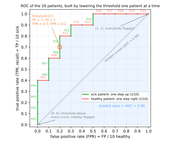
Three landmarks:
- (0, 0): the threshold is above every score, nobody is flagged: no false alarms and no catches;
- (1, 1): the threshold is below every score, everybody is flagged;
- the diagonal TPR = FPR: a scorer that assigns random scores flags sick and healthy patients at the same rate, whatever the threshold. A good scorer climbs early: it meets the sick patients first. A perfect one goes straight up to (0, 1) and then right.
scikit-learn draws the same curve:
import numpy as np
from sklearn.metrics import roc_curve

score = np.array([0.95, 0.90, 0.85, 0.80, 0.75, 0.70, 0.65, 0.60, 0.55, 0.45,
                  0.40, 0.35, 0.30, 0.25, 0.20, 0.15, 0.10, 0.08, 0.05, 0.02])
sick = np.array([1, 1, 1, 1, 0, 1, 1, 0, 1, 1, 0, 1, 0, 0, 1, 0, 0, 0, 0, 0])

fpr, tpr, thresholds = roc_curve(sick, score)
for t, f, r in zip(thresholds, fpr, tpr):
    print(f"threshold {t:4.2f}   FPR {f:.1f}   TPR {r:.1f}")
_, _, all_thresholds = roc_curve(sick, score, drop_intermediate=False)
print(len(thresholds), "points kept;", len(all_thresholds), "with drop_intermediate=False")
threshold  inf   FPR 0.0   TPR 0.0
threshold 0.95   FPR 0.0   TPR 0.1
threshold 0.80   FPR 0.0   TPR 0.4
threshold 0.75   FPR 0.1   TPR 0.4
threshold 0.65   FPR 0.1   TPR 0.6
threshold 0.60   FPR 0.2   TPR 0.6
threshold 0.45   FPR 0.2   TPR 0.8
threshold 0.40   FPR 0.3   TPR 0.8
threshold 0.35   FPR 0.3   TPR 0.9
threshold 0.25   FPR 0.5   TPR 0.9
threshold 0.20   FPR 0.5   TPR 1.0
threshold 0.02   FPR 1.0   TPR 1.0
12 points kept; 21 with drop_intermediate=False
The first threshold is inf: the "flag nobody" corner. The list is shorter than the table because roc_curve drops, by default (drop_intermediate=True), the points in the middle of a straight run: P02 and P03 lie on the segment from P01 to P04, and removing them does not change the curve. Pass drop_intermediate=False to get one point per distinct score, plus the corner.
The simulator below does the same on 600 simulated scores (500 negatives, 100 positives). Slide the threshold and watch the confusion matrix move along the ROC curve:
3. AUC: one number for the whole curve
Stage 2. The area under the ROC curve (AUC) summarizes the curve in a single number. For the staircase it can be computed with rectangles: each step to the right (a healthy patient) adds a rectangle of width 1/10 and height equal to the TPR at that moment. The healthy patients are met at heights 0.4 (P05), 0.6 (P08), 0.8 (P11), 0.9 (P13), 0.9 (P14) and 1.0 (P16 to P20, five times):
The same number, counted in pairs
Now forget the curve. Form every (sick, healthy) pair: 10 × 10 = 100 pairs. In how many does the sick patient get the higher score? For P05 (0.75), 4 sick patients score higher (P01–P04). For P08, 6. For P11, 8. For P13 and P14, 9 each. For P16–P20, all 10. In total \(4 + 6 + 8 + 9 + 9 + 5 \times 10 = 86\) of 100 pairs are in the right order: 0.86 again.
It is not a coincidence. The height of each rectangle, times 10, is the number of sick patients ranked above that healthy patient. So
with ties counted as half. This is the Mann–Whitney \(U\) statistic divided by the number of pairs (Hanley & McNeil, 1982), and it is the most useful way to read an AUC: if I pick one sick and one healthy patient at random, how often does the model put them in the right order?
from sklearn.metrics import roc_auc_score

# 1) area: every healthy patient adds a rectangle of width 1/10 and height = current TPR
tpr_now, area = 0.0, 0.0
for s in sick:
    if s == 1:
        tpr_now += 1 / 10
    else:
        area += (1 / 10) * tpr_now
# 2) pairs: in how many (sick, healthy) pairs does the sick patient score higher?
pos, neg = score[sick == 1], score[sick == 0]
concordant = (pos[:, None] > neg[None, :]).sum()
print(f"area by rectangles: {area:.2f}")
print(f"concordant pairs:   {concordant} of {len(pos) * len(neg)} = {concordant / (len(pos) * len(neg)):.2f}")
print(f"roc_auc_score:      {roc_auc_score(sick, score):.2f}")
Reading the scale: AUC = 0.5 is a random ranking (the diagonal), AUC = 1 puts every sick patient above every healthy one, and AUC < 0.5 means the ranking is inverted, more often wrong than right. An AUC of 0.14 is not a bad model, it is a good model with the labels swapped: flip its scores and it has 0.86.
What AUC measures: the separation between the classes
The pairs reading says what AUC measures: how much the score distributions of the sick and the healthy overlap. In the figure, healthy patients get scores from a normal \(N(0, 1)\) and sick ones from an \(N(d, 1)\). With the classes almost on top of each other (\(d = 0.5\)), drawing a sick and a healthy patient and asking who has the higher score is barely better than a coin flip: AUC 0.64. As the distributions move apart, the curve climbs toward the top-left corner and the AUC goes to 0.85 and then 0.98.
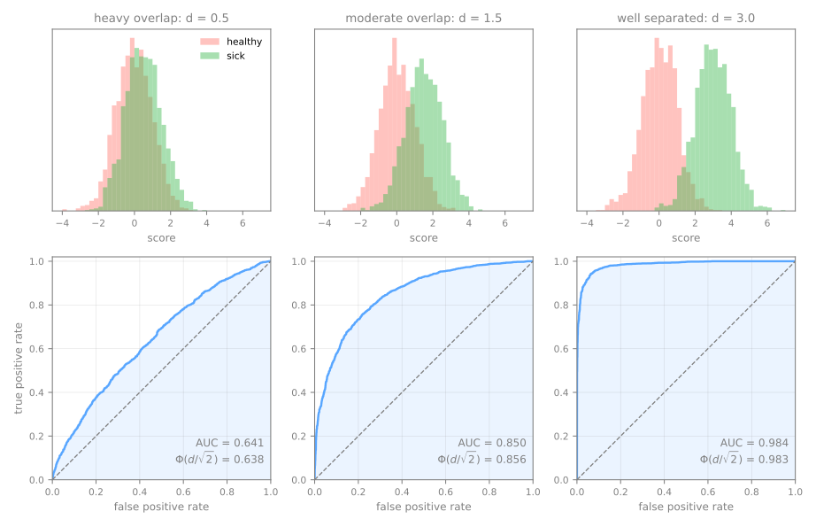
For this model there is even a formula. The difference between a sick patient's score and a healthy one's is a normal \(N(d, 2)\), so \(\text{AUC} = P(\text{difference} > 0) = \Phi(d/\sqrt{2})\), where \(\Phi\) is the cumulative distribution function of the standard normal:
from scipy.stats import norm

rng = np.random.default_rng(0)
for d in [0.5, 1.5, 3.0]:
    neg, pos = rng.normal(0, 1, 2000), rng.normal(d, 1, 2000)    # healthy and sick
    y, s = np.r_[np.zeros(2000), np.ones(2000)], np.r_[neg, pos]
    print(f"d = {d}: AUC {roc_auc_score(y, s):.3f} · Phi(d / sqrt 2) {norm.cdf(d / np.sqrt(2)):.3f}")
d = 0.5: AUC 0.641 · Phi(d / sqrt 2) 0.638
d = 1.5: AUC 0.850 · Phi(d / sqrt 2) 0.856
d = 3.0: AUC 0.984 · Phi(d / sqrt 2) 0.983
The sample of 2,000 patients per class lands within 0.01 of the formula. The lesson holds for any model: no threshold separates two overlapping distributions. Moving the threshold only picks where on the same curve to operate; raising the curve takes a model, or features, that pull the distributions apart.
Only the order matters
Because the AUC counts pairs in the right order, it depends only on the ranking of the scores, never on their values. Any transformation that keeps the order keeps the AUC:
for name, s in [('score', score), ('score ** 2', score ** 2), ('log(score)', np.log(score)),
                ('100 * score - 7', 100 * score - 7), ('1 - score', 1 - score)]:
    print(f"{name:16s} AUC = {roc_auc_score(sick, s):.2f}")
score            AUC = 0.86
score ** 2       AUC = 0.86
log(score)       AUC = 0.86
100 * score - 7  AUC = 0.86
1 - score        AUC = 0.14
Squared, logged or rescaled, the "probabilities" stop being probabilities (100 × score − 7 goes up to 88), but the AUC stays at 0.86. Reversing the order (1 - score) gives 1 − 0.86 = 0.14. This has two consequences worth remembering:
- the AUC says nothing about calibration. A model whose "probabilities" are all between 0.40 and 0.41 can have AUC 0.99, as long as the order is right;
- the AUC says nothing about any particular threshold. It averages over all of them, including thresholds you would never use. Two models with the same AUC can be very different at the one operating point you care about.
Scores, not labels
roc_auc_score needs the scores: predict_proba(X)[:, 1] or decision_function(X). Passing the output of predict is a common mistake, and it does not raise an error:
from sklearn.metrics import balanced_accuracy_score

labels = (score >= 0.5).astype(int)              # hard predictions, not scores
print(f"AUC from labels:   {roc_auc_score(sick, labels):.2f}")   # wrong: labels
print(f"balanced accuracy: {balanced_accuracy_score(sick, labels):.2f}")
print(f"AUC from scores:   {roc_auc_score(sick, score):.2f}")    # right: scores
With only two distinct values, the "curve" has a single point, (0.2, 0.7), joined to the corners by straight lines. Its area is \((\text{TPR} + \text{TNR})/2 = (0.7 + 0.8)/2 = 0.75\): the balanced accuracy at 0.5, not the AUC of the model, which the scores put at 0.86. A milder version of the same effect appears with k-NN: with \(k = 5\), predict_proba can only take the values 0, 0.2, 0.4, 0.6, 0.8 and 1, so its ROC curve has at most 7 points, a coarse staircase. The advanced lab shows one.
4. The precision–recall curve
Stage 3. The ROC curve looks at the two classes separately: TPR within the sick, FPR within the healthy. The question a doctor asks when a patient is flagged is different: of the patients I flag, how many are really sick? That is the precision, \(TP / (TP + FP)\), the last column of the table. Plotting precision against recall (= TPR) for every threshold gives the precision–recall (PR) curve.
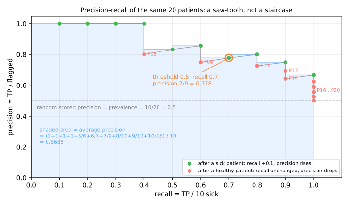
It does not look like the ROC staircase. Each sick patient moves the point right (recall + 0.1) and slightly up, because a correct flag raises precision. Each healthy patient leaves recall unchanged and pushes precision down. The result is a saw-tooth. Its end point is always recall 1 with precision = 10/20 = 0.5, the share of sick patients among all 20. That share, the prevalence, is also the curve of a random scorer: if the flagged group is a random sample, its share of sick patients is the share in the population, whatever the threshold. On the PR plot the "no skill" line is therefore horizontal, at the prevalence, and not a diagonal.
Average precision
The PR curve is summarized by average precision (AP):
a sum over thresholds of the gain in recall times the precision reached there. Recall only grows at sick patients, by 1/10 each time, so AP is simply the mean of the precision at the rank of each sick patient. From the table, those precisions are 1, 1, 1, 1, 5/6, 6/7, 7/9, 8/10, 9/12 and 10/15:
from sklearn.metrics import auc, average_precision_score, precision_recall_curve

flagged = np.arange(1, 21)                      # threshold at patient k flags k patients
precision_k = np.cumsum(sick) / flagged
print("precision at each sick patient:", precision_k[sick == 1].round(3))
print(f"AP by hand:              {precision_k[sick == 1].mean():.4f}")
print(f"average_precision_score: {average_precision_score(sick, score):.4f}")
prec, rec, _ = precision_recall_curve(sick, score)
print(f"trapezoidal area:        {auc(rec, prec):.4f}")
precision at each sick patient: [1.    1.    1.    1.    0.833 0.857 0.778 0.8   0.75  0.667]
AP by hand:              0.8685
average_precision_score: 0.8685
trapezoidal area:        0.8608
The last line is a trap to avoid. auc(recall, precision) joins the PR points with straight lines and computes the trapezoid area, here 0.8608. But between two operating points, precision does not vary linearly with recall, so the straight line describes classifiers that do not exist, and the trapezoid can be optimistic (Davis & Goadrich, 2006). AP sums rectangles instead, with no interpolation. The two numbers are close here and can be far apart on real curves; report AP, computed with average_precision_score.
5. ROC vs PR when the positive class is rare
The two curves react differently to one thing: the prevalence. To isolate it, keep the scorer fixed: healthy patients get scores from a normal distribution \(N(0, 1)\), sick patients from \(N(2, 1)\). Then change only how many sick patients there are, from 50% down to 1%:
rng = np.random.default_rng(0)
neg = rng.normal(0, 1, 100_000)                   # healthy: score ~ N(0, 1)
for prev in [0.5, 0.1, 0.01]:
    n_pos = round(len(neg) * prev / (1 - prev))
    pos = rng.normal(2, 1, n_pos)                 # sick: score ~ N(2, 1), the same scorer every time
    s = np.r_[pos, neg]
    y = np.r_[np.ones(n_pos), np.zeros(len(neg))]
    tp, fp = (pos >= 1.16).sum(), (neg >= 1.16).sum()      # one fixed threshold
    print(f"prevalence {prev:4.0%}  AUC {roc_auc_score(y, s):.3f}  AP {average_precision_score(y, s):.3f}"
          f"   at 1.16: TPR {tp / n_pos:.2f}  FPR {fp / len(neg):.2f}  precision {tp / (tp + fp):.2f}")
prevalence  50%  AUC 0.921  AP 0.922   at 1.16: TPR 0.80  FPR 0.12  precision 0.87
prevalence  10%  AUC 0.922  AP 0.666   at 1.16: TPR 0.80  FPR 0.12  precision 0.42
prevalence   1%  AUC 0.914  AP 0.252   at 1.16: TPR 0.79  FPR 0.12  precision 0.06
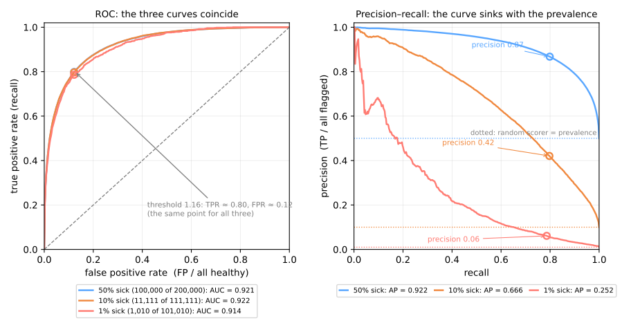
The ROC curves are the same curve (the small wobble of the 1% curve is sampling noise, with only 1,010 sick patients). The PR curves collapse: AP goes from 0.922 to 0.666 to 0.252. At the same threshold, catching the same 80% or so of sick patients with the same 12% false-alarm rate, the precision falls from 0.87 to 0.42 to 0.06. At 1% prevalence, 94 of every 100 flagged patients are healthy.
The reason is in the denominators. FPR divides by the number of healthy patients, so it is a property of the scorer on healthy patients alone, blind to how many sick ones exist. Precision divides by the number of flagged patients, which mixes both classes in proportion to their sizes. To see it, write precision in terms of the prevalence \(\pi\), the fraction of sick people in the population. Among \(N\) people there are \(\pi N\) sick and \((1-\pi) N\) healthy. The scorer flags a fraction TPR of the sick, \(TP = \text{TPR} \cdot \pi N\), and a fraction FPR of the healthy, \(FP = \text{FPR} \cdot (1-\pi) N\). In precision, \(TP / (TP + FP)\), the \(N\) cancels:
TPR and FPR belong to the scorer; \(\pi\) belongs to the population. With TPR 0.80 and FPR 0.12: at \(\pi = 0.5\) the formula gives \(0.40 / (0.40 + 0.06) = 0.87\); at \(\pi = 0.01\), \(0.008 / (0.008 + 0.119) = 0.06\). A false-alarm rate of 12% sounds small, but 12% of 100,000 healthy people is 12,000 false alarms against 800 true ones.
Neither curve is wrong; they answer different questions. A rule of thumb (Saito & Rehmsmeier, 2015):
- ROC / AUC when both classes matter, when the prevalence in deployment is unknown or will change, or when you compare rankers across datasets with different prevalences. It is prevalence-free by construction;
- PR / AP when the positive class is rare and what you pay for is the flagged cases (alerts to review, patients to call back, transactions to block). It shows the cost of false alarms that the ROC curve hides. Always read AP against its baseline: an AP of 0.25 is poor at 50% prevalence and 25 times better than chance at 1%.
6. Choosing the operating threshold
Stage 4. The curves describe all thresholds; a deployed model uses one. Choosing it is a decision, so it follows the rule used since the k-NN lesson for choosing k: it is made on a validation set, never on the test set. (Cross-validation will later make this choice more robust; here we use a single hold-out split.) Treat the 20 patients as our validation set, and evaluate every threshold under four common criteria:
import pandas as pd

rows = []
for t in score:                                  # each patient's score is a candidate threshold
    flag = score >= t
    TP = int((flag & (sick == 1)).sum())
    FP = int((flag & (sick == 0)).sum())
    FN = 10 - TP
    rows.append(dict(t=t, TP=TP, FP=FP, precision=TP / (TP + FP), recall=TP / 10,
                     F1=2 * TP / (2 * TP + FP + FN), J=(TP - FP) / 10, cost=10 * FN + FP))
table = pd.DataFrame(rows)
print(table.round(3).to_string(index=False))
   t  TP  FP  precision  recall    F1   J  cost
0.95   1   0      1.000     0.1 0.182 0.1    90
0.90   2   0      1.000     0.2 0.333 0.2    80
0.85   3   0      1.000     0.3 0.462 0.3    70
0.80   4   0      1.000     0.4 0.571 0.4    60
0.75   4   1      0.800     0.4 0.533 0.3    61
0.70   5   1      0.833     0.5 0.625 0.4    51
0.65   6   1      0.857     0.6 0.706 0.5    41
0.60   6   2      0.750     0.6 0.667 0.4    42
0.55   7   2      0.778     0.7 0.737 0.5    32
0.45   8   2      0.800     0.8 0.800 0.6    22
0.40   8   3      0.727     0.8 0.762 0.5    23
0.35   9   3      0.750     0.9 0.818 0.6    13
0.30   9   4      0.692     0.9 0.783 0.5    14
0.25   9   5      0.643     0.9 0.750 0.4    15
0.20  10   5      0.667     1.0 0.800 0.5     5
0.15  10   6      0.625     1.0 0.769 0.4     6
0.10  10   7      0.588     1.0 0.741 0.3     7
0.08  10   8      0.556     1.0 0.714 0.2     8
0.05  10   9      0.526     1.0 0.690 0.1     9
0.02  10  10      0.500     1.0 0.667 0.0    10
print("max F1:              t =", table.loc[table.F1.idxmax(), 't'])
print("max Youden J:        t =", table.loc[table.J == table.J.max(), 't'].tolist())
ok = table[table.recall >= 0.9]
print("recall >= 0.9, best precision: t =", ok.loc[ok.precision.idxmax(), 't'])
print("min cost (FN = 10 FP): t =", table.loc[table.cost.idxmin(), 't'], "  cost", table.cost.min())
max F1:              t = 0.35
max Youden J:        t = [0.45, 0.35]
recall >= 0.9, best precision: t = 0.35
min cost (FN = 10 FP): t = 0.2   cost 5
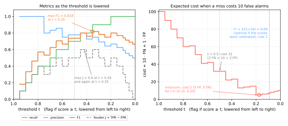
Four criteria, and not all the same answer:
- Maximum F1 picks \(t = 0.35\): 9 of 10 sick found, 3 false alarms, F1 = 0.818. F1 weighs precision and recall equally, which is rarely what the application wants, but it is a reasonable default when nobody can say otherwise.
- Youden's J \(= \text{TPR} - \text{FPR}\) (Youden, 1950) is the vertical distance from the ROC point to the diagonal. Here it is tied at 0.6 between \(t = 0.45\) (TPR 0.8, FPR 0.2) and \(t = 0.35\) (TPR 0.9, FPR 0.3). It ignores the prevalence, like the ROC curve it lives on.
- "Recall ≥ 0.9, then the best precision" is how requirements usually arrive ("we must catch at least 90% of cases"): among the thresholds that reach recall 0.9, \(t = 0.35\) has the best precision, 0.75.
- Minimum expected cost. Suppose a missed disease costs 10 times more than a needless referral: cost = 10·FN + 1·FP. The minimum, cost 5, is at \(t = 0.20\): all 10 sick found, 5 healthy referred. The default 0.5 costs 32 (3 misses × 10 + 2 false alarms).
For the cost criterion there is also a formula. If the scores were calibrated probabilities, flagging a patient with probability \(p\) costs \((1-p)\,c_{FP}\) in expectation, and not flagging costs \(p\,c_{FN}\). Flag when the second is larger:
(Elkan, 2001). On our 20 patients, \(t = 0.10\) costs 7 (7 false alarms, no miss), close to the empirical minimum but not equal: our scores are not perfectly calibrated and 20 patients is a small sample. The formula tells you where to look; the validation set tells you where to stop. Notice also that 0.5 is the right threshold only when the two errors cost the same and the scores are calibrated. Nothing about 0.5 is special otherwise.
scikit-learn (≥ 1.5) automates this with TunedThresholdClassifierCV, which searches the threshold by cross-validation under the criterion you pass in scoring (balanced accuracy by default, that is, Youden's J). You will be able to use it after the cross-validation lesson; the procedure is the one done by hand in this section.
Key idea
The curve is the model; the point on it is your decision. AUC and AP score the ranking, which training produces; the threshold picks the operating point, which you produce — and which can be changed later without retraining anything.
7. Summary: the two curves and the operating point
| ROC curve | precision–recall curve | |
|---|---|---|
| axes | FPR × TPR | recall × precision |
| denominators | each class on its own | the flagged column, which mixes both |
| "no skill" line | the diagonal | a horizontal at the prevalence |
| number that summarizes it | AUC = P(sick ranked above healthy) | AP = mean precision at each positive |
| changes with prevalence? | no | yes |
| use when | both classes matter; prevalence will change | the positive class is rare and you pay for the flagged cases |
- Score the ranking with AUC and AP, always passing scores, never labels.
- Read AP against the prevalence: 0.25 is weak at 50% positives and 25 times better than chance at 1%.
- Choose the threshold on validation, by a declared criterion: a recall target, a cost ratio, the best F1 if nothing else is known.
- Nothing about 0.5 is special outside the case where both mistakes cost the same and the scores are calibrated.
Fundamental lab — the curves of a screening tool
The mammography dataset (OpenML 310, also one of the benchmarks of the SMOTE paper) has 11,183 mammogram regions described by 6 numeric features computed from the image, of which 260, 2.3%, are microcalcifications, tiny calcium deposits that can be an early sign of breast cancer. Below they are the positive class, called malignant for short, and the rest benign. The task: flag them for a radiologist to look at. Missing one is much worse than a false alarm, so the goal is stated up front: recall of at least 0.80 on malignant cases, with the best precision possible.
How to run this lab in class (about 35 min, in pairs)
- Open the lab notebook on Colab (in Portuguese). There is nothing to download or install: Colab runs in the browser. To keep your answers, save a copy to your Drive (File → Save a copy in Drive) before editing. Run the cells in order, in one session.
- This lab covers steps 1 to 5 of the notebook. The advanced lab continues in the same notebook, from step 6.
- Each step starts with a Predict: answer it with your partner before running the cell. Getting the prediction wrong is what makes the result stick.
- After running, compare with the output and the reading on this page. Every output here is exactly what the code prints.
- The Simulations ask you to write a small Python experiment: change one input and watch what happens to the output. No arithmetic by hand. The solution is collapsed right below: try before opening it.
- Suggested pace: steps 1 to 3 in 10 min; step 4 and its simulation in 12 min; step 5 and its simulation in 13 min.
Step 1 — load and look at the prevalence
Predict. Microcalcifications are rare findings on a mammogram. Before running: do you expect them to be more or less than 10% of the regions? With that prevalence, how much accuracy would a model that never flags anything reach?
import numpy as np
import pandas as pd
from sklearn.datasets import fetch_openml

mammo = fetch_openml(data_id=310, as_frame=True)
X = mammo.data                                   # 6 numeric features per region
y = (mammo.target == '1').astype(int)            # target is '-1' (benign) or '1' (malignant)
print(X.shape)
print(y.value_counts())
print(f"prevalence: {y.mean():.2%}")
The target comes as the strings '-1' and '1'; we map it to 0/1 so that 1 is the class we want to catch. 260 of 11,183 regions are malignant: 2.32%. Any metric we compute must be read against that number.
Step 2 — a stratified train / validation / test split
Predict. Why does stratifying matter more here than on a balanced dataset? If validation holds about 50 malignant cases, how much recall is one case worth?
from sklearn.model_selection import train_test_split

X_tmp, X_test, y_tmp, y_test = train_test_split(X, y, test_size=0.2, stratify=y, random_state=7)
X_train, X_val, y_train, y_val = train_test_split(X_tmp, y_tmp, test_size=0.25,
                                                  stratify=y_tmp, random_state=7)
for name, part in [('train', y_train), ('validation', y_val), ('test', y_test)]:
    print(f"{name:10s} {len(part):5d} rows  {part.sum():3d} malignant  ({part.mean():.2%})")
train       6709 rows  156 malignant  (2.33%)
validation  2237 rows   52 malignant  (2.32%)
test        2237 rows   52 malignant  (2.32%)
60/20/20, stratified. Training fits the models, validation chooses between them and sets the threshold, and the test set is used once, in step 10. Note how few positives each part has: 52 malignant cases in validation means one case is worth almost 2 points of recall.
Step 3 — a baseline that never flags anything
Predict. What accuracy will answering "benign" for every region reach? And what recall?
from sklearn.dummy import DummyClassifier
from sklearn.metrics import accuracy_score, recall_score

dummy = DummyClassifier(strategy='most_frequent').fit(X_train, y_train)
pred = dummy.predict(X_val)
print(f"accuracy {accuracy_score(y_val, pred):.4f}   recall {recall_score(y_val, pred):.3f}")
Answering "benign" to everything gives 97.7% accuracy and finds zero cancers. That is the bar accuracy must be compared with, and the reason we will not look at accuracy again.
Step 4 — a logistic regression at the default threshold
Predict. Will accuracy beat the baseline by a lot or by a little? And recall at 0.5: do you expect it near 0.9 or well below, given that only 2.3% of the regions are malignant?
from sklearn.linear_model import LogisticRegression
from sklearn.metrics import average_precision_score, precision_score, roc_auc_score
from sklearn.pipeline import make_pipeline
from sklearn.preprocessing import StandardScaler

lr = make_pipeline(StandardScaler(), LogisticRegression()).fit(X_train, y_train)
p_val = lr.predict_proba(X_val)[:, 1]
pred = (p_val >= 0.5).astype(int)
print(f"accuracy {accuracy_score(y_val, pred):.4f}   flagged {pred.sum()} of {len(pred)}")
print(f"recall {recall_score(y_val, pred):.3f}   precision {precision_score(y_val, pred):.3f}")
print(f"ROC AUC {roc_auc_score(y_val, p_val):.3f}   AP {average_precision_score(y_val, p_val):.3f}"
      f"   (AP of a random scorer = {y_val.mean():.3f})")
accuracy 0.9839   flagged 30 of 2237
recall 0.442   precision 0.767
ROC AUC 0.946   AP 0.653   (AP of a random scorer = 0.023)
How to read it:
- accuracy 98.4%, barely above the dummy's 97.7%;
- at 0.5 the model flags only 30 regions: 23 of them are malignant (precision 0.767), but that is 23 of 52, recall 0.442. More than half of the cancers are missed, far from the 0.80 target;
- the ranking is good: ROC AUC 0.946, and AP 0.653 against a random-scorer AP of 0.023, about 28 times better. The model knows a lot; 0.5 is simply the wrong cut for this problem.
Simulation: AUC only sees the order. Take the scores p_val and transform them in ways that preserve the order (cube them, turn them into odds \(p/(1-p)\)) and one that reverses it (\(1-p\)). For each version, measure AUC, AP and how many regions land above 0.5. What changes and what does not?
Solution
for name, s in [('p', p_val), ('p ** 3', p_val ** 3),
                ('p / (1 - p)', p_val / (1 - p_val)), ('1 - p', 1 - p_val)]:
    flagged = (s >= 0.5).sum()
    print(f"{name:12s} AUC {roc_auc_score(y_val, s):.3f}   AP {average_precision_score(y_val, s):.3f}"
          f"   flagged at 0.5: {flagged:4d}   recall {recall_score(y_val, s >= 0.5):.3f}")
p            AUC 0.946   AP 0.653   flagged at 0.5:   30   recall 0.442
p ** 3       AUC 0.946   AP 0.653   flagged at 0.5:   14   recall 0.231
p / (1 - p)  AUC 0.946   AP 0.653   flagged at 0.5:   38   recall 0.558
1 - p        AUC 0.054   AP 0.012   flagged at 0.5: 2207   recall 0.558
The first three rows have exactly the same AUC and the same AP, because no increasing transformation changes who comes before whom. What does change, a lot, is the operating point at 0.5: from 14 to 38 regions flagged, with recall going from 0.231 to 0.558. So AUC scores what training produced (the ranking) and is blind to the cut; 0.5, in turn, only means something if the scores are genuine probabilities. The last row reverses the order: AUC becomes \(1 - 0.946 = 0.054\), a "terrible model" that is really the same model with its sign flipped.
Step 5 — the ROC and PR curves
Predict. To reach recall 0.80 on this dataset, do you think precision lands nearer 0.8 or nearer 0.3? Remember that only 2.3% of the regions are malignant.
import matplotlib.pyplot as plt
from sklearn.metrics import PrecisionRecallDisplay, RocCurveDisplay, precision_recall_curve, roc_curve

fig, (ax1, ax2) = plt.subplots(1, 2, figsize=(10, 4))
RocCurveDisplay.from_predictions(y_val, p_val, ax=ax1, plot_chance_level=True)
PrecisionRecallDisplay.from_predictions(y_val, p_val, ax=ax2, plot_chance_level=True)
plt.show()

fpr, tpr, _ = roc_curve(y_val, p_val)
for max_fpr in [0.01, 0.05, 0.10]:
    print(f"FPR <= {max_fpr:.2f}: best recall {tpr[fpr <= max_fpr].max():.3f}")
prec, rec, _ = precision_recall_curve(y_val, p_val)
for min_rec in [0.5, 0.8, 0.9]:
    print(f"recall >= {min_rec:.1f}: best precision {prec[rec >= min_rec].max():.3f}")
FPR <= 0.01: best recall 0.654
FPR <= 0.05: best recall 0.808
FPR <= 0.10: best recall 0.904
recall >= 0.5: best precision 0.784
recall >= 0.8: best precision 0.294
recall >= 0.9: best precision 0.232
The two plots show the same model. The ROC curve climbs steeply: at a false-positive rate of 5% it already reaches recall 0.808. That sounds cheap, but 5% of the 2,185 benign regions is up to 109 false alarms, against 42 cancers found. The PR curve shows that price directly: to reach recall 0.8 the best precision is 0.294, so roughly 2 of every 3 flagged regions are benign; to reach 0.9 it falls to 0.232. That is the trade-off the radiologists will live with, and neither curve can change it. Only the choice of the point on the curve is ours.
Simulation: the price of each point of recall. For recall targets from 0.50 to 0.95, find on validation the threshold that reaches the target with the best precision, and count how many regions it flags. Translate precision into something a radiologist understands: how many benign regions are reviewed per cancer found?
Solution
prec, rec, thr = precision_recall_curve(y_val, p_val)
print("target threshold  flagged  precision  benign reviewed per cancer found")
for target in [0.5, 0.7, 0.8, 0.9, 0.95]:
    ok = rec[:-1] >= target
    i = int(np.argmax(np.where(ok, prec[:-1], -1)))
    flag = p_val >= thr[i]
    tp = int((flag & (y_val == 1)).sum()); fp = int((flag & (y_val == 0)).sum())
    print(f"{target:6.2f} {thr[i]:9.4f}  {flag.sum():7d}  {prec[i]:9.3f}  {fp / tp:26.1f}")
target threshold  flagged  precision  benign reviewed per cancer found
  0.50    0.3651       37      0.784                         0.3
  0.70    0.1085       82      0.451                         1.2
  0.80    0.0632      143      0.294                         2.4
  0.90    0.0425      203      0.232                         3.3
  0.95    0.0050      835      0.060                        15.7
The last column is the PR curve written as workload. At a recall target of 0.50 the radiologist reviews one benign region per three cancers; raising it to 0.80 means almost two and a half per cancer; at 0.95, almost 16. The cost of each extra point of recall grows fast, which is why the 0.80 target was declared before seeing the data rather than after. Notice too that the matching threshold falls from 0.37 to 0.005: nothing in these numbers looks like 0.5.
To close the fundamental part. One sentence each: (1) why does the ROC curve not move when the disease gets rarer while the PR curve does? (2) What does AUC measure that accuracy at 0.5 does not? (3) Who decides the operating point, training or you?
Your turn (fundamental)
For homework:
- The staircase by hand. Take the first 10 patients of the 20-row example and draw their ROC curve on paper, one step per patient. Check it with
roc_curve. Where does the 0.5 threshold sit? - AUC without calibration. Squeeze the validation scores of step 4 into the range 0.40 to 0.41 with
0.40 + 0.01 * p_val. What happens to AUC, and what happens to accuracy at 0.5? Which metric would tell you the probabilities are wrong? - AP against its baseline. Compute the AP of a random scorer (use
rng.random(len(y_val))) and compare it with the model's AP and with the prevalence. How many times better than chance is the model?
Advanced approach
The fundamental part was about scoring and cutting a ranking. This part goes to the setting where that matters most: the class of interest is 2% of the rows. The question becomes what the common remedies — class weights, resampling, SMOTE — actually change, and what they do not. The code blocks continue those of sections 1 to 6 (the lab code runs separately, on Colab): the imports and the 20 patients (score, sick) are already in the session.
This part ends with an order of attack and, before it, runs in four stages, drawn below: 1. what goes wrong when the class is rare; 2. three remedies: class weights, a moved threshold, resampling; 3. side by side, on the same split; 4. two pitfalls that make a remedy look better than it is. Each stage links to its section, and in the slides a strip at the bottom shows which stage you are in.
- What goes wrong2% fraud: high accuracy, low recall; is it the model or the threshold?
- Three remediesclass weights, a moved threshold, resampling and SMOTE
- Side by sidefive approaches on the same split, one curve
- Two pitfallsresampling before the split; distorted probabilities
Slides: advanced approach
Click the slides and use the ← → arrows to navigate; F goes full screen and Esc shows every slide. Open the slides in a new tab
8. Imbalanced data: what goes wrong
Stage 1. Now the training side. Take a simulated fraud screen: 20,000 card transactions, about 2% fraudulent, 5 numeric features that are a little higher, on average, for frauds. The split is 60/20/20 with stratify=y, so each part keeps the 2%:
from sklearn.model_selection import train_test_split

rng = np.random.default_rng(0)
n = 20_000
y = (rng.random(n) < 0.02).astype(int)                               # about 2% fraud
X = rng.normal(size=(n, 5)) + y[:, None] * np.array([1.2, 1.0, 0.8, 0.8, 0.6])

X_tmp, X_test, y_tmp, y_test = train_test_split(X, y, test_size=0.2, stratify=y, random_state=0)
X_train, X_val, y_train, y_val = train_test_split(X_tmp, y_tmp, test_size=0.25,
                                                  stratify=y_tmp, random_state=0)
for name, part in [('train', y_train), ('validation', y_val), ('test', y_test)]:
    print(f"{name:10s} {len(part):6,d} rows  {part.sum():4d} frauds  ({part.mean():.2%})")
train      12,000 rows   233 frauds  (1.94%)
validation  4,000 rows    77 frauds  (1.93%)
test        4,000 rows    78 frauds  (1.95%)
Without stratify, the number of frauds in each part would change from split to split, and with so few positives that alone moves recall by several points. Stratifying is the first, free remedy. A logistic regression, trained as usual:
from sklearn.dummy import DummyClassifier
from sklearn.linear_model import LogisticRegression
from sklearn.metrics import accuracy_score, precision_score, recall_score
from sklearn.pipeline import make_pipeline
from sklearn.preprocessing import StandardScaler

dummy = DummyClassifier(strategy='most_frequent').fit(X_train, y_train)
plain = make_pipeline(StandardScaler(), LogisticRegression()).fit(X_train, y_train)
p_plain = plain.predict_proba(X_test)[:, 1]
pred = plain.predict(X_test)                     # threshold 0.5
print(f"dummy accuracy:   {accuracy_score(y_test, dummy.predict(X_test)):.4f}")
print(f"model accuracy:   {accuracy_score(y_test, pred):.4f}")
print(f"flagged:          {pred.sum()} of {len(pred)}  (true frauds: {y_test.sum()})")
print(f"recall:           {recall_score(y_test, pred):.3f}   precision: {precision_score(y_test, pred):.3f}")
print(f"ROC AUC:          {roc_auc_score(y_test, p_plain):.3f}   AP: {average_precision_score(y_test, p_plain):.3f}")
print(f"mean probability: {p_plain.mean():.4f}   median: {np.median(p_plain):.4f}")
dummy accuracy:   0.9805
model accuracy:   0.9838
flagged:          23 of 4000  (true frauds: 78)
recall:           0.231   precision: 0.783
ROC AUC:          0.930   AP: 0.459
mean probability: 0.0206   median: 0.0030
(In this section the test set is only displayed, to compare remedies on the same rows; every choice, like a threshold, is made on the validation set.)
The accuracy, 98.38%, looks excellent and says almost nothing: the dummy that never flags anything already has 98.05%. The model flags 23 transactions and catches 18 of the 78 frauds, a recall of 0.23. Yet the ranking is good: ROC AUC 0.930. Pick a random fraud and a random legitimate transaction, and 93% of the time the fraud gets the higher score.
So the model is not blind; its probabilities are just small. The median transaction gets 0.003, and 60 of the 78 frauds stay below 0.5. That is honest: with a 2% base rate, even a suspicious transaction is usually more likely legitimate than not, so few cross 0.5. The problem is the threshold and the metric, not necessarily the model. That diagnosis matters because each remedy below acts on a different part: some change the operating point, some the ranking, and they are easy to confuse.
9. Remedies, measured side by side
Stage 2. Three families of remedy, measured on the same split: change the weight of each class in the loss, change the threshold, and change the training rows.
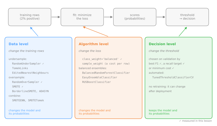
Each family acts at a different point on the way from the training rows to the decision. The figure places the three and also lists the most common imblearn variants this lesson does not measure:
Class weights
Most scikit-learn classifiers accept class_weight. With 'balanced', each example of class \(c\) counts in the loss with weight
where \(n\) is the number of rows, \(k = 2\) the number of classes and \(n_c\) the rows of class \(c\). On our training set, \(n = 12{,}000\), with 11,767 legitimate and 233 frauds: \(w_0 = 12000 / (2 \times 11767) = 0.510\) and \(w_1 = 12000 / (2 \times 233) = 25.751\). Each fraud now weighs as much as 50 legitimate transactions, and the two classes contribute equally to the loss.
from sklearn.utils.class_weight import compute_class_weight

n_c = np.bincount(y_train)                       # [legitimate, fraud]
print("by hand:", (len(y_train) / (2 * n_c)).round(3))
print("sklearn:", compute_class_weight('balanced', classes=np.array([0, 1]), y=y_train).round(3))
weighted = make_pipeline(StandardScaler(), LogisticRegression(class_weight='balanced'))
weighted.fit(X_train, y_train)
p_w = weighted.predict_proba(X_test)[:, 1]
for name, p in [('no weights', p_plain), ('balanced', p_w)]:
    flag = p >= 0.5
    print(f"{name:10s}  AUC {roc_auc_score(y_test, p):.3f}  AP {average_precision_score(y_test, p):.3f}  "
          f"flagged {flag.sum():3d}  recall {recall_score(y_test, flag):.3f}  "
          f"precision {precision_score(y_test, flag):.3f}")
no weights  AUC 0.930  AP 0.459  flagged  23  recall 0.231  precision 0.783
balanced    AUC 0.929  AP 0.460  flagged 673  recall 0.821  precision 0.095
The ranking metrics barely move: AUC 0.930 → 0.929, AP 0.459 → 0.460. What moves is the operating point at 0.5: 23 → 673 transactions flagged, recall 0.231 → 0.821, precision 0.783 → 0.095. The weights did not make the model better at telling frauds from the rest; they made it say "fraud" much more often.
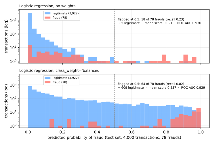
For logistic regression we can see exactly how. Compare the fitted parameters:
lr_plain, lr_w = plain[-1], weighted[-1]
print("no weights: coef", lr_plain.coef_[0].round(2), " intercept", lr_plain.intercept_[0].round(2))
print("balanced:   coef", lr_w.coef_[0].round(2), " intercept", lr_w.intercept_[0].round(2))
print(f"intercept shift {lr_w.intercept_[0] - lr_plain.intercept_[0]:.2f}"
      f"   log(n0 / n1) = {np.log(n_c[0] / n_c[1]):.2f}")
no weights: coef [1.07 1.   0.85 0.8  0.59]  intercept -5.77
balanced:   coef [1.09 1.04 0.78 0.84 0.68]  intercept -1.9
intercept shift 3.86   log(n0 / n1) = 3.92
The slopes stay within 0.1 of each other; the intercept rises by 3.86, almost exactly \(\log(n_0/n_1) = \log(11767/233) = 3.92\). Weighting the positives by \(n_0/n_1\) multiplies the odds by that factor, which in log-odds is adding a constant. For a logistic regression, class_weight='balanced' is approximately a shifted intercept, which is the same thing as a shifted threshold.
Moving the threshold
If weighting mostly moves the threshold, we can move the threshold directly and keep the unweighted model. Adding \(\log(n_0/n_1)\) to the log-odds and cutting at 0.5 is the same as cutting the original probability at \(n_1/(n_0 + n_1)\), the training prevalence:
t_prev = y_train.mean()                          # threshold = training prevalence
moved = p_plain >= t_prev
print(f"no weights, t = {t_prev:.4f}: flagged {moved.sum()}  recall {recall_score(y_test, moved):.3f}  "
      f"precision {precision_score(y_test, moved):.3f}")
print(f"balanced,   t = 0.5   : flagged {(p_w >= 0.5).sum()}  recall {recall_score(y_test, p_w >= 0.5):.3f}  "
      f"precision {precision_score(y_test, p_w >= 0.5):.3f}")
print("transactions classified differently:", (moved != (p_w >= 0.5)).sum(), "of", len(y_test))
no weights, t = 0.0194: flagged 685  recall 0.833  precision 0.095
balanced,   t = 0.5   : flagged 673  recall 0.821  precision 0.095
transactions classified differently: 42 of 4000
Same operating point, without retraining: the two rules disagree on 42 of 4,000 transactions. The threshold does not have to be the prevalence either. Any criterion from section 6 (best F1, a recall target, a cost) can be applied to the validation scores of the unweighted model. This is often the cheapest remedy, and the only one that can be changed after deployment without touching the model.
Resampling: change the training data
The third family changes the rows the model is trained on, so that the classes look balanced. The imbalanced-learn library (pip install imbalanced-learn, imported as imblearn) provides the standard methods with a scikit-learn interface:
- Random undersampling (
RandomUnderSampler) drops majority rows at random until the classes are equal. Fast, but it throws away information: here, 11,534 of the 11,767 legitimate transactions; - Random oversampling (
RandomOverSampler) duplicates minority rows at random. Nothing is thrown away, but each fraud is repeated about 50 times, and a flexible model can memorize the copies; - SMOTE (Synthetic Minority Over-sampling Technique, Chawla et al., 2002) creates new minority points. For a minority point \(x_i\), it picks one of its \(k\) nearest minority neighbors \(x_{nn}\) (as in k-NN, default \(k = 5\)) and a random \(\lambda \in [0, 1]\), and adds
a point on the segment between them.
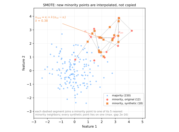
The picture shows what SMOTE does and its limitation. The synthetic points fill the region between minority points instead of stacking on top of them, which is gentler than duplication. But SMOTE only looks at minority neighbors: it will happily draw a segment through a region full of majority points (the lower-left minority point in the figure sits inside the blue cloud, and a synthetic point was drawn on the way to it). Variants such as Borderline-SMOTE and SMOTE + Tomek links clean up such points; none of them changes the basic idea.
imblearn tool | what it does |
|---|---|
TomekLinks | removes the majority point of each pair of mutual nearest neighbors from different classes: cleans the boundary |
EditedNearestNeighbours | removes majority points that disagree with their 3 nearest neighbors (by default, one disagreeing neighbor is enough) |
BorderlineSMOTE | applies SMOTE only to minority points near the boundary, mostly surrounded by the majority |
ADASYN | generates more synthetic points around the minority points with more majority neighbors, the hardest ones |
SMOTEENN, SMOTETomek | SMOTE followed by a cleaning step with ENN or Tomek links |
BalancedRandomForestClassifier | a random forest in which each tree trains on a sample balanced by undersampling |
EasyEnsembleClassifier | several AdaBoost models, each on a different balanced subsample of the majority |
RUSBoostClassifier | AdaBoost with random undersampling before each round |
The cleaning methods (Tomek, ENN) remove few rows and barely change the imbalance; the balanced ensembles combine undersampling with averaging many models, which recovers part of the information each subsample throws away. All of them fit in an imblearn pipeline and should be compared like the others: on validation, with the same metric.
Resampling must only touch the training data. Validation and test sets must keep the real prevalence, since that is what the model will meet. imblearn.pipeline.Pipeline (or its make_pipeline) enforces this: a sampler inside it runs during fit and is skipped during predict. A plain sklearn pipeline cannot hold a sampler.
from imblearn.over_sampling import SMOTE, RandomOverSampler
from imblearn.pipeline import make_pipeline as make_imb_pipeline
from imblearn.under_sampling import RandomUnderSampler

samplers = {'undersampling': RandomUnderSampler(random_state=0),
            'oversampling': RandomOverSampler(random_state=0),
            'SMOTE': SMOTE(random_state=0)}
for name, sampler in samplers.items():
    X_r, y_r = sampler.fit_resample(X_train, y_train)
    print(f"{name:14s} the model trains on {len(y_r):6,d} rows, {y_r.sum():6,d} of them fraud")
undersampling  the model trains on    466 rows,    233 of them fraud
oversampling   the model trains on 23,534 rows, 11,767 of them fraud
SMOTE          the model trains on 23,534 rows, 11,767 of them fraud
The comparison
Stage 3. All five approaches on the same split. For each: the ranking metrics, the operating point at 0.5, and the operating point at the threshold that maximizes F1 on the validation set, then measured on the test set:
from sklearn.metrics import f1_score

models = {'no weights': make_pipeline(StandardScaler(), LogisticRegression()),
          'balanced weights': make_pipeline(StandardScaler(), LogisticRegression(class_weight='balanced'))}
for name, sampler in samplers.items():
    models[name] = make_imb_pipeline(StandardScaler(), sampler, LogisticRegression())

rows = []
for name, model in models.items():
    model.fit(X_train, y_train)                  # any resampling happens here, on X_train only
    prec, rec, thr = precision_recall_curve(y_val, model.predict_proba(X_val)[:, 1])
    t_best = thr[np.argmax(2 * prec[:-1] * rec[:-1] / (prec[:-1] + rec[:-1] + 1e-12))]   # on validation
    p = model.predict_proba(X_test)[:, 1]
    row = {'model': name, 'AUC': roc_auc_score(y_test, p), 'AP': average_precision_score(y_test, p)}
    for tag, t in [('0.5', 0.5), ('tuned', t_best)]:
        f = p >= t
        row |= {f'P@{tag}': precision_score(y_test, f), f'R@{tag}': recall_score(y_test, f),
                f'F1@{tag}': f1_score(y_test, f)}
    row['t tuned'] = t_best
    rows.append(row)
print(pd.DataFrame(rows).set_index('model').round(3).to_string())
                    AUC     AP  P@0.5  R@0.5  F1@0.5  P@tuned  R@tuned  F1@tuned  t tuned
model
no weights        0.930  0.459  0.783  0.231   0.356    0.478    0.423     0.449    0.217
balanced weights  0.929  0.460  0.095  0.821   0.170    0.400    0.487     0.439    0.910
undersampling     0.931  0.464  0.092  0.833   0.166    0.486    0.449     0.467    0.942
oversampling      0.929  0.461  0.094  0.821   0.169    0.396    0.487     0.437    0.910
SMOTE             0.929  0.453  0.098  0.821   0.176    0.462    0.462     0.462    0.939
Read it by column groups:
- AUC and AP (the ranking) are the same for all five within noise: 0.929–0.931 and 0.453–0.464. None of the remedies taught the model anything new about fraud. This is typical for a well-specified model with enough minority examples; resampling can help a little, or hurt a little, but it is not where the big differences come from;
- at 0.5 the table splits in two: the unweighted model sits at high precision and low recall (0.783 / 0.231), all four rebalanced models at low precision and high recall (about 0.09–0.10 / 0.82–0.83). They are the same kind of ranking cut at very different places;
- at the threshold tuned on validation, the differences shrink: F1 between 0.44 and 0.47 for everybody. Once each model is allowed its own threshold, what remains is the ranking, and the ranking was the same. Look at the thresholds: 0.22 for the unweighted model, 0.91–0.94 for the rebalanced ones. Same operating point, different numbers on the dial.
The figure shows the five precision–recall curves on the test set. They almost coincide: it is the same ranking. The circles mark where each model cuts at 0.5, and the stars where it cuts at the threshold tuned on validation. At 0.5, the unweighted model sits at one end of the curve and the four rebalanced ones at the other; with tuned thresholds, the five meet again on the same stretch:
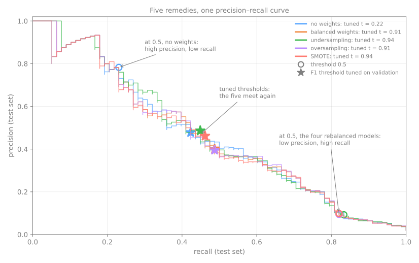
The lesson: resampling and weighting mostly move the operating point, and moving the threshold does that too, for free. They are worth trying, especially with models that cannot take a threshold easily or when there are very few positives, but they are not magic, and they come with two traps.
10. Two pitfalls
Resampling before the split
Stage 4. Resampling the whole dataset and then splitting is the classic mistake, and it is a form of data leakage. The difference between the two orders is in what the "test" set ends up containing:
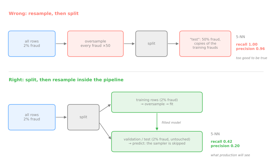
Measured with two samplers and two models, against the honest version (split first, resample only the training part inside the pipeline):
from sklearn.neighbors import KNeighborsClassifier

X_dev, y_dev = np.r_[X_train, X_val], np.r_[y_train, y_val]      # everything except the test set
for sampler in [RandomOverSampler(random_state=0), SMOTE(random_state=0)]:
    for clf in [KNeighborsClassifier(n_neighbors=5), LogisticRegression()]:
        # WRONG: resample the whole dataset, then split
        X_r, y_r = sampler.fit_resample(X, y)
        Xa, Xb, ya, yb = train_test_split(X_r, y_r, test_size=0.2, stratify=y_r, random_state=0)
        wrong = clf.fit(Xa, ya).predict(Xb)
        # RIGHT: split first, resample only when fitting
        right = make_imb_pipeline(sampler, clf).fit(X_dev, y_dev).predict(X_test)
        print(f"{type(sampler).__name__:17s} {type(clf).__name__:20s} "
              f"wrong: R {recall_score(yb, wrong):.2f} P {precision_score(yb, wrong):.2f}   "
              f"right: R {recall_score(y_test, right):.2f} P {precision_score(y_test, right):.2f}")
print(f"fraud share in the 'wrong' test set: {yb.mean():.0%}")
RandomOverSampler KNeighborsClassifier wrong: R 1.00 P 0.96   right: R 0.42 P 0.20
RandomOverSampler LogisticRegression   wrong: R 0.82 P 0.84   right: R 0.82 P 0.09
SMOTE             KNeighborsClassifier wrong: R 1.00 P 0.92   right: R 0.56 P 0.12
SMOTE             LogisticRegression   wrong: R 0.84 P 0.84   right: R 0.82 P 0.10
fraud share in the 'wrong' test set: 50%
Two things go wrong at once:
- the test set is contaminated. After oversampling, each fraud exists about 50 times, so almost every fraud in the "test" part has identical copies in the "training" part. The k-NN finds them and copies their label: recall 1.00 and precision 0.96, against 0.42 and 0.20 honestly. SMOTE is barely better, since each synthetic test point lies on a segment between training points;
- the test set no longer has the real prevalence. It is 50% fraud instead of 2%. Even the logistic regression, which cannot memorize copies and keeps its recall of 0.82, jumps from precision 0.09 to 0.84, a number that tells you nothing about deployment, where 98% of transactions are legitimate.
Distorted probabilities
Weighting or resampling tells the model that frauds are 50% of the world. It believes it:
p_smote = models['SMOTE'].predict_proba(X_test)[:, 1]
print(f"true fraud rate (test):       {y_test.mean():.4f}")
print(f"mean probability, no weights: {p_plain.mean():.4f}")
print(f"mean probability, balanced:   {p_w.mean():.4f}")
print(f"mean probability, SMOTE:      {p_smote.mean():.4f}")
odds = p_w / (1 - p_w) * n_c[1] / n_c[0]         # undo the reweighting: odds times n1/n0
print(f"balanced, corrected:          {(odds / (1 + odds)).mean():.4f}")
true fraud rate (test):       0.0195
mean probability, no weights: 0.0206
mean probability, balanced:   0.2370
mean probability, SMOTE:      0.2227
balanced, corrected:          0.0208
The unweighted model's probabilities average 0.0206, close to the true fraud rate of 0.0195. The balanced and SMOTE models average 0.237 and 0.223: more than ten times too high. If you only need a ranking or a yes/no decision at a tuned threshold, that does not matter. If you need the number itself (an expected loss, a risk score shown to a doctor, the cost formula \(t^* = c_{FP}/(c_{FP}+c_{FN})\) from section 6), it does. For logistic regression the fix is direct: multiply the odds by \(n_1/n_0\) to undo the weights, which brings the mean back to 0.0208 (Elkan, 2001). For other models, recalibrate the probabilities on held-out data; scikit-learn's CalibratedClassifierCV does it, using the cross-validation that comes later in the course.
11. A sensible order of attack
- Measure the right thing. Stratify every split. Report recall, precision, PR curve and AP next to the prevalence, and ROC AUC for the ranking. Accuracy says almost nothing here. Many "imbalance problems" are metric problems.
- Choose the threshold on validation data, with the criterion the application implies (a recall target, a cost ratio, the best F1 if nothing else is known).
- Class weights are one argument away and change no data. They mostly shift the operating point; combined with step 2, they rarely change much for a logistic regression, but they can help models whose training is dominated by the majority (trees, SVMs).
- Resampling only inside an
imblearnpipeline, only on training data, and compared against steps 2–3 on the same validation set. Expect small differences. - More minority examples is the only remedy that improves the ranking itself. No resampling can invent information the data does not have.
Advanced lab — remedies, threshold and the single test
Steps 6 to 11 continue the same mammography screening, now against the goal declared at the start of the fundamental lab: recall of at least 0.80 on the malignant cases, with the best precision possible.
How to run this lab in class (about 35 min, in pairs)
- Use the same Colab notebook as the fundamental lab and go to step 6 (Passo 6). Nothing to download.
- Steps 6 to 11 use the data and the model of steps 1 to 4. If the Colab session is new (or has expired), click the step 6 cell and use Runtime → Run before (Ctrl+F8) before going on.
- Step 7 uses
imbalanced-learn. Colab ships with it; if it is missing, run!pip install -q imbalanced-learnin a cell first. - Same routine: Predict before running, compare with the page, and try the Simulations before opening the solution.
- Suggested pace: steps 6 and 7 with the simulation in 15 min; step 8 and its simulation in 10 min; steps 9 to 11 in 10 min.
Step 6 — class weights
Predict. With class_weight='balanced', which do you expect to move more: the ROC AUC (the ranking) or the number of regions flagged at 0.5?
lr_w = make_pipeline(StandardScaler(), LogisticRegression(class_weight='balanced')).fit(X_train, y_train)
p_val_w = lr_w.predict_proba(X_val)[:, 1]
pred = (p_val_w >= 0.5).astype(int)
print(f"flagged {pred.sum()}   recall {recall_score(y_val, pred):.3f}   precision {precision_score(y_val, pred):.3f}")
print(f"ROC AUC {roc_auc_score(y_val, p_val_w):.3f}   AP {average_precision_score(y_val, p_val_w):.3f}")
n0, n1 = np.bincount(y_train)
print(f"intercept shift {lr_w[-1].intercept_[0] - lr[-1].intercept_[0]:.2f}   log(n0/n1) = {np.log(n0 / n1):.2f}")
flagged 298   recall 0.904   precision 0.158
ROC AUC 0.954   AP 0.641
intercept shift 4.04   log(n0/n1) = 3.74
As in the lesson, the weights mostly move the operating point: at 0.5 the weighted model flags 298 regions instead of 30, recall jumps from 0.442 to 0.904 and precision drops from 0.767 to 0.158. The intercept rises by 4.04, close to \(\log(n_0/n_1) = 3.74\). On real data the match is looser than on the simulated fraud screen, and the ranking moves a little too: ROC AUC goes up (0.946 → 0.954) while AP goes down (0.653 → 0.641). The two metrics weight different parts of the curve, and here the changes are within the noise of 52 positives.
Simulation: the threshold that imitates the weights. If weights mostly shift the operating point, you can get close without retraining: cut the plain model's scores at the training prevalence instead of at 0.5. Compare that point with the weighted model at 0.5, and count on how many regions the two rules disagree.
Solution
t_prev = y_train.mean()
a = p_val >= t_prev                               # plain model, threshold = training prevalence
b = p_val_w >= 0.5                                # weighted model, default threshold
for name, f in [(f'plain,    t = {t_prev:.4f}', a), ('balanced, t = 0.5   ', b)]:
    print(f"{name}: flagged {f.sum():3d}  recall {recall_score(y_val, f):.3f}"
          f"  precision {precision_score(y_val, f):.3f}")
print(f"regions classified differently: {(a != b).sum()} of {len(y_val)}")
plain,    t = 0.0233: flagged 366  recall 0.923  precision 0.131
balanced, t = 0.5   : flagged 298  recall 0.904  precision 0.158
regions classified differently: 110 of 2237
The two operating points are similar — high recall, precision around 0.14 — and no model had to be retrained to reach the first one. But the correspondence is looser than in the simulated fraud screening of section 9, where the two rules disagreed on 42 of 4,000 rows: here it is 110 of 2,237. The reason is that weighting a class does not shift the intercept exactly on real data; step 6 had already shown that (4.04 against \(\log(n_0/n_1) = 3.74\)). The practical lesson stands: before retraining with weights, test what a different threshold would do, because it is free and reversible.
Step 7 — resampling inside an imblearn pipeline
Predict. How many rows will undersampling train on, roughly? And SMOTE? Which of the two throws information away?
from imblearn.over_sampling import SMOTE
from imblearn.pipeline import make_pipeline as make_imb_pipeline
from imblearn.under_sampling import RandomUnderSampler

models = {
    'logistic': lr,
    'logistic, balanced': lr_w,
    'undersampling': make_imb_pipeline(StandardScaler(), RandomUnderSampler(random_state=0),
                                       LogisticRegression()),
    'SMOTE': make_imb_pipeline(StandardScaler(), SMOTE(random_state=0), LogisticRegression()),
}
for name in ['undersampling', 'SMOTE']:
    models[name].fit(X_train, y_train)            # the sampler runs here, on X_train only
    X_r, y_r = models[name][1].fit_resample(X_train, y_train)
    print(f"{name:14s} trains on {len(y_r):5d} rows, {y_r.sum():4d} malignant")
The two samplers go in opposite directions. Undersampling trains the logistic regression on 312 rows (the 156 malignant plus 156 benign drawn at random), discarding 6,397 benign regions. SMOTE keeps all 6,553 benign regions and adds 6,397 synthetic malignant ones. Both live inside an imblearn pipeline, so validation and test rows are never resampled: predict_proba skips the sampler. (The fit_resample call here only counts the rows; the pipelines were already fitted on the line above.)
Step 8 — compare on the validation set
Predict. Among the four models, which do you expect to have the best ranking (ROC AUC and AP)? Will the gap be large?
from sklearn.metrics import f1_score

rows = []
for name, model in models.items():
    p = model.predict_proba(X_val)[:, 1]
    f = p >= 0.5
    rows.append({'model': name, 'ROC AUC': roc_auc_score(y_val, p), 'AP': average_precision_score(y_val, p),
                 'precision@0.5': precision_score(y_val, f), 'recall@0.5': recall_score(y_val, f),
                 'F1@0.5': f1_score(y_val, f)})
comparison = pd.DataFrame(rows).set_index('model')
print(comparison.round(3).to_string())
                    ROC AUC     AP  precision@0.5  recall@0.5  F1@0.5
model
logistic              0.946  0.653          0.767       0.442   0.561
logistic, balanced    0.954  0.641          0.158       0.904   0.269
undersampling         0.941  0.622          0.146       0.904   0.251
SMOTE                 0.955  0.647          0.164       0.885   0.276
The same pattern as the simulated fraud screen:
- ranking: ROC AUC between 0.941 and 0.955, AP between 0.622 and 0.653. With 52 positives in validation, one malignant region ranked a few places higher or lower moves these numbers by about that much. No remedy is clearly better at ranking; undersampling, which threw away 97% of the benign data, is slightly the worst on both;
- at 0.5: the plain model is at precision 0.767 / recall 0.442, the three rebalanced models at 0.146–0.164 / 0.885–0.904. Neither is the operating point we want (recall ≥ 0.80 with the best precision); both are just where 0.5 happens to cut.
Since the threshold is ours to choose, the fair comparison is the ranking, and it says: keep the simplest model.
Simulation: compare at a fair threshold. The table above cuts all four models at 0.5, which is unfair: each one puts its scores on a different scale. Redo the comparison giving each model its own threshold, the one that reaches recall ≥ 0.80 on validation with the best precision. Do the differences grow or shrink?
Solution
print("model                threshold  recall  precision  flagged")
for name, model in models.items():
    p = model.predict_proba(X_val)[:, 1]
    prec, rec, thr = precision_recall_curve(y_val, p)
    ok = rec[:-1] >= 0.80
    i = int(np.argmax(np.where(ok, prec[:-1], -1)))
    print(f"{name:20s}{thr[i]:10.4f}{rec[i]:8.3f}{prec[i]:11.3f}{(p >= thr[i]).sum():9d}")
model                threshold  recall  precision  flagged
logistic                0.0632   0.808      0.294      143
logistic, balanced      0.6026   0.808      0.211      199
undersampling           0.6433   0.808      0.206      204
SMOTE                   0.6379   0.808      0.255      165
With everyone at the same recall, what is left to compare is precision — and there the plain logistic regression comes out ahead (0.294 against 0.206 to 0.255), that is, 143 regions flagged instead of up to 204 to find the same 42 cancers. Look at the thresholds: 0.06 for the plain model and 0.60 to 0.64 for the rebalanced ones. The same operating point shows up as completely different numbers on the dial, which is exactly why comparing models at a fixed 0.5 means nothing. No remedy beat the original ranking; the simplest model won.
Step 9 — choose the model and the threshold on validation
Predict. Given what step 8 showed, which model should be chosen? And will the threshold that reaches recall 0.80 be near 0.5 or well below it?
best_name = comparison['AP'].idxmax()
best = models[best_name]
p_val_best = best.predict_proba(X_val)[:, 1]
prec, rec, thr = precision_recall_curve(y_val, p_val_best)
ok = rec[:-1] >= 0.80                            # thresholds that reach the recall target
i = np.argmax(np.where(ok, prec[:-1], -1))       # among them, the best precision
threshold = thr[i]
print(f"model: {best_name}   threshold {threshold:.4f}")
print(f"validation: recall {rec[i]:.3f}   precision {prec[i]:.3f}   flagged {(p_val_best >= threshold).sum()}")
The model with the best AP on validation is the plain logistic regression (0.653, ahead of SMOTE's 0.647 by a hair). Among its thresholds that reach recall 0.80 on validation, the one with the best precision is 0.0632: the model flags every region whose estimated probability of malignancy is above 6.3%. On validation that means 143 regions flagged, 42 of the 52 cancers found (0.808), precision 0.294. A threshold of 0.06 may look strange, but it is the arithmetic of a 2.3% base rate and a miss that costs much more than a second look.
Step 10 — the single test
Predict. Will test recall land above or below the 0.808 of validation? With 52 malignant cases, how much is one case worth?
from sklearn.metrics import confusion_matrix

p_test = best.predict_proba(X_test)[:, 1]
pred_test = (p_test >= threshold).astype(int)
print(confusion_matrix(y_test, pred_test, labels=[1, 0]))
print(f"recall {recall_score(y_test, pred_test):.3f}   precision {precision_score(y_test, pred_test):.3f}"
      f"   flagged {pred_test.sum()} of {len(pred_test)}")
print(f"ROC AUC {roc_auc_score(y_test, p_test):.3f}   AP {average_precision_score(y_test, p_test):.3f}")
Once, at the end, the chosen model and threshold meet the test set. 43 of the 52 malignant regions are found (recall 0.827) and 9 are missed; 97 benign regions are flagged, so the radiologist reviews 140 of 2,237 regions (6.3%) and about 1 in 3 of them is a cancer (precision 0.307). The validation estimates (recall 0.808, precision 0.294) held up. Two cautions. With 52 positives, one cancer is worth 1.9 points of recall, so "0.827" means "43, give or take a few"; the ROC AUC, 0.913 here against 0.946 on validation, moves by as much between two splits of this size. And if 0.827 disappoints you, going back to change the threshold now would turn the test set into a validation set.
Step 11 — the coarse staircase of a k-NN
Predict. With \(k = 5\), how many distinct probabilities can k-NN produce? How many points will its ROC curve have, and is that a problem for our recall 0.80 goal?
from sklearn.neighbors import KNeighborsClassifier

knn = make_pipeline(StandardScaler(), KNeighborsClassifier(n_neighbors=5)).fit(X_train, y_train)
p_knn = knn.predict_proba(X_val)[:, 1]
print("distinct probabilities:", np.unique(p_knn))
fpr_k, tpr_k, thr_k = roc_curve(y_val, p_knn)
print(f"ROC points: {len(thr_k)}   ROC AUC {roc_auc_score(y_val, p_knn):.3f}   AP {average_precision_score(y_val, p_knn):.3f}")
for t, f, r in zip(thr_k, fpr_k, tpr_k):
    print(f"threshold {t:.1f}   FPR {f:.3f}   recall {r:.3f}")

fig, ax = plt.subplots(figsize=(5, 4))
RocCurveDisplay.from_predictions(y_val, p_val, ax=ax, name='logistic')
RocCurveDisplay.from_predictions(y_val, p_knn, ax=ax, name='5-NN')
plt.show()
distinct probabilities: [0.  0.2 0.4 0.6 0.8 1. ]
ROC points: 7   ROC AUC 0.935   AP 0.670
threshold inf   FPR 0.000   recall 0.000
threshold 1.0   FPR 0.001   recall 0.308
threshold 0.8   FPR 0.002   recall 0.481
threshold 0.6   FPR 0.004   recall 0.558
threshold 0.4   FPR 0.007   recall 0.750
threshold 0.2   FPR 0.038   recall 0.885
threshold 0.0   FPR 1.000   recall 1.000
With \(k = 5\), the probability of malignancy is the share of malignant regions among the 5 nearest neighbors, so it can only be 0, 0.2, 0.4, 0.6, 0.8 or 1: six thresholds, seven ROC points including the corner. The ranking is not bad (ROC AUC 0.935, AP 0.670, close to the logistic regression), but the menu of operating points is short. For our target, recall ≥ 0.80, the k-NN must jump from 0.750 (threshold 0.4) to 0.885 (threshold 0.2, FPR 0.038): there is nothing in between. The last segment of its ROC curve, from FPR 0.038 to 1, is a straight line: the AUC counts the area under it, but the only way to operate on it is to flag the regions with probability 0 at random. A larger \(k\) gives more distinct values and a finer curve.
To close the class. One sentence each: (1) what did class weights change and what did they leave alone? (2) Why does resampling before splitting inflate the result in two different ways? (3) Why did the plain logistic regression win the comparison?
Your turn (advanced)
For homework, with more time:
- A cost instead of a target. Suppose a missed cancer costs 20 times a needless recall. On the validation set, compute the cost \(20 \cdot FN + FP\) for every threshold of the chosen model and find the minimum. Compare with the formula \(t^* = 1/(1+20)\). Why do they differ?
- Resample before splitting. Apply
SMOTEto the whole ofX, y, then split 80/20 and fit a 5-NN. Compare its recall and precision with step 10. Which two things went wrong? - More neighbors. Repeat step 11 with \(k = 15\) and \(k = 51\). How many distinct probabilities, how many ROC points, and what happens to the AUC? Which operating points near recall 0.80 become available?
- The luck of the split. Change
random_state=7in step 2 to 0, 1, 2, 3 and 4 and rerun steps 2–10. How much do the chosen threshold and the test recall move? What does that say about quoting "recall 0.827" with three decimals?
References
- Hanley, J. A.; McNeil, B. J. "The Meaning and Use of the Area under a Receiver Operating Characteristic (ROC) Curve." Radiology 143, no. 1 (1982): 29–36 — the AUC as the probability of ranking a random positive above a random negative. DOI
- Fawcett, T. "An Introduction to ROC Analysis." Pattern Recognition Letters 27, no. 8 (2006): 861–874. DOI
- Davis, J.; Goadrich, M. "The Relationship Between Precision-Recall and ROC Curves." Proceedings of the 23rd International Conference on Machine Learning (ICML) (2006): 233–240 — why PR points cannot be joined by straight lines. DOI
- Saito, T.; Rehmsmeier, M. "The Precision-Recall Plot Is More Informative than the ROC Plot When Evaluating Binary Classifiers on Imbalanced Datasets." PLoS ONE 10, no. 3 (2015): e0118432. DOI
- Youden, W. J. "Index for Rating Diagnostic Tests." Cancer 3, no. 1 (1950): 32–35. DOI
- Elkan, C. "The Foundations of Cost-Sensitive Learning." Proceedings of the 17th International Joint Conference on Artificial Intelligence (IJCAI) (2001): 973–978 — the optimal threshold for given costs, and how reweighting changes probabilities. PDF
- Chawla, N. V.; Bowyer, K. W.; Hall, L. O.; Kegelmeyer, W. P. "SMOTE: Synthetic Minority Over-sampling Technique." Journal of Artificial Intelligence Research 16 (2002): 321–357. DOI
- He, H.; Garcia, E. A. "Learning from Imbalanced Data." IEEE Transactions on Knowledge and Data Engineering 21, no. 9 (2009): 1263–1284 — a survey of sampling, cost-sensitive and evaluation methods. DOI
- Lemaître, G.; Nogueira, F.; Aridas, C. K. "Imbalanced-learn: A Python Toolbox to Tackle the Curse of Imbalanced Datasets in Machine Learning." JMLR 18, no. 17 (2017): 1–5. PDF
- imbalanced-learn — resampling (SMOTE, under/oversampling) inside pipelines.
Quiz
The quiz covers the fundamental approach.