A scoring model is a family of classifiers
Pick a threshold \(t\), flag everyone with score \(\geq t\), and you get one confusion matrix. Two rates summarize it:
\[ \text{TPR} = \text{recall} = \frac{TP}{TP + FN} \qquad \text{FPR} = \frac{FP}{FP + TN} \]- TPR (true positive rate) is the share of the sick that we catch;
- FPR (false positive rate) is the share of the healthy that we alarm.
TP, FN, FP and TN: true positives, false negatives, false positives and true negatives.
The path of this part
- ROC curveeach threshold is a point: sick caught against healthy alarmed
- One number: AUCAUC (area under the curve) = the share of (sick, healthy) pairs in the right order
- Precision–recall curveaverage precision; why it shows a rare class that ROC hides
- Choose the thresholdfour criteria, decided on validation; a formula when scores are calibrated
Each row of the table is a threshold
| patient | score | sick | TP | FP | TPR | FPR |
|---|---|---|---|---|---|---|
| P01 | 0.95 | 1 | 1 | 0 | 0.1 | 0.0 |
| P04 | 0.80 | 1 | 4 | 0 | 0.4 | 0.0 |
| P05 | 0.75 | 0 | 4 | 1 | 0.4 | 0.1 |
| P09 | 0.55 | 1 | 7 | 2 | 0.7 | 0.2 |
| … | … | … | … | … | … | … |
| P20 | 0.02 | 0 | 10 | 10 | 1.0 | 1.0 |
The ROC staircase
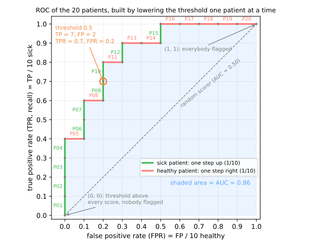
- (0, 0): nobody flagged;
- (1, 1): everybody flagged;
- the diagonal: random scores — flags sick and healthy at the same rate.
Simulator: slide the threshold
Predict. Same idea on 600 simulated scores (500 negatives, 100 positives). Lower the threshold from 0.5: which way does the ROC point move, and what happens to precision?
AUC, two ways
As an area
The AUC (area under the curve) is the area under the staircase. Each healthy patient adds a rectangle of width 1/10 and height equal to the current TPR:
\[ \begin{aligned} \tfrac{1}{10}\,(&0.4 + 0.6 + 0.8 + 0.9 + 0.9 \\ &+ 5 \times 1.0) = 0.86 \end{aligned} \]As pairs
Of the 10 × 10 = 100 (sick, healthy) pairs, in how many does the sick one score higher?
\[ \begin{aligned} \tfrac{1}{100}\,(&4 + 6 + 8 + 9 + 9 \\ &+ 5 \times 10) = \tfrac{86}{100} = 0.86 \end{aligned} \]AUC measures how far apart the classes are
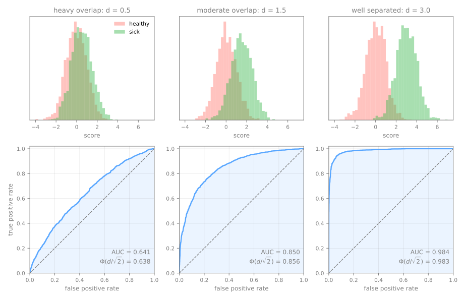
Only the order matters
| transformation of the scores | AUC |
|---|---|
score | 0.86 |
score ** 2 | 0.86 |
log(score) | 0.86 |
100 * score - 7 | 0.86 |
1 - score (reverses the order) | 0.14 |
AUC 0.14 is not a bad model: it is a good model with the labels flipped.
Scores, not labels
# wrong: predicted labels (output of predict)
labels = (score >= 0.5).astype(int)
roc_auc_score(sick, labels)             # 0.75  ← NOT the model's AUC
balanced_accuracy_score(sick, labels)   # 0.75  ← this is what you computed

# right: scores (predict_proba(X)[:, 1])
roc_auc_score(sick, score)              # 0.86  ← the model's AUC
- With only two distinct values, the "curve" has one point, joined to the corners by straight lines.
- Its area becomes \((\text{TPR} + \text{TNR})/2\), with TNR = true negative rate (specificity), which is balanced accuracy at 0.5.
predict_proba(X)[:, 1] or decision_function(X). The mistake raises no exception at all.The precision–recall (PR) curve
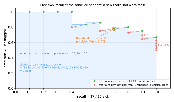
ROC looks at the two classes separately. The doctor asks something else: of the patients I flag, how many are really sick?
- each sick patient: recall rises and precision rises a little;
- each healthy one: recall stays and precision falls.
Average precision (AP)
\[ \text{AP} = \sum_k (R_k - R_{k-1})\,P_k = \text{the mean precision at each sick patient} \]| computation | value |
|---|---|
| AP by hand (mean of 1, 1, 1, 1, 0.833, 0.857, 0.778, 0.8, 0.75, 0.667) | 0.8685 |
average_precision_score | 0.8685 |
auc(recall, precision) — trapezoidal area | 0.8608 |
When the positive class is rare
The same scorer, changing only how many sick patients exist:
| prevalence | AUC | AP | TPR | FPR | precision |
|---|---|---|---|---|---|
| 50% | 0.921 | 0.922 | 0.80 | 0.12 | 0.87 |
| 10% | 0.922 | 0.666 | 0.80 | 0.12 | 0.42 |
| 1% | 0.914 | 0.252 | 0.79 | 0.12 | 0.06 |
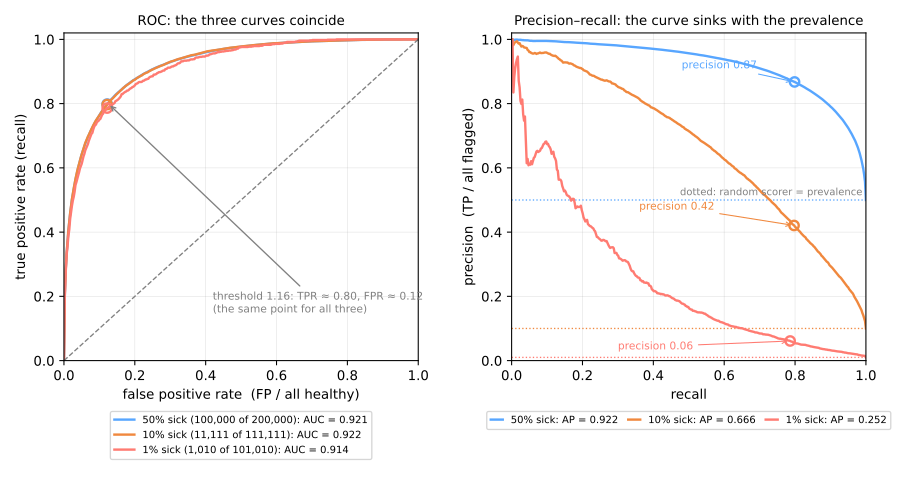
Precision in terms of prevalence
Precision: of the flagged patients, the fraction that is really sick, \(TP/(TP + FP)\). Prevalence \(\pi\): the fraction of sick people in the population. Among \(N\) people:
| how many | how many the model flags | |
|---|---|---|
| sick | \(\pi N\) | \(TP = \text{TPR} \cdot \pi N\) |
| healthy | \((1-\pi) N\) | \(FP = \text{FPR} \cdot (1-\pi) N\) |
\(\pi = 0.5 \;\Rightarrow\; 0.40/(0.40 + 0.06) = \mathbf{0.87}\)
\(\pi = 0.01 \;\Rightarrow\; 0.008/(0.008 + 0.119) = \mathbf{0.06}\)
Why: look at the denominators
- FPR divides by the number of healthy: a property of the model within one class, blind to how many sick exist;
- precision divides by the flagged, which mixes the two classes in proportion to their sizes.
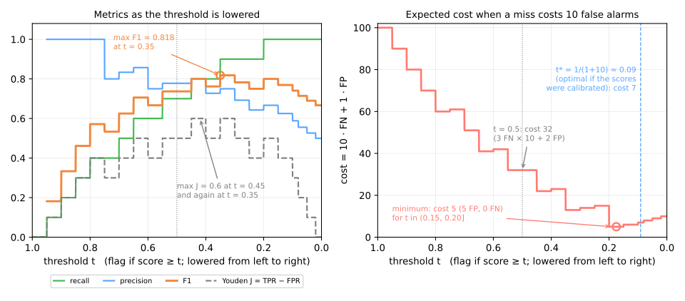
Choosing the threshold: four criteria
| criterion | \(t\) |
|---|---|
| max F1 | 0.35 |
| Youden's J = TPR − FPR | 0.45 or 0.35 |
| recall ≥ 0.9, best precision | 0.35 |
| min cost, FN = 10 FP | 0.20 |
F1: harmonic mean of precision and recall. The default 0.5 costs 32; the minimum costs 5.
When scores are calibrated, there is a formula
\[ p > t^* = \frac{c_{FP}}{c_{FP} + c_{FN}} = \frac{1}{1 + 10} \approx 0.09 \]- flagging a patient with probability \(p\) costs \((1-p)\,c_{FP}\) on average; not flagging costs \(p\,c_{FN}\);
- flag when the second is larger (Elkan, 2001).
0.5 is the right threshold only when both mistakes cost the same and the scores are calibrated.
Summary
| ROC | precision–recall | |
|---|---|---|
| axes | FPR × TPR | recall × precision |
| denominators | each class on its own | the flagged column |
| "no skill" line | the diagonal | horizontal at the prevalence |
| summary | AUC = P(sick above healthy) | AP = mean precision at positives |
| changes with prevalence? | no | yes |
Mammography: the curves, steps 1 to 5
- 11,183 regions, 2.3% malignant; the task is to flag them for a radiologist.
- Notebook on Colab (in Portuguese): nothing to download. Save a copy to your Drive.
- In each step, answer the Predict before running.
- Simulations: AUC only sees the order (step 4) and the price of each point of recall (step 5).
Pace: steps 1 to 3 in 10 min; step 4 and its simulation in 12 min; step 5 and its simulation in 13 min.