Análise Exploratória de Dados
A Análise Exploratória de Dados (EDA, do inglês Exploratory Data Analysis) é a prática disciplinada de olhar para os dados antes de modelá-los. O termo foi cunhado por John Tukey (1977), que defendia que a análise de dados deveria começar com exploração sem preconceitos — gráficos, resumos, anomalias — em vez de saltar direto para testes de hipóteses ou modelos.
Tukey (1977)
O maior valor de uma figura é quando ela nos força a perceber o que nunca esperávamos ver.
A EDA é o passo 2 do fluxo de trabalho de ML; pulá-la é a fonte mais comum de falha silenciosa: modelos treinados em dados mal compreendidos produzem absurdos com confiança. Esta aula é o primeiro contato de verdade com um conjunto de dados, então ainda não há modelos. O objetivo é sair com uma lista curta de fatos sobre os dados, de problemas a corrigir antes de modelar e de perguntas que vale a pena testar depois.
O exemplo que atravessa a aula é o California Housing: 20.640 distritos do censo americano de 1990 (Pace & Barry, 1997), o mesmo arquivo usado no roteiro da aula. Todo número citado abaixo é impresso pelo código ao lado; toda figura é produzida por um script curto que fica junto desta página. Quando uma estatística pode ser calculada com uma calculadora, primeiro fazemos à mão numa coluna minúscula e depois deixamos o pandas confirmar.
A aula segue um caminho em cinco etapas, desenhadas abaixo: 1. conhecer os dados, o tamanho, o que é uma linha e o tipo de cada coluna; 2. resumir à mão, o centro, a dispersão e a forma de uma coluna; 3. olhar a forma, porque poucos números escondem o que um gráfico mostra; 4. duas variáveis, como pares de colunas andam juntos e quando uma terceira engana; 5. problemas a corrigir, valores faltantes, outliers e tetos, encontrados só na parte de treino. Cada etapa leva à sua seção e, nos slides, uma faixa embaixo mostra em que etapa você está.
- Conhecer os dadostamanho, o que é uma linha, tipos das colunas, describe()
- Resumir à mãocentro, dispersão e forma de uma coluna
- Olhar a formaAnscombe, histogramas, densidade, escala log
- Duas variáveisdispersão, Pearson e Spearman, Simpson, grupos
- Problemas a corrigirfaltantes, outliers, tetos; dividir antes de explorar
Slides
Clique nos slides e use as setas ← → para navegar; F abre em tela cheia e Esc mostra todos os slides. Abrir os slides numa aba nova
Primeiro contato com um conjunto de dados
Etapa 1. Carregue o arquivo e faça as três perguntas que valem para qualquer tabela: qual o tamanho, como é uma linha e qual o tipo de cada coluna?
import numpy as np
import pandas as pd

pd.set_option('display.width', 120)       # tabelas impressas mais largas
URL = "https://raw.githubusercontent.com/hsandmann/biblio/refs/heads/main/ml/aula02/housing.csv"
df = pd.read_csv(URL)
print(df.shape)
print(df.head(3).T)                       # transposta: uma linha por coluna
(20640, 10)
                           0         1         2
longitude            -122.23   -122.22   -122.24
latitude               37.88     37.86     37.85
housing_median_age      41.0      21.0      52.0
total_rooms            880.0    7099.0    1467.0
total_bedrooms         129.0    1106.0     190.0
population             322.0    2401.0     496.0
households             126.0    1138.0     177.0
median_income         8.3252    8.3014    7.2574
median_house_value  452600.0  358500.0  352100.0
ocean_proximity     NEAR BAY  NEAR BAY  NEAR BAY
20.640 linhas e 10 colunas. Transpor o head() coloca uma coluna por linha, o que facilita a leitura quando há muitas colunas. Em seguida, os tipos, junto com as frequências da única coluna de texto:
longitude             float64
latitude              float64
housing_median_age    float64
total_rooms           float64
total_bedrooms        float64
population            float64
households            float64
median_income         float64
median_house_value    float64
ocean_proximity           str
dtype: object
ocean_proximity
<1H OCEAN     9136
INLAND        6551
NEAR OCEAN    2658
NEAR BAY      2290
ISLAND           5
Name: count, dtype: int64
Nove colunas numéricas e uma de texto (o pandas recente imprime str para texto; versões mais antigas imprimem object). ocean_proximity tem cinco níveis; um deles, ISLAND, tem só 5 linhas. Guarde isso: uma categoria com 5 linhas se comporta de modo muito diferente de uma com 9.136.
O que é uma linha?
O erro mais comum com este conjunto é conceitual. Uma linha não é uma casa. É um block group do censo, uma área pequena, tipicamente com 600 a 3.000 habitantes. Chamamos de distrito. Toda coluna descreve o distrito como um todo:
| Coluna | Significado | Unidade e tipo |
|---|---|---|
longitude, latitude | localização do distrito | graus; numérica |
housing_median_age | idade mediana das residências | anos; numérica, truncada em 52 |
total_rooms, total_bedrooms | cômodos e quartos somados sobre todas as residências | contagens; numérica |
population, households | moradores e domicílios ocupados | contagens; numérica |
median_income | renda domiciliar mediana | dezenas de milhares de US$ (3,87 = US$ 38.700); truncada em 15,0001 |
median_house_value | valor mediano das residências — o alvo | US$ de 1990; truncado em 500.001 |
ocean_proximity | distância até o oceano | categórica, 5 níveis |
Então total_rooms = 39.320 não é uma mansão: é um distrito muito populoso. Contagens como total_rooms medem o tamanho do distrito e só ficam comparáveis entre distritos quando divididas por alguma coisa (cômodos por domicílio). Voltaremos a isso.
O describe() dá o primeiro resumo numérico de todas as colunas de uma vez:
                      count      mean       50%      min       max
longitude           20640.0    -119.6    -118.5   -124.4    -114.3
latitude            20640.0      35.6      34.3     32.5      42.0
housing_median_age  20640.0      28.6      29.0      1.0      52.0
total_rooms         20640.0    2635.8    2127.0      2.0   39320.0
total_bedrooms      20433.0     537.9     435.0      1.0    6445.0
population          20640.0    1425.5    1166.0      3.0   35682.0
households          20640.0     499.5     409.0      1.0    6082.0
median_income       20640.0       3.9       3.5      0.5      15.0
median_house_value  20640.0  206855.8  179700.0  14999.0  500001.0
Leia linha por linha, procurando qualquer coisa surpreendente:
- count é 20.433 em
total_bedroomse 20.640 nas demais: faltam 207 valores; - média vs mediana (
50%): nas quatro contagens, a média fica bem acima da mediana (2.635,8 contra 2.127,0 cômodos). Alguns distritos muito grandes puxam a média para cima — uma cauda longa à direita; - mín e máx: um distrito com 3 habitantes, outro com 35.682; e três máximos que parecem redondos demais: 52, 15,0 (15,0001 antes do arredondamento) e 500.001. São os tetos da tabela acima e ganham uma seção própria.
O resto desta aula explica como ler direito cada uma dessas pistas.
Estatísticas descritivas, primeiro à mão
Etapa 2. Considere uma coluna minúscula: os salários mensais, em milhares de reais, das nove pessoas de um pequeno escritório. Oito funcionários e o dono.
O centro: média e mediana
A média soma tudo e divide por \(n\):
A mediana ordena os valores e pega o do meio: o 5º de 9, que é 3. Agora tire o dono e recalcule: a média dos outros oito é \(28/8 = 3{,}5\) e a mediana deles é 3.
print(f"all nine:     mean {salaries.mean():.2f}   median {salaries.median():.2f}")
print(f"without 26:   mean {salaries[:-1].mean():.2f}   median {salaries[:-1].median():.2f}")
Uma única pessoa levou a média de 3,5 para 6. A mediana não se mexeu. Um "salário típico" de 6 não descreve ninguém neste escritório: sete das nove pessoas ganham menos que isso (e uma ganha exatamente 6). Esta é a regra geral:
- a média é puxada para a cauda longa, porque cada valor conta na proporção do seu tamanho;
- a mediana só conta posições, então ignora o quão longe estão os valores extremos;
- média bem acima da mediana é a assinatura de uma cauda longa à direita (renda, preços, tamanho de cidades); média abaixo da mediana, de uma cauda longa à esquerda.
No California Housing, total_rooms tem média 2.635,8 e mediana 2.127,0: a mesma assinatura.
A dispersão: desvio padrão, quantis e IQR
O desvio padrão é a distância típica até a média:
À mão, com \(\bar{x} = 6\):
| \(x_i\) | 2 | 2 | 3 | 3 | 3 | 4 | 5 | 6 | 26 | soma |
|---|---|---|---|---|---|---|---|---|---|---|
| \(x_i - \bar{x}\) | −4 | −4 | −3 | −3 | −3 | −2 | −1 | 0 | 20 | 0 |
| \((x_i - \bar{x})^2\) | 16 | 16 | 9 | 9 | 9 | 4 | 1 | 0 | 400 | 464 |
\(s^2 = 464 / 8 = 58\), então \(s = \sqrt{58} = 7{,}62\). Só o dono contribui com 400 dos 464: assim como a média, o desvio padrão é dominado pelos valores extremos. (Dividir por \(n - 1 = 8\) em vez de \(n\) é a correção amostral usual; o pandas faz isso por padrão, o np.std do NumPy não.)
Os quantis são a alternativa robusta. O quantil \(q_p\) é o valor abaixo do qual está uma fração \(p\) dos dados. O pandas o encontra na posição \(p\,(n-1)\) da lista ordenada, contando a partir de 0: com \(n = 9\), o primeiro quartil \(Q_1\) (\(p = 0{,}25\)) está na posição 2, a mediana na 4 e o terceiro quartil \(Q_3\) na 6. Na lista ordenada 2 2 3 3 3 4 5 6 26, esses são 3, 3 e 5. O intervalo interquartil \(\text{IQR} = Q_3 - Q_1 = 2\) é a largura da metade central dos dados; o dono não o afeta em nada.
print(f"std {salaries.std():.2f}")
print(salaries.quantile([0.25, 0.50, 0.75]))
print(salaries.describe().round(2))
std 7.62
0.25    3.0
0.50    3.0
0.75    5.0
dtype: float64
count     9.00
mean      6.00
std       7.62
min       2.00
25%       3.00
50%       3.00
75%       5.00
max      26.00
dtype: float64
O pandas confirma a conta à mão: \(s = 7{,}62\), \(Q_1 = 3\), mediana 3, \(Q_3 = 5\). O describe() é simplesmente tudo isso numa única chamada. (Quando \(p\,(n-1)\) não é inteiro, o pandas interpola linearmente entre os dois vizinhos; outras ferramentas usam convenções um pouco diferentes, então quartis de softwares diferentes podem divergir um pouco em amostras pequenas.)
A forma: assimetria
A assimetria (skewness) transforma "de que lado fica a cauda?" em um número: a média dos desvios padronizados elevados ao cubo,
em que \(\sigma\) é o desvio padrão calculado com \(n\) no denominador. O cubo preserva o sinal, então valores muito acima da média empurram o resultado para cima e valores muito abaixo o empurram para baixo; uma distribuição simétrica dá 0.
z = (salaries - salaries.mean()) / salaries.std(ddof=0)
n = len(salaries)
print(f"by the formula: {(z ** 3).mean():.2f}")
print(f"pandas .skew(): {salaries.skew():.2f}  (formula x {np.sqrt(n * (n - 1)) / (n - 2):.2f})")
O dono deixa os salários fortemente assimétricos à direita. O pandas imprime um número maior porque multiplica pela correção de amostra pequena \(\sqrt{n(n-1)}/(n-2)\), que vale 1,21 para \(n = 9\) e fica perto de 1 para \(n\) grande. Uma leitura comum: \(|\text{assimetria}| < 0{,}5\), aproximadamente simétrica; de 0,5 a 1, moderada; acima de 1, forte. Vamos medi-la nas colunas do housing na seção de distribuições.
Por que estatísticas não bastam
Etapa 3. Estatísticas descritivas comprimem uma coluna em poucos números; comprimir joga informação fora. Os quatro conjuntos abaixo — o quarteto de Anscombe (Anscombe, 1973) — foram construídos para mostrar isso:
x123 = [10, 8, 13, 9, 11, 14, 6, 4, 12, 7, 5]
quartet = {
    'I':   (x123, [8.04, 6.95, 7.58, 8.81, 8.33, 9.96, 7.24, 4.26, 10.84, 4.82, 5.68]),
    'II':  (x123, [9.14, 8.14, 8.74, 8.77, 9.26, 8.10, 6.13, 3.10, 9.13, 7.26, 4.74]),
    'III': (x123, [7.46, 6.77, 12.74, 7.11, 7.81, 8.84, 6.08, 5.39, 8.15, 6.42, 5.73]),
    'IV':  ([8, 8, 8, 8, 8, 8, 8, 19, 8, 8, 8],
            [6.58, 5.76, 7.71, 8.84, 8.47, 7.04, 5.25, 12.50, 5.56, 7.91, 6.89]),
}
rows = {}
for name, (x, y) in quartet.items():
    x, y = np.array(x, float), np.array(y)
    slope, intercept = np.polyfit(x, y, 1)             # reta de mínimos quadrados
    rows[name] = {'mean x': x.mean(), 'mean y': y.mean(), 'var x': x.var(ddof=1),
                  'var y': y.var(ddof=1), 'r': np.corrcoef(x, y)[0, 1],
                  'intercept': intercept, 'slope': slope}
print(pd.DataFrame(rows).T.round(2))
     mean x  mean y  var x  var y     r  intercept  slope
I       9.0     7.5   11.0   4.13  0.82        3.0    0.5
II      9.0     7.5   11.0   4.13  0.82        3.0    0.5
III     9.0     7.5   11.0   4.12  0.82        3.0    0.5
IV      9.0     7.5   11.0   4.12  0.82        3.0    0.5
Médias, variâncias, correlação e reta de mínimos quadrados coincidem até a segunda casa decimal (a variância de \(y\) difere em 0,01). Só um gráfico revela quão diferentes são os quatro conjuntos (script da figura):
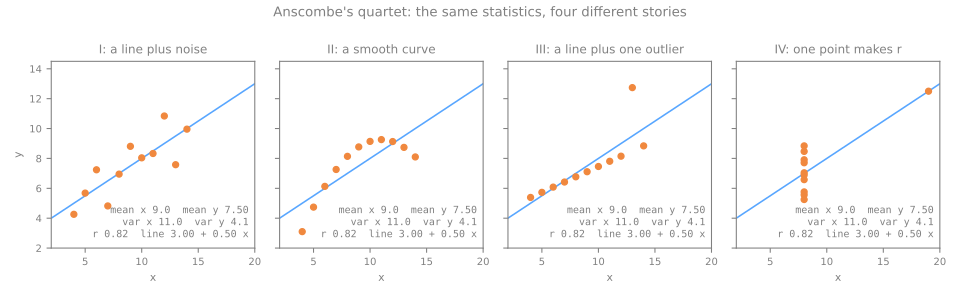
O conjunto II é uma curva suave, então uma reta é o resumo errado. O conjunto III é uma reta perfeita, exceto por um outlier que inclina a reta ajustada. No conjunto IV, um único ponto cria toda a correlação: tire-o e \(x\) deixa de variar.
Os conjuntos de Anscombe têm 11 pontos cada. Matejka & Fitzmaurice (2017) levaram a ideia ao limite: partindo do desenho de um dinossauro, moveram os pontos um passo minúsculo de cada vez em direção a uma forma-alvo, mantendo apenas os movimentos que deixavam as estatísticas inalteradas até a segunda casa decimal. Quatro dos seus treze conjuntos (script da figura):
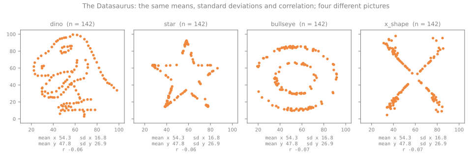
As mesmas médias (54,3 e 47,8), os mesmos desvios padrão (16,8 e 26,9) e a mesma correlação (−0,06 a −0,07) descrevem um dinossauro, uma estrela, um alvo e um X. Sempre faça gráficos.
Distribuições
Histogramas: a largura do bin muda a história
Um histograma corta a faixa de uma coluna em intervalos (bins) e conta os valores em cada um. É o primeiro gráfico a fazer para toda coluna numérica, porque é o único gráfico simples que mostra a forma: quantos picos, onde estão os buracos e se há picos artificiais. Ele depende de um parâmetro que importa: o número de bins. A mesma coluna-alvo, desenhada com 10 e com 50 bins:
v = df['median_house_value']
for bins in [10, 50]:
    counts, edges = np.histogram(v, bins=bins)
    print(f"{bins} bins of width {edges[1] - edges[0]:8,.0f}: last bin {counts[-1]:5d}, "
          f"its neighbor {counts[-2]:4d}, tallest bin {counts.max():5d}")
print("Freedman-Diaconis rule:", len(np.histogram_bin_edges(v, bins='fd')) - 1, "bins")
print(v.value_counts().head(3))                      # os valores mais repetidos
10 bins of width   48,500: last bin  1243, its neighbor  479, tallest bin  4099
50 bins of width    9,700: last bin  1030, its neighbor   47, tallest bin  1030
Freedman-Diaconis rule: 46 bins
median_house_value
500001.0    965
137500.0    122
162500.0    117
Name: count, dtype: int64
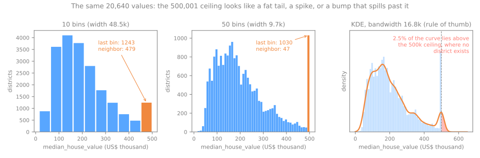
Com 10 bins, a última barra (1.243 distritos) é uma pequena elevação, 30% da barra mais alta: parece uma cauda um pouco gorda. Com 50 bins ela vira a barra mais alta de todo o histograma (1.030), 22 vezes a vizinha (47). Nenhum processo natural empilha mil distritos na borda da faixa. A última linha da saída aponta o culpado: o valor mais frequente da coluna é exatamente 500.001, compartilhado por 965 distritos — o teto. Bins de menos podem esconder o defeito mais importante do conjunto. Regras práticas:
- experimente mais de um número de bins; comece com 30 a 50 para alguns milhares de linhas ou mais;
bins='fd'(Freedman–Diaconis) escolhe a largura a partir do IQR e de \(n\) e é robusto a caudas longas; aqui ele escolhe 46 bins, perto dos nossos 50;- para uma coluna discreta com poucos valores (idade em anos inteiros), use um bin por valor.
Estimativas de densidade por kernel
Uma estimativa de densidade por kernel (KDE, do inglês kernel density estimate) troca cada valor por uma pequena curva em forma de sino (um "kernel" gaussiano) e soma todas, dando uma curva suave em vez de barras. O parâmetro dela é a largura do sino, a bandwidth; a regra prática \(h = 1{,}06\,s\,n^{-1/5}\) dá 16,8 mil dólares aqui. O painel da direita da figura mostra os dois lados da suavização. A curva é agradável de ler e não depende de onde os bins começam. Mas ela transforma o pico numa lombada suave e, como cada sino se estende para os dois lados do seu valor, 2,5% da curva fica acima de 500.001, onde não existe um único distrito. Um KDE pode inventar valores fora da faixa possível (preços negativos, idades acima do teto). Use-o para comparar formas entre grupos, nunca como a única visão de uma coluna.
Atributos assimétricos e a escala log
Quatro colunas do housing são contagens com cauda longa à direita, como os salários acima. O logaritmo é o remédio padrão: ele comprime valores grandes muito mais que os pequenos (\(\log 10 = 2{,}3\), \(\log 10.000 = 9{,}2\)), então uma cauda longa à direita é recolhida. Meça a assimetria antes e depois:
for col in ['median_income', 'population']:
    x = df[col]
    print(f"{col:14s} skew {x.skew():5.2f} -> after log {np.log(x).skew():5.2f}   "
          f"(mean {x.mean():,.1f}, median {x.median():,.1f})")
print("districts with fewer than 50 people:", (df['population'] < 50).sum(),
      "· smallest:", df['population'].min())
small_out = np.log(df.loc[df['population'] >= 200, 'population'])
print(f"log(population) without districts under 200 people: skew {small_out.skew():.2f}")
median_income  skew  1.65 -> after log -0.15   (mean 3.9, median 3.5)
population     skew  4.94 -> after log -1.07   (mean 1,425.5, median 1,166.0)
districts with fewer than 50 people: 104 · smallest: 3.0
log(population) without districts under 200 people: skew 0.12
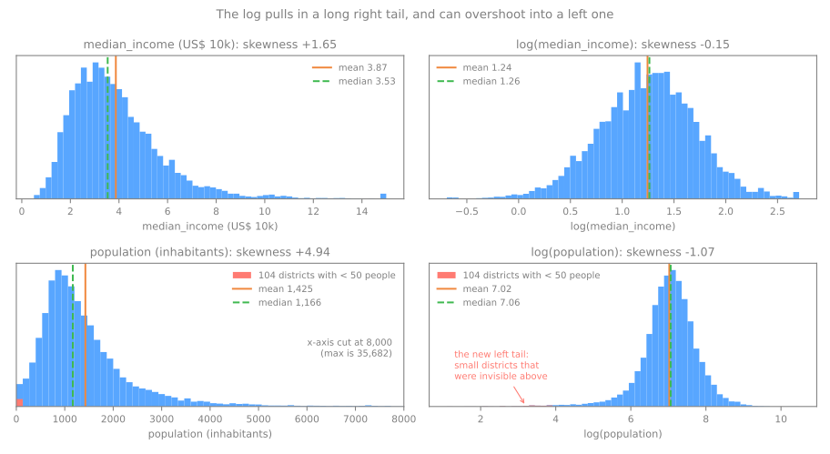
Em median_income o log funciona como prometido: a assimetria de 1,65 vira −0,15 e média e mediana quase coincidem. Em population ele passa do ponto: +4,94 vira −1,07, uma cauda longa à esquerda. Os culpados são os 104 distritos com menos de 50 habitantes (o menor tem 3). Na escala original eles ficam invisíveis perto do zero; o log estica justamente essa região (\(\log 3 = 1{,}1\) contra uma mediana de \(\log 1.166 = 7{,}1\)) e eles viram os novos extremos. Excluindo os distritos com menos de 200 pessoas, o log da população tem assimetria 0,12. A lição é geral: transformação é hipótese, não receita — aplique e meça de novo. A aula de pré-processamento cobre as transformações em si (log1p para colunas com zeros, Box-Cox, Yeo-Johnson) e quando um modelo precisa delas.
Relações entre duas variáveis
Gráficos de dispersão e sobreposição
Etapa 4. O gráfico de dispersão (scatter) é a visão básica de duas colunas numéricas. Com 20.640 pontos, porém, ele tem um problema próprio: os pontos se sobrepõem e uma região densa fica igual a uma moderadamente densa — uma mancha sólida. Três visões da renda contra o valor do imóvel (script da figura):
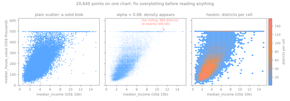
- Transparência (
alpha=0.08): cada ponto sozinho é quase invisível, então a cor só se acumula onde muitos pontos se sobrepõem. Aparecem o núcleo denso e também detalhes que a mancha sólida escondia: uma linha horizontal de 965 distritos no teto de 500.001 e linhas mais fracas em valores redondos que se repetem muito mais que os vizinhos (137.500 aparece 122 vezes e 162.500 aparece 117 vezes, como o código do histograma imprimiu). - Hexbin (
plt.hexbin): corta o plano em células hexagonais e colore cada uma pelo número de pontos que ela contém. Mostra onde está a massa (rendas de 2 a 5 e valores de 100 a 250 mil) ao custo dos pontos individuais. - O que o gráfico diz: o valor sobe com a renda, de forma aproximadamente linear até uma renda de cerca de 8; a dispersão vertical cresce com a renda — os erros de um modelo não terão o mesmo tamanho em toda parte.
Correlação: Pearson e Spearman
A correlação de Pearson mede o quanto os pontos se aproximam de uma reta:
A correlação de Spearman \(\rho\) é o Pearson calculado sobre os postos (1º, 2º, ...) em vez dos valores. Ela mede se \(y\) sobe sempre que \(x\) sobe, em linha reta ou não. À mão, em cinco pontos em que \(y\) sempre cresce, mas o último salto é enorme:
| \(x\) | \(y\) | \(x - \bar{x}\) | \(y - \bar{y}\) | produto | \((x - \bar{x})^2\) | \((y - \bar{y})^2\) | posto \(x\) | posto \(y\) |
|---|---|---|---|---|---|---|---|---|
| 1 | 1 | −2 | −5 | 10 | 4 | 25 | 1 | 1 |
| 2 | 2 | −1 | −4 | 4 | 1 | 16 | 2 | 2 |
| 3 | 3 | 0 | −3 | 0 | 0 | 9 | 3 | 3 |
| 4 | 4 | 1 | −2 | −2 | 1 | 4 | 4 | 4 |
| 5 | 20 | 2 | 14 | 28 | 4 | 196 | 5 | 5 |
| soma | 40 | 10 | 250 |
Com \(\bar{x} = 3\) e \(\bar{y} = 6\): \(r = 40 / \sqrt{10 \times 250} = 40/50 = 0{,}8\). Os postos de \(x\) e \(y\) são idênticos, então o Spearman é exatamente 1.
pts = pd.DataFrame({'x': [1, 2, 3, 4, 5], 'y': [1, 2, 3, 4, 20]})
print(f"Pearson  {pts['x'].corr(pts['y']):.3f}")
print(f"Spearman {pts['x'].corr(pts['y'], method='spearman'):.3f}")
A relação é perfeitamente monotônica, mas não é uma reta. Além disso, o ponto distante domina as somas: 28 dos 40 do numerador vêm dele. O Pearson diz 0,8; o Spearman diz 1. Calcular os dois e compará-los é um diagnóstico barato. Nos dados do housing, contra o alvo:
target = df['median_house_value']
cols = ['median_income', 'total_rooms', 'housing_median_age', 'households', 'population', 'latitude']
print(pd.DataFrame({'pearson': df[cols].corrwith(target),
                    'spearman': df[cols].corrwith(target, method='spearman')}).round(3))
                    pearson  spearman
median_income         0.688     0.677
total_rooms           0.134     0.206
housing_median_age    0.106     0.075
households            0.066     0.113
population           -0.025     0.004
latitude             -0.144    -0.166
median_incomeé o atributo dominante: 0,688 e 0,677, quase iguais, então a relação é quase linear (como o scatter mostrou);- em
total_rooms, o Spearman (0,206) fica bem acima do Pearson (0,134): uma relação monotônica distorcida pela cauda longa das contagens; latitudetem \(r = -0{,}144\), o que parece fraco. Não é: no lab, o valor mediano oscila de 84.500 a 236.500 entre faixas de um grau de latitude, subindo e descendo duas vezes. Os dois coeficientes ficam perto de zero porque a relação não é monotônica, algo que nem Pearson nem Spearman conseguem enxergar. \(r \approx 0\) quer dizer "nenhuma associação linear (ou monotônica)", nunca "nenhuma relação".
O simulador põe os dois coeficientes lado a lado em vinte pontos. Comece pela curva monótona: os pontos nunca descem, então o Spearman é exatamente 1 e o Pearson não, como na tabela. Depois carregue com um outlier, ou acrescente um, e arraste o ponto vermelho para ainda mais longe: veja qual coeficiente continua se mexendo.
O Pearson eleva distâncias ao quadrado, então um único ponto distante pode movê-lo muito. No quadro dos postos o mesmo ponto é só um posto entre os outros e, depois de virar o primeiro ou o último, não tem para onde ir. O Spearman é robusto a quão longe um ponto está, não a um ponto que inverte a ordem: arraste um ponto para o canto de baixo à direita e os dois coeficientes caem.
Atributos redundantes
A correlação entre atributos também importa. Quando duas colunas são quase perfeitamente correlacionadas, carregam quase a mesma informação:
size = ['total_rooms', 'total_bedrooms', 'population', 'households']
print(df[size].corr().round(2))

from sklearn.datasets import load_iris
iris = load_iris(as_frame=True).frame
print(f"iris, petal length vs petal width: r = "
      f"{iris['petal length (cm)'].corr(iris['petal width (cm)']):.3f}")
                total_rooms  total_bedrooms  population  households
total_rooms            1.00            0.93        0.86        0.92
total_bedrooms         0.93            1.00        0.88        0.98
population             0.86            0.88        1.00        0.91
households             0.92            0.98        0.91        1.00
iris, petal length vs petal width: r = 0.963
As quatro contagens do housing se correlacionam entre 0,86 e 0,98: as quatro medem o tamanho do distrito. No conjunto iris, comprimento e largura da pétala têm \(r = 0{,}963\): sabendo um, você quase sabe o outro. Redundância não é erro, mas vale registrar. Modelos lineares ficam com coeficientes instáveis quando os atributos são tão correlacionados (veja a aula de regressão linear). A redução de dimensionalidade explora justamente essa redundância. Para as contagens do housing há uma solução mais simples, dividir pelo tamanho (cômodos por domicílio), que o lab testa no passo 9.
Duas regras práticas para ler correlações entre atributo e alvo:
- um atributo suspeitamente associado ao alvo pode ser o alvo disfarçado — uma coluna vazada (veja Vazamento de Dados). Se um modelo depois ficar perfeito, desconfie dele primeiro;
- as tabelas de correlação só cobrem pares numéricos. Para os outros pares: categórica × numérica, compare os grupos (próxima seção, com o teste de Kruskal–Wallis se precisar de um número); categórica × categórica, uma tabela de contingência (
pd.crosstab) resumida pelo V de Cramér.
Correlação não é causalidade
Renda e valor do imóvel têm \(r = 0{,}69\). Isso não quer dizer que aumentar a renda de um distrito aumenta o preço das casas nem o contrário. Os dois respondem a uma terceira coisa, a demanda por morar naquele lugar (empregos, litoral, escolas). Vendas de sorvete e afogamentos se correlacionam por causa do verão. Sempre que ler uma correlação, pergunte que terceira variável poderia estar movendo as duas. O próximo paradoxo mostra até onde uma variável dessas pode enganar.
O paradoxo de Simpson
Uma tendência nos dados inteiros pode se inverter dentro de cada grupo. O exemplo real clássico compara dois tratamentos para cálculo renal (Charig et al., 1986):
stones = pd.DataFrame({'treatment': ['A', 'A', 'B', 'B'],
                       'stone':     ['small', 'large', 'small', 'large'],
                       'patients':  [87, 263, 270, 80],
                       'successes': [81, 192, 234, 55]})
stones['rate'] = stones['successes'] / stones['patients']
print(stones.pivot(index='stone', columns='treatment', values='rate').round(3))
overall = stones.groupby('treatment')[['successes', 'patients']].sum()
print((overall['successes'] / overall['patients']).round(3))
O tratamento A vence para pedras pequenas (0,931 contra 0,867) e para pedras grandes (0,730 contra 0,688), mas perde no total (0,780 contra 0,826). Confira com uma calculadora: o total de A é \((81 + 192)/(87 + 263) = 273/350\). A razão está no número de pacientes: A foi aplicado sobretudo a pedras grandes (263 dos seus 350 pacientes), que são mais difíceis de tratar; B, sobretudo a pedras pequenas. A taxa total compara um grupo de casos difíceis com um grupo de casos fáceis. O tamanho da pedra é um confundidor: influencia tanto a escolha do tratamento quanto o sucesso dele.
A mesma armadilha está nos nossos dados. Divida quartos por cômodos para obter a fração dos cômodos que são quartos e correlacione-a com o valor do imóvel, primeiro no geral e depois dentro de cinco faixas de renda (quintis de median_income):
d = df.dropna(subset=['total_bedrooms']).copy()
d['bedrooms_per_room'] = d['total_bedrooms'] / d['total_rooms']
print(f"overall: r = {d['bedrooms_per_room'].corr(d['median_house_value']):.3f}   "
      f"(and with income: r = {d['bedrooms_per_room'].corr(d['median_income']):.3f})")
band = pd.qcut(d['median_income'], 5, labels=['Q1', 'Q2', 'Q3', 'Q4', 'Q5'])
within = d.groupby(band, observed=True)[['bedrooms_per_room', 'median_house_value']].corr()
print(within.xs('bedrooms_per_room', level=1)['median_house_value'].round(3))
print(d[band == 'Q1'].groupby('ocean_proximity')['bedrooms_per_room'].median().round(3))
overall: r = -0.256   (and with income: r = -0.616)
median_income
Q1    0.418
Q2    0.368
Q3    0.335
Q4    0.237
Q5   -0.174
Name: median_house_value, dtype: float64
ocean_proximity
<1H OCEAN     0.279
INLAND        0.230
ISLAND        0.311
NEAR BAY      0.253
NEAR OCEAN    0.276
Name: bedrooms_per_room, dtype: float64
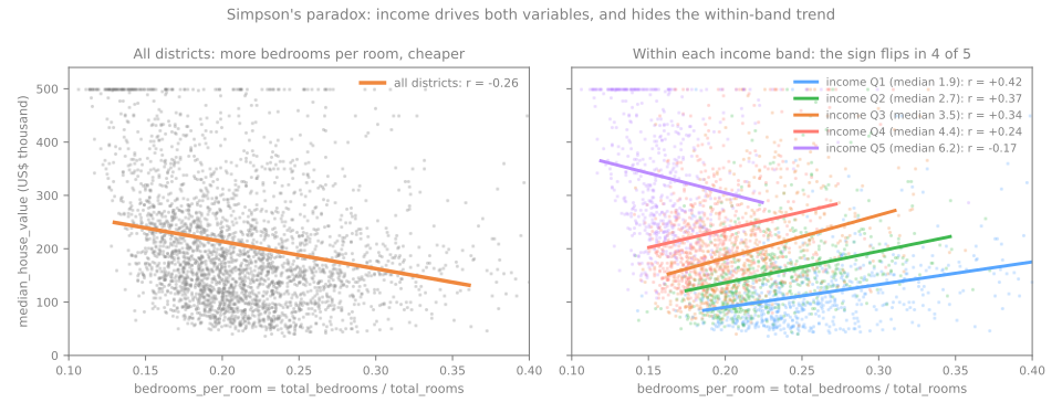
No geral, uma fração maior de quartos acompanha distritos mais baratos (\(r = -0{,}256\)). Dentro de cada uma das quatro faixas de renda mais baixas, acompanha distritos mais caros (\(r\) de +0,24 a +0,42). A renda move as duas variáveis: distritos mais ricos têm preços mais altos e casas maiores, com mais cômodos que não são quartos (\(r = -0{,}616\) entre fração de quartos e renda). A correlação agregada mede sobretudo a renda. Dentro de uma faixa, a fração de quartos conta outra história; por exemplo, dentro da faixa mais baixa (as últimas linhas da saída), a fração mediana é 0,230 nos distritos INLAND e de 0,253 a 0,311 no litoral, onde os preços são mais altos, então uma fração alta significa em parte "perto da costa". A faixa mais alta mantém a inclinação negativa; um suspeito é o teto de 500.001, que achata justamente os distritos mais ricos.
A lição para a EDA: uma correlação nos dados agregados é hipótese, não achado. Antes de escrever "X baixa o preço", condicione nas terceiras variáveis óbvias (renda, localização) e veja se a relação sobrevive.
Categórica vs numérica
Para comparar uma coluna numérica entre os níveis de uma categórica, agrupe pela categoria e resuma cada grupo — sempre com o tamanho \(n\) ao lado:
summary = (df.groupby('ocean_proximity')['median_house_value']
             .agg(['count', 'mean', 'median', 'std'])
             .sort_values('median'))
print(summary.round(0))
print(df.groupby('ocean_proximity')['median_income'].median().round(2))
                 count      mean    median       std
ocean_proximity
INLAND            6551  124805.0  108500.0   70008.0
<1H OCEAN         9136  240084.0  214850.0  106124.0
NEAR OCEAN        2658  249434.0  229450.0  122477.0
NEAR BAY          2290  259212.0  233800.0  122819.0
ISLAND               5  380440.0  414700.0   80560.0
ocean_proximity
<1H OCEAN     3.88
INLAND        2.99
ISLAND        2.74
NEAR BAY      3.82
NEAR OCEAN    3.65
Name: median_income, dtype: float64
O gráfico são boxplots ou violinos, um por grupo, ordenados pela mediana em vez da ordem alfabética (script da figura):
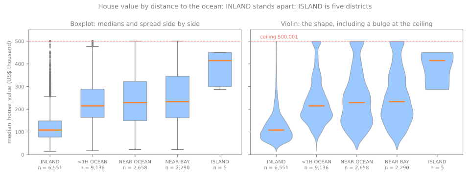
- Um boxplot desenha cinco números por grupo: a caixa vai de \(Q_1\) a \(Q_3\), a linha dentro é a mediana, os bigodes vão até os valores mais extremos dentro de 1,5 IQR da caixa e os pontos além deles são desenhados um a um. É a melhor visão para comparar muitos grupos lado a lado. INLAND se destaca na hora: mediana 108.500 contra 214.850–233.800 nos três grupos litorâneos e uma dispersão menor (desvio 70.008 contra 106.124–122.819).
- Um violino desenha a distribuição inteira de cada grupo, espelhada. Ele mostra o que a caixa esconde: os grupos litorâneos incham no teto de 500.001, então o teto os afeta muito mais que INLAND.
- ISLAND tem 5 distritos. A mediana de 414.700 é a maior da tabela e também a menos confiável: 5 valores ao lado de milhares. Nunca reporte uma estatística de grupo sem o respectivo \(n\).
Antes de concluir "estar perto do oceano aumenta o preço", lembre-se da seção anterior: os distritos INLAND também têm renda menor (mediana 2,99 contra 3,65–3,88 no litoral), então parte da diferença é renda. Condicionar na renda, como no exemplo de Simpson, é a forma de separar as duas coisas.
Valores faltantes: o porquê importa
Etapa 5. total_bedrooms tem 207 valores faltantes (1,00%). Quantos é a pergunta fácil. A importante é por quê, porque o motivo decide quais correções são seguras. Rubin (1976) deu nome aos três mecanismos possíveis:
| Mecanismo | Significado | Exemplo | Correções seguras |
|---|---|---|---|
| MCAR | faltando completamente ao acaso: nada prevê quais valores faltam | um sensor perde pacotes ao acaso | descartar as linhas ou imputar |
| MAR | faltando ao acaso dadas outras colunas observadas | usuários mais jovens pulam o campo de renda; a idade é registrada | imputar usando essas colunas |
| MNAR | faltando não ao acaso: a chance de faltar depende do próprio valor faltante | rendas altas deliberadamente não informadas | perigoso — exige raciocínio de domínio |
Os nomes são fáceis de confundir, então vamos ver os três mecanismos agindo sobre dados em que conhecemos a verdade. Simule 10.000 pessoas cuja renda cresce com a idade e depois esconda cerca de 30% das rendas de três maneiras diferentes. Por fim, preencha cada renda faltante com a média das pessoas do mesmo grupo de idade (abaixo de 35 anos ou não) — uma imputação simples que usa uma coluna observada.
rng = np.random.default_rng(0)
n = 10_000
age = rng.uniform(20, 65, n)
income = np.exp(0.5 + 0.03 * age + rng.normal(0, 0.4, n))     # R$ mil por mês
people = pd.DataFrame({'age': age, 'income': income})
young = people['age'] < 35
rich = people['income'] > people['income'].quantile(2 / 3)
p_missing = {'MCAR': np.full(n, 0.3),                # uma moeda, igual para todos
             'MAR':  np.where(young, 0.6, 0.15),     # depende da idade, que vemos
             'MNAR': np.where(rich, 0.6, 0.15)}      # depende da própria renda
print(f"true mean income: {people['income'].mean():.2f}")
for mech, p in p_missing.items():
    missing = rng.random(n) < p
    seen = people['income'].mask(missing)                             # NaN onde falta
    by_age = seen.fillna(seen.groupby(young).transform('mean'))      # preenche por grupo de idade
    print(f"{mech:4s}  missing {missing.mean():.1%}   mean of what we see {seen.mean():.2f}   "
          f"after filling by age group {by_age.mean():.2f}")
true mean income: 6.89
MCAR  missing 30.1%   mean of what we see 6.82   after filling by age group 6.85
MAR   missing 30.6%   mean of what we see 7.48   after filling by age group 6.88
MNAR  missing 30.2%   mean of what we see 5.91   after filling by age group 6.11
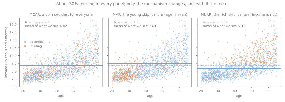
- MCAR: as rendas que vemos são uma amostra aleatória de todas as rendas, então a média delas (6,82) fica perto da verdade (6,89). Descartar as linhas só custa precisão.
- MAR: os jovens, que ganham menos, faltam com mais frequência, então a média observada fica alta demais (7,48). Mas dentro de cada grupo de idade os faltantes são aleatórios, então preencher por grupo de idade recupera a verdade (6,88). O viés é real, mas corrigível com as colunas disponíveis.
- MNAR: os ricos escondem a renda, então a média observada fica baixa demais (5,91); preencher por grupo de idade quase não ajuda (6,11): nada do que foi observado diz quem é rico. Nenhuma imputação corrige MNAR; é preciso conhecimento sobre como os dados foram coletados ou pelo menos uma declaração honesta do viés.
Excluir todas as linhas com algum valor faltante só é inofensivo sob MCAR. Duas consequências práticas para a EDA:
- dá para juntar evidência contra MCAR: compare as linhas com e sem o valor faltante nas outras colunas. Se forem diferentes (as linhas com falta são mais jovens, mais pobres, mais vezes INLAND), os dados não são MCAR. O lab faz essa checagem em
total_bedroomsno passo 3; - nunca dá para provar MCAR; já o MNAR é indetectável só pelos dados: o valor que o revelaria é justamente o que falta. Na dúvida, mantenha uma coluna indicadora (
bedrooms_missing = df['total_bedrooms'].isna()) para que um modelo possa usar o fato de que o valor faltou.
Estratégias de imputação são cobertas em Pré-processamento de Dados.
Outliers
Duas regras, à mão
Um outlier é um valor longe dos demais. Duas regras colocam um número em "longe". De volta aos salários:
- Regra do IQR (os bigodes do boxplot): sinalize valores fora de \([Q_1 - 1{,}5\,\text{IQR},\; Q_3 + 1{,}5\,\text{IQR}]\). Com \(Q_1 = 3\), \(Q_3 = 5\), \(\text{IQR} = 2\): as cercas são \(3 - 3 = 0\) e \(5 + 3 = 8\). O 26 é sinalizado.
- Regra do escore z: sinalize valores a mais de 3 desvios padrão da média, \(|z| = |x - \bar{x}|/s > 3\). Para o dono, \(z = (26 - 6)/7{,}62 = 2{,}63\). Não é sinalizado.
q1, q3 = salaries.quantile([0.25, 0.75])
iqr = q3 - q1
low, high = q1 - 1.5 * iqr, q3 + 1.5 * iqr
print(f"IQR fences [{low}, {high}] -> flagged: {salaries[(salaries < low) | (salaries > high)].tolist()}")
z = (salaries - salaries.mean()) / salaries.std()
print("z-scores:", z.round(2).tolist())
n = len(salaries)
print(f"largest |z| possible with n = {n}: {(n - 1) / np.sqrt(n):.2f}")
IQR fences [0.0, 8.0] -> flagged: [26]
z-scores: [-0.53, -0.53, -0.39, -0.39, -0.39, -0.26, -0.13, 0.0, 2.63]
largest |z| possible with n = 9: 2.67
A regra do escore z deixa passar o valor mais extremo da coluna por dois motivos. Primeiro, o outlier infla as próprias estatísticas usadas para julgá-lo: puxa a média de 3,5 para 6 e o desvio padrão para 7,62, então parece menos extremo (isso se chama mascaramento). Segundo, numa amostra de \(n\) valores nenhum escore z pode passar de \((n-1)/\sqrt{n}\) (Shiffler, 1988): com \(n = 9\) isso dá 2,67, então "\(|z| > 3\)" não consegue sinalizar nada, sejam quais forem os dados. Os quartis não se movem com o valor extremo; é por isso que a regra do IQR é o padrão usual na EDA.
Em dados reais as duas regras também discordam bastante:
def iqr_flags(s):
    q1, q3 = s.quantile([0.25, 0.75])
    return ((s < q1 - 1.5 * (q3 - q1)) | (s > q3 + 1.5 * (q3 - q1))).sum()

pop = df['population']
print("population, IQR rule:        ", iqr_flags(pop))
print("population, |z| > 3:         ", (((pop - pop.mean()) / pop.std()).abs() > 3).sum())
print("log(population), IQR rule:   ", iqr_flags(np.log(pop)))
Em population, a regra do IQR sinaliza 1.196 distritos (5,8%) — não porque estejam errados, mas porque as cercas de 1,5 IQR foram pensadas para dados aproximadamente simétricos e uma cauda longa à direita coloca muitos distritos grandes e comuns além delas. Na escala log, ela sinaliza 847. As regras só sinalizam candidatos; não dizem o que fazer.
Erro ou raro-mas-real?
A decisão exige olhar as linhas sinalizadas e conhecer o domínio:
- uma
idade = 190numa tabela de clientes é quase certamente erro de digitação (19? 90?) → corrija se a fonte permitir; senão, marque como faltante; - o salário de 26 do dono é real → mantenha-o e prefira estatísticas e modelos robustos a ele (a mediana, quantis, uma escala log);
- no meio ficam valores corretos que significam algo diferente do resto.
O California Housing tem um caso marcante do terceiro tipo. Divida a população pelo número de domicílios:
people_per_household = df['population'] / df['households']
print(f"median {people_per_household.median():.2f} people per household · "
      f"{(people_per_household > 10).sum()} districts above 10 · {(people_per_household > 50).sum()} above 50")
print(df.loc[people_per_household.idxmax(),
             ['population', 'households', 'total_rooms', 'latitude', 'longitude']])
median 2.82 people per household · 37 districts above 10 · 7 above 50
population     7460.00
households        6.00
total_rooms      19.00
latitude         38.32
longitude      -121.98
Name: 4407, dtype: float64
O distrito típico tem 2,82 pessoas por domicílio. Um deles tem 7.460 pessoas em 6 domicílios com 19 cômodos no total — 1.243 pessoas por domicílio. Nenhum arranjo familiar produz isso. O que produz é uma instituição: um presídio, uma base militar, um alojamento. O censo conta essas pessoas na população do distrito, mas elas não moram em "domicílios". (As coordenadas ficam perto de Vacaville, cidade com dois presídios estaduais, o que é uma hipótese a verificar, não um fato.) Os números provavelmente estão corretos; o que muda é o significado. Nos 37 distritos com mais de 10 pessoas por domicílio, as colunas de tamanho descrevem uma população que não mora nas casas cujo valor queremos prever. Decisões razoáveis são sinalizá-los com uma coluna ou removê-los declarando a regra e a contagem. A decisão errada é descobri-los depois que um modelo falhar.
Valores truncados e censurados
Três colunas param num máximo precisamente suspeito:
for col, cap in [('median_house_value', 500001), ('housing_median_age', 52), ('median_income', 15.0001)]:
    at_cap = (df[col] >= cap).sum()
    print(f"{col:19s} cap {cap:>9,}: {at_cap:4d} districts ({at_cap / len(df):.1%})")
capped = df['median_house_value'] >= 500001
print(f"mean income of capped districts {df.loc[capped, 'median_income'].mean():.2f} "
      f"vs {df['median_income'].mean():.2f} overall")
print(df.loc[capped, 'ocean_proximity'].value_counts())
median_house_value  cap   500,001:  965 districts (4.7%)
housing_median_age  cap        52: 1273 districts (6.2%)
median_income       cap   15.0001:   49 districts (0.2%)
mean income of capped districts 7.83 vs 3.87 overall
ocean_proximity
<1H OCEAN     532
NEAR OCEAN    212
NEAR BAY      194
INLAND         27
Name: count, dtype: int64
965 distritos (4,7%) têm alvo exatamente igual a 500.001; 1.273 (6,2%) têm idade mediana exatamente 52; 49 têm renda exatamente 15,0001. Valores como 500.001 e 15,0001, logo acima de um número redondo, são a assinatura clássica de truncamento no topo (top-coding): quem publicou os dados substituiu todo valor acima de um limite pelo próprio limite (mais um pouquinho, para marcá-lo). Um distrito registrado como 500.001 não vale 500.001 — vale pelo menos 500.000; o valor verdadeiro se perdeu. Estatísticos chamam esses valores de censurados. Esses distritos não são um subconjunto aleatório: a renda média deles é 7,83 (o dobro dos 3,87 da tabela inteira) e só 27 dos 965 são INLAND.
Como encontrar tetos em qualquer conjunto de dados: um pico na borda de um histograma (como na figura da largura dos bins), uma linha horizontal num scatter, um máximo compartilhado exatamente por muitas linhas. Consequências a declarar antes de modelar:
- um modelo treinado nesses valores aprende que nenhum distrito vale mais que cerca de 500.000 e vai subestimar os caros;
- as relações se achatam no topo: a relação renda–valor parece se estabilizar depois de uma renda de cerca de 8, mas parte disso é o teto, não economia;
- opções defensáveis: mantê-los e documentar a limitação; remover as linhas truncadas e declarar que o modelo só cobre distritos abaixo de 500.000; ou usar um modelo feito para dados censurados. A única opção indefensável é não perceber.
Não bisbilhote: divida antes de explorar
Uma sutileza em que o roteiro da aula insiste: faça a divisão treino/teste antes da análise exploratória e rode a EDA apenas no conjunto de treino. Explorar o conjunto completo significa "espiar" o conjunto de teste — data snooping — e o que você aprende (quais atributos parecem promissores, onde estão os outliers, quais transformações aplicar) influencia silenciosamente decisões que o conjunto de teste deveria julgar de fora.
from sklearn.model_selection import train_test_split

train, test = train_test_split(df, test_size=0.2, random_state=42)
# daqui em diante, explore só `train`; `test` espera até o final
Os dois princípios
- O conjunto de treino pode ser usado livremente.
- O conjunto de teste é SAGRADO. Ele existe para exatamente um propósito: medir o modelo final uma única vez. Não olhe para ele, não chegue perto, não reconheça sua existência até o fim.
Onde traçar a linha na prática: fatos sobre como o arquivo foi produzido (as unidades, os tetos, que uma coluna tem valores faltantes) não vêm das linhas de teste; conhecê-los não faz mal. Tudo o que é estimado a partir dos dados e alimenta uma decisão — um valor de imputação, uma média de padronização, um limiar de outlier, quais atributos se correlacionam melhor com o alvo — tem que vir só da parte de treino. As figuras desta aula usam as 20.640 linhas porque ilustram técnicas, não decisões; o lab abaixo faz do jeito certo. A aula de validação cruzada mede o tamanho dos erros que isso pode causar.
Um checklist de EDA
- Contexto — quem coletou os dados e quando? O que exatamente é uma linha? Qual coluna é o alvo?
- Divida primeiro — separe o conjunto de teste antes de olhar qualquer outra coisa.
- Formato e tipos — linhas, colunas, dtypes; numéricas, categóricas, datas, identificadores.
- Integridade — valores faltantes (quantos e por quê), linhas duplicadas, valores impossíveis (mais domicílios que pessoas), tetos e valores redondos suspeitos.
- Uma coluna por vez — histograma com mais de um número de bins, média vs mediana, assimetria; para categorias, frequências e níveis raros.
- Pares — scatter (com transparência ou hexbin quando \(n\) é grande), Pearson e Spearman, boxplots por grupo; atributos redundantes; atributos suspeitamente bons em prever o alvo.
- Terceiras variáveis — a relação sobrevive dentro de grupos (faixas de renda, regiões)?
- Escreva — todo gráfico merece uma frase que comece com "isto implica que...". O produto da EDA é uma lista de achados, de problemas a corrigir no pré-processamento e de hipóteses a testar com modelos.
A EDA é iterativa
Você voltará à EDA depois de modelar: erros de previsão, importâncias de atributos surpreendentes e alertas de drift fazem você voltar aos dados.
Lab: uma primeira EDA do California Housing
Uma análise exploratória completa dos dados do housing, feita do jeito certo: dividir primeiro, explorar só a parte de treino e terminar com uma lista escrita de achados. Os passos seguem o checklist acima. Não há modelos: o produto do lab é um conjunto de fatos, problemas e hipóteses sobre os quais as próximas aulas (pré-processamento, pipelines e, mais adiante, regressão linear) vão agir.
Rode os blocos em ordem, numa mesma sessão. Toda saída abaixo é o que o código imprime; os gráficos aparecem quando você roda o notebook. Para trabalhar direto nele, baixe o notebook do lab e abra no Jupyter ou no Colab (File → Upload notebook). O lab inteiro roda em poucos segundos.
Passo 1 — carregar e conhecer as colunas
import numpy as np
import pandas as pd
import matplotlib.pyplot as plt
import seaborn as sns

pd.set_option('display.width', 120)
URL = "https://raw.githubusercontent.com/hsandmann/biblio/refs/heads/main/ml/aula02/housing.csv"
df = pd.read_csv(URL)
print(df.shape)
df.info()
(20640, 10)
<class 'pandas.DataFrame'>
RangeIndex: 20640 entries, 0 to 20639
Data columns (total 10 columns):
 #   Column              Non-Null Count  Dtype
---  ------              --------------  -----
 0   longitude           20640 non-null  float64
 1   latitude            20640 non-null  float64
 2   housing_median_age  20640 non-null  float64
 3   total_rooms         20640 non-null  float64
 4   total_bedrooms      20433 non-null  float64
 5   population          20640 non-null  float64
 6   households          20640 non-null  float64
 7   median_income       20640 non-null  float64
 8   median_house_value  20640 non-null  float64
 9   ocean_proximity     20640 non-null  str
dtypes: float64(9), str(1)
memory usage: 1.6 MB
O info() dá numa só chamada o tamanho, o tipo de cada coluna e as contagens de não nulos. 20.640 distritos e 10 colunas: nove numéricas, uma de texto (ocean_proximity; o pandas mais antigo imprime object em vez de str). Uma contagem se destaca: total_bedrooms tem 20.433 valores não nulos, então faltam 207. Antes de seguir, releia o dicionário de dados: uma linha é um distrito (não uma casa) e median_house_value é o alvo.
Passo 2 — dividir primeiro, depois explorar
from sklearn.model_selection import train_test_split

train, test = train_test_split(df, test_size=0.2, random_state=42)
train = train.copy()          # vamos adicionar colunas ao treino; o teste fica intocado
print(train.shape, test.shape)
80% das linhas (16.512) para explorar e, mais tarde, treinar; 20% (4.128) separadas. O random_state=42 fixa o embaralhamento, então todo mundo que rodar isto obtém as mesmas linhas e os mesmos números. Daqui em diante, toda linha usa apenas train.
Passo 3 — auditoria: valores faltantes e duplicatas
print(train.isna().sum()[lambda s: s > 0])
print("duplicated rows:", train.duplicated().sum())
print("more bedrooms than rooms:", (train['total_bedrooms'] > train['total_rooms']).sum())
impossible = train[train['households'] > train['population']]
print("more households than people:", len(impossible))
print(impossible[['population', 'households', 'total_rooms', 'median_house_value']])

missing = train['total_bedrooms'].isna()
print(train.groupby(missing)[['median_income', 'median_house_value', 'housing_median_age']].mean().round(2))
target = train['median_house_value']
gap = target[missing].mean() - target[~missing].mean()
print(f"difference in mean value: {gap:,.0f} · standard error for {missing.sum()} random rows: "
      f"{target.std() / np.sqrt(missing.sum()):,.0f}")
total_bedrooms    163
dtype: int64
duplicated rows: 0
more bedrooms than rooms: 0
more households than people: 3
      population  households  total_rooms  median_house_value
1235         3.0         4.0         18.0            350000.0
5901       198.0       204.0        484.0            187500.0
5892        27.0        39.0       1116.0             83000.0
                median_income  median_house_value  housing_median_age
total_bedrooms
False                    3.86           206190.97               28.58
True                     3.79           198105.55               29.91
difference in mean value: -8,085 · standard error for 163 random rows: 8,991
Como ler:
- 163 dos 207
total_bedroomsfaltantes caíram na parte de treino; não há linhas duplicadas; - regras que valem por definição. Nenhum distrito tem mais quartos que cômodos. Mas 3 têm mais domicílios que pessoas, o que é impossível: um domicílio ocupado tem pelo menos um morador. Os três são pequenos (3, 27 e 198 pessoas), então algumas unidades contadas errado pesam muito. São quase certamente erros de registro; qualquer razão calculada a partir deles não faz sentido: separe-os para o pré-processamento descartar ou corrigir;
- a tabela compara as linhas com o valor faltante (
True) e sem ele (False), a checagem de evidência contra MCAR da seção de valores faltantes. Renda (3,79 contra 3,86) e idade (29,91 contra 28,58) são próximas; - o valor médio do imóvel é 8.085 menor nas linhas com falta. Essa diferença é real? O último número diz quanto a média de 163 linhas sorteadas ao acaso oscilaria: cerca de 8.991. A diferença é menor que essa oscilação. Então não encontramos evidência contra MCAR, o que não é o mesmo que prova. Decisão para o pré-processamento: imputar com a mediana do treino e adicionar uma coluna indicadora de falta.
Passo 4 — estatísticas descritivas
num = train.select_dtypes('number')
stats = pd.DataFrame({'mean': num.mean(), 'median': num.median(),
                      'min': num.min(), 'max': num.max(), 'skew': num.skew()})
print(stats.round(2))
                         mean     median       min        max  skew
longitude             -119.57    -118.49   -124.35    -114.31 -0.30
latitude                35.63      34.25     32.54      41.95  0.47
housing_median_age      28.59      29.00      1.00      52.00  0.07
total_rooms           2635.52    2129.00      2.00   32627.00  3.85
total_bedrooms         538.92     437.00      1.00    6445.00  3.32
population            1428.12    1169.00      3.00   35682.00  5.17
households             500.26     411.00      1.00    6082.00  3.26
median_income            3.86       3.52      0.50      15.00  1.71
median_house_value  206111.15  179200.00  14999.00  500001.00  0.99
Como ler:
- média vs mediana e assimetria. As quatro contagens (
total_rooms,total_bedrooms,population,households) têm a média de 22% a 24% acima da mediana e assimetria entre 3,26 e 5,17: caudas longas à direita.median_incomeé moderadamente assimétrica (1,71), o alvo levemente (0,99).housing_median_ageé simétrica (0,07); - mín e máx. Um distrito com 2 cômodos e outro com 3 habitantes: distritos minúsculos, que vale lembrar no log do próximo passo. Os máximos 52, 15,00 e 500.001 são os tetos;
- longitude e latitude têm assimetria pequena, mas isso não diz nada sobre o número de picos. Os histogramas do próximo passo mostram dois.
Passo 5 — distribuições, tetos e o log
num.hist(bins=50, figsize=(12, 8))
plt.tight_layout()
plt.show()

at_max = pd.DataFrame({'max': num.max(), 'rows at max': (num == num.max()).sum()})
at_max['share'] = (at_max['rows at max'] / len(num)).round(4)
print(at_max.sort_values('rows at max', ascending=False).head(4))

counts = ['total_rooms', 'total_bedrooms', 'population', 'households', 'median_income']
print(pd.DataFrame({'skew': train[counts].skew(), 'skew of log': np.log(train[counts]).skew()}).round(2))
                            max  rows at max   share
housing_median_age      52.0000         1022  0.0619
median_house_value  500001.0000          761  0.0461
median_income           15.0001           44  0.0027
latitude                41.9500            2  0.0001
                skew  skew of log
total_rooms     3.85        -1.12
total_bedrooms  3.32        -1.08
population      5.17        -1.07
households      3.26        -1.14
median_income   1.71        -0.13
Olhe primeiro a grade de histogramas. Depois os números:
- Os tetos, encontrados sem saber que existem. Quantas linhas compartilham o máximo de cada coluna? Numa coluna comum, uma ou duas (
latitude: 2). Emhousing_median_age, 1.022 linhas (6,2%); no alvo, 761 (4,6%); emmedian_income, 44. Nos histogramas, são os picos isolados na borda direita de três painéis; - Dois picos em
longitudeelatitude: as duas grandes regiões metropolitanas, Los Angeles (latitudes de 33 a 35) e a Área da Baía de São Francisco (de 37 a 38); a tabela do passo 8 as conta. Uma coluna com dois picos quase sempre significa dois grupos; - O log. Ele conserta
median_income(1,71 → −0,13) e passa do ponto nas quatro contagens (em torno de −1,1), pelo motivo visto na seção do log: os menores distritos viram a nova cauda. Anote como opção de pré-processamento a testar, não como decisão.
Passo 6 — a coluna categórica
print(train['ocean_proximity'].value_counts())
g = train.groupby('ocean_proximity')
table = pd.DataFrame({'n': g.size(), 'median value': g['median_house_value'].median(),
                      'median income': g['median_income'].median().round(2)}).sort_values('median value')
print(table)

sns.violinplot(data=train, x='ocean_proximity', y='median_house_value', order=table.index, cut=0)
plt.show()
ocean_proximity
<1H OCEAN     7313
INLAND        5276
NEAR OCEAN    2091
NEAR BAY      1827
ISLAND           5
Name: count, dtype: int64
                    n  median value  median income
ocean_proximity
INLAND           5276      108800.0           2.99
<1H OCEAN        7313      214800.0           3.85
NEAR OCEAN       2091      231300.0           3.62
NEAR BAY         1827      232200.0           3.80
ISLAND              5      414700.0           2.74
Como ler:
- Frequências. Duas categorias concentram 76% das linhas (7.313 e 5.276 de 16.512). Os 5 distritos ISLAND caíram todos na parte de treino, então o teste não tem nenhum. Num split aleatório, uma categoria de 5 linhas acaba inteira de um lado com frequência surpreendente; estratificar o split ou agrupar níveis raros são as correções usuais;
- Grupos. INLAND tem metade do valor mediano dos grupos litorâneos (108.800 contra 214.800–232.200) e também renda mediana menor (2,99 contra 3,62–3,85). Parte do efeito "distância do oceano" é renda;
- O violino mostra o mesmo, mais o inchaço em 500.001 nos grupos litorâneos.
Passo 7 — relações com o alvo
features = train.select_dtypes('number').drop(columns='median_house_value')
corr = pd.DataFrame({'pearson': features.corrwith(target),
                     'spearman': features.corrwith(target, method='spearman')})
print(corr.sort_values('spearman', key=abs, ascending=False).round(3))

train.plot.hexbin(x='median_income', y='median_house_value', gridsize=40, mincnt=1)
plt.show()
                    pearson  spearman
median_income         0.687     0.674
total_rooms           0.134     0.204
latitude             -0.146    -0.169
households            0.066     0.113
total_bedrooms        0.050     0.086
housing_median_age    0.105     0.076
longitude            -0.044    -0.068
population           -0.026     0.004
Como ler:
median_incomedomina (Pearson 0,687, Spearman 0,674). Todas as outras colunas numéricas ficam abaixo de 0,21 em valor absoluto. Para um modelo que só soma linearmente as colunas brutas, a renda vai carregar quase tudo;- em
total_roomsehouseholds, o Spearman fica bem acima do Pearson (0,204 contra 0,134; 0,113 contra 0,066): relações monotônicas, mas entortadas pelas caudas longas; latitudeelongitudeparecem inúteis (\(|r| < 0{,}17\)). O próximo passo mostra que estão longe disso;- no hexbin, procure a linha do teto em 500.001 e a dispersão em leque, que abre com a renda.
Passo 8 — o mapa
train.plot.scatter(x='longitude', y='latitude', c='median_house_value', cmap='viridis',
                   s=train['population'] / 100, alpha=0.4, figsize=(7, 6))
plt.show()

bands = pd.cut(train['latitude'], [32, 33, 34, 35, 36, 37, 38, 39, 40, 42])
print(train.groupby(bands, observed=True)['median_house_value'].agg(['size', 'median']))
          size    median
latitude
(32, 33]  1043  158500.0
(33, 34]  3967  194900.0
(34, 35]  4031  199800.0
(35, 36]   419   84500.0
(36, 37]  1022   90250.0
(37, 38]  3619  236500.0
(38, 39]  1615  139100.0
(39, 40]   467   96200.0
(40, 42]   329   80400.0
O scatter de longitude contra latitude, colorido pelo valor e com tamanho pela população, desenha a Califórnia sem nenhuma biblioteca de mapas: os dois aglomerados caros do litoral, o Vale Central barato entre eles e os preços caindo rápido com a distância da costa. A tabela quantifica isso. Andando para o norte um grau de cada vez, o valor mediano vai de 158.500 → 194.900 → 199.800, cai para 84.500 e 90.250, salta para 236.500 (a Área da Baía) e cai de novo para algo entre 80.000 e 140.000. Uma relação que sobe e desce duas vezes não cabe num único coeficiente de correlação; é por isso que \(r = -0{,}146\). A localização importa muito; só não importa linearmente. Hipótese para depois: modelos capazes de combinar longitude e latitude (árvores, atributos de distância às cidades) devem ganhar bastante sobre um modelo linear nas coordenadas brutas.
Passo 9 — contagens redundantes e razões
train['rooms_per_household'] = train['total_rooms'] / train['households']
train['bedrooms_per_room'] = train['total_bedrooms'] / train['total_rooms']
train['people_per_household'] = train['population'] / train['households']

size = ['total_rooms', 'total_bedrooms', 'population', 'households']
ratios = ['rooms_per_household', 'bedrooms_per_room', 'people_per_household']
print(train[size].corr().round(2))
print(train[size + ratios].corrwith(target).round(3))
                total_rooms  total_bedrooms  population  households
total_rooms            1.00            0.93        0.85        0.92
total_bedrooms         0.93            1.00        0.87        0.98
population             0.85            0.87        1.00        0.90
households             0.92            0.98        0.90        1.00
total_rooms             0.134
total_bedrooms          0.050
population             -0.026
households              0.066
rooms_per_household     0.147
bedrooms_per_room      -0.255
people_per_household   -0.022
dtype: float64
As quatro contagens se correlacionam entre 0,85 e 0,98: todas medem o tamanho do distrito e nenhuma se correlaciona com o alvo acima de 0,134. Um distrito maior não tem casas mais caras; tem mais casas. Dividir pelo tamanho o remove. bedrooms_per_room chega a \(r = -0{,}255\), cinco vezes os 0,050 de total_bedrooms, sem nenhuma informação nova. Lembre-se, porém, da seção de Simpson: a maior parte desse −0,255 é renda disfarçada. As razões são atributos candidatos a avaliar com um modelo, não atributos comprovados.
Passo 10 — outliers e distritos estranhos
def iqr_outliers(s):
    q1, q3 = s.quantile([0.25, 0.75])
    iqr = q3 - q1
    return ((s < q1 - 1.5 * iqr) | (s > q3 + 1.5 * iqr)).sum()

print(train[size + ['median_income', 'people_per_household']].apply(iqr_outliers))
odd = train[train['people_per_household'] > 10]
print(len(odd), "districts with more than 10 people per household")
print(odd.sort_values('people_per_household', ascending=False)
         [['population', 'households', 'people_per_household', 'median_house_value']].head(5).round(1))
total_rooms             1033
total_bedrooms          1013
population               965
households               975
median_income            573
people_per_household     545
dtype: int64
28 districts with more than 10 people per household
       population  households  people_per_household  median_house_value
4407       7460.0         6.0                1243.3            137500.0
13850      4198.0         7.0                 599.7             67500.0
4002       6532.0        13.0                 502.5            350000.0
12562      6675.0        29.0                 230.2            225000.0
14320      1275.0        20.0                  63.8            162500.0
Como ler:
- a regra do IQR sinaliza cerca de 1.000 distritos em cada coluna de contagem (cerca de 6%). São as caudas longas à direita, não erros: removê-los jogaria fora os distritos grandes e, aplicada coluna após coluna, uma fração considerável dos dados. Nenhuma remoção automática;
- a razão
people_per_householdaponta para algo diferente: 28 distritos com mais de 10 pessoas por domicílio na parte de treino, até 1.243. Provavelmente são instituições (presídios, quartéis, alojamentos), em que as colunas de tamanho descrevem pessoas que não moram nas casas cujo preço se quer prever. Decisão para o pré-processamento: sinalizá-los (ou removê-los e reportar a regra e a contagem).
Passo 11 — registre os achados
findings = {
    'training rows': len(train),
    'impossible rows (more households than people)': len(impossible),
    'missing total_bedrooms (no evidence against MCAR)': train['total_bedrooms'].isna().sum(),
    'target at the 500,001 ceiling': (target >= 500001).sum(),
    'housing_median_age at the 52 ceiling': (train['housing_median_age'] >= 52).sum(),
    'ISLAND districts': (train['ocean_proximity'] == 'ISLAND').sum(),
    'districts with > 10 people per household': len(odd),
    'strongest feature (Spearman)': corr['spearman'].abs().idxmax(),
}
for k, v in findings.items():
    print(f"{k:50s} {v}")
training rows                                      16512
impossible rows (more households than people)      3
missing total_bedrooms (no evidence against MCAR)  163
target at the 500,001 ceiling                      761
housing_median_age at the 52 ceiling               1022
ISLAND districts                                   5
districts with > 10 people per household           28
strongest feature (Spearman)                       median_income
O último passo de uma EDA é escrever. Gráfico sem frase é decoração. A partir dos números acima e dos gráficos que você olhou, um primeiro data card:
Fatos sobre os dados
- Uma linha é um distrito censitário (block group) da Califórnia de 1990, não uma casa; as contagens dependem do tamanho do distrito.
- O alvo é truncado em 500.001 (761 distritos de treino, 4,6%),
housing_median_ageem 52 emedian_incomeem 15,0001. median_incomeé de longe o preditor isolado mais forte (Spearman 0,674); a localização importa muito, mas não linearmente.
Problemas a corrigir no pré-processamento
- 163
total_bedroomsfaltantes: imputar com a mediana do treino e adicionar uma coluna indicadora. - 3 distritos impossíveis (mais domicílios que pessoas): descartá-los ou marcar as contagens como faltantes.
- Quatro contagens assimétricas à direita, redundantes entre si: substituí-las ou complementá-las com razões; testar um log.
- 28 distritos com ocupação implausível: sinalizar ou remover, documentando a regra.
- Uma categoria de 5 linhas (ISLAND): agrupá-la, descartá-la ou pelo menos garantir que o codificador lide com um nível que nunca viu.
- O teto: decidir entre manter, remover ou declarar o modelo válido apenas abaixo de 500.000.
Hipóteses a testar com modelos
- Um modelo usando só
median_incomeserá um baseline forte; qualquer coisa mais complexa tem de superá-lo. - Combinações de longitude e latitude (ou distâncias às grandes cidades) vão acrescentar muito sobre as coordenadas brutas.
bedrooms_per_roompode ajudar menos do que a correlação sugere, porque acompanha sobretudo a renda.- Os erros serão maiores nos distritos caros, onde a dispersão é maior e o teto distorce o alvo.
Sua vez
- Split estratificado. Crie
income_cat = pd.cut(df['median_income'], [0, 1.5, 3, 4.5, 6, np.inf], labels=[1, 2, 3, 4, 5])e compare as proporções de cada categoria de renda no conjunto de teste para o split aleatório do passo 2 e paratrain_test_split(..., stratify=income_cat). Qual split deixa o teste mais parecido com o conjunto inteiro? Por que isso importa mais justamente para a coluna que melhor se correlaciona com o alvo? - Encontre os tetos automaticamente. Escreva uma função que devolva toda coluna numérica cujo máximo ou mínimo é compartilhado por mais de 1% das linhas. Quais colunas ela encontra? Que teto ela deixa passar com o limiar de 1%? O que isso diz sobre a escolha de limiares?
- A categoria rara. Repita o split do passo 2 com 1.000 valores diferentes de
random_statee conte com que frequência o teste fica sem nenhum distrito ISLAND. Compare com \(0{,}8^5\). O que aconteceria com um modelo avaliado por categoria? - Pearson vs Spearman. Para
rooms_per_household, calcule os dois coeficientes com o alvo e recalcule depois de remover os distritos com mais de 10 pessoas por domicílio. Qual coeficiente muda mais? Por quê?
Material de aula
Roteiro completo de EDA — California Housing (em português)
Material de referência de 3 h, com todos os gráficos renderizados a partir dos dados reais: grade de histogramas e de boxplots, univariada numérica e categórica, os três cruzamentos (numérica × numérica, categórica × numérica, categórica × categórica), análise multivariada e geoespacial, simulador interativo de assimetria e curtose, além de 10 exercícios com solução.
Referências
- Tukey, J. W. Exploratory Data Analysis. Addison-Wesley (1977) — o livro que deu nome à área.
- Anscombe, F. J. "Graphs in Statistical Analysis." The American Statistician 27, no. 1 (1973): 17–21 — o quarteto. DOI
- Matejka, J.; Fitzmaurice, G. "Same Stats, Different Graphs: Generating Datasets with Varied Appearance and Identical Statistics through Simulated Annealing." Proceedings of CHI 2017, ACM (2017): 1290–1294 — o Datasaurus Dozen. DOI
- Rubin, D. B. "Inference and Missing Data." Biometrika 63, no. 3 (1976): 581–592 — MCAR, MAR e MNAR. DOI
- Pace, R. K.; Barry, R. "Sparse Spatial Autoregressions." Statistics & Probability Letters 33, no. 3 (1997): 291–297 — a origem dos dados do California Housing. DOI
- Géron, A. Hands-On Machine Learning with Scikit-Learn, Keras, and TensorFlow. 3ª ed. O'Reilly (2022), capítulo 2 — o projeto de ponta a ponta com o mesmo arquivo de imóveis.
- Simpson, E. H. "The Interpretation of Interaction in Contingency Tables." Journal of the Royal Statistical Society B 13, no. 2 (1951): 238–241 — o paradoxo de Simpson. DOI
- Charig, C. R.; Webb, D. R.; Payne, S. R.; Wickham, J. E. A. "Comparison of Treatment of Renal Calculi by Open Surgery, Percutaneous Nephrolithotomy, and Extracorporeal Shockwave Lithotripsy." British Medical Journal 292, no. 6524 (1986): 879–882 — os dados do cálculo renal. DOI
- Spearman, C. "The Proof and Measurement of Association between Two Things." The American Journal of Psychology 15, no. 1 (1904): 72–101 — correlação de postos. DOI
- Freedman, D.; Diaconis, P. "On the Histogram as a Density Estimator: L2 Theory." Zeitschrift für Wahrscheinlichkeitstheorie und verwandte Gebiete 57 (1981): 453–476 — a regra da largura dos bins. DOI
- Shiffler, R. E. "Maximum Z Scores and Outliers." The American Statistician 42, no. 1 (1988): 79–80 — por que \(|z| > 3\) não dispara em amostras pequenas. DOI
- pandas e NumPy — manipulação de dados.