Distributions
Distributions and Visualization
You plot a column before you model it. Not out of diligence — because there are three decisions you cannot make without seeing it, and no summary statistic makes them for you.
What you are looking for
- Which transformation? — the shape of a column decides whether to standardize it, log it, bound it, or split it in two.
- Which model, which loss, which metric? — a target that is 1% positives and a target that is balanced are different problems, whatever the architecture.
- Is the task possible at all? — if the classes occupy the same values, no model separates them, and the honest move is to find a better feature rather than a deeper network.
Those three run in order of how much work they save you. The third one saves the most, and almost nobody does it first.
1. Shapes, and what each one asks for
The normal distribution is the one every course draws and the one real columns least often follow. Click through the shapes below: the statistics under the panel are computed from the sample, including how much of it falls outside three standard deviations — a figure that is 0.27% for a normal and much larger for most of the alternatives.
| Shape | Tell-tale sign | What it asks for |
|---|---|---|
| Symmetric | mean ≈ median, skew ≈ 0 | standardize; the mean and the standard deviation genuinely describe it |
| Right-skewed | mean ≫ median, skew > 1 | log1p first, then standardize |
| Heavy-tailed | excess kurtosis in the tens or hundreds | median and IQR; a robust scaler; expect single rows to dominate gradients |
| Bimodal | two humps, mean in the valley | find the hidden variable that splits it and make it a feature |
| Bounded | hard walls at both ends | min-max; logit if the mass piles against a wall |
| Zero-inflated | a spike at zero plus a distribution | two features: did it happen, and how much given that it did |
The one to internalize is bimodal. A second hump is rarely a curiosity about the variable — it is usually two populations that got concatenated: two sensors, two branches, before and after a schema migration. The mean then lands in the valley between them, describing a value that occurs in no row at all.
The cheapest diagnostic there is
Compare the mean and the median. Equal means symmetric. Mean much larger means a right tail. Mean stuck between two clumps means two populations. One subtraction, and it catches most of what a histogram would have told you.
2. Reading a distribution against the target
A histogram of one feature is half the picture. The question that decides whether your project is feasible is whether the classes occupy different values.
This panel reports two numbers that are worth more than any qualitative "separability: medium". The first is
the distance between the class means measured in standard deviations. The second follows from it: for two gaussians with equal spread, the best accuracy that any classifier can reach is
with \(\Phi\) the normal cumulative distribution. That is a ceiling, not an estimate. At \(d' = 1\) it is 69.1%, and no architecture, no optimizer and no amount of tuning moves it — because in the overlapping region the two classes really do produce the same measurements, and a measurement that both classes produce carries no information about which one produced it.
Slide the two spread controls up without touching the means: the ceiling falls while the centres stay exactly where they were. Separation is not distance between means. It is distance relative to spread. (Move only one of them and the panel integrates the exact ceiling instead: with unequal spreads the best boundary is two thresholds, not one, and \(\Phi(d'/2)\) is only an approximation.)
What to do when the ceiling is too low
Nothing in the model. Everything in the data: a new feature, a better sensor, a finer label, an interaction between two existing columns. The panel is one-dimensional, and two features that each overlap badly can still separate perfectly when taken together — which is exactly what the salmon example below shows.
3. Salmon and seabass: one feature at a time is not the same as two
Fish on a conveyor belt, to be sorted as salmon or seabass from two sensors — length in centimetres and brightness on a 0–10 scale. The example is Duda, Hart and Stork's, and so is the Bayes-error framing of the previous section.2
Each feature on its own, salmon in blue and seabass in orange. The two species overlap on both axes: whichever threshold you pick on length alone, a sizeable share of both species lands on the wrong side, and the same is true of brightness.
The same fish, plotted against both features at once. A line now separates most of the samples — and that line is not available in either of the panels above. The green cross on the right is a new fish, sorted by the side of the line it falls on.
This is the point of the previous section, made in two dimensions. Each feature alone has a low ceiling. Together the ceiling rises, because the combination of a length and a brightness is informative even where neither number is on its own.
The other direction exists too
"More features" is not a strategy. Each additional column also adds parameters to estimate, and in high dimensions points become sparse and nearly equidistant, so a genuinely uninformative column costs accuracy rather than merely wasting space. That trade-off is the curse of dimensionality, which measures exactly what an uninformative column costs, and what to do about it is dimensionality reduction.
4. Iris: the dataset to know by heart
UCI Machine Learning Repository — collected by Edgar Anderson and published by Ronald Fisher in 1936.1 150 rows, four measurements, three species. It is small enough to read end to end and structured enough to demonstrate almost everything on this page.
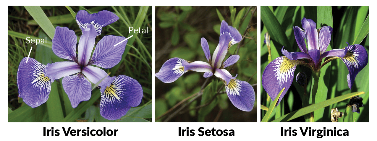
| Feature | Unit | Range |
|---|---|---|
| Sepal length | cm | 4.3–7.9 |
| Sepal width | cm | 2.0–4.4 |
| Petal length | cm | 1.0–6.9 |
| Petal width | cm | 0.1–2.5 |
     sepal_l  sepal_w  petal_l  petal_w      class
0        5.1      3.5      1.4      0.2     setosa
1        4.9      3.0      1.4      0.2     setosa
2        4.7      3.2      1.3      0.2     setosa
3        4.6      3.1      1.5      0.2     setosa
4        5.0      3.6      1.4      0.2     setosa
..       ...      ...      ...      ...        ...
145      6.7      3.0      5.2      2.3  virginica
146      6.3      2.5      5.0      1.9  virginica
147      6.5      3.0      5.2      2.0  virginica
148      6.2      3.4      5.4      2.3  virginica
149      5.9      3.0      5.1      1.8  virginica

[150 rows x 5 columns]
import pandas as pd
from sklearn.datasets import load_iris

# Carregar o conjunto de dados Iris
iris = load_iris()

# Transforma em DataFrame
df = pd.DataFrame(
    data=iris.data,
    columns=['sepal_l', 'sepal_w', 'petal_l', 'petal_w']
)
df['class'] = iris.target_names[iris.target]

# Imprime os dados
print(df)
Every pair of features. Read the panels against each other rather than one at a time.
Three things are visible in that grid, and each one is a decision:
- Petal length against petal width separates all three species, almost with straight lines. That pair has a high ceiling.
- Sepal length against sepal width does not. versicolor and virginica sit on top of each other. If those were your only two sensors, the project would be capped well below what the petal measurements allow — and no model would fix it.
- Petal length and petal width are strongly correlated with each other. They carry overlapping information, so the fourth column buys much less than the third did. That is the observation PCA formalizes.
5. The distribution of the target
Everything above is about the inputs. Plot the target too, and plot it first:
- Classification — the class balance decides the metric before it decides anything else. At 1% positives, accuracy is uninformative; see class imbalance.
- Regression — a skewed target usually wants a log, and then the metric you report is in log units, which is a different claim about what an error costs. A heavy-tailed target means squared error is dominated by a handful of rows.
- Either — a spike, a wall, an impossible value, a suspiciously round number. The target is data too, and it has the same defects as everything else. See data quality.
6. The toolkit
| Plot | Answers | Call |
|---|---|---|
| Histogram | what shape is this column? | plt.hist, sns.histplot |
| Box / violin by class | do the classes occupy different values? | sns.violinplot |
| Scatter | is the relationship between two columns linear, curved, absent? | plt.scatter |
| Pairplot | which pairs separate, which are redundant? | sns.pairplot |
| Correlation heatmap | which columns are saying the same thing? | sns.heatmap(df.corr()) |
| ECDF | what fraction is below this value? | sns.ecdfplot |
| Missingness matrix | is the missingness patterned or random? | msno.matrix |
| t-SNE / UMAP | is there cluster structure in many dimensions? | sklearn, umap-learn |
import seaborn as sns

sns.violinplot(data=df, x='species', y='petal_length')   # overlap, per class
sns.heatmap(df.corr(numeric_only=True), annot=True, cmap='coolwarm', center=0)
sns.pairplot(df, hue='species', corner=True)
A t-SNE plot is not a map
t-SNE and UMAP produce beautiful pictures and are the most over-read plots in machine learning. The size of a cluster means nothing, the distance between two clusters means nothing, and a structure that is not in the data can be manufactured by the perplexity setting alone. What they can honestly show is local neighbourhood structure. The full treatment, including what you may and may not say about such a plot, is in dimensionality reduction.
Lab: the shape and the ceiling
Step 1 — what a log transform actually buys
Income is lognormal, and the target is linear in its logarithm. The network is handed the column raw, and then logged, at four sample sizes — and then asked to extrapolate into a tail it never saw.
regime | raw | log1p |
|---|---|---|
n = 100 | 0.838 | 0.955 |
n = 200 | 0.860 | 0.953 |
n = 500 | 0.919 | 0.955 |
n = 2000 | 0.952 | 0.963 |
unseen top decile | -80.3 | 0.726 |
column | skew | kurtosis |
|---|---|---|
income | 9.25 | 128.2 |
log1p(income) | 0.35 | 0.0 |
"""What a log transform actually buys, and when it buys nothing.

Income is lognormal — the textbook right-skewed column — and the target is
linear in its logarithm. A network is handed the column raw, and then handed it
logged, at four sample sizes and then asked to extrapolate into a tail it never
saw.

The lesson is not "always transform". It is that the transform buys sample
efficiency and extrapolation, and that with enough data inside the observed
range a network will learn the curvature on its own.

Printed as a markdown table, in identifiers only, so one artifact serves both
the English and the Portuguese page.
"""

import numpy as np
from scipy.stats import kurtosis, skew
from sklearn.metrics import r2_score
from sklearn.model_selection import KFold, cross_val_score
from sklearn.neural_network import MLPRegressor
from sklearn.pipeline import make_pipeline
from sklearn.preprocessing import FunctionTransformer, StandardScaler


def sample(n, seed=17):
    rng = np.random.default_rng(seed)
    income = np.exp(rng.normal(3.0, 1.3, n))
    return income.reshape(-1, 1), 2.0 * np.log(income) + 0.5 * rng.normal(size=n)


net = lambda: MLPRegressor(hidden_layer_sizes=(16,), max_iter=4000, random_state=0)
raw = lambda: make_pipeline(StandardScaler(), net())
logged = lambda: make_pipeline(FunctionTransformer(np.log1p), StandardScaler(), net())
cv = lambda: KFold(5, shuffle=True, random_state=0)

print("| `regime` | `raw` | `log1p` |")
print("|---|---:|---:|")
for n in (100, 200, 500, 2000):
    X, y = sample(n)
    score = lambda m: cross_val_score(m, X, y, cv=cv(), scoring="r2").mean()
    print(f"| `n = {n}` | **{score(raw()):.3f}** | **{score(logged()):.3f}** |")

X, y = sample(2000)                      # train below the 90th percentile, test above it
inside = X.ravel() <= np.quantile(X, 0.90)
tail = lambda make: r2_score(y[~inside], make().fit(X[inside], y[inside]).predict(X[~inside]))
print(f"| `unseen top decile` | **{tail(raw):.1f}** | **{tail(logged):.3f}** |")

print()
print("| `column` | `skew` | `kurtosis` |")
print("|---|---:|---:|")
column = X.ravel()
tidy = lambda v, places: f"{v:.{places}f}".removeprefix("-") if abs(v) < 0.05 else f"{v:.{places}f}"
for label, values in (("income", column), ("log1p(income)", np.log1p(column))):
    print(f"| `{label}` | {tidy(skew(values), 2)} | {tidy(kurtosis(values), 1)} |")
The second table is the transformation doing its job as a transformation: skew from 9.25 to 0.35, excess kurtosis from 128 to 0. The column went from something the mean cannot describe to something it can.
The first table is what that is worth. At \(n = 100\) the log is worth 0.838 → 0.955 in \(R^2\), a large gap. By \(n = 2000\) it is worth 0.952 → 0.963, almost nothing — because with enough data inside the observed range, the network learns the curvature by itself. The transform buys sample efficiency, not capability.
Except in the last row. Asked about the top decile of incomes, which it never saw in training, the raw model returns \(R^2 = -80.3\) — worse than predicting the mean, by a lot — while the logged model returns 0.726. A network extrapolates as a nearly linear function of its inputs, so what it extrapolates in is exactly the thing the transformation chose.
Try it
Change the target to 2.0 * income instead of 2.0 * np.log(income) and rerun. Now the raw encoding is the one that extrapolates and the log is the one that fails. Neither transform is right; the right one is the one that linearizes your relationship.
Step 2 — the ceiling is a property of the data
Two gaussian classes, separated along a single axis. The middle column is \(\Phi(d'/2)\), computed in closed form. The right column is what a small network reaches.
d_prime | bayes_accuracy | mlp_accuracy |
|---|---|---|
| 0.5 | 0.599 | 0.574 |
| 1.0 | 0.691 | 0.673 |
| 2.0 | 0.841 | 0.833 |
| 3.0 | 0.933 | 0.932 |
| 4.0 | 0.977 | 0.975 |
"""The data sets the ceiling. The model only decides how close it gets.

Two classes, both gaussian, differing only in the mean of the first feature.
For that setup the best accuracy *any* model can reach is known in closed form:
with the separation measured in standard deviations as d' = |mu_1 - mu_0| / sigma,
an optimal classifier is right a fraction Phi(d'/2) of the time — where Phi is
the normal cumulative distribution. Nothing beats it: not a bigger network, not
more epochs, not a better optimizer.

The last column is what a small network actually reaches. Compare it to the
column on its left before blaming the architecture for a disappointing score.

Printed as a markdown table, in identifiers only, so one artifact serves both
the English and the Portuguese page.
"""

import numpy as np
from scipy.stats import norm
from sklearn.model_selection import StratifiedKFold, cross_val_score
from sklearn.neural_network import MLPClassifier
from sklearn.pipeline import make_pipeline
from sklearn.preprocessing import StandardScaler

N, DIM = 4000, 4

model = lambda: make_pipeline(
    StandardScaler(), MLPClassifier(hidden_layer_sizes=(32, 16), max_iter=3000, random_state=0)
)
cv = StratifiedKFold(5, shuffle=True, random_state=0)

print("| `d_prime` | `bayes_accuracy` | `mlp_accuracy` |")
print("|---:|---:|---:|")
for separation in (0.5, 1.0, 2.0, 3.0, 4.0):
    rng = np.random.default_rng(3)
    y = rng.integers(0, 2, N)
    shift = np.zeros(DIM)
    shift[0] = separation                       # the classes differ along one axis only
    X = rng.normal(size=(N, DIM)) + y[:, None] * shift

    reachable = norm.cdf(separation / 2)         # nothing can do better than this
    reached = cross_val_score(model(), X, y, cv=cv).mean()
    print(f"| {separation:.1f} | {reachable:.3f} | **{reached:.3f}** |")
The two columns agree to within 0.025 at every separation, and the gap closes as the problem gets easier: at \(d' = 3\) the network reaches 0.932 against a ceiling of 0.933.
That is the result to remember the next time a model disappoints. The architecture was never the binding constraint. At \(d' = 1\) the best possible classifier is right 69.1% of the time, and a two-layer network with 48 units gets to 67.3% of it. There is at most two points of accuracy available from anything you could do to the model; everything else has to come from the data.
What the lab is teaching
Both steps are the same lesson from opposite ends. Step 1: a transformation does not add information, it makes the information easier to reach — which is why its value shrinks as the data grows and becomes decisive where the data runs out. Step 2: the information content is fixed by the distributions, and it is the thing you should measure before you start choosing architectures.
-
Fisher, R. A. (1936). The use of multiple measurements in taxonomic problems. Annals of Eugenics 7(2), 179–188. Dataset at the UCI ML Repository. The measurements were collected by Edgar Anderson; Fisher used them to demonstrate discriminant analysis. ↩
-
Duda, R. O., Hart, P. E., & Stork, D. G. (2000). Pattern Classification, 2nd Edition. Wiley — the source of the salmon/seabass example and of the Bayes-error framing used above. ↩